It’s been a very snowy winter here in the northeast US of A. We’ve gotten two to three times the normal amount of snow of an average winter and it’s trying my patience and motivation. I’m lucky that I don’t have to commute through the stuff but it’s still a pain. This is my fourth winter in a row cycling all through the winter and I’ve had to miss more days this year because of the snow and cold than in the previous three years combined. Right now I’m looking at missing a full week of cycling for the second time this winter. I haven’t lost a full week of cycling in any of the previous three winters. Or summers for that matter. SO you know the weather is bad.
In January when I missed a full week of cycling because of snow and cold I was surprised at how much my lungs burned on my first ride back. Maybe I was a little too excited to be riding again and didn’t pace myself properly but I was really sucking wind on that ride. Not having missed more than a couple or three days rides over the years it hadn’t even occurred to me to take it easy after a week off. When I finally get back on the bike again I’ll have to remember that.
All the snow has affected my own work too. We had four snowstorms in about two weeks. It’s tough to get things done when I have to go out and clear the driveway and walkways so many times. Besides the fact that it’s physically tiring it also makes life seem awfully repetitive and pointless. Clear the driveway, more snow, clear the driveway, more snow, what’s the point of it all? You know the drill.
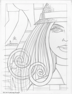
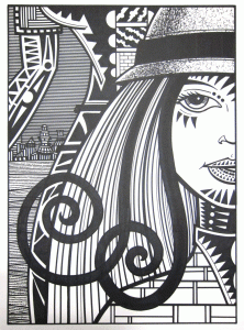
Oddly enough I got quite a bit done in the first part of the week. Well, maybe it’s no so odd since that was before all four storms hit but I was on a roll. Besides the large 20×28 inch drawing that I wrote about last week I got two more of those size drawings done. I was getting it done for a little while. Since I always have a bunch of pencil drawings lying around I looked through the pile and found a couple that I wanted to make big black and white marker drawings out of. So I did. I had the focus, concentration, and motivation to get them done. It’s always cool when that happens.
Then the storms wore me down. It started with six inches of snow on a Monday. Then on Wednesday another ten inches hit. Somehow between then and the Thursday a week away a “Wintery mix” became a Nor’ Easter which dropped a foot of show on us followed by another six inches on Friday. Luck was with on on Saturday as that storm was only a couple more inches. Today’s storm on Tuesday dropped three more. Did I mention that it’s been below freezing most of the time? None of the snow had time to melt before more snow fell. It’s at the point where there is no more room to put new snow on the sides and back of my driveway. It’s crazy.
I got those two large drawings done mostly in the week between the storms. I think the third one overlapped with the big Nor’Easter but after finishing that one I was a bit cooked. On Saturday I managed to get my usual five “Four Talking Boxes” strips done for the week and a little bit of drawing but not much else. I spent a lot of Sunday organizing old drawings.
Years ago I attached two drawers underneath the surface of my drawing table. It’s an out of the way but completely handy place to keep drawings. Somehow over the years I’ve come up with a system where the right hand drawer holds my drawings that I haven’t made into anything finished yet and the left hand one holds the drawings that I have made something finished out of. Eventually when the left hand drawer is full I have to find a place to put the drawings. That was what happened. I made a box out of old matte board to put the drawings in and stuck them on a shelf. I also cleaned up some vertical files with all sorts of odds and ends of drawings in them.
I spend a good deal of that Sunday organizing time cutting up odd size pieces of drawing paper into 5×7 inch and 2.5×3.5 inch pieces of paper that I would use. That odd size paper has been sitting around for years waiting for me to get to use it. I finally decided I never would use the paper in its current form but it’s still good paper. It took me a couple of hours to cut it all to size but I didn’t have the energy for much else anyway.
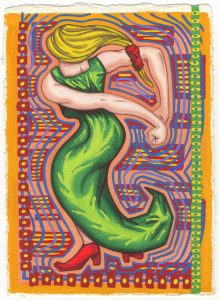
Today, besides writing this, I painted four “On the Rough” drawings. These are the 5×7 inch ink and watercolor drawings that I do on super textured watercolor paper. I haven’t made any since December but since they’re a spontaneous kind of work I do okay with them on a low energy day. I didn’t end up liking any of the four of them very much but that could just be my mood.
One other odd thing happened this week. I use my inkjet printer a lot in my work. I’m forever scanning in drawings, blowing them up, and printing them out in blue line to redraw. My habit is that when I run out of a color I go to my reserve box, pull out another ink tank of the same color, put it in the printer, and then immediately order a replacement ink tank to put in my reserve box. That way I always have a spare of the color I need. Except this time I didn’t. I ran out of magenta, went to my box, and saw no new magenta ink. I had two ink tanks of light magenta though. I guess I somehow bought the wrong one last time. I’ve had an inkjet printer of one kind or another since 1996 and that’s the first time I was caught without ink. Of course that was on Thursday when the Nor’Easter was hitting. The ink tank was supposed to arrive on Saturday but too many storms kept it away. Then Monday was Presidents’ Day. Today, as I write this, it’s Tuesday and it’s still not here. Oh well, maybe I’ll be able to print again tomorrow.
