Comics I Bought This Week: March 1, 2014

I’m back from the comic shop this week and I got nine new comics.
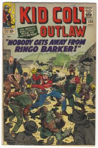
This week’s comic book cover to look at and examine is “Kid Colt Outlaw” #123 by Jack Kirby. Stan Goldberg and Sam Rosen are both also credited on the database I looked at so I figure they did the color and lettering. I’m not sure when or where I got this comic from. I’m guessing I saw it for cheap and bought it because I like old Marvel westerns and I like this cover.
This cover is all about chaos and action. Action was Kirby’s strength and it shows here. Kid Colt is in a fight with over a dozen bad guys. Let’s see someone pull that off these days. They’re coming at him from all angles and there is a lot going on. There is a nice sense of time in this one as we have the past, the present, and the future all in one shot. It the present we have Kid Colt getting the gun shot out of his hand and punching some one. In the past we have a guy on the ground holding his head as he was obviously punched a moment before. In the future we have a bunch of characters rushing to join the fight. That’s a lot going on. Ringo Baker, the leader, is almost an afterthought.
I like that the type is all in the top third of the cover. That makes things orderly amongst the chaos. Often on these old covers the type is peppered all over the image but that would have made a mess of this cover. My copy is a bit faded and the purple type looks darker than it must have originally but the red logo against the light blue sky still looks good.
Overall the color on this cover is pretty subdued. Only Kid Colt in the middle of all the action has full primary colors going on. A red shirt, blue pants, and yellow gloves. Otherwise everything else going on around him is in greens, greys, and browns. The figures in the foreground are even completely knocked out in grey. This might be a bit of a conservative choice color-wise but I can’t say that it’s wrong.
Order and chaos are often the two opposing forces in fiction. I think this cover has them going on too. Interesting.
Discussion ¬