
It’s early on a Saturday morning right now and I’m contemplating which books I want to buy. Of course by “Books” I mean collected editions of comics and graphic novels. I do buy (and borrow from the library with Hoopla) regular (prose) books but I went digital with regular books (prose) a long time ago. I have an overabundance of comics around here and I don’t need to add even more books to them.
One of my all time favorite comics is “Hate” by Peter Bagge. Most of its issues were made in the 1990s and I bought them off the rack at the time. Volume one of “Hate” was thirty issues and after that came “Hate Annual” which ran nine issues. I didn’t get the nine issues of the Annual for some reason but bought the collected edition of them “Buddy Buys a Dump” when it came out many years latter (2014).
A few years ago (2016) another comic of Bagge’s “Neat Stuff” was collected into an oversized, slipcased, hardcover edition. That’s the series where Buddy Bradley (the star of “Hate”) first appeared and, though I had many of them, I don’t have all of the issues. It was an expensive book. It was in two volumes and was about $80 (if memory serves). I kept my eye on it and eventually bought it on sale (in December 2019) for $32.50. A nice pickup. The book is now out of print and expensive.
“The Complete Hate” which collects all of “Hate” and “The Hate Annual” came out in December 2020 and is three hardcover volumes in a slipcase. It’s been on my wish list since then but it has a retail price of $120 and is currently available online at about $90. I’ve had my eye on it all these years and it’s never gone down cheaper than $85. It even went out of print and raised in price before going back into print.
In September of 2022 as I was, once again, contemplating buying “The Complete Hate” I decided to check out the softcover versions available for the book. The whole thing was printed in three volumes: “Buddy Does Seattle,” “Buddy Does New Jersey,” and “Buddy Buys a Dump.” I already had “Dump” and the first two I already had in their original issues. But sometimes it’s nice to have them in collected editions too.
The main problem I had with these collected edition was that they were a bit smaller in size than a regular comic. Around 6×9 inches compared to about 7×10 inches. I like the bigger size. But in the end I bought them because they were much cheaper. I bought them used online for about $25 for the pair. Boom. Done. I had the whole series in collected editions. But they still weren’t the big oversized hardcovers.
Over the last two years I’ve still kept my eye on those box sets. What I decided to do was to save up credit card points and make the purchase with them. That way I wouldn’t have to spend actual money. I’ve saved up the points three times in the last two years but have always ended up using them on something else. Last year I used them when I bought a camera. My DJI Pocket 3.
This year as I was contemplating finally getting that box set I decided on getting something else. Some Richard Corben books. Despite having some Richard Corben comics since the 1980s I didn’t really become a big Corben fan until the early 2000s. For some reason that’s when his work really clicked with me and I’ve been buying all of his stuff since then. But, of course, I missed a lot of it from the 1970s-2000s.
Richard Corben died in 2020 and since 2022 Dark Horse comics has been publishing a lot of his work in hardcover editions. I’ve had my eye on them but hadn’t bought any yet. They start out at about $40 but like most books they drop in price after a while. After they go out of print they can sometimes shoot up in price so it’s good to find the sweet spot before that happens.
I saw that the first four volumes of the Corben stuff was available from between $20-$25 a piece. This was fairly cheap and the first volume was the cheapest at $20 and it had been out for a couple of years. I didn’t think it was going to get any cheaper than that and enough time had gone by that it might go out of print.
I had around $100 worth of credit card points saved up and that would be enough to get all four volumes. A fifth volume had just came out but that one was still at full price. So I abandoned my idea of getting the “Complete Hate” and bought the Corben books. Why buy another copy of stuff I already had when I could get stuff I’ve never read before?
Another funny thing happened in these four years that I’ve been thinking about buying “The Complete Hate.” It’s not complete anymore! In 2024 Peter Bagge did four more issues of “Hate”. It was called “Hate: Revisited” and it was terrific. I have no idea if there are any plans to put it in a new volume but it’s sure not in the old one.
I also just saw that this year they are coming out with softcover editions of “The Complete Hate.” No box set and the three volumes are comic out individually over time. Volume One is set for August and the list price is $30. I wonder if the new Volume Three will have “Hate: Revisited” in it?
Meanwhile “Hate: Revisited” will be getting its own collected edition in July. The list price on that one is around $20. Maybe I’ll pick it up or maybe I won’t.
All this contemplating about buying “The Complete Hate” is really a little bit silly in the end. It’s not like I have been so broke over the last four years that I haven’t had a spare $100. I’ve probably spent $100 on dumb stuff that I shouldn’t have in that time but in smaller increments. Somehow spending $20 on something silly and impulsive five times over time is easier than spending $100 on something I already have in another form. I want to go read some comics now.
I’m back from the comic shop this week and I got eight new comics.
Check them all out here:
I think that January is the toughest month for me in terms of creativity. I get stuff done eventually but it’s harder to start than normal and harder to get going. I’m not sure why. It could be that winter has started and it’s cold outside or it could be that the end of the year holidays were such a disruption that I have to get the old habits going again. It could also be that January starts a new year and that’s when I contemplate what I want to get done in the coming year. Even if it’s all pie in the sky I still think about it a bit.
Of course I also tend to not take a holiday during the end of the year when it comes to my own creative stuff so I was working on things on New Year’s Eve day and on new Year’s Day. Not that I got a ton of stuff done on those days but I did get a couple of “Dreams of Things” drawing done.
One New Year’s Day tradition I have is to start a new Inkbook/Sketchbook. I’ve mentioned my Inkbooks before. They’re the ones I fill up with small ink drawings all year and then I will use those small ink drawings as my starting point for a lot of my work. Those inkbooks are where I work on a lot of my basic visual ideas. I randomly name them by closing my eyes and picking a word out of a dictionary. This year’s Inkbook is called “Paregoric” and is number 26. That means I’ve been filling up one of these a year for 25 years. That’s a long time.
One of the things I decided to do this week was to make some more ink textures to be scanned in and used digitally. Like a lot of artists I like sketchbooks and end up buying more of them than I need. So I usually have a handful of blank ones lying around. A few years ago I had a Strathmore multi media 5.5×8.5 inch one that I decided to use for making textures. Because it’s “Multimedia” it has thick paper that won’t buckle with a lot of ink and I can use both sides of the paper.
I ended up filling up that sketchbook (about 80 pages) with textures made from ink and I even filled up a second sketchbook the following year. So now I have about 160 textures scanned in and ready to go when I need them. I used them in the design for my “The Great Gatsby” illustrated book that I’ve been working on. I think this is the beginning of year three working on that Gatsby project.
So on Monday the 30th of December I decided to start working on textures in a new Strathmore multi media sketchbook. Something like that is more of a task than a creative endeavor and this is a time when I find it easier to get tasks done than to be creative. So I threw down an old towel on the surface of my drawing table and put the book on top of it. I’ve learned that when making these textures ink can fly around so it’s best to have a rag under the book rather than try and clean up later. There is also a lot of hand washing going on as the ink can get all over my hands.
The hardest part of making ink textures if thinking of different ways to make them. Especially after filling two books with textures already. I had gotten it in my head a few days earlier to try and use a dryer sheet to make a texture. A used dryer sheet has an interesting texture and maybe that would help. I dipped the dryer sheet in some ink and dabbed it on the paper. It was really tough to work with and mostly made a mess so I only got two pages out of the dryer sheet.
Trying not to make such a mess did lead me to using a sports card penny sleeve next. Those are the little bags that baseball cards slip into to protect them. I put my fingers into the bag, brushed ink onto the outside of the bag, and then touched the paper. This was less messy on my fingers but I was only so-so in making textures with the bag.
My most versatile tool for making these textures was a medium size bamboo brush. I could load the brush up with ink, smash the brush tip down on an ink stone, and then use the busted-up-many-tipped brush to dab different textures. Or I could spin the brush or drag it across the paper. There were a few different ways to use the brush. I also used it to put ink on different things like the dryer sheet and penny sleeve.
I could use the brush to fill up the whole book but I wanted more variety so I kept trying out new things. One of my favorite things turned out to be the round plastic container that Ice Breaker mints come in. For a couple of pages I brushed ink onto the lip of the circular container and used that like a stamp to leave ink on the page. I built up the texture over many stamps of the partial circle. I also put ink on the bottom of the container for a couple of pages of textures made from bigger circle parts. It’s kind of like drawing with coffee cup ring stains. Those ones were fun.
I also made some textures with actual stamps. Back in the 1990s I bought these stamps that were used with stamp pads. Two were of famous paintings and two were of textures. I brushed ink onto the stamps and used them over and over to fill a page with a texture. I used these in the previous two books but the textures are different every time so I used them again.
One of favorite tools this time around was the end of a piece of scrap wood. It was a four inch piece of one by two pine. I took the brush and brushed a lot of ink onto the one by two end. The end was pretty rough and absorbed a lot of ink. I then used that end as a rectangular stamp. It left some nice texture behind and I was able to fill about six pages that way. Some good textures.
It took about three days to fill the whole book. Just parts of days really. I would get something small and creative done in the morning and then I’d spend an hour or two working on the task of textures. I could put it down or pick it up at any time.
The final thing I had to do was to scan in the textures and set them up to be used. Photoshop and Illustrator actions help a lot with this next part. I scanned them in grayscale and then had to straighten and crop them. After that I copied them and turned the greyscale documents into bitmapped ones. Finally I image traced those bitmapped files into vector graphics in Adobe Illustrator. Then they were ready to use in three different formats.
Now I’m ready to go in 2025 with a whole bunch of new textures at the ready!
I’m back from the comic shop this week and I got five new comics.
Check them all out here:

I’m a camera guy. I like taking photos and I’ve been taking them for long time. Back in the days of film cameras, which for me were from 1984 to 2001, I owned about six cameras. That was over that whole stretch. At any one time I probably had three cameras that I used regularly. A 35mm SLR with interchangeable lenses, a small pocketable 35mm point and shoot, and the third camera was some weird fun thing I was trying out. A small Olympus XA rangefinder camera is one example, an Advanced Photo System (APS) camera another, a Polaroid instant camera a third, and even a Gameboy Digital camera.
Now, in the digital age (for me from 2001 until now) I use even more cameras regularly. Of course I have a camera on my phone plus I have one on my iPad. Those are almost incidental cameras but I do use them all the time. Then I have a super zoom camera and also a smaller super zoom camera that I carry with me on my commutes. Lastly I have my DJI 3 stabilized video camera that I film my Walks in NYC with.
I also spend some time looking at new cameras on the internet. I like seeing what’s out there and shopping around for whatever the latest thing is. I’m often checking out micro four thirds cameras which I’ve always wanted one of but have never bought. I guess it’s not that important to me but I like looking at them online.
I tell you all of this to explain the latest camera that I got. The two primary places online that I look at cameras are Amazon and eBay. If I’m just looking for prices of cameras in general I go to Amazon but if I want a bigger range of prices, such as for used stuff, I go to eBay.
One camera that always pops up on my searches is this cheap “Vlogging Camera.” It’s called that because it has an LCD that swivels around and can face the front of the camera (I love a swivel LCD by the way). It is a 48 megapixel camera and also shoots video.
I’ve seen this camera branded various ways but they all seem to be the same basic model. That happens a lot with stuff these days. I’ve noticed it a lot with mens’ shoes too. I think a Chinese factory makes a lot of a product for cheap and another company buys that product, brands it, and then sells it cheap.
A lot of companies do this and we end up with a lot of identical stuff with different branding. It’s probably why I always see complaints on Amazon that the product pictured isn’t the one sent to the customer. I think companies are just selling whatever the factory sends them. I think a lot of drop shipping is involved too. This is when the company branding and selling the product never even has the product in their hands. I’d shipped right from the factory’s warehouse to the customer.
These 48 megapixel vlogging cameras are usually priced from $50 to $100. I don’t know if there is a difference between the cameras on those two ends of the price but if there is I haven’t noticed it. I’ve always been curious what a $50 camera could possibly be like but I never wanted to pay $50 to find out.
So there I was a couple of weeks ago looking at Micro Four Thirds cameras, yet again, on Amazon and, yet again, these $50 48 megapixel camera pop up. But this time I decide to go to eBay and see if they are there too. Sure enough they are except I see one for $13. That’s kind of a crazy price. That included shipping too. With tax the price ended up being $14 and change so let’s just call it $15. I ended up buying that $15 camera.
When the camera came the first thing I noticed, that I hadn’t even thought of, was that it didn’t come with a Micro SD card. Of course it didn’t. What would a $15 camera came with a Micro SD card? So I pulled one out of a Ambernic hand held device that I wasn’t using and put it in the $15 camera and got to testing it.
The first thing I noticed was that it wouldn’t save a photo. I had the resolution set to 48 megapixels and it would go through the motions of saving a photo but nothing would end up on the card. I turned the resolution down to 44 megapixels and it saved a couple of photos. I thought things were fine but then it stopped saving photos again.
I also shot video with the camera and it saved that (unless it didn’t) but the video was choppy and was unwatchable. Don’t know how many frames a second it was recording but it wasn’t enough.
After all these troubles with the camera the idea struck me that maybe I had the wrong Micro SD card for the camera. Sometimes devices have an upper limit on how big a Micro SD card can be. I dug out the camera manual and found the info I needed. A 128 gig SD card was the upper limit and I had an 256 gig Micro SD card in there. I went online and spent $10 on a new Micro SD card that had the specs that they asked for. I now own a $25 “$15 camera!”
Guess what? It didn’t matter. I turned the resolution up to 48 megapixels again and it saved one photo and then stopped saving anything. I turned the resolution down to 44 megapixels and it saved three photos and then stopped saving anything. It wouldn’t save video either. I put the frustrating camera down and left it.
It wasn’t until a week later when I was telling the story of this camera to someone that it struck me to turn the resolution down to 24 megapixels. It never occurred to me because who wants to shoot with a camera on half resolution? But all my other cameras have less than 20 megapixels anyway. 48 megapixels is crazy large. That was one of the reasons I was always curious about these cameras. How can such a cheap camera have such a large megapixel count? It turns out that it can’t.
Anyway it was just this morning that I tried the camera out on 24 megapixels. Everything worked fine. It saved all the photos I took. I guess it’s not a 48 megapixel camera at all. And the picture quality was not particularly good. Lots of grain. About what you’d expect from a $15 camera.
I’m back from the comic shop this week and I got eight new comics.
Check them all out here:
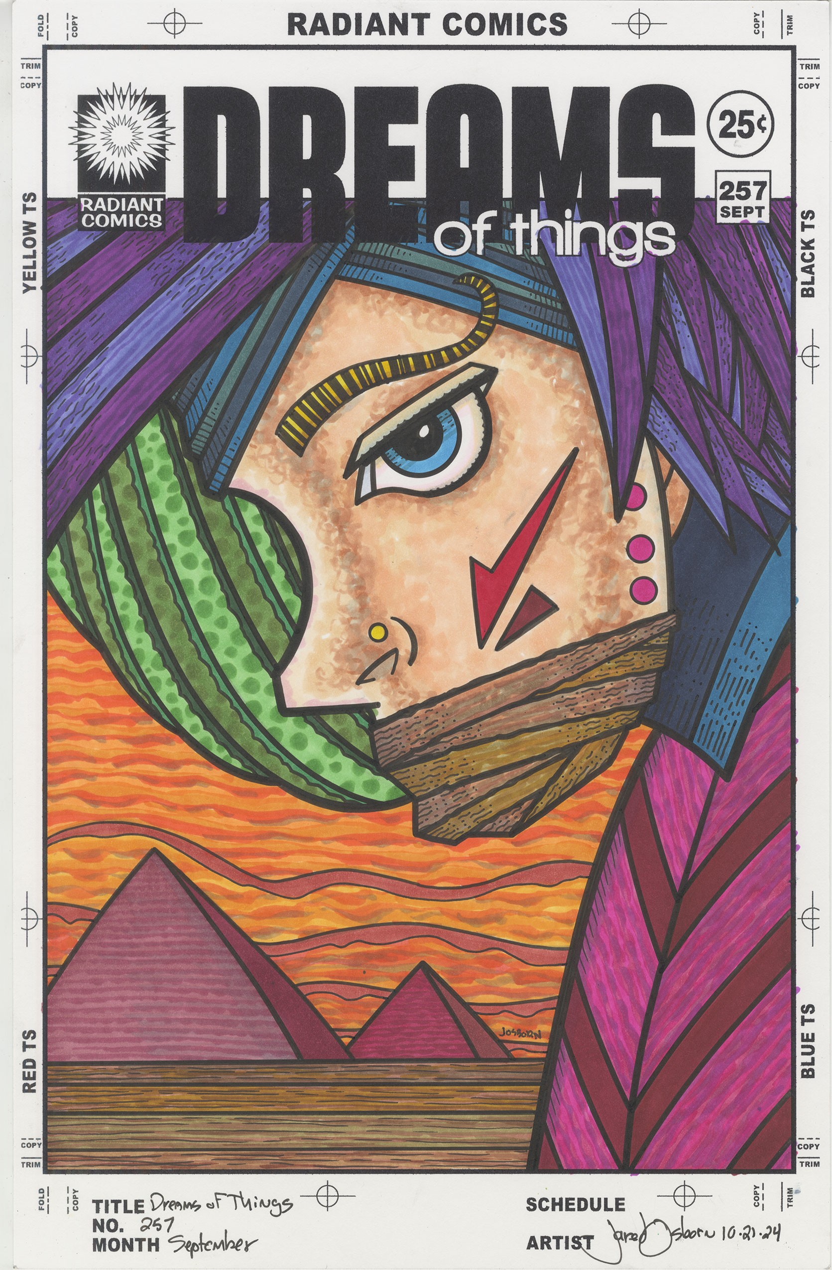
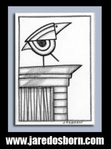
This week I’m going to write about the “Dreams of Things” cover that is sitting on my easel. It’s sitting in front of a bunch of other works on paper most of which are faux comic book covers like DOT. This one is in front of because every week when I make my comic book haul videos I show off a piece of my art. This is the one I showed off during December 18, 2024’s video. I spoke a little bit about it there but now I’ll write about it.
First off this one strikes me as a little unusual because there is only one person in it. For these covers I usually have at least two people in the composition. Not always and they have changed over time but this single figure makes the piece seem lonelier than usual. The figure is also androgynous and I’m not sure if it’s a she or a he. I think it’s a he in my mind my then it can change on me. I think I’ll go with he for this writing though.
There is a lot of purple in this piece and it’s mostly a reddish purple. That plus the orange sky and brown ground give this cover a strange glow. It’s definitely not cool as it would be if there was more blue nor is it hot as it would be if there was more red but it’s somewhere near warm. I think the blues surrounding his blue eye also bring the color back from hot to warm. The blue of his eye is central to the piece and its visual importance calms things down.
The bit of green that’s part of his hair or headdress also brings the color out of the hot zone. It’s its own bit of color reality creating a middle ground of space. The foreground is the figure, the background the sky and pyramids, and the middle ground is just that bit of green. The green also has spots on it that gives it a texture all of its own further putting that part of the piece on its own plane.
I love pyramids and work them into a lot of these covers. First off triangles are one of the three basic shapes along with rectangles and circles so they are easily relatable and then there is the historical aspect. Lots of ancient peoples built pyramids but we know the Egyptian ones best. They go back in time a long way and still have a bit of mystery about them. So for both their shape and feeling of deep history I like drawing pyramids in the background of these dream-like covers.
There is a loneliness to this piece not only because there is only one figure but also because he is silenced. He has some sort of brown cloth over his mouth and therefore cannot speak to us. Why is that there? Who silenced him? What would he have to say to us if he could? He looks like he wants to tell us something. Maybe he knows the secrets of the pyramids behind him but now he can’t tell us because someone won’t let him. And who is that someone?
The only touch of red in this cover is the face marking that he has. It’s an arrow that’s on his cheekbone and the arrow is pointing at his covered mouth. What does this mean? Is it to emphasize the importance of his silence? Would his talking to us actually be a bad thing and the red arrow is warning us?
The gold stud on his nose makes me think someone cares about him. If him being gagged against his will was by someone who didn’t’ like him then I’d imagine they wouldn’t let him keep that gold jewelry.
The main thing I like about working in markers is that they are instant color. You draw on a piece of paper and the color is there and settled in an second. You don’t even have to wait for water to dry as you do with watercolor or acrylic paints. It’s fast and it’s direct. I find that a good way to work.
The drawback to working with markers is that they have no surface. With paint you can leave behind brushstrokes that have a physical property to them. Paint sits on top of a surface and you can build it up so it has literal thickness. A lot of painting is about using the surface to create brushstrokes and textures. With markers there is none of that. No matter how many times you go over an area with a marker the ink always soaks into the paper and leaves no texture behind.
The fact that there is no texture to marker ink means that I have to draw some textures. I find that gives a piece more visual interest. That’s why I used a scumbling technique on the face. Scumbling is when I dab the side of the marker brush onto the paper creating a different small shape with every dab. This gives his face some texture and makes his skin a little more interesting.
The brown fabric/rope/tape that is wrapped around his mouth also has its own texture. It also has some small ink lines in there. I hope the color and ink textures give that part a natural organic look. It’s not something magical that’s keeping him silent but something physical.
I mentioned before the shapes in the green but all of the hair and headdress have their own textures. The two tone purple has a darker color running the length of it suggesting hair and the blue has some small ink lines going across it suggesting some kind of head wrap. It matches the blue of the collar too.
The orange sky is full of textures clouds, the ground has darker colored lines running across it, and the pyramids have lines running across them too.
The final texture is in his shirt and those lines almost form a herringbone pattern. They run from the outside of the shirt to the center seam or zipper. This makes it look a little bit more like fabric to me.
Overall this cover poses a lot of questions for me about what exactly is going on. But that’s what I’m looking for in this and my other “Dreams of Things” covers. I like exploring the meaning of things. It’s what I do.
I’m back from the comic shop this week and I got seven new comics.
Check them all out here:
Most of the time commuting is boring, tedious, and dreary. Yesterday (December 11, 2024) it was way too much of an adventure. I commute into NYC a couple of days a week and usually I catch a train in Nanuet NY, take that train to Secaucus Junction in NJ, and then take a train from there into Penn Station in NYC. That how I thought things would go on Wednesday but they didn’t.
First of all it was raining out. Pouring rain at different times and that really set the mood. I got to the station in Nanuet and was waiting for the 12:25 PM train. Not a lot of trains run at that time so missing one isn’t an option. The train is almost always on time.
Soon 12:25 PM came and went and it was 12:30 PM. I checked the NJ Transit app for a real time update and sure enough it told me that the train has left Spring Valley (the previous stop) and was three minutes away. Good. Three minutes later and there was no train. I then spent the next ten minutes checking the app and the train was always two or three minutes away.
Finally at about 12:45 I tried looking around on the app to see if I could find some more news. I found an area for notices and saw there was one for my train line. It said that right outside of Spring Valley there was a trespasser strike. After wondering for a moment why there was a work stoppage I realized that meant a person was hit by the train. I was a little stunned.
I was on a train once when a train ahead of us hit a person. They kicked us off the train and closed down the whole line. I knew that the current train from Spring Valley was not reaching Nanuet. So at about 12:50 I decided to walk back to my car (in the rain) and drive across the Hudson river to Tarrytown NY.
The Jersey Transit trains I take are on the west side of the Hudson River. Across the river are the Metro North trains that run down the Hudson into Grand Central Terminal. I set up my phone GPS to give me driving instructions to the Tarrytown train station. It told me it would take about 20 minutes. By the time I was on the Tappan Zee Bridge it was pouring rain. It’s a good thing I had GPS because I didn’t remember the way once I got across the bridge and into Tarrytown. You have to drive through town a bit. It’s not a straight shot.
Next came my parking adventure. I drove into the main lot. It’s a pay lot. I drove all around and there was not a spot to be found. Hundreds of cars filled the whole lot. My frustration level was high. I drove out of that lot and tried to find another but every lot around was full.
I finally remembered back to when, back in the 1990s, I occasionally commuted with a friend through Tarrytown and he used to park at a metered spot on the street. He had to pump a lot of quarters into the meter for the whole day but I figured that there was probably an app for that now. I found right street and luckily there were still spots.
By the way it was still pouring rain at this point.
I saw on the meter that I had to go to a website to pay. At first it said that I could sign in with my Apple ID but that seemed to do nothing. I had to sign up myself, my car, and my credit card. Plus I had to locate the number of the individual parking meter and the number of the general area of the parking meter. I kept having to run out of the car into the rain to find the numbers. I think I ran in and out of the car at least five times. A phone touch screen doesn’t work very well in the rain so I couldn’t stand outside.
Finally, after about ten minutes, I paid $15 for my parking and started walking to the station. I still had no idea what time a train was coming so I was in a hurry. I made it to the ticket machine and went to but a ticket. It wanted to know if I wanted a peak ticket or off peak. This is normal stuff except I had no idea when the off peak was on this train. So I opted for peak both ways so there wouldn’t bet be trouble. It cost me another $30 for the round trip ticket. That about $10 more than I was paying for my off peak ticket in Nanuet. And $7 more than peak.
I got lucky in that a train was supposed to be in ten minutes from when I got on the platform. It could have been as much as half an hour. As I was waiting I got the idea to check on the Nanuet train. The app said that it was cancelled. Just as I suspected. I was glad I made the drive to Tarrytown.
When I got on the train I downloaded the Metro North app. I probably could have bought my ticket on that (I do that for my NJ Transit rides) but I was taking no chances. I did use the app to check on the subway ride. I usually walk from 31st Street and Penn Station down to 14th Street but I wasn’t going to walk from Grand Central (42nd and Park Ave) all the way downtown in the pouring rain.
I don’t usually take the subway anywhere so it was a good thing I set up my phone to get me on the subway just a couple of months ago. You wave your phone over the turnstile and it pays your fare. It costs $2.90 a ride. I took the S (Shuttle) to Times Square and then took the 2 train down to 14th Street. I somehow made it to class only about 15 minutes late.
Getting back home was much easier though it was again pouring rain as I drove over the bridge. It was an expensive day too. Bridge toll: $6, Parking: $15, train: $30, and subway: $6 for a total of: $57. That’s all money I wasn’t expecting to spend that day. With my original ticket (that I can use next semester) being $20 the total is really $37 but that’s still a lot.
The strange thing to me was that not one bit of that money was cash. I use my credit cards for a lot of things but I still use cash quite a bit. Not one bill left my wallet. The bridge toll was EZ-Pass, the parking online with my phone and credit card, the train ticket my credit card, and the subway was my phone.
It was not a fun commute for me but it was even less fun for the person who got hit by the train. I finally found a story about it and the guy wasn’t killed. He was jumping out of the way of the train and got hit in the shoulder.
I’m back from the comic shop this week and I got six new comics.
Check them all out here: