This week I’ve been writing some of my “Message Tee” comics. I finished up fifty two new drawings earlier in the year and now I have to put pithy sayings on their shirts. My method for writing these strips is to get a small notebook and write as many sayings as I can think of in the notebook. Or at least as many sayings as I can think of at the moment.
I like to have choices when I’m putting a saying on a comic so that I end up writing twice as many sayings as I need. Since I have fifty two drawings I write a hundred and four sayings. Usually I round it up to one hundred and five.
The reason for the extra one is because of the little notebook that I write in. It’s a 3.5×5.5 inch notebook and I can fit five sayings on a page. Each saying fits on two lines with a blank line in-between sayings. After I fill up a page I write the page number on it and also put a date on the page.
Usually I write these where ever I am. I’ve written them on my commute, I’ve written them in waiting rooms, I’ve written them sitting in my chair, and I’ve written them standing at my drawing table. But this year I wrote some of them as I was on walks. That was new.
As one of my forms of exercise and to get out into the open air I like to take walks. They’re not long walks as they only take me about half an hour. I’m not power walking or ruck sacking. I’m just out for a stroll. So one time I decided to take my notebook with me to see if I could come up with any ideas. I could.
The walk took me about an extra ten to fifteen minutes since I had to stop and write every time that I came up with an idea. I was also thinking about ideas nearly the whole walk. At first I was thinking I would stop after writing five ideas but then they came pretty quickly so I said ten ideas and then fifteen. I think I got all fifteen done and still had about a third of the walk to go. So after that I just relaxed and walked.
I ended up doing this twice or maybe it was three times. But finally there was one time I was sitting down and I said to myself, “I’m going for a walk in half an hour.” It was my plan to walk and write but then since I was just sitting and resting anyway I decided to write the fifteen lines then so I wouldn’t be bothered with the writing on my walk. So that’s what I did and it worked out fine.
I’ve also been getting ahead on the writing for my “Four Talking Boxes” strip. When I first started the strip way back when I would write five strips a week (that’s how many run per week). I started out three months ahead and kept it that way for a long time. I would write the strips in the beginning of the week and finish the art at the end. I never fell behind but I wanted to get further ahead with the writing.
At first I would write the strips whenever but eventually I settled into writing the strips Monday through Friday at breakfast time. That was my habit when I decided to get further ahead. I decided to write strips seven days a week with breakfast. So that’s what I did for a long time. Writing seven strips a week when I only need five means that I’m gaining two strips every week. I kept this up of so long that eventually I was a year ahead.
Being that far ahead was kind of absurd so I stopped. Then for the next few years I took time off from writing strips. Months would go by without me writing one and then I’d go back to writing seven mornings a week. I was just going by whatever I felt like doing. I never fell behind but eventually I got tired of losing track of how far ahead I was. I think I even got to the point where I was back to writing the strips the week I was finishing them. That’s when I decided to do them steady from Monday through Friday again.
At some point earlier this year I decided that I wanted to get ahead on the “Four Talking Boxes” writing again. I went back to writing seven strips a week. But instead of doing them at a set time I decided to do them whenever it crossed my mind. The game was that if I thought of it I had to do it. There were occasionally days when I never thought of it at all. Then I’d do two the next day when I thought of it. That method is working well and I’ve kept it going for about three months so far.
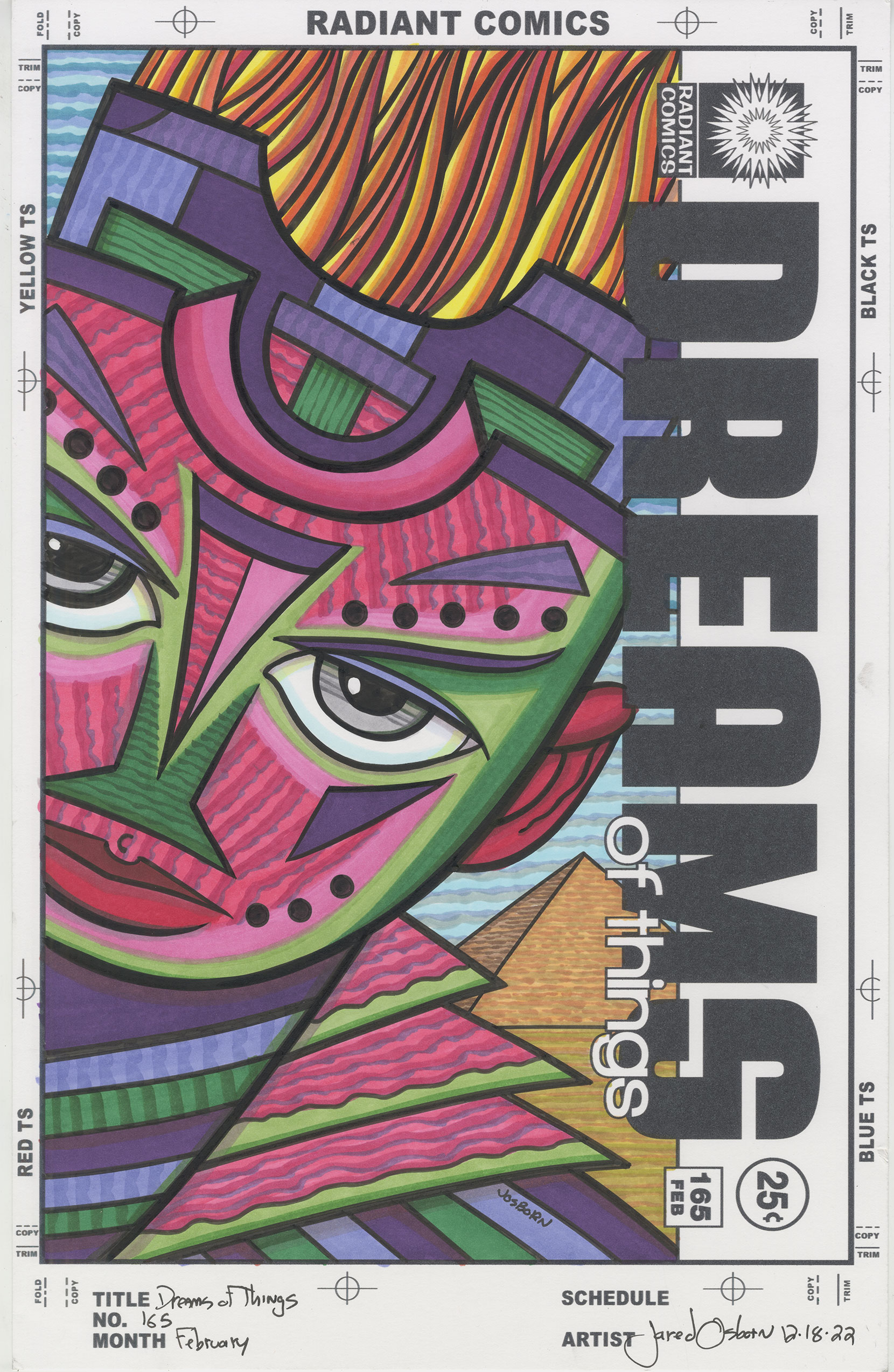
One thing I haven’t written is any of my “Drifting and Dreaming” strips. I have all fifty two of them finished for next year (2025) and usually I work on them from January to June but recently I decided to draw some new ones. I couldn’t get anything big started and so decided to make some “Drifting and Dreaming” art cards. I draw that whole strip on individual 2.5×3.5 inch pieces of paper.
I drew ten faces, got them ready to say weird things, and then couldn’t write anything. I needed to get 2025’s “Message Tee” comics written so it seemed absurd to be working on 2026’s “Drifting and Dreaming” writing. I put those cards aside and will get back to them after I finish my “Message Tee” strips.
That’s the state of my writing as I write this. Yes, I am still managing to get one thousand words a week written on this very blog that I started back in 2005. Time just keeps marching forward.