
I’m back from the comic shop this week and I got nine new comics.
Check them all out here:
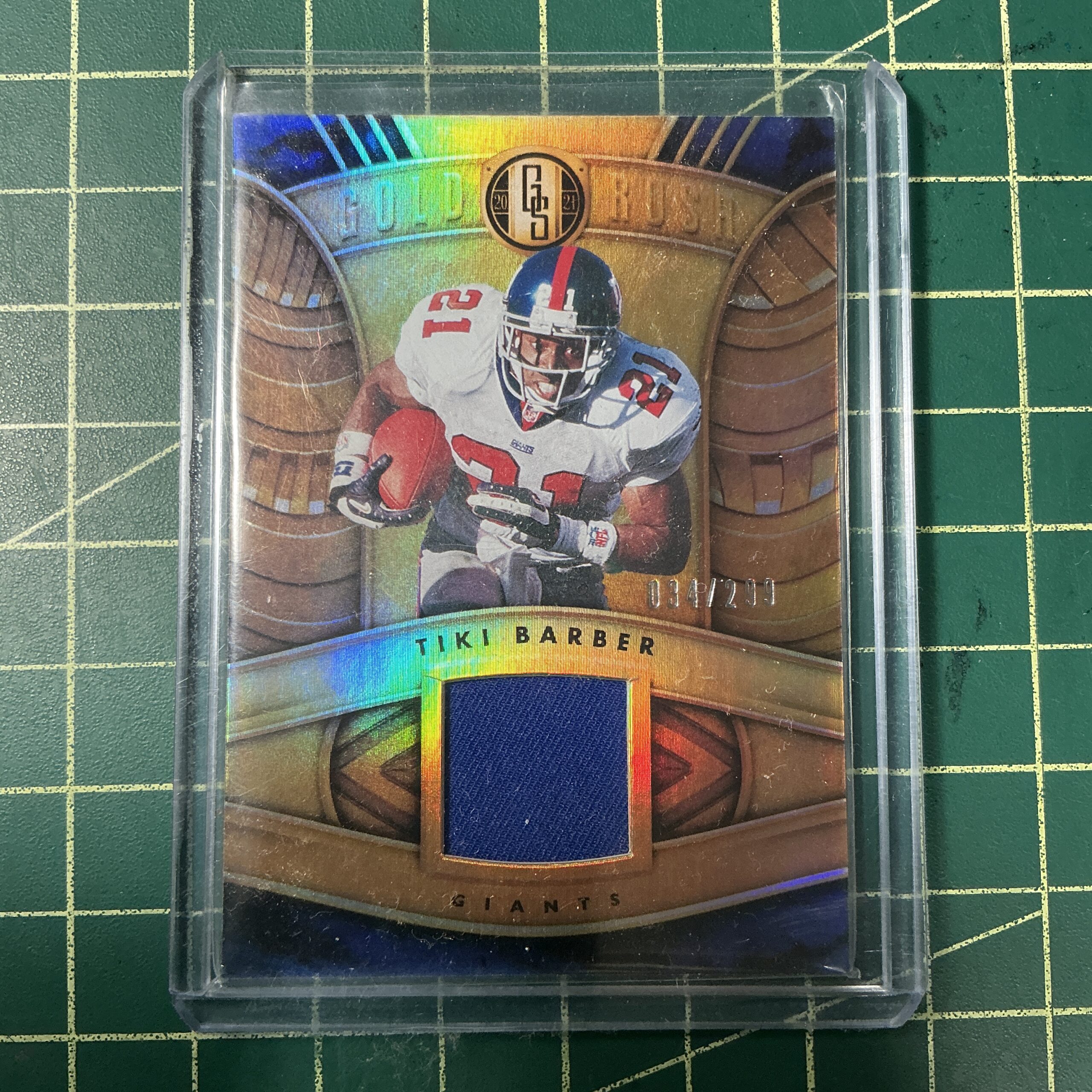
Tiki Barber
I’m a fan of NFL football and the New York Giants. I watch the game every week despite how terrible the Giants have been for about twelve years. Back in the early 1990s, when the Giants were better, for a brief time I collected football cards. It was a boom time in the sports card business, card stores were everywhere, and packs of cards were cheap. I would buy packs, rip them open, and sort them into their teams. I got bored with them after a couple of years and stopped. Packs of random football cards can also build up pretty quickly and take up too much room. That was another reason for stopping.
I mention this because last year (2024) I started buying some football cards again. But not random packs. Since the early 1990s the whole sports card and non-sports card world has changed. Now it’s all about finding the special “Chase Cards” that are in packs. Those are the cards they do a little extra with to get you to buy more packs.
It was last year I found out (on eBay) that there was such a thing as “Relic” football cards. Those are chase cards that have a piece of football jersey mounted in them. Some of them are made from a jersey that the player wore in a game. Some are made from a jersey the player just wore, and I think some are just a random piece of material that no one ever wore. You really have to read the fine print.
Since the Giants have been terrible for so long they don’t have a lot of players whose cards are in high demand. A KC Chiefs Patrick Mahomes relic card might run you anywhere from $40 to $200 but a NY Giants Reuben Randle relic card is only $3. That’s a lot more of an impulse purchase.
So that’s what I did over the last year or so. I made impulse purchases of NY Giants jersey relic cards. Purely out of nostalgia for NY Giants players of the past. I even paid $4.32 for a Saquon Barkley relic card. He went to the Eagles this year and is in the Giants’ past.
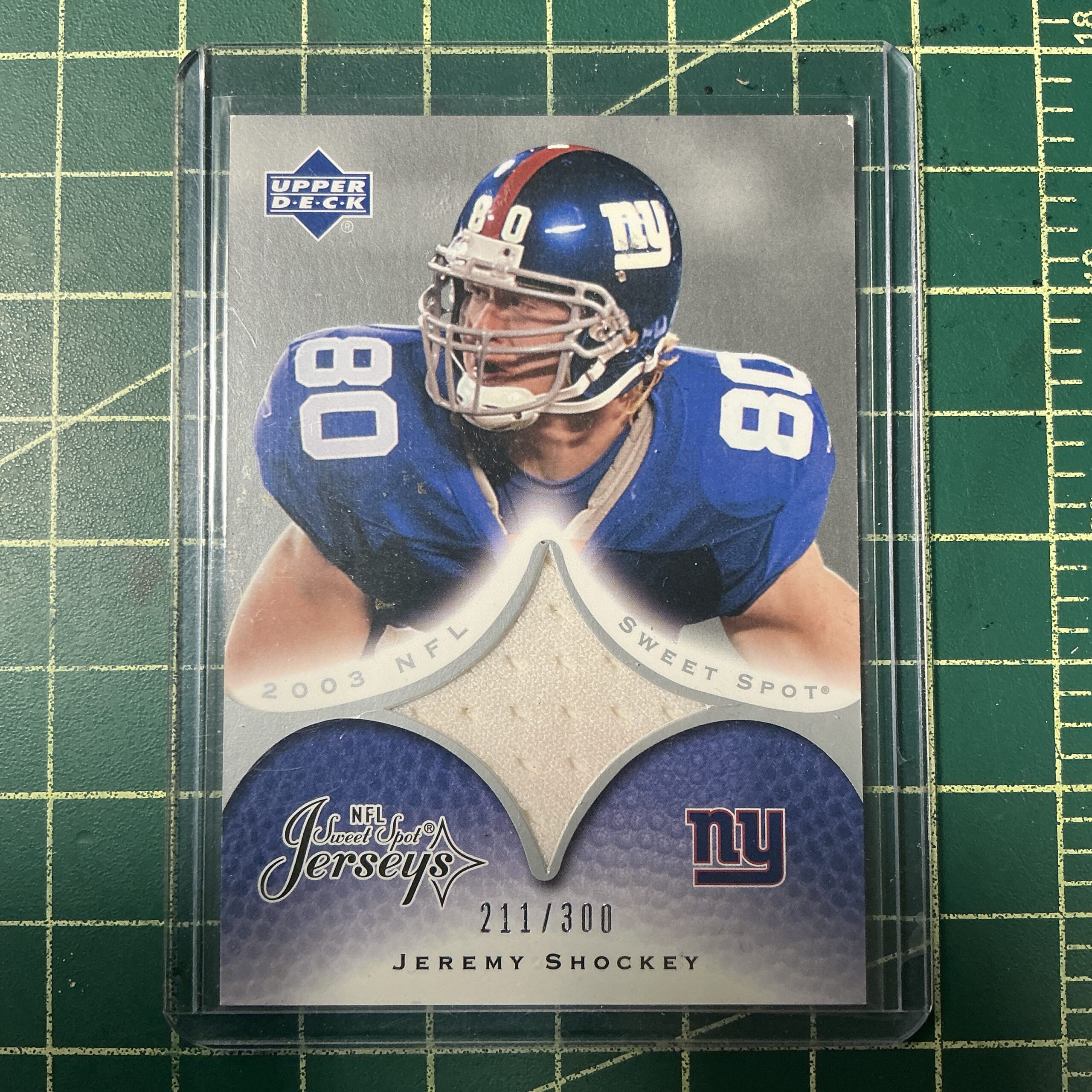
Jeremy Shockey
These jersey cards are also extra thick. They are really two cards with the small piece of jersey sandwiched in between them and a window in the front card so you can see the jersey. The window is usually only about an inch square. I had to buy some extra thick hard shelled card holders to put the cards in. They’re too thick for regular card holders.
I’m not even sure (besides nostalgia) why I like these jersey cards more than other chase cards. There is something about the fabric being a physical textile and somehow more real to me than other chase cards. It’s also a completely different look for a card. It’s a regular looking card with a window to another reality in it.
What that other reality is doesn’t even matter to me. As I wrote above you have to pay attention to the fine print on the card as to if it has been anywhere near the player or not but I kind of like all of them equally. I’ll never really know if the jersey was game worn or not but I find it fun to contemplate. It could be fake, it could be real, it could be something in between. Looking into that window on the card is looking into different realities.
I have about twenty five of these jersey cards right now and I enjoy looking at them. I paid anywhere between $2 and $6 (tax and shipping included) a piece for them with just a few of the more popular players being about $8.
Buying these football cards brought me to buying a couple of non-sports cards that were even more nostalgic. There was a movie that came out back in 1994 called “Clerks” that I really enjoyed. It was a low budget black and white movie by director Kevin Smith. He has since gone on to become much more famous and make more movies. But back in 1994 he was an unknown who came out of nowhere to make a cool movie.
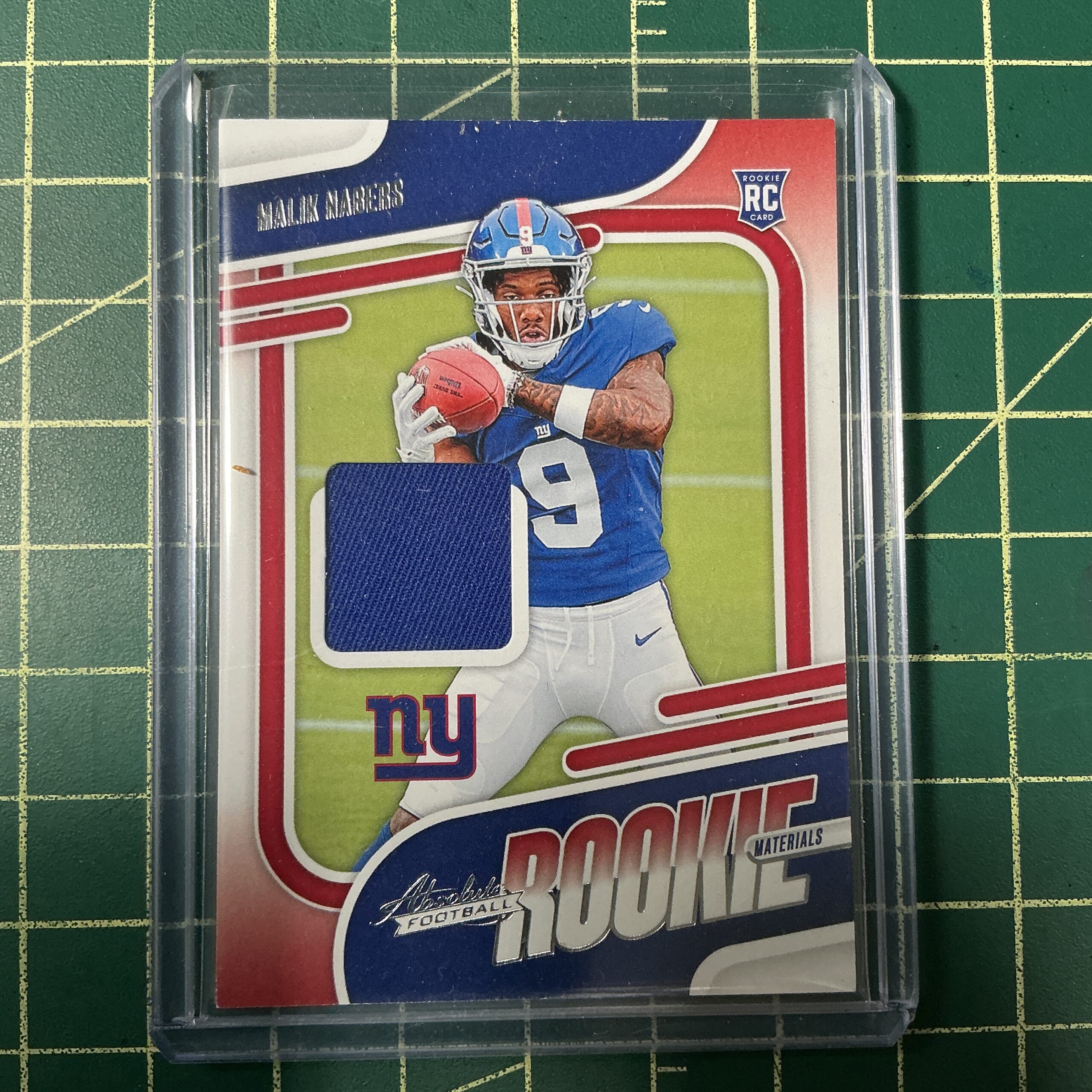
Malik Nabers
Kevin Smith is four years younger than me and we’re both considered Generation X. His movie “Clerks” was one of the first movies made by a GenXer for GenXers. It was a lot of fun when it came out, became a cult hit, and I still like it today. It is also one of those movies that became so influential that younger people who see it today for the first time might ask, “What’s the big deal? It’s a movie just like a lot of other movies?” That may be true now but in 1994 there were not many movies like it. Its sense of humor has gone on to become more mainstream but it wasn’t back then.
So now that I’ve establish how much I like the movie “Clerks” you can understand my nostalgia for it and the early 1990s. As I was looking for random football cards to buy I decided to look at non-sports cards too. I found some cards from the movie “Clerks.” The cards certainly aren’t from 1994, they’re from 2014 to 2016, but the pictures on them are from 1994.
One card could my eye. A chase card with an autograph on it from Marilyn Ghigliotti. She’s an actress from the movie and the card had two pictures of her on it. In one she has her hair up and on the other her hair down. Beneath the two pictures is her autograph. Its design motif is that it’s a hand made card and you can see the tape on it that holds all the elements in place.
I’m not an autograph person. I don’t collect autographs and I generally don’t care about them. I don’t know why but they don’t do a lot for me. But this card looked really cool. A big part of it is nostalgia. A love for the good parts of the past. I ended up paying $17 for the card. That’s an expensive one for me but I like looking at the card. Worth every penny.
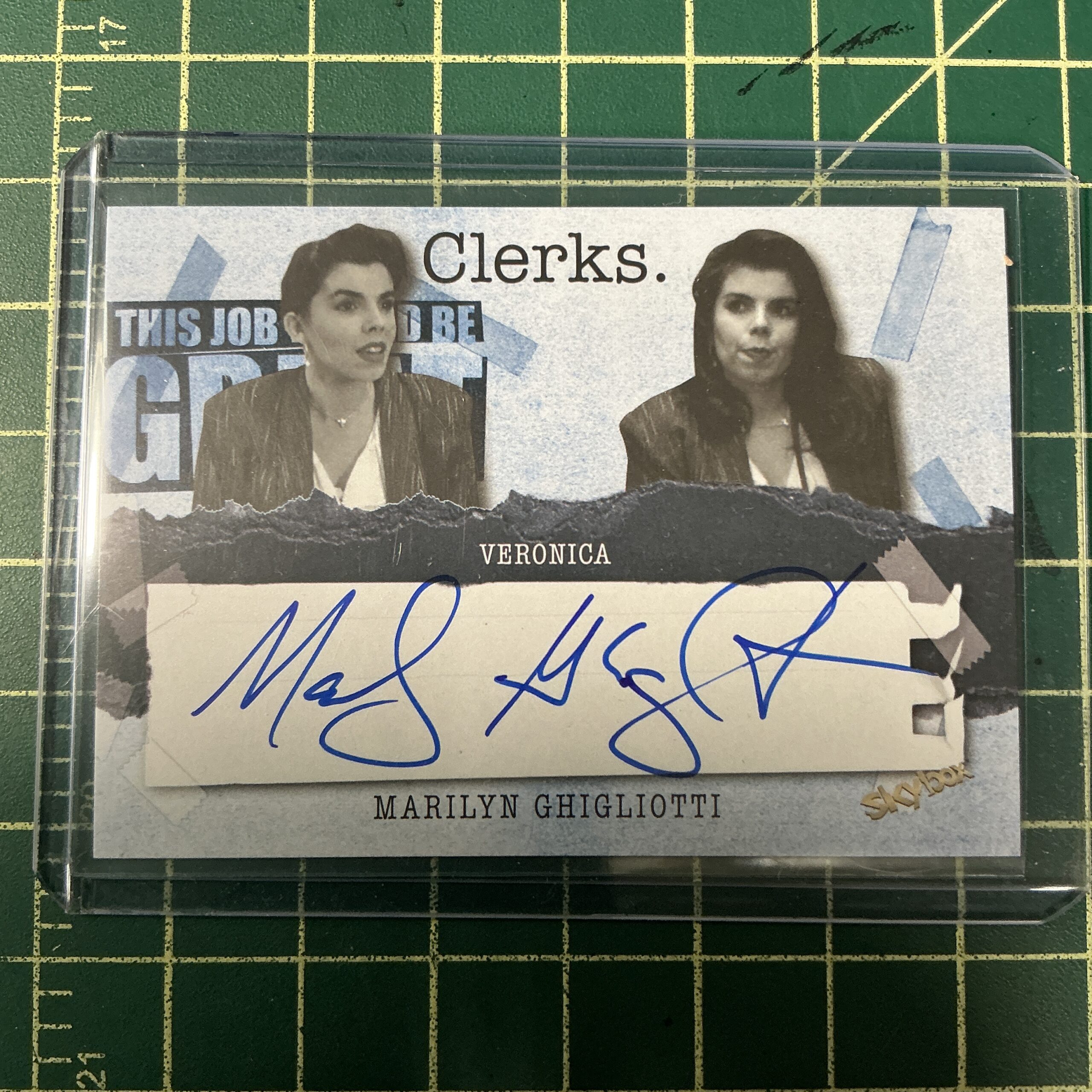
Marilyn Ghigliotti
That brings me to one final nostalgia card. There was another actress in the movie named Lisa Spoonauer. Unfortunately she died back in 2017 when she was still in her mid-40s. I saw they had a card with her autograph on it that came out back in 2014. I decided to get it too.
This card is made to look like a video store membership card. I don’t think the card is as well designed as the other one but it’s still pretty cool. The all yellow look of the card contrasts well with the light blues of the first card.
Lots of nostalgia with both the football cards and the Clerks cards. But that Lisa Spoonauer card also reminds me of the fragility of life. Let’s keep remembering the good times.
I’m back from the comic shop this week and I got seventeen new comics.
Check them all out here:

Recently I took on the task of filling out a survey for the school that I work for. One of the things that they wanted to know was what art groups and such I might belong to. Shows, publications, and things like that. Stuff they can use to brag about their professors. That makes sense. Plus I’ve noticed that groups like groups and organizations like organizations. The problem is that artists are famously not very good joiners but that’s also because no one wants us to join. Most artists rely on individual effort rather than groups blessing them.
I saw a video on social media a couple years ago in which a woman referred to “Art with no destination.” This is art made with individual effort and there is no end place for the art. Most art is made that way. There is no big show sponsored by some big corporation at the end of the project. There is just the next project to work on. No one applauds you and there is no group to motivate you to do more. You’re on your own and have to put in the effort to get anything done yourself.
I write this all as a praise for individual effort and to brag on some of the stuff I’ve gotten done over the years. No one told me to do any of this stuff, I belong to no group that backs me, not many people ever care to buy anything I make, hardly anyone actually even sees it, but still I go on putting in the individual effort.
Let’s start with this very blog. 2025 is my twentieth year posting a piece of writing once a week. I think it was around year two or three that I decided to make each one about a thousand words. I think I just passed one thousand of these blog posts. That’s a lot. How many people have done that? Probably most of them who have did it on their own.
I started the web comic that goes on this site in January of 2010. That means that it is now my sixteenth year of posting “Four Talking Boxes” five days a week. No one pays me to do it. I do it because I want to make a comic strip. Within a few years of 2010 I added “Message Tee” and “Drifting and Dreaming” on the weekends. That’s a new comic everyday for over a decade. That’s an accomplishment that very few people have ever achieved.
But without a group it’s just, “Jared has been posting a comic a day for ten years.” With a group it would be, “Jared had been making comics for Big Comic Book Company for ten years.” People are more impressed with a Big Comic Book Company involved. People are impressed by work but don’t see anything without money involved as work. Individual effort is not always respected unless it comes with a payday.
I just finished inking “Dreams of Things” #276. That is the 276th cover in my “Covers to Comics That Don’t Exist” series. That’s a big number. I’ve done a lot of these and I will probably be reaching #300 sometime this year. I think that’s an impressive bit of individual effort. I don’t even have a spot where I could possibly display all 276 of these covers. At 11×17 inches each that’s a lot of real estate.
Of course people would be more impressed if I worked for Marvel Comics and drew 276 Spider-Man covers. People know and love Spider-Man because a big corporation has spent a lot of time and money getting them to love Spider-Man. All of my covers are individual pieces that you can love or not on their own. But I only have individual effort. It’s tough to compete with a company that has paid artists to make Spider-Man covers for sixty years. But I still put in the effort.
Another thing I put in the effort with over the last ten years have been my Big Ink Drawings. They are 22×30 inch drawings made with black ink. Each one is individual and each one is a unique picture. I’m not ever sure how many of them I’ve made but it’s over fifty. Once again that’s a lot of real estate. A lot of square feet of art. I think it’s an impressive bit of individual effort.
Back in 2019 I developed my three marker technique for drawing 6×9 inch ink drawings. It was just something new I came up with so that I could create drawings and work on images. I like to create new and unique images. At some point after I had a bunch of them done I dedicated to keep going with them and someday make a deck of cards with the images. I now have 340 of these drawing and can make multiple decks if I want to. That is a lot of individual effort over the years.
There is also the “Great Gatsby” illustrations that I’ve been working on. This is my third year that I’ve been working on it and it’s close to being finished. I’ve made more than a hundred drawings for it and it has been a lot of work. If it was being published by a big book company people would be impressed. That’s something they could wrap their heads around but for me it’s been all about the individual effort. I’ve been doing it because I want to do it.
I’ve been making art with individual effort since the late 1980s. You’d be hard pressed to meet an artist who has made more art than I have. There are plenty of things that I haven’t even mentioned here. I have made about a hundred small 8×10 inch acrylic on canvas paintings. I have about as many larger (various sizes) oil or acrylic on canvas paintings from my decades of painting. I have a couple of thousand small art card sized pieces. I have a lot of gouache and watercolor paintings. I have twenty five sketchbooks (my Inkbooks) on my shelf that are filled with small drawings. I have a lot of pages of comics that I have drawn. I’m still forgetting a lot of stuff.
So there you go. I try to practice the art of humility but sometimes I have to brag about myself. In this world that likes groups I wanted to put in a good word for individual effort.
I’m back from the comic shop this week and I got nine new comics.
I got these at MOCCA Fest.
Check them all out here:
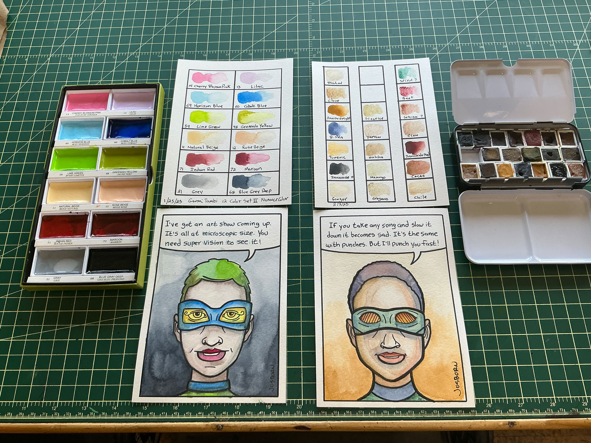
Paint and Swatches
It was another watercolor week for me this week. I wrote just two weeks ago about how I was using watercolors to color some of my superhero talking head comics and then this week I bought two new watercolor sets to continue that project. I got six more comics/heads done. That makes forty two out of fifty two done for 2026’s webcomics.
I actually have another twelve or so of these talking superhero heads finished that I make a few years ago. I never posted those twelve so I really could add them to the forty two I have now and be done with it for the year but I’m having a lot of fun making them. So I think I’ll just keep going with them for a while.
The first new set of watercolors that I bought were from eBay. They are a set of natural paint pigments. They cost me $16 and the set I bought was a set of ten half pans but the seller upgraded me to a set of nineteen half pans of paint.
A watercolor half pan is a little rectangle of paint that comes in an open topped plastic box/pan that’s about one half inch wide by three quarters of an inch long and three eights of an inch tall. You wet the top of the paint, wet your brush, and dip or rub the top of the paint with the brush to load some pigment onto your brush.
This is basically how pan watercolors work. They’re hard to begin with but wetting them softens them up so you can use them. How much pigment you get on your brush depends on how much pigment is in the water you apply. A lot of water means not much pigment and light colors. A little bit of water means more pigment and stronger color.
I’ll give you some of the copy that was in the eBay listing.
“These pigments are made from finely ground iron oxides, herbs, and spices. Create stunning, eco-friendly art using nature’s own color palette.”
Here are some of the descriptions of the colors:
– Cinnamon: Rich brown hues with a warm, earthy tone.
– Moringa: Lush green for a fresh, organic feel.
– Turmeric: Bright yellow, perfect for adding warmth.
– Cacao: Deep chocolate brown for richness.
– Chili: Bold orange for striking highlights.
– Spirulina:Vibrant blue-green, ideal for unique shades.
– Beet Root: Beautiful magenta for eye-catching effects.
– Iron Oxides: Variety of earthy tones (red, yellow, black).
I like to try out new art supplies so these seemed like they’s be fun to get. Especially since I’d been working with watercolors lately. After I got them the first thing I did was to swatch the colors. That’s always my first step with a new set of paints, markers, or anything that makes colors.
In swatching these the first thing that I noticed is that they are not highly pigmented. That makes sense because they are made with natural elements like oregano, ginger, and mango. Most of the colors are light and on the brown and yellow side. This suited me well since I was making faces.
The most pigmented colors were the Iron Oxides. There are three of these: dark, medium, and light, and those three have a lot of pigment compared to the others. Spirulina (greenish), Beet Root (reddish), B. Pea (blueish), and Cacao (brownish) have the second most pigments of the batch. It was good to have those colors.
Watercolor is a medium of layered washes and that’s what I did with these. Since I was doing superhero heads I saved the brightest and most pigmented colors for their masks and used the lightly pigmented colors for their skin tones. I got some interesting skin tones with all the different light browns and yellows. I think the faces came out well.
One more note about this set is that the colors have some texture to them. I’m guessing it’s because they use natural colors that the pigment isn’t always as evenly dissolved and spread out in the paint. So the Beet Root one has flecks of red in it, the Oregano one has some flecks of brown and so on. It varies from paint to paint. I like texture so this if fine with me.
By the way this watercoloring was all done over a black India ink drawing of the face. So it’s a little different than a drawing with just watercolors. The black line does a lot of the work of holding things together.
I also got a second new set of pan watercolors this week. This one was more typical. It was the Gansai Tambi 12 Color Set !! Nuance Color. They are a Japanese brand of watercolor and I have another set by them. I bought it because I liked the colors in the ad.
The first thing I noticed when I got the package was that these are not really watercolors but gouache (a watercolor with opaque white added to the paint). The package said to use them at full strength for gouache and water them down for watercolors. I actually like gouache and am better with it than a regular watercolor but I wan’t expecting that. I somehow missed it when reading about the set online.
I swatched them first thing and there are some nice colors in the set. But as the name of the set “Nuance Colors” implies these are not a primary set but a bunch of colors that you can add to an already existing palette. It was a little bit of a struggle to make a superhero face with these colors.
Superhero costumes and masks are usually made up of strong primary colors. This set has three reds but they are a pink and two darker reds. Cobalt blue makes for a pretty good main blue but there is no yellow. The greens are both very light. The two beiges worked okay for skin tones.
I think it was because I was trying out the set that I insisted on only using the colors form this one set. I only made two faces with it and they came out fine. I did use another set (with sparkly paints) for the backgrounds. But this is a set I will use in conjunction with the main set of Gansai Tambi paints I already have.
So there you go. A little bit more watercolor action for you. Two new sets of paints as I add to my collection of watercolors.
I’m back from the comic shop this week and I got eight new comics.
Check them all out here:
I haven’t written a TV round up in a while so I thought I would. Here is the stuff I’ve been checking out this winter. It’s March 6, 2025 as I write this.
Animal Control – A Joel McHale sitcom about a group of people who work for animal control. I guess it’s a workplace sitcom. It’s an ensemble show but it was McHale who brought me on board. I generally like his stuff. I think this show is cut above the other new sitcoms on this list. It’s solidly likable.
Austin Stories – This a twelve episode show that I rewatch every December. It is another “Show about nothing” that first ran in 1997. It follows our main three twenty-something characters as they live their lives in Austin Texas. I have a special affection for this show and it has grown nostalgic over the decades.
Cheers – Here is another show that has gotten nostalgic as the years have passed. Cheers is, of course, a famous sitcom about a bar in Boston. I like to watch it occasionally and I also watch it on shuffle. I never know what episode will come up. I find that more fun than watching it in order.
Cobra Kai – I don’t think this show is anywhere near as good as it was in the beginning but it’s still okay. It’s the story of a couple of karate school and their rivalry. This season the schools are over in Europe for a big tournament.
From – This one is a horror show about people trapped in a town with monsters that come out at night. Most people got to the town just by driving and suddenly they drive into this town and there is no way out. Everybody is trying to stay alive and figure out what’s happening. Scary stuff.
Ghosts (USA) – A sitcom about a couple who buys a big old house and finds out it’s full of ghosts. Because of an accident the female lead can see and hear the ghosts but no one else can. Hijinks ensue. There is also a British version of the show that has ended. Both are good.
High Potential – Staring Dee from “It’s Always Sunny in Philadelphia” this is another Quirky Detective show. That’s a genre that I’m fond of. The main character is a super smart and an excellent observer except she has underachieved in life. Now she helps out the police solve cases. A fun detective show.
The Irrational – My second Quirky Detective show. This time it stars a professor who researches and teaches about human behavior. He uses his skills to help the police solve crimes. Lots of behavior lessons in this one.
Laid – A dark comedy about a woman who discovers that her ex-lovers are all dying. Since she and they are all young they are dying in weird ways. She and her best friend try to figure out what is going on. Strange stuff.
Man on the Inside – A Ted Danson vehicle. He stars as a man who is hired by a detective agency to live in a retirement home and figure out who stole an expensive piece of jewelry. It’s a sweet comedy that is very likable.
Modern Family – I’ve been rewatching this one for a while now. It’s a sitcom about a big family and what goes on in their lives. I watched a lot of it first run but this is only the second time I’ve watched it. There is around 250 episodes so this will take a while.
Night Court (2023) – A new and updated version of the 1980s show about the people who work in a courtroom. It’s solidly okay. Not the funniest sitcom ever but it has its moments and is pleasant overall.
Paradise – A show about a Secret Service agent who is the lead in protecting the President. He fails to do so and then there is a weird twist at the end of the first episode. It’s been good so far.
Paris Has Fallen – This one is an action show about special agents who try to stop a terrorist from blowing up parts of Paris. Part of it is in English and part in French. It’s only eight episodes and is a fairly straight forward action show. It made for solid watching as I rode my stationary bike.
Poppa’s House – A sitcom that stars Damon Wayans and Damon Wayons junior. I think there is some radio/podcast angle but mostly it’s a family comedy staring the father and son. I like both of the Wayans and that’s why I’m watching it. It’s only okay but the Wayans have their moments.
The Rookie – We’re on season seven of this one. I find that hard to believe. It’s a solid cop show staring Nathan Fillion. I’ve been watching him on TV for a long time starting with Two Guys, a Girl, and a Pizza Place.
Severance – I think this is my favorite new show on the list. It’s part mystery and part thriller. Mostly it’s a mystery. It’s a workplace mystery. Four people have signed up for a job where they get a chip in their head that separates their work life from the rest of their life. When they go to work they have no memory of who they are and what goes on when they are not at work. And vice versa. But what is the company really up to? That’s what they start to try to figure out. A good mystery and it’s fun to follow everybody’s theories online.
School Spirits – A show about a bunch of people who have died in their high school and now their spirits are trapped there. A new ghost arrives but does she really belong there? Maybe and maybe not. That’s what the show will reveal.
Silo – Another mystery show about a society of people living in a silo after some kind of disaster. So many generations have passed since the disaster that the knowledge of it has been lost. The show is about trying to hold the society together and also figure out what happened. One aspect of season two was a little annoying to me but overall I still like the show.
The Simpsons – Thirty six seasons and I’m still liking this show. What more can I say?
Sunny – A show about an American woman living in Japan. Her Japanese husband and son have just died and there is some sort of mystery about their deaths. I kept waiting for this show to get more interesting but it ended up being only so-so.
Teacup – A horror show about a few families why are suddenly trapped by a deadly forcefield that surrounds their property. They can’t leave and there is a monster in there with them hunting one of them. A solid show. One of the things I liked about it was that they explained to us what was going on. A lot of shows like this never explain anything and I find that annoying.
Tracker – Another detective show about a guy who tracks people down. He works for reward money and travels the USA looking for cases. Or maybe he just travels and one of his coworkers finds cases for him. He’s not quite a Quirky Detective. It’s more like his job is the quirky part.
Will Trent – Another cop show. The lead works for the Georgia Bureau of Investigations. He is totally a quirky detective. He grew up in foster care and has Dyslexia. He has lots of quirks as he solves cases. It’s another solid show.
I’m back from the comic shop this week and I got six new comics and a hardcover book.
Check them all out here:
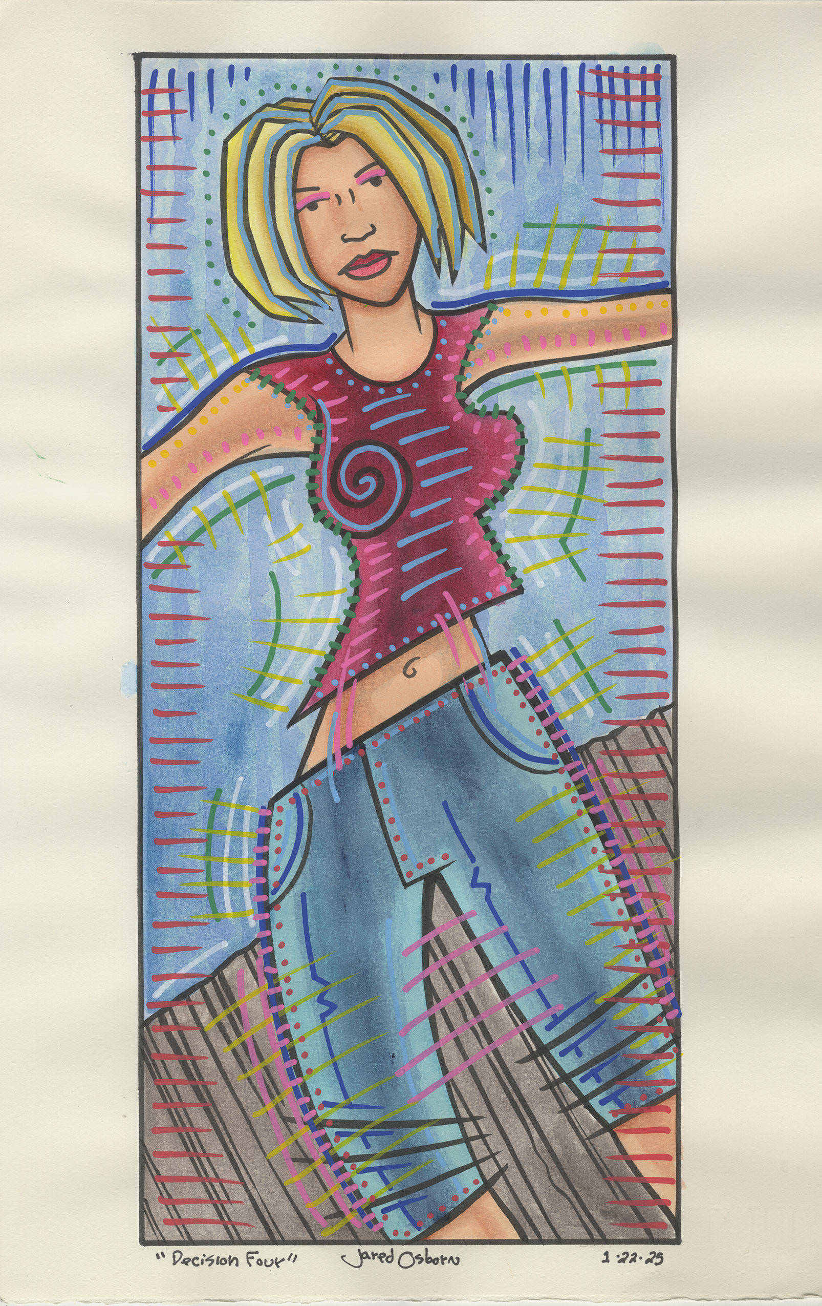
“Decision Four”
Watercolor is my worst medium. I’m not as good at it as I am with oils, acrylic, markers, pencils, or ink. I don’t know why. I just have never found my place with it. But I seem to be always trying it every now and again. It has an appeal to me.
I especially like watercolor in pans. That’s the kind you always see in random stores for kids. It’s a tiny little round or rectangular container filled with dry paint that you then wet and the paint comes to life. You have to keep rewetting the paint as you work and depending on how much water you add the paint is lighter or darker. A lot of water and it’s pretty transparent without much pigment in it. It also comes in tubes but I prefer the pans.
Over the last year and a half or so I bought a bunch of new watercolor pan sets. I bought one main set that has twenty four colors in it and then four smaller six to eight color sets that are more gimmicky specialty sets. One set is “Graphite” colors. They look like the color of a graphite pencil with a little bit of red, blue, or yellow thrown in. I think the other three sets are all a little shiny. There are flakes of stuff in them to make them iridescent.
I made some small 2.5×3.5 inch art cards with these sets last year but they were nothing special. I could have just as easily used my markers for them but I wanted to try the new watercolor sets. I don’t think I did anything of note with them except those small cards.
One thing I did do with the sets is to swatch them. Since they are small sets I took a sheet of 5×7 inch watercolor paper (one piece per set) and put down a sample of each color. Some of the iridescent sets were made to work on a dark background so for those I put down some India ink on half the paper and swatched the color on both black and white.
By the way I love the way these swatches look. Sometimes I think the swatches are the best watercolor art that I’ve made. All the various colors lined up and easily seen on a piece of paper. There is something simple and appealing to me about a set of swatches.
What got me going again with the watercolors is my 5×7 inch talking superhero cartoon art cards. There are the cartoons that I’m doing that I’m going to post next year. It’s the head and shoulders of a superhero with a word balloon above him. I’ve been doing a bunch of these lately. I’ve been drawing them on the iPad, printing them out in blue line, and then inking them on a 5×7 inch piece of paper. The final step is to color them and for that I’ve been using my markers.
The problem was that after about thirty of them I was getting bored with the markers. Since I’ve been getting one “Dreams of Things” cover done a week in marker I was growing tired of the medium and wanted to change things up. So that’s when I decided to pull out one of my watercolor sets.
Though I knew I would be using the main twenty four color watercolor set I pulled out the graphite set first. Usually the first thing I do with these art cards is to color the background. For the marker ones I chose a dark and light marker of a single color and color the top light and the bottom dark and then scumble them together in the middle. For these I wanted the backgrounds to be a single graphite color.
One of the advantages of watercolor is that I can get dark and light out of a single pan of color. I add more water for light and more paint for dark. With watercolor you can get a lot of cool effects just by how you put the paint on the paper. I’m not particularly skilled at doing that but I thought I could make a nice background with the graphite ones and I think I did.
I was working four faces at a time on four different pieces of paper. I find this to be an advantage for me because when using watercolor you often have to wait for the water in the paint to dry. During that time I can just switch to another face. This keeps me going and I’m always up for less waiting.
I’m better with the medium of gouache (also a watercolor) than regular watercolor because gouache allows me some opacity while watercolor is all transparent. Gouache takes longer for me to finish a painting in though. So I said to myself that these heads would have no gouache in them and I’d work only with transparency. So that’s what I set out to do.
Markers are also a transparent medium and I had been coloring these faces with marker for a while. So I ended up following my marker technique except with the watercolors. First I laid down big chunks of transparent color and then I added more pigment to my brush and put down some darker color. I blended the darks and lights together and repeated the process until I got what I was looking for.
In the end I managed to get all four faces done in about the same amount of time that it would have taken me if I had used markers. This surprised me a little because I thought it would take me a lot longer since it was a less familiar medium. But since it was such a familiar task it really didn’t.
The next step is to do something less familiar with the watercolors. The problem is that I’m not sure what that is exactly. I have some vague ideas in my head to paint something at 11×17 inches but scaling up isn’t always easy. I also have some vague ideas about seeing the drawing I make simple but I still have no idea what the image should be. I’m going to have to look through some of my inkbooks with all my little drawings in them and pick one. Or I could possibly look through my scans of finished but unused drawings. I’ll let you know.