Comics I Bought This Week: February 8, 2014
I’m back from the comic shop this week and I got four new comics and a giant hardcover.
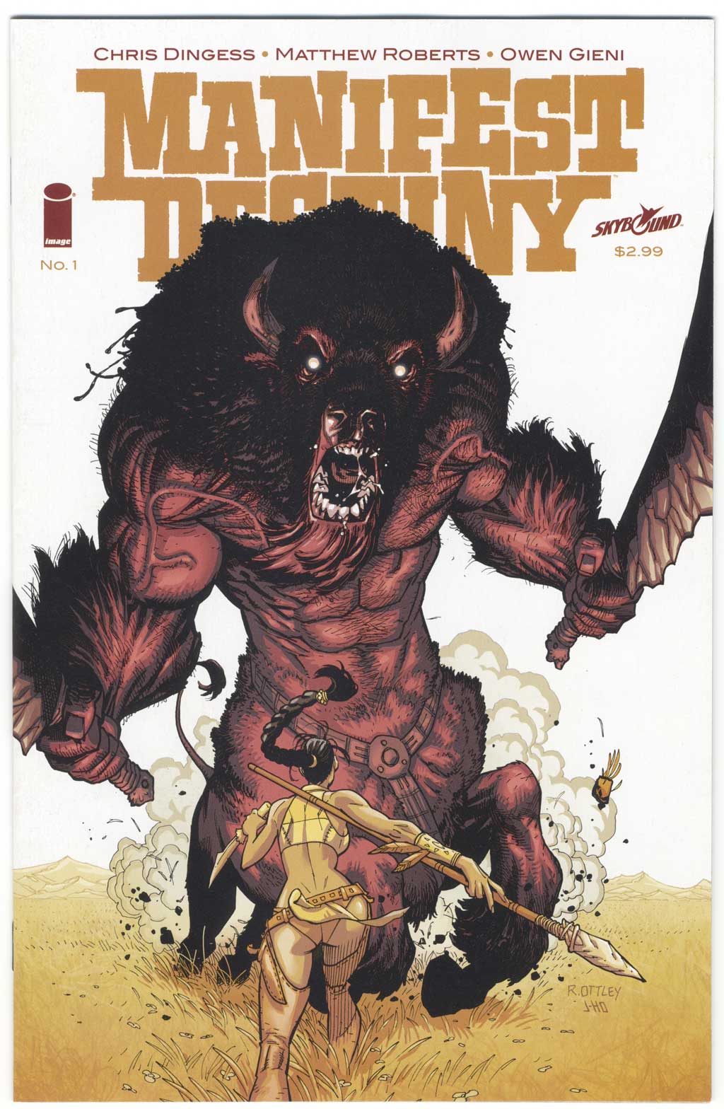
This week’s comic book cover to look at and examine is “Manifest Destiny” #1 by Ryan Ottley and Jason Howard. I figured I’d take a look at a recent cover for a change and this in one I bought back in November. I had read a preview of it and liked it a bit but then this cover sold me on it. It’s not the regular cover but an alternate one.
The two stars of this cover are the giant monster and the woman’s behind. Those are the first two things that jump out at me. The monster for the obvious reason that he’s so big and takes up most of the room and the woman because the composition makes you end up on her thrust out backside. The composition of the cover is almost straight up and down like a column. First you see the monster’s eyes, then you move to his mouth and chest, which leads you too the pony tail, down the woman’s back, and you end up on her butt.
It’s a nicely drawn cover. Ottley has done a lot of nice covers in his time. I like the monster. He’s a sufficiently ferocious bison beast who even has a couple of swords! I wouldn’t want to tangle with him. But our nice-butted halter-topped heroine will. She’s got a knife at the ready and a spear to back it up. Let’s dance she’s saying. A lot of modern comic book covers don’t tell much of a story but this one has a little bit more. I think it’s that the monster looks cool and it depicts the moment right before a confrontation. That makes for a nice tension.
I like the color on this cover a lot. It’s stripped down and well done. It has a little bit of rendering in it but that little bit works well. It gives some dimension and mood to the monster and some dramatic shadows to the woman. The color of the dusty dry grass that fades into the distance appeals to me.
It’s odd that the cut off the logo in a first issue of a comic but this is the alternate cover and not the main one. The type is much more subdued than in older comics and we don’t get many word balloons these days so there is plenty of room for the illustration. This isn’t good or bad it just is. Sometimes balloons can help a cover and sometimes hurt it. Without then a cover has to sink or swim on the power of an artist to tell a story. Here I think it works. On a lot of modern covers it doesn’t. But they’re too boring to write about.
Discussion ¬