Comics I Bought This Week: February 15, 2014
I’m back from the comic shop this week and I got six new comics.
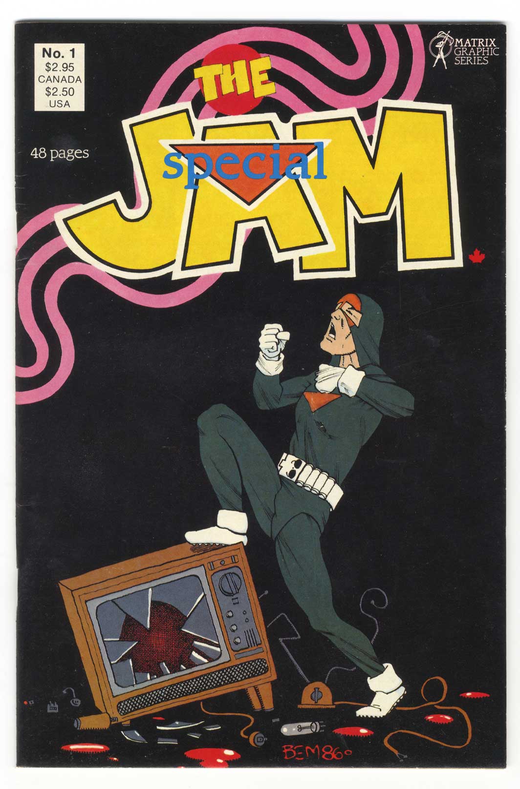
This week’s comic book cover to look at and examine is “The Jam Special” #1 by Bernie Mireault. The cover is dated 1986 (one of my college years) by I think I didn’t get this particular issue until a little later. I don’t think I discovered this series until “The Jam: Urban Adventures” came out the following year. Then I tracked this particular issue down.
We get an interesting story with this cover. The Jammer looks like he just smashed a TV and is now standing over it and bowing in victory. It makes me giggle. It could be takes in a couple of metaphorical ways. Either the character himself has triumphed over the sedentary nature of watching TV or the comic book itself has triumphed over TV by getting us to buy and read it. The Jammer (I haven’t read it in a while but I think that was the actual name of the character) is a character who lives in the real world like us and dresses up as a super-hero to have something to do rather than do nothing i.e. watch TV.
I’ve always enjoyed Mireault’s simple drawing style. It’s clean and clear. He captures the gestures over an over-the-top triumphant celebration well. That’s what this cover is mainly about. The TV sure has a lot of character but the Jammer is front and center. The graphic design is a bit nostalgic. In this day and age of computers it’s odd to se a hand drawn logo. Especially one with those hand drawn pink stripes behind it.
Overall I like the color on the cover too. The black background dominates the cover as the dark green of the Jammer’s costume seems to barely separate itself from the background. I find myself peering into the cover almost like it was an Ad Reinhardt grey composition painting. The yellow logo certainly stands out from the black background and those pink strips adds some color interest too but the blue of the word “Special” really catches my eye. It’s strange that it has no outline, is in the middle of the logo, and is the only blue on the page. But I like it.
This is a simple and fun cover to me. I have to go back and read all the Jam issues one of these days.
Discussion ¬