I’m back from the comic shop this week and I got five new comics.
Check them all out here:
Comment
I’m back from the comic shop this week and I got five new comics.
Check them all out here:
It’s not easy to get anything done. That’s the way the world is. It’s easier to get things done when you’re being paid to do them but even then it’s not always easy. I’ve known plenty of people who didn’t want to get anything done even at their jobs. It’s easier to do nothing. That’s the way of the world.
That’s why, when it comes to my own art that I don’t get paid for, I like to keep a lot of balls in the air. That may be the wrong metaphor since there is no danger of anything falling if I don’t catch it but you get the idea. I like to have a lot of projects in different media to work in so I can switch from one to another if I can’t get something done. If my drawing isn’t working I can switch to inking. If that doesn’t have it going on I can do some painting with watercolor, gouache, or acrylic. I can break out my markers and draw in color. I can work on some digital at if that gets me going. I can even work on some photography. That’s what’s been missing lately. Photography.
There are two stages to my photography. Taking the photos and then turning those photos into some kind of finished photo. Often I use Photoshop to digitally manipulate the image into something I want. I’ve got a few different methods of finishing a photo digitally and I go with whatever way moves me at the time. Except none of them have moved me lately. I don’t know why. I just checked my calendar and according to that it’s been about six months since I’ve worked on one of those. It seems like I must have worked on one since then but maybe not. I’m not even sure why I haven’t worked on one except that I haven’t been moved to. That’s what I’m pondering. What moves me. Or anyone else for that matter
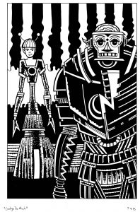
“Judge Too Much”
I also haven’t been able to get any of my large drawings or paintings done. It’s obvious to me why I can’t get those done though. Money troubles. As a freelancer I’ve had periods in my life when the money wasn’t flowing. That is never fun. During these times I seem to have a hard time getting anything big done. Its a psychological hurdle. I can’t think big during those times. Once things get better and I feel more secure I think big again and want to make bigger art. I’m guessing a lot of artists are like that. I’ve been wanting to work on some big 22×30 ink marker drawings but haven’t had it in me. That’s the way life is. But at least I got that one figured out.
What I’ve not gotten done at all in the last few months is my iPad edited street photos. As a photo editing tool I really like the iPad. It does a really good job. Over the years I’ve collected various photo apps and kept the ones that I like. There are about a half dozen of them that I use regularly to edit my photos in. It’s fun. Using a touch screen and my finger to edit photos may not be ideal if I was doing really delicate work on them but mostly the work is blunt but subtle. I’m not doing stuff on a pixel by pixel level but I don’t need to. The programs do a good job of changing the photos overall.
Back in September I even put together a PDF photo book of my iPad photos. That took a while. It’s not a book that will ever exist in physical form though because it’s pretty big and prohibitively expensive at one go those short run printing places. There are about 150 photos in the book and 150 pages. I think the price of a physical book was over a hundred dollars. No thanks. I like the way the PDF book came out and that will have to be good enough for now. After that I’m not sure how many photos I’ve made.
I post things on Instagram. https://www.instagram.com/artbyosborn/ Usually I post my art or my photography. With my art it’s pretty easy since I have most of my stuff scanned into the computer so I can use one of various programs I have set up to view my various files, pick one I like, and post it to Instagram. I only do it to get things out there for people to see. I only have about four hundred followers and get maybe thirty likes on any give piece but it’s still fun.
The way I’d post a photo to Instagram is that I’d make it there and then. I’d look through my digital files of photos until something grabbed my eye. They I’d transfer it over to my iPad and use those photo apps on it. It’s not a long process. I’d say I took fifteen minutes to half an hour on the outside to get one done. Not a huge time investment and often I’d make them while sitting down and watching TV at night. I usually found it a relaxing thing to do. But not lately.
I’m not sure when is the last time I made a photo on my iPad. It must be a month now. It’s my habit to try transfer my photos from my iPad to my desktop when after I made my Comic Book Haul YouTube videos on Thursday nights. I have to plug my iPad into my computer anyway so why not bring the photos over too? So I notice when there are no photos to transfer. Most of this year it’s been rare to have none. But not lately. Makes me ponder.
The only reason I can think of for not wanting to make photos is that on some level I’m upset with my iPad. My iPad is old. It’s an iPad 2. Apple’s update to iOS 10 left me behind. My iPad can only run up to iOS 9. That saddens me. Pretty soon all the new apps will be leaving me behind. I can still use all the old ones and work on my iPad as usual but it still bothers me. I don’t know if that’s really what’s holding me back but it’s all I got. I think I’ll keep pondering.
I’m back from the comic shop this week and I got six new comics.
Check them all out here:
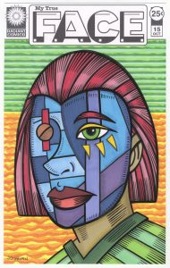
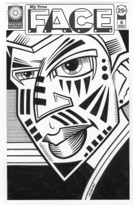
I’ve been dipping into a familiar well lately but the water I drew out of it wasn’t what the well usually holds. How is that for a colorful opening line? The well is one of my faux comic book covers. My “My True Face” series to be specific. I made a bunch of these covers before. Nine of them. Only one of those nine was made this year and that was way back in February so the concept isn’t something that’s been on my mind lately.
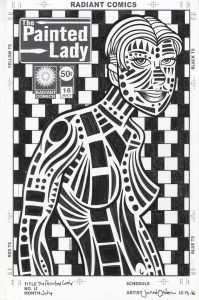
The series is one of those that’s based on my love of drawing faces and masks. Its basic conceit it that the mask we show the world is our true face. Or maybe that our masks would be even fancier if the world would let them be. Either way it’s about faces that aren’t real. The first nine were in black and white and have a very graphic quality to them. Much like my “The Painted Lady” series they’re all about the shapes and marks on the faces. I like the way they came out but after nine of them I moved on. Ideas burn themselves out.
“My True Face” only came to my mind again because I thought about adding color to them. I’ve been doing a lot of coloring with marker over India ink lately and I thought the technique might work well with the graphic look of the faces. Ultimately I decided against it because in the original series the faces were close up and had almost no roundness to them. They were very much done in a flat graphic way that I didn’t think color would add anything too. So I shelved the idea. But it stuck with me a little. So I stated to work out some new color ones.
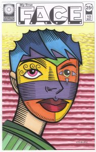
The funny thing is that I didn’t even notice, at first, how I changed things because I was adding color. It wasn’t until I had two of them done that I realized how different they were from the first nine black and white covers. The color ones are pulled back more so we can see the person’s entire head. I remember thinking if I should go for a front view or three quarter view of the head and decided on the three quarter view. This means the face will be rounder and less flat and graphic as the first nine were. A three quarter view works well when we see the whole head so I guess I just automatically did that.
One of the first differences I notice with the color version is that there are not many small shapes like in the black and white ones. Instead I used larger shapes of color. These faces look like they are wearing skin tight color masks rather than a thick wooden masks which hide the real face entirely. That is how I often draw masks. The main giveaway that they are masks are the eyes. On three of them the eyes obviously don’t match at all and on the other two the eyes are bigger than normal. This doesn’t quite fit with them being painted faces.
The hardest thing about this round of faces was the hair. I found that it’s really hard to find interesting ways to represent hair in this mask style. I’ve tried drawing hair in a normal way but it doesn’t fit in well with the rest of the face. All those strands don’t work with the broad areas of color. Or at least I couldn’t get them to work well together. I like the ideas for the hair that I came up with but I’m not sure how many more I’ve got in me. We’ll have to see.
One of the things you should notice about these is something I’ve mentioned before. Whenever I’m drawing crazy faces or masks I am sure to make the lips red. I’ve tried making the lips other colors but that never seems to work for me. It makes the face a little too odd and unrelatable. So in all of these the lips are red. I’ve gone off that reservation only to get lost many a time so now I stick with red lips almost all of the time.
I used a little bit of a different process with these. Normally I’d draw them in pencil, grab a brush and ink them, and then finish them off with color markers. But sometimes the markers can dull the black India ink they go over so I then have to redo parts of the inking. This time after the pencil stage I took a marker and quickly redrew all the pencil lines with a thin single weight ink line. After erasing the pencil I went in with the markers and colored the whole thing. It was only after that that I did the inking over the thin marker line. I found that worked pretty well. Less wasted time.
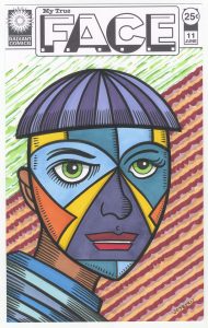
One part of the inking I didn’t do until the end was the little shading lines in the face. I waited on those until I put a background in. I decided to go with flat patterns of color in the background to make the faces seem more rounded by comparison. I mainly used my cloud technique and some parallel lines. I even broke out my rolling ruler for the parallel lines. I haven’t used that in a while. It’s just what it sounds like. A ruler with wheels on it so you can roll it and make parallel lines. It’s less precise than my Haff cross hatching machine but I didn’t need precise for these backgrounds. I notice a lot of red in the backgrounds. That’s because with the lips being red I didn’t use a lot of the color in the masks so it was the obvious color left for the backgrounds.
Finally I made all the little lines that are the minimal shading. I left them for the end because I didn’t want to overdo them. I wanted all the color in first. I think they were a nice finishing touch. To my eye they gave the faces a little more roundness that brought them to life for me. It’s not often something does that so late in the process. But it’s fun when it happens.
I’m back from the comic shop this week and I got six new comics.
Check them all out here:
I’m doing it again this week. I’m going over to my shelf and pulling out a painting of mine that I made in the past in order to write a painting analysis. It’s been a while since I’ve done that and part of the reason I’m choosing to do that right now is nostalgia. I haven’t made many paintings this year as I’ve mostly been working on drawings of various types so that’s made me a bit nostalgic for my eight by ten inch acrylic on canvas paintings. So I pulled out an old one.
I’m not even sure when I made this painting. It comes from the period before I meticulously dated everything. I’m guessing it comes from some time in the early 2000s. I didn’t even name the piece and write that name on the back as I always do. But I did name everything when I made my website years ago and I was able to find the name there. I called this one “Rainy Day”. It’s a random name so it doesn’t offer meany insight into the painting but that’s fine with me.
The first thing I notice is something you won’t see on a scan of the painting. It’s thicker than most of my paintings. Not the painting itself but the stretchers the canvas is stretched over. Most of my eight by ten inch paintings are on stretchers that are three quarters of an inch thick. This means that the total size is eight by ten by three quarters of an inch deep. This painting is on stretchers that are an inch and a half deep. That makes the painting look twice as thick as my normal ones. This is important because it gives the painting more presence as an object. It makes it look more important. It’s an illusion of course but it’s still cool. I’d paint on these one and a half canvases all the time except they’re more expensive than the three quarters of an inch ones and they take up twice the space to store. In the end the extra thickness really doesn’t matter but I do note it.
What I notice about the picture itself right away is that it’s one of my figures that’s drawn out of my head. It’s easy to see because there is nothing photographic about it. I was working on a photo referenced drawing just today and the differences between that one and this one are obvious. No real person could have the shape I’ve drawn here. She’s all angles and a few gentle curves. One of the things I tend to do when drawing out of my head is to give people broad shoulders and then drop an arm out of the shoulder and nearly a ninety degree angle. I can juxtapose that with a gentle sweeping curve of a waist and hip. I like the drama of that. I like it so much that I often have to stop myself from doing it. Something I like can be like a crutch that I lean on too much. But here I was making it work.
I find the color in this painting to be remarkably calm and balanced. I don’t often dabble in calm with my color as I normally find that to be boring. I do find It a little boring here but I like the imagery in the painting none the less. The color is mostly red and blue with some yellow highlights to complete our package of the three primary colors. The green is mostly next to the blue making for a harmonious pair as is the light purple and blue plus the red and orange. The only color not working in a pair is the yellow and it’s doing its job to stand out a little bit more than the other colors. But since there isn’t a lot of the yellow it doesn’t stand out too much. You have to find just that right amount.
The idea of straight lines and angles is in play in this image too. Most of the lines, such as in her skirt and in the background, are horizontal. It’s very much a horizontal and vertical piece except for her hair and a sleeve. They give a much needed break from the grid. I’m a fan of the grid and am always composing with vertical and horizontal lines but part of composing with the grid for me is smashing it a little too. The grid is like symmetry. I like the illusion of it rather than concrete reality of it. Start with a grid or start with symmetry and then bend their rigid patterns. Not so much that they break but that they’re a little more interesting. It’s a balancing act.
The decorative elements in this painting are more restrained than I normally use. Those tiny blue dots on her top that define the space of her torso are barely noticeable. They seem to fade into the blue of the background. I guess the thin yellow lines could be seen as decorative but they’re really there to bring more yellow into the piece. That leaves us with the pretend writing. It’s an element I’ve uses a lot in these paintings and I like the look of it. I can use a bunch of brush strokes to bring visual interest to a piece without using an image. It’s another word in my usual vocabulary. Here it works as part of the color harmony too as the blue and purple pair calmly. This fake writing doesn’t scream at me but rather calms me a bit. That one stroke of purple in the bottom left corner continues the visual influence of the purple fake lettering above it to help painting the illusion of symmetry.
By the way there is one other way I can tell this painting is an older one and that’s by the way I stored it. I’ve used a few different methods over the years and they’re mostly to keep dust off the paintings. Dust can really mess a painting up. This one was wrapped in a large sheet of tracing paper that was taped to itself. The white tape is looking brown around the edges and so is the tracing paper. The paper is feeling a little brittle too. Some day I might have to re-wrap all my paintings stored that way. But not today.
I’m back from the comic shop this week and I got seven new comics.
Check them all out here:
I’ve been making a lot of logos lately. That’s because I’ve been making a lot of my “Covers to Comics That Don’t Exist”. I’ve been putting them up for sale on Ebay and though no one is buying them yet a bunch of people are looking at them. They are looking at them way more than any of the drawings or paintings I’ve posted without any logos on them. I think people respond well to the concept of a comic book cover. They like it better than a random drawing. A comic book cover, even a faux one, puts a drawing into an interesting context.
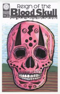
I’ve been looking for ways to turn some of my non-comic book drawings into comic book covers. For example I’ve been making a bunch of five by seven inch skull drawings over the last few months. I think they’re pretty cool but if I post them on Ebay almost no one ever looks at them. That’s just the way it is. So I came up with the name “Reign of the Blood Skull” and made up a logo of it too. One of the odd things about this logo is that I used two fonts to make the “Blood Skull” part of the logo. That’s something I never do. They are similar fonts so I’d guess the average person couldn’t really tell but it makes it look a little odd none the less. But odd was what I was going for. So now I can make some skull drawings (all red or reddish so far) in my six by ten inch comic book format and more people will look at them. The skulls don’t even look like any sort of traditional comic book cover but with the logo and trade dress on them that tell more of a story than a regular skull drawing.
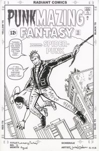
I worked on a couple of my “Punk” logos too. Those are for when I take a comic book cover and redraw it with a punk rocker in the lead roll. I’ve made a couple of romance comic covers that way, a science fiction cover, and now I moved into the super hero genre. I decided to work with the cover to Amazing Fantasy #15 (the first appearance of Spider-Man). The first thing I usually do is recreate the actual logo. I get a scan of the original cover and rebuild the logo as a vector graphic in Adobe Illustrator. That can take a little while but I’ve worked in Illustrator a lot so it’s no problem. After I make the original logo I have to figure out how I want to change it. In this case it was easy. I changed Amazing into Punkmazing by deleting some letters and putting Punk in another font. I wish they were all this easy.
The second Punk logo I worked on was one for Iron Man #100. I haven’t finished this one yet buy I have remade the original logo. That was the easy part. Now I have to figure out how to turn Man into Punk. It’s not as easy as the Amazing Fantasy logo because I don’t want to just use a font. I want the Punk part done in the same style as the Iron part. That means a tilted 3D style. That is going to take some doing and I haven’t been into it just yet.
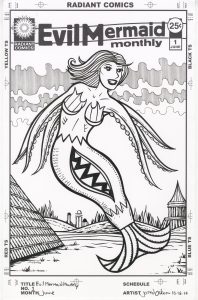
Another logo I made recently is “Evil Mermaid Monthly”. Yeah, that’s a weird one. It comes from last month when I made a bunch of small figure drawings. For some weird reason I didn’t draw legs on about six of them and instead I drew them as mermaids (with tentacle arms). I wanted to make something out of those little drawings and so this faux comic book cover was born. This logo was a little different and tricky. Rarely do I split up the words on a cover like I did on this one. I twisted it a bit too. I think it works because the title itself is so odd and twisted. It fits.
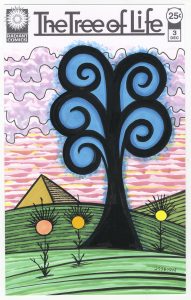
I have been drawing some “Tree of Life” drawings along with my skull drawings in recent weeks so I decided to make a comic book cover out of that too. This one started as a font but I moved all the letters around and connected them where I wanted to. I kept it fairly simple looking but it was a complex piece of moving things around. Simple often take a bit of doing. “Tree of Life” seems to have less of a story than events skulls but adding some flowers and even a pyramid made it more interesting to me.
The last logo I made in this recent spurt of logos is one that I’m not sure what I even want to do with. It started with my Pop Art Bottoms series of drawings that are of butts colored as if they were Mondrian-ish modern art pieces. They amuse me and I was thinking of some kind of way to try and turn them into comic book covers. I don’t think I quite have the idea down yet but I decided to try and do a museum motif. I thought of the Norman Rockwell illustration called “The Connoisseur” which depicts a man in a suit standing in front of a large Jackson Pollack-esque painting. It’s a cool piece and I thought make something like it. I came up with a Museum of the Weird logo but I still haven’t nailed down exactly how I’m going to pull it off. Are the Pop Art Bottoms really weird enough? Should there be people looking at the paintings that are weird? Should I make the paintings on the wall even weirder than model art butts? Should I make a frame as part of the cover’s trade dress? I don’t know. It’s all up in the air right now. I’ve moved on to my “Pretty Danger” series (a logo I made months ago and then abandoned) for the moment so I’m not thinking about it.
So that’s my logo talk for the day. Some days I’m bored with making logos and some days they just pour out of me. It’s been pouring lately. I’m okay with that.
I’m back from the comic shop this week and I got two new comics.
Plus I do the five covers tag in my video.
Check them all out here:
It was just a short while ago I was writing about how I wasn’t interested in doing any more of my “Painted Lady” faux comic book cover series. I was bored of the process. That happens. Except that I recently finished a couple of ink drawings in that very series. How did that happen? I changed the process. And it was completely inadvertent.
It all started with some really small thumbnail drawings. I normally don’t do those for my “Painted Lady” drawings because those are all photo referenced. But I was working on something completely different and drawing small figures in pencil on two by three inch pieces of paper. I was even using a mechanical pencil that I don’t often use. Normally I draw with either a regular 4B wooden drawing pencil or a 2B .7mm mechanical pencil. Since I was working really small I pulled out my 2B .5mm mechanical pencil. That’s a small width of lead for me but since I was drawing tiny this time it was just the right size. Plus most of the time I do my thumbnails in ink so I was off my normal trail but I was enjoying the way the thumbnails were coming out. I didn’t actually use those thumbnails for anything though.
The little figure pencil drawings set up my next round of thumbnail drawings. Thumbnail drawings are idea generators. So sometimes if I’m on a roll I just keep going with them. I don’t worry about what I’m going to do with them or worry about finishing anything since I want to keep the ideas flowing. So I pulled out a 9×12 inch piece of Bristol board and made a bunch of small 1.5×2.5 inch boxes on it. I wanted to work out some small half figures for some of the 5×7 inch marker drawings I was working on. I got about a dozen compositions done, looked at them, and still had no idea what I wanted to do with them. They seemed okay to be made into small marker drawings but that didn’t excite me. They had no theme or reason for being. I put them aside and worked on other things.
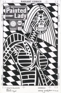
It was a while later that I looked at them again. I still couldn’t see any small marker drawings in them but I began to envision them with marks on their bodies. That got things going in the “Painted Ladies” direction. These little thumbnails were figures from my imagination rather than drawn from life or from photos. That was a change from how I had done all the other “Painted Ladies.”
I picked one of the small thumbnail drawings and dropped it into my “Painted Lady” template that has the logo and trade dress in it. Not that I printed out this version with the logo but I needed to see if the thumbnail drawing fit the composition. Being that it wasn’t made for this composition some adjustments were necessary. I had to shift the head a little, move most of the figure to the right, and add a little more arm on the left. Nothing too complicated and when I finished I printed the figure in blue line much larger on a 9×12 inch piece of Bristol board.
It was freeing that I got out of my usual habit and made things slightly differently. The basic figure drawing was more cartoony with bigger heads and eyes on the characters than my photo referenced stuff but the real difference was in the marks. Since I had less body structure to work with compared to a photo referenced body I made different patterns of marks than I did in the other “Painted Ladies.” Things presented themselves that hadn’t before. I’m not sure that anyone else would notice but I did. It took just as long to complete as any of my other ones though. It takes a lot of time and concentration to draw and ink all those marks.
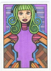
I got one more slightly different thing out of that second set of thumbnails too. A new “Dreams of Things” cover. I was also pretty tired of doing those ones. I had been making a lot of them lately. Thirty two of them. That’s twice as many as I made of “Painted Lady” covers but there is more variety in the “Dreams of Things” covers so it’s not so surprising that they’ve held my interest for longer than the Painted Ladies. But still the Dreams had run their course and I hadn’t done one in a few weeks.
It was a thumbnail figure that caught my eye. A long time ago I painted a dreamy little 5×7 inch gouache painting that had a landscape inside a figure. You basic mixing up the background with the foreground thing. I saw that again here. Ended up drawing the figure, transferring it to an 11×17 inch piece of Bristol boar, and then inking and coloring it with markers. The same as I did with all my other “Dreams of Things” covers except there was very little improvisation with this one. I saw it all in the thumbnail. That’s fairly rare for me. The only thing I didn’t have down was the exact nature of the landscape on the shirt. I ended up with something I rarely do. Clouds were on one side of the picture and the moon was on the other. Usually I have the clouds go all the way across the picture. Why did I do it this way? I’m not even sure. I think I just wanted a change. I look at it now and it looks so weird. Either the clouds are running away from the moon or chasing it. I have no idea which but it makes me wonder. I think wondering is good so I’m okay with it.
When it comes to trying to get art done I’m a big believer in habit. It makes it easier to get things done if you do them the same way time after time. But sometimes Habit can tie me up. That’s when breaking habits and new approaches are the things that can save me.