I’m doing it again this week. I’m going over to my shelf and pulling out a painting of mine that I made in the past in order to write a painting analysis. It’s been a while since I’ve done that and part of the reason I’m choosing to do that right now is nostalgia. I haven’t made many paintings this year as I’ve mostly been working on drawings of various types so that’s made me a bit nostalgic for my eight by ten inch acrylic on canvas paintings. So I pulled out an old one.
I’m not even sure when I made this painting. It comes from the period before I meticulously dated everything. I’m guessing it comes from some time in the early 2000s. I didn’t even name the piece and write that name on the back as I always do. But I did name everything when I made my website years ago and I was able to find the name there. I called this one “Rainy Day”. It’s a random name so it doesn’t offer meany insight into the painting but that’s fine with me.
The first thing I notice is something you won’t see on a scan of the painting. It’s thicker than most of my paintings. Not the painting itself but the stretchers the canvas is stretched over. Most of my eight by ten inch paintings are on stretchers that are three quarters of an inch thick. This means that the total size is eight by ten by three quarters of an inch deep. This painting is on stretchers that are an inch and a half deep. That makes the painting look twice as thick as my normal ones. This is important because it gives the painting more presence as an object. It makes it look more important. It’s an illusion of course but it’s still cool. I’d paint on these one and a half canvases all the time except they’re more expensive than the three quarters of an inch ones and they take up twice the space to store. In the end the extra thickness really doesn’t matter but I do note it.
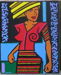
What I notice about the picture itself right away is that it’s one of my figures that’s drawn out of my head. It’s easy to see because there is nothing photographic about it. I was working on a photo referenced drawing just today and the differences between that one and this one are obvious. No real person could have the shape I’ve drawn here. She’s all angles and a few gentle curves. One of the things I tend to do when drawing out of my head is to give people broad shoulders and then drop an arm out of the shoulder and nearly a ninety degree angle. I can juxtapose that with a gentle sweeping curve of a waist and hip. I like the drama of that. I like it so much that I often have to stop myself from doing it. Something I like can be like a crutch that I lean on too much. But here I was making it work.
I find the color in this painting to be remarkably calm and balanced. I don’t often dabble in calm with my color as I normally find that to be boring. I do find It a little boring here but I like the imagery in the painting none the less. The color is mostly red and blue with some yellow highlights to complete our package of the three primary colors. The green is mostly next to the blue making for a harmonious pair as is the light purple and blue plus the red and orange. The only color not working in a pair is the yellow and it’s doing its job to stand out a little bit more than the other colors. But since there isn’t a lot of the yellow it doesn’t stand out too much. You have to find just that right amount.
The idea of straight lines and angles is in play in this image too. Most of the lines, such as in her skirt and in the background, are horizontal. It’s very much a horizontal and vertical piece except for her hair and a sleeve. They give a much needed break from the grid. I’m a fan of the grid and am always composing with vertical and horizontal lines but part of composing with the grid for me is smashing it a little too. The grid is like symmetry. I like the illusion of it rather than concrete reality of it. Start with a grid or start with symmetry and then bend their rigid patterns. Not so much that they break but that they’re a little more interesting. It’s a balancing act.
The decorative elements in this painting are more restrained than I normally use. Those tiny blue dots on her top that define the space of her torso are barely noticeable. They seem to fade into the blue of the background. I guess the thin yellow lines could be seen as decorative but they’re really there to bring more yellow into the piece. That leaves us with the pretend writing. It’s an element I’ve uses a lot in these paintings and I like the look of it. I can use a bunch of brush strokes to bring visual interest to a piece without using an image. It’s another word in my usual vocabulary. Here it works as part of the color harmony too as the blue and purple pair calmly. This fake writing doesn’t scream at me but rather calms me a bit. That one stroke of purple in the bottom left corner continues the visual influence of the purple fake lettering above it to help painting the illusion of symmetry.
By the way there is one other way I can tell this painting is an older one and that’s by the way I stored it. I’ve used a few different methods over the years and they’re mostly to keep dust off the paintings. Dust can really mess a painting up. This one was wrapped in a large sheet of tracing paper that was taped to itself. The white tape is looking brown around the edges and so is the tracing paper. The paper is feeling a little brittle too. Some day I might have to re-wrap all my paintings stored that way. But not today.
Discussion ¬