I’ve been making a lot of logos lately. That’s because I’ve been making a lot of my “Covers to Comics That Don’t Exist”. I’ve been putting them up for sale on Ebay and though no one is buying them yet a bunch of people are looking at them. They are looking at them way more than any of the drawings or paintings I’ve posted without any logos on them. I think people respond well to the concept of a comic book cover. They like it better than a random drawing. A comic book cover, even a faux one, puts a drawing into an interesting context.
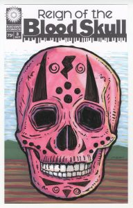
I’ve been looking for ways to turn some of my non-comic book drawings into comic book covers. For example I’ve been making a bunch of five by seven inch skull drawings over the last few months. I think they’re pretty cool but if I post them on Ebay almost no one ever looks at them. That’s just the way it is. So I came up with the name “Reign of the Blood Skull” and made up a logo of it too. One of the odd things about this logo is that I used two fonts to make the “Blood Skull” part of the logo. That’s something I never do. They are similar fonts so I’d guess the average person couldn’t really tell but it makes it look a little odd none the less. But odd was what I was going for. So now I can make some skull drawings (all red or reddish so far) in my six by ten inch comic book format and more people will look at them. The skulls don’t even look like any sort of traditional comic book cover but with the logo and trade dress on them that tell more of a story than a regular skull drawing.
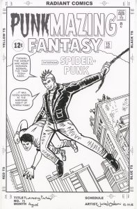
I worked on a couple of my “Punk” logos too. Those are for when I take a comic book cover and redraw it with a punk rocker in the lead roll. I’ve made a couple of romance comic covers that way, a science fiction cover, and now I moved into the super hero genre. I decided to work with the cover to Amazing Fantasy #15 (the first appearance of Spider-Man). The first thing I usually do is recreate the actual logo. I get a scan of the original cover and rebuild the logo as a vector graphic in Adobe Illustrator. That can take a little while but I’ve worked in Illustrator a lot so it’s no problem. After I make the original logo I have to figure out how I want to change it. In this case it was easy. I changed Amazing into Punkmazing by deleting some letters and putting Punk in another font. I wish they were all this easy.
The second Punk logo I worked on was one for Iron Man #100. I haven’t finished this one yet buy I have remade the original logo. That was the easy part. Now I have to figure out how to turn Man into Punk. It’s not as easy as the Amazing Fantasy logo because I don’t want to just use a font. I want the Punk part done in the same style as the Iron part. That means a tilted 3D style. That is going to take some doing and I haven’t been into it just yet.
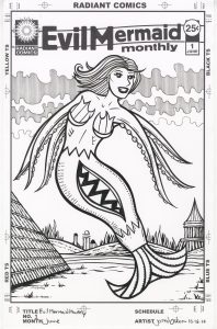
Another logo I made recently is “Evil Mermaid Monthly”. Yeah, that’s a weird one. It comes from last month when I made a bunch of small figure drawings. For some weird reason I didn’t draw legs on about six of them and instead I drew them as mermaids (with tentacle arms). I wanted to make something out of those little drawings and so this faux comic book cover was born. This logo was a little different and tricky. Rarely do I split up the words on a cover like I did on this one. I twisted it a bit too. I think it works because the title itself is so odd and twisted. It fits.
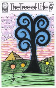
I have been drawing some “Tree of Life” drawings along with my skull drawings in recent weeks so I decided to make a comic book cover out of that too. This one started as a font but I moved all the letters around and connected them where I wanted to. I kept it fairly simple looking but it was a complex piece of moving things around. Simple often take a bit of doing. “Tree of Life” seems to have less of a story than events skulls but adding some flowers and even a pyramid made it more interesting to me.
The last logo I made in this recent spurt of logos is one that I’m not sure what I even want to do with. It started with my Pop Art Bottoms series of drawings that are of butts colored as if they were Mondrian-ish modern art pieces. They amuse me and I was thinking of some kind of way to try and turn them into comic book covers. I don’t think I quite have the idea down yet but I decided to try and do a museum motif. I thought of the Norman Rockwell illustration called “The Connoisseur” which depicts a man in a suit standing in front of a large Jackson Pollack-esque painting. It’s a cool piece and I thought make something like it. I came up with a Museum of the Weird logo but I still haven’t nailed down exactly how I’m going to pull it off. Are the Pop Art Bottoms really weird enough? Should there be people looking at the paintings that are weird? Should I make the paintings on the wall even weirder than model art butts? Should I make a frame as part of the cover’s trade dress? I don’t know. It’s all up in the air right now. I’ve moved on to my “Pretty Danger” series (a logo I made months ago and then abandoned) for the moment so I’m not thinking about it.
So that’s my logo talk for the day. Some days I’m bored with making logos and some days they just pour out of me. It’s been pouring lately. I’m okay with that.
Discussion ¬