I’ve been dipping into a familiar well lately but the water I drew out of it wasn’t what the well usually holds. How is that for a colorful opening line? The well is one of my faux comic book covers. My “My True Face” series to be specific. I made a bunch of these covers before. Nine of them. Only one of those nine was made this year and that was way back in February so the concept isn’t something that’s been on my mind lately.
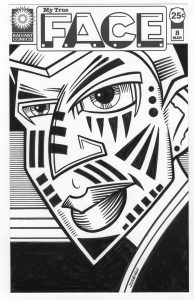
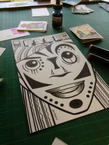
The series is one of those that’s based on my love of drawing faces and masks. Its basic conceit it that the mask we show the world is our true face. Or maybe that our masks would be even fancier if the world would let them be. Either way it’s about faces that aren’t real. The first nine were in black and white and have a very graphic quality to them. Much like my “The Painted Lady” series they’re all about the shapes and marks on the faces. I like the way they came out but after nine of them I moved on. Ideas burn themselves out.
“My True Face” only came to my mind again because I thought about adding color to them. I’ve been doing a lot of coloring with marker over India ink lately and I thought the technique might work well with the graphic look of the faces. Ultimately I decided against it because in the original series the faces were close up and had almost no roundness to them. They were very much done in a flat graphic way that I didn’t think color would add anything too. So I shelved the idea. But it stuck with me a little. So I stated to work out some new color ones.
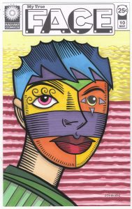
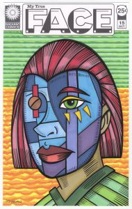
The funny thing is that I didn’t even notice, at first, how I changed things because I was adding color. It wasn’t until I had two of them done that I realized how different they were from the first nine black and white covers. The color ones are pulled back more so we can see the person’s entire head. I remember thinking if I should go for a front view or three quarter view of the head and decided on the three quarter view. This means the face will be rounder and less flat and graphic as the first nine were. A three quarter view works well when we see the whole head so I guess I just automatically did that.
One of the first differences I notice with the color version is that there are not many small shapes like in the black and white ones. Instead I used larger shapes of color. These faces look like they are wearing skin tight color masks rather than a thick wooden masks which hide the real face entirely. That is how I often draw masks. The main giveaway that they are masks are the eyes. On three of them the eyes obviously don’t match at all and on the other two the eyes are bigger than normal. This doesn’t quite fit with them being painted faces.
The hardest thing about this round of faces was the hair. I found that it’s really hard to find interesting ways to represent hair in this mask style. I’ve tried drawing hair in a normal way but it doesn’t fit in well with the rest of the face. All those strands don’t work with the broad areas of color. Or at least I couldn’t get them to work well together. I like the ideas for the hair that I came up with but I’m not sure how many more I’ve got in me. We’ll have to see.
One of the things you should notice about these is something I’ve mentioned before. Whenever I’m drawing crazy faces or masks I am sure to make the lips red. I’ve tried making the lips other colors but that never seems to work for me. It makes the face a little too odd and unrelatable. So in all of these the lips are red. I’ve gone off that reservation only to get lost many a time so now I stick with red lips almost all of the time.
I used a little bit of a different process with these. Normally I’d draw them in pencil, grab a brush and ink them, and then finish them off with color markers. But sometimes the markers can dull the black India ink they go over so I then have to redo parts of the inking. This time after the pencil stage I took a marker and quickly redrew all the pencil lines with a thin single weight ink line. After erasing the pencil I went in with the markers and colored the whole thing. It was only after that that I did the inking over the thin marker line. I found that worked pretty well. Less wasted time.
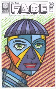
One part of the inking I didn’t do until the end was the little shading lines in the face. I waited on those until I put a background in. I decided to go with flat patterns of color in the background to make the faces seem more rounded by comparison. I mainly used my cloud technique and some parallel lines. I even broke out my rolling ruler for the parallel lines. I haven’t used that in a while. It’s just what it sounds like. A ruler with wheels on it so you can roll it and make parallel lines. It’s less precise than my Haff cross hatching machine but I didn’t need precise for these backgrounds. I notice a lot of red in the backgrounds. That’s because with the lips being red I didn’t use a lot of the color in the masks so it was the obvious color left for the backgrounds.
Finally I made all the little lines that are the minimal shading. I left them for the end because I didn’t want to overdo them. I wanted all the color in first. I think they were a nice finishing touch. To my eye they gave the faces a little more roundness that brought them to life for me. It’s not often something does that so late in the process. But it’s fun when it happens.
Discussion ¬