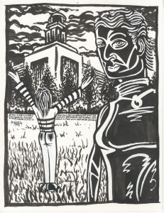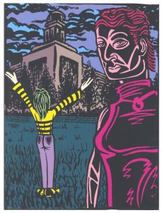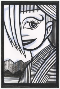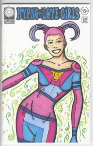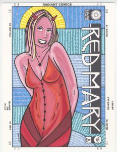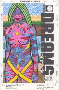
I’m back from the comic shop this week and I got four new comics.
Check them all out here:
I’m back from the comic shop this week and I got four new comics.
Check them all out here:
Time to talk TV shows again. I like to do that every now and again and I haven’t since last fall. As I write this summer is about to begin so let me think back on what I was watching this past winter and spring.
Agents of SHIELD – This is the only Marvel or DC TV show that I watch. A lot of my comic book friends don’t like it but I do. I hear complaints that it’s too mundane but that’s why I like it. It’s mostly a cop/spy show with some occasional super-stuff thrown in. That’s more up my alley than super-hero stuff so it suits me fine. This season had a few main stories going on and I liked them all. Ghost Riders, killer robots, and virtual reality. Fine by me.
Legion – I just remembered this Marvel-based show that I watched and enjoyed too. It was only a ten episode season so it slipped my mind. It was about a mutant with mental powers that thought he was mad. A group of other mutants who were trying to stay off the radar of a secret anti-mutant group were trying to help him out. The main problem I had with the show was that the first episode was very skip-able. Thing didn’t get good until episode two. It was a beautifully filmed show. A lot of shows I half watch but this one held my attention from start to finish with it’s beautiful visuals.
The Night Manager – A six part series that I watched on Amazon Prime. A spy story based on a novel. It was well done except that its first episode was also very skip-able. Other than that it had lots of tension plus some derring-do. I even watched the final fifteen minutes again a day after I finished watching the show just to see the payoff once more.
Chance – Hugh Laurie played the heavy in “The Night Manager” but in this Hulu show he was the hero. He was some kind of consulting brain doctor who got mixed up with a femme fatale and a crooked cop. It was a tense “Fish out of water and caught up in a world not his own” story. Ethan Suplee, who played the brother in “My Name is Earl” was good in it. A solid bit of entertainment.
Brockmire – A Hank Azaria half hour comedy with eight episodes. You’d better like some cursing and blue humor if you’re going to watch this baseball comedy. Hank is a disgraced baseball announcer who is trying to make a comeback by calling a minor league team’s games. Not even on the TV or radio he calls the games over the stadium’s PA system. It was dark and funny.
Nobodies – Another half hour comedy (twelve episodes) this time about three writers who write for a kids’ cartoon series trying to get a movie made. All three stars are from the “Groundlings” comedy troupe and other, more famous, members make appearances in the show. It’s a little bit “Inside Hollywood” but not too much so. It has a lot of wackiness that’s fun.
Training Day – I was enjoying this cop show based on the movie of the same name and then one of the stars of the show, Bill Paxton, up and died. It’s an odd thing watching a TV show after that happens. It’s tough not to think of the actor as a person at that point instead of the character he is playing. It was a pretty good show none the less and I enjoyed it. No second season for it though. I guess they didn’t want to retool it.
Red Oaks – Another Amazon show that takes place in 1985-1986 and is about a twenty year old who works at a country club and is trying to find himself. It started slow but I kept watching it and it grew on me. There are two seasons of ten episode each with a third season on the way. It’s a half hour slice-of-life coming of age story. It was good in the end.
Bones – This show finally ended after twelve seasons. I watched them all but kind of only with one eye the last few seasons. It was an okay final season if not spectacular.
Better Call Saul – I didn’t watch “Breaking Bad”, which this show is a prequel to, but I still like this show. It’s about a not very successful lawyer trying to get by. As I watch it I often wonder what I’m missing compared to people who have seen “Breaking Bad.” They all know the futures of these characters and so they know where they are headed and the ends of their story arcs. I’m along for the ride without knowing where it’s going. Strange.
The Blacklist – This show returned for its fourth season and I liked it. It’s another cop show but this time the FBI and a high profile criminal that’s informing for them. There was even a six episode spinoff series that wasn’t nearly as good as “The Blacklist.” The spinoff won’t be back for another season but this one will. I’ll keep watching.
Elementary – I like Sherlock Holmes stories. I like quirky detective shows in general and this show is good at both. It’ll be back for one last season next year and so will I.
Fargo – Another returning favorite comes back for its third season. This one turns the quirky detective genre up a notch by making almost everyone in the show quirky to some extent. It’s fun to follow along with the crazy twists and turns of the story.
Brooklyn Nine-Nine – The fourth season just finished up of this wacky police comedy and it still tickles my funny bone. It has a good ensemble cast and lots of laughs.
New Girl – A show I’ve found funny since the beginning and it hasn’t let up. Lots of crazy fast back and forth dialogue keeps me interested. Next year will be its last season and I’ll miss it when it’s gone.
There you go. What have you been watching?
I’m back from the comic shop this week and I got seven new comics.
Check them all out here:
With all of the twenty five cent Walking Dead and Invincible comics that I got this past Spring I’ve been making a lot of sketch covers. I wrap a piece of Bristol board around the comic and draw on it. That creates a whole new original art cover for the comic. Sometimes I stick to the Walking Dead theme and sometimes I come up with my own. Recently I came up with a new “Comic book that doesn’t exist” to make some sketch covers of. “The Museum of the Strange.”
I’m sure there have been lots of museums of the strange over the years. In movies, TV, comic books, novels, or whatever it’s not a rare concept. There are plenty of stories to be told that have to do with getting a whole bunch of weird things in a room and calling it a museum. My particular take on the concept was to go literal with it. I wanted to draw a picture of a picture that was in a museum. It was a simple concept but it took a while to come together. Figuring out how to represent the museum was the hardest part.
First I had the idea that the drawings should be in drawings of frames. But unless I wanted to draw an ornate frame, which I didn’t want to, a frame is just a series of rectangles. It could easily be mistaken for a window or something else. Even with the “Museum of the Strange” logo I wanted to make sure the “Museum” part was clear. It popped into my head that I could have people standing in front of the painting and looking at it to make the museum part clear. The problem I ran into with that was that drawings of the backs of people’s heads are really boring and were distracting. Plus they ate up too much room on the cover. A cover that’s one third boring isn’t going to cut it.
Eventually I landed on the single figure silhouette. Once again a solution that I am not the first to arrive at but it works well. A silhouette says that a person is in the picture but offers no more detail than that because no more detail is needed.
It’s not as easy to draw a silhouette of somebody from the back as you might think. You have to capture some sort of gesture or stance when really most of us look like blobs from the back. With our arms at our sides all our shapes blend together. Plus all the characters need short haircuts in general. Otherwise things blur together even more. So short hair, arms akimbo, shoulders tilted, and hips slanted. That’s what I went for. It’s not hard but I had to find the path.
Taking a look at “Museum of the Strange” #5 you can see my basic approach to these covers. They’re all about my weird drawings of weird faces. And those weird faces are looking at you. I made the logo and picture frame on the computer and printed those out on a blank piece of paper. I even drew the silhouette before hand, scanned it in, and printed that out on the paper along with the other stuff. Then I drew the picture in the frame. I like to keep it spontaneous but not as spontaneous as one of my ink drawings. I draw it in pencil first. I keep the pencils loose to give myself more room when I come in with the ink but I do nail down the basics.
That creature with the bright green face came first and I had all of his face down in pencil except for those round markings. That’s the sort of thing I leave for later. I even leave other things, like the small tick marks on his jaw, for after I color it in marker. If I try to put those in before the color I find they smear a little sometimes. Not always but I can’t count on them not smearing. It’s odd that the little ink marks smear but the bigger ink marks almost never smear. I think it’s easier for the alcohol from the marker to surround the little marks and lift a little bit of ink off the paper. I like little tick marks when not overdone. They add a little bit of texture things.
The woman on the left came second. Big head in front and slim body off to the side is a composition I used a lot. It works for me. It helps with scale and depth plus it allows me variety. I get to draw a big face and a torso. The background also has some of my usual elements. Pyramids are something I always use in drawings. They have a few things going for them. They’re familiar but exotic, they add a sense of scale since we know they’re big, and they’re a basic shape. Basic is always relatable. I also put a circle behind the woman’s head. I’ve been into background circles lately. Once again a basic shape that always works. Plus it can reference the sun or a halo if the circler is in the right spot.
The part where things got unfamiliar is the very bottom part of the drawing. The blue strip with the vague sort of machinery on it. After defining every little shape in the rest of the drawing I kept those for legged buttons loose. Unlike the rest of the drawing the lines that make them up don’t even connect. They land sketchily near each other instead. They make up a different world. I was going to draw them like the rest of the drawing but then I said no and changed course. I’m not even sure why but I like the decision.
After the inks I colored it with marker. That’s something I’m good at so it didn’t take long. I kept things bright and clear. I let the greens and blues dominate, threw in some hot oranges to bounce around, and ground it all with neutrals. That may sound like gibberish to some but I’ve got it down.
The last thing I added was the colored stripes in the background. I used my hatching guide and figured out a pattern. It added just the right finishing touch. I’m always happy with a nice pattern.
I’m back from the comic shop this week and I got eight new comics.
Check them all out here:
I’ve decided to go back in time again. I pulled out an old painting to look at and write about. It’s from December 5, 2000 which is before I named all my stuff and instead this one just has a number. It’s oil #18. I also didn’t put a date on the canvas but back in those days I used to keep a paper calendar in which I wrote down what I worked on each day. I did that from about 1999 until 2005 before I stopped. In 2008 I took up the habit again except now I keep a digital calendar. That makes things easier to find. Someday I’ll sit down and transfer all the info from the paper to the computer but for now I have to flip pages to find what I want.
I haven’t painted with oil paints in quite a while. I switched over to acrylic paints some time back just because I wanted to work a little faster as to explore and make more images. That’s when I started making my small 8×10 inch acrylic on canvas paintings. Until then this was about as small as I worked on canvas. Oil #18 is on a ten by eighteen inch canvas that I stretched myself. When I paint at an 8×10 inch size I buy pre-stretched canvas but this one is from the days when I stretched all my own canvas. This canvas is an odd size. It has a very vertical configuration. It’s not a size you can buy as a pre-stretched canvas and I wonder why I picked this size? It could just be that those were the size stretchers I had laying around. Sometimes people have given me stretcher bars that they don’t want and sometimes I bought my own, not for a specific project, but just to have around. That part of my decision making process is lost to time.
Oil #18 is different from all my other oil painting in that I did it quickly. I’m guessing that it’s one of the paintings that lead me to doing small acrylic paintings. Almost all of my oil paintings were well worked out. I did a lot of preliminary work on them to make sure the drawing and colors were right. Method is important to me and as a consequence I am a methodical worker. But with this painting I wanted to do something different. I wanted to make it spontaneous. As a result I don’t think it’s a very good painting. It’s funny though because it presages a lot of my future work. This was painted the same year that I started my first ink book where I draw spontaneously in ink trying to pull strange images out of my head. I’m on Inkbook 17 right now so I have a lot more experience with this type of drawing than I did back in 2000.
The first thing I notice when looking at this painting is that it’s drawn with a red line. I almost always used a black line back then so the red really makes a statement. It warms up the whole picture. The line is also very spontaneous. My usual line is well defined and worked until it’s exactly how I want it to be. The lines that define the person in this picture seem to be instant. It looks like they were the first line that came off my brush. There is a bit of shakiness to them and the edges are often blurred and not defined. Without the line being dark the shapes don’t seem as strong. The color all seems to be in the midrange with no darks and lights. Except that one bit of yellow.
Speaking of color, when painting like this an artist has to be really careful with color. If you mix together too much color on the canvas it makes everything brown. That’s an easy pit to fall into with spontaneous painting. I knew that when making this and therefor was bold and definitive with my color. I mixed two different greens in his shirt and blended his hair from orange to yellow. Those simple combinations won’t ever get muddy but they’re also not terribly interesting. I like the hair with all its brushstrokes but the shirt does nothing for me. You can see that I put a few strokes of color in the shirt but none of those strokes are strong and the orange is even just starting to get muddy. Working wet-on-wet isn’t easy.
Another problem that I have with this painting is the ill-defined geometry. This background shapes aren’t working. I want to straighten them and line them up more distinctly. The way the blue sky meets the brown could work if only the shapes were more clear. The dark red and light purple stripes on the right side are also a bit of a mess. They don’t do much for me. I don’t think the color combo works and the brush strokes let me down.
The part of this painting I like the best is the face. It’s not great and I don’t like the wishy-washy ears but the stroke of the nose works. That and those three grey strokes in the face are my favorites. I’m not positive what those three grey strokes are but they look like they’re supposed to be there. The eyes are okay but the eyebrows start to get a little muddy. The hair is nice. It has a lot of good strokes in it.
Overall this was an odd painting to look at because it’s not a good one. But it is a signaler of a new direction of my work so that makes it more interesting. I can see a lot of my future work in it. I have to say the strange thing about it for me are those “V” birds up in the top right corner. What are they doing there? I’m sure I put those in last as a finishing touch but they don’t do much for the picture at all. Sometimes “V” birds work and sometimes they don’t.
I’m back from the comic shop this week and I got eight new comics.
Check them all out here:
Time to pull out a piece of my art and take a look at it. I don’t feel like digging out anything old so I’m going to give a look to a recent piece that I still have lying about the studio. I usually have a bunch of pieces around the place and it’s only after they pile up for a while that I take a day and try to organize them all and find a place for everything.
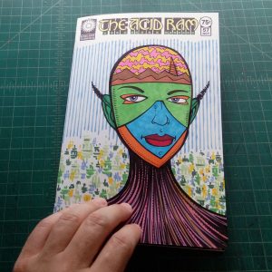
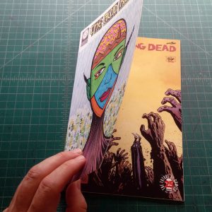
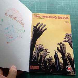
I’ve been making a lot of hand bound sketch covers lately. That’s when I attach a drawing onto a printed comic book to make it into a new cover. I draw a piece on Bristol board, cut it to size, pull the staples on a comic book, wrap the drawing around the comic, and put the staples back in. It’s a twist on the sketch covers that comic book publishers sell. They sell comic books with blank covers so a fan can get his favorite artist to sketch on.
I’ve been doing series of these comic book covers but the one I’m looking at is a singular one. It’s “Deep Space” number twenty one. That’s a pretty high issue number so it doesn’t sound like a singular one and it’s not really. It’s the only one I’ve done as a sketch cover. I’ve made a bunch of “Deep Space” drawings as part of my “Cover to Comics That Don’t Exist” series. I also refer to that type of drawing as my “Faux Conic Book Covers.” That series is 10×15 inches on 11×17 inch paper. “Deep Space” twenty one is at comic book size. About six and a half by ten inches but since it’s a wrap around cover you can double the width to thirteen inches. When it’s in a comic book bag it’s at half width.
The “Deep Space” series started as some small thumbnail sketches. Instead of my usual method of making a series of drawings that get bigger as I figure things out I worked just from my thumbnails for “Deep Space.” I wanted to keep the drawing loose and spontaneous. I wanted strange spacesuits and a sense of loneliness. I wanted to keep things simple. I think I may have erred on the side of “Too simple” for the series but I’m looking at just this one and not the series today.
I like this one better than when I finished it. I’ve know a lot of artists over the years who were their own worst critics. They hated everything they did. That’s a tough way to live as an artist. I’ve consciously tried not to do that and judge my work as objectively as possible. It’s not always easy to do. When something doesn’t come out as I wanted it to it’s tough to think of it as anything but a failure. I’m lucky that doesn’t happen to me too often but it did with this one. I finished it and then didn’t like it. I had to remove it from my sight. That’s what I do when something doesn’t come out right.
Now it’s a few weeks later and I pulled it out of the pile to give it another look. I like it better now. There is a weird awkwardness to the figure that I hated when I first finished it but now I like it. The person is having trouble standing in this strange alien landscape and so is not at ease. He has a wide stance but it’s not a very stable stance. I wonder how long he’s going to be able to stand on that spot? Adding to the awkwardness is that his arms are long and his legs are short. Strange proportions for a strange space.
In all of my “Deep Space” drawings the spacesuits are different from one and other. I make them look bulky but other than that they all have different shapes on them. I use a side-of-the-brush technique to make a rough line that is the opposite of hi-tech. Some of my spacesuits look like they are made out of hay. I like that strange dichotomy. Sometimes I think it doesn’t work though so it’s a challenge to draw one that I really like. This one is okay except that his underpants area looks like the bow of a ship. I keep noticing that and it’s bonkers.
The art takes on a different tone when I open the comic up to see the full wraparound cover. Outer space is all around him and there is a large planet or moon to his left. The space behind him opens up and he gets swallowed by it more than he was when we could only see the front cover. I also think the moon near his head grows in prominence as the space gets wider and the smaller moon can be seen in opposition the the bigger moon on the left. Now he’s caught between two large forces.
I’m not sure about the stars I made in the background. There are a couple of acceptable techniques for making stars in ink and they involve splattering ink with a brush or toothbrush. I’ve done the techniques many times but didn’t want to here. Since I was using a rough-brush technique for the planet on the left I decided to use that some rough brush to make stars. The reason I didn’t want to use the toothbrush technique is that I find it sometimes calls too much attention to itself as a technique. I don’t think I dodged that here. The stars still look “Technique-y” to me. Oh, well, you can’t have everything.
One final thing about this cover has to do with the white line around the figure. I never liked the technique of outlining a figure against a black background but for some reason I did it here. I think I was trying to give the suit a little more bulk rather than an outline as a graphic element but in the end I think I just made the figure look shaky. He seems to be trembling a little bit. I don’t hate it but it’s another uncomfortable element in a drawing that’s not about comfort. It does a good job but I’n still not sure if I like the outline. Hey, at least I can look at the cover and enjoy it a little now.
Today I feel like analyzing a comic book cover. For a short time I did this every week on this blog but these days it’s every now and then. The cover I’ll look at is Sub-Mariner #50 which has a cover date of June 1972. That means it was on the stands in March of 1972 since publishers forward-dated their comics so they could look new for longer. It’s pencilled by Gil Kane and inked by Vince Colletta. I looked it up and the cover lettering is credited to John Costanza. The lettering is a big part of this cover so I’m glad I was able to find a credit for it.
First of all this is a Marvel Tenth Anniversary cover. That was the period of time, in the early 1970s, when Marvel used a box on all of their covers as part of the design. In the early 1990s I asked John Romita why Marvel went with that design and he told me it was for a tenth anniversary. Though he couldn’t quite remember what it was the tenth anniversary of. It had to be of Fantastic Four or Spider-Man number one since they come out in the early 1960s. I’ve heard a lot people complain about the “Box covers” but I mostly like them. I think the design works plus a whole lot of them were drawn by Gil Kane and he could draw a nice cover.
I really like the drawing on this cover. Gil Kane was a master of figure drawing and he did an excellent job with the main figure. The Sub-Mariner looks like he’s swimming and fighting and that’s not easy to capture. The crab/lobster people look pretty darn bizarre but in a good way. I don’t think I’ve ever seen anything quite like them and they give me the feeling that they could give Subby some trouble. They may not be the scariest monsters ever but they’ll do. The way that human arm turns into a claw is pretty weird.
I’m not fond of the background art on this cover. There are some ruins in the upper right which are serviceable enough but it’s the woman in the giant ice cube that doesn’t work for me. It seems tacked on. The perspective of the cube is off and that throws off the whole composition. Gil Kane was usually a master of perspective so maybe the woman was drawn in later but someone else. The left side of the drawing with no background at all works fine. The bottom crab-man looks like he’s coming out of the depths of the ocean. So that’s good.
The inker, Vince Colette, is famous for being the guy editors went to when they needed a job done in a hurry. As a consequence he got the nickname “Destroyer of Armies” for his habit of erasing backgrounds and detail in a effort to get the job done on time. He was talented but under those circumstances his inks were often not very good. The problem I have with his inks are “Who knows what he could have erased and therefor affected the piece?” His inks on the Sub-Mariner’s figure are good and he captured some nice feathery detail. But did he erase things from the background? I have no idea.
There is a lot of type on this cover (called cover copy), maybe too much type, but it’s well balanced. I say “Too much type” because that’s always the question with comics of this age. So many comic book covers were brought down by too much cover copy that whenever I see a copy heavy cover I (and many other people) question it. We’ve been in the age of minimal cover copy for so long that it seems odd to see so much type. But I think I like this one.
The “Sub” in “Sub-Mariner” was shifted left to fit in the 50th issue blurb and it fits well. The “Fighting For His Life” also fills a spot left by the rise of the logo while bridging the logo and the design box. The copy on the bottom also drops in nicely. The main problem I have with all the type is that it doesn’t tell me a lot about the story. It’s generic type that could be on any cover. And what the heck does “Who Am I?” mean? Does Namor (that’s the Sub-Mariner’s real name) have amnesia? Is it an identity crisis? I don’t recall the plot of this issue at all so I have no idea. Though I think it’s well done, the type doesn’t entice me at all the look at the comic. Even the “50th Issue” blurb is only a few inches from the actual issue number so what’s the point?
I wish I could find a credit for who colored this cover but there probably isn’t one. I know that George Roussos came on staff at Marvel sometime in the 1970s and colored a lot of their covers but I’m not sure if he did this one. I think Marie Severin colored a lot of them before that so it could be her too. Either way I like the blue/green they used for the ocean with a little bit of an airbrush effect as it went up. The mix of the reds and oranges also work for me and make this a very warm cover. Warm with the coolness of the sea is an interesting juxtaposition. I dig it.
All-in-all I have to say that I like this cover. I’ve had it for a long time and used to collect Sub-Mariners from this era because there were so many good covers. They were already about five years old by the time I ever got them but since Namor was never that popular people (kids around the neighborhood actually) were always willing to sell then to me way back when an old comic would cost you a nickel or a dime. I think I found some at garage sales too. Those were the good old days.
I’m back from the comic shop this week and I got six new comics.
Check them all out here: