This week I’m taking a look at a faux comic book cover that I did back in August. The date on it is August 10, 2017. That’s the day I finished it. The date on my stuff is always the day I finish something but that doesn’t tell you when I started or how long it took. Sometimes a drawing like this can sit around for weeks before I finish it and sometimes I can go from start to finish in a day.
I keep a calendar of when I do stuff so I can look up when I started this one. Looks like I inked it on July 12. I’m not sure when I pencilled it though. I randomly name my drawings and paintings and often I will make a drawing without knowing what I will be using it for. When that happens the drawing can have a different name from the finished piece. I think that happened in this case. I made the drawing long before and used it to create this faux cover from.
This one was also part of a burst of covers. I like to do things in bursts. It doesn’t always work out but it’s cool when it does. A burst is when I set up a bunch of things to be done. I’ll make a half dozen drawings, scan them all in, and set each drawing up as a faux cover, and then print them all out to be inked. That way I’ve got lots of stuff to chose from depending on what I want to do. But I also can have a lot of stuff sitting around in various stages of finish. That’s why it took me almost a month to get around to coloring this one after I inked it.
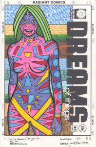
The first thing I notice when looking at this cover is the color. I really like the way the color come out. I find it bright, vibrant, and attractive. I’ve used all these colors before but they are at their best here. I like the pink. I’ve used this pink marker before (Copic RV04 Shock Pink) but usually in small spots. I find that it can let me down in large amounts as it looks artificial. But it works fine here as every color looks artificial. The woman looks as much like a piece of candy as she does a person. Hot pink works well for candy.
The second color is a purple (Copic BV 13 Hydrangea Blue). I’d say the pink and purple are the two main colors with maybe the pink being slightly more dominant. Or maybe they’re in balance. It’s hard to tell because of the way they work well together. I often find purple a difficult color to work with since it usually skews too much towards either red or blue and that can mess up the whole balance of color in a piece but here the purple finds a nice home next to the pink without being too dark or too anything.
Though it’s only an accent color, the yellow (Copic Y18 Lightning Yellow) might be the strongest color in the piece. It has a lot of presence. It may not have the most real estate but since those two swoops of yellow that go from her hips to her legs are the longest bits of color in the piece they stand out. Plus they create an “X marks the spot” over her crotch so how is that not going to stand out? The bits of yellow in her upper body bring some brightness up to her neck and face.
The two other colors on her body red (Copic R29 Lipstick Red) and blue (B04 Tahitian Blue) pair very nicely together. The red is denser than the blue which isn’t the usual case. In many cases blue is denser than red but I wanted to avoid that. This lets the red be the darkest color on her body which is not normal. The blue floats slightly above the red and hits the eye first. The blue and red also sit harmoniously with the pink and purple. That’s what I was looking for. A little harmony.
The green hair sets itself apart by not playing nice with all the other colors. It stands out. All the other colors blend together well but not the green (it’s three greens really). I consider the green the icing on the cake. Its the fancy part. It’s the part you can take off the cake and the cake will still be cake but it won’t be as complete as if it had its icing. The icing is the part that makes everyone oh and ah.
I remember having trouble when it came to making the background. I saved it for last and I liked the body color so much that I was afraid I was going to mess up the color balance when I came to the background. At first I was tempted to make the whole background neutral color but I didn’t think that would work. So I decided to emphasize texture and keep the background to more expected colors like blue and green. I didn’t exactly draw the sky and trees but I used their colors.
I used repetition too. I wanted to break the literal part of the sky and trees but still keep them there somewhat. So I broke the background down into three sections. I started with a blue sky, went to an orange sky, drew in some green ground, and then some brown dirt. This was all in the top section. The second section has blue sky and blue green water. I mixed it up. The third section has blue sky and green grass. The fourth section has orange sky and a brown fence. I turned the background into four backgrounds.
I also used fairly light and not so dense background colors. This made the body colors stand out. It helped the body colors keep their already established relationships. If, for example, I made the background orange too bright it would fight with the pink for dominance. But instead it quietly sits behind the pink.
I’ve enjoyed making most of my faux comic book covers. I’ve done fifty of them in my “Dreams of Things” series. I think most of them came out well but I might like the color in this one the best of them all.
Discussion ¬