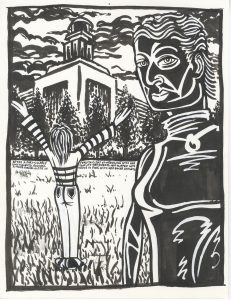
It’s time to pull out some old work and do some art writing. This week I grabbed a binder off my shelf that holds a bunch of my paintings on paper. It also has some ink drawings from when I was first learning how to draw directly in ink with no underdrawing. As proof of that this one has an unfinished ink drawing on the back. Looks like I couldn’t get it to go anywhere so I turned the paper over and started again. I didn’t title or date this drawing but the dates of the others around it are from 1999. I bet this is from then too.
The first thing I notice about this drawing is the paper it’s on. Coquille board. That’s a heavy paper that has a fine texture to it. A friend had introduced me to it around this time so I wanted to do some drawings on it. It turned out that I wasn’t so fond of the texture when drawing on it with a pencil so I turned to just ink. Ink and whiteout at this time.
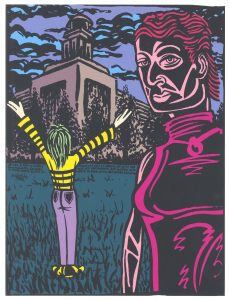
There is even a color version of this unnamed drawing. I colored it on the computer and printed it out. The printout was in the binder with the original drawing. This was the early days of my making computer fine art prints of my work and this one doesn’t measure up as a print. Mostly because of the paper. I can’t remember if I’ve had three or four printers over the years but this looks like printer number two. An Epson photo printer. The dot pattern is tight so it’s not my first Epson printer, that much I’m sure of, but this must be before they were making a lot of heavier stock fine art paper. That’s the paper I switched over to after a while. This paper stock it too thin for my liking.
The drawing itself is one of my old standby compositions. Big figure in front and little figure beside it. Other than that it has some odd compositional elements. The horizon line almost cuts the drawing exactly in half. That’s not something I would normally recommend but since the big figure cuts off a third of the horizon line plus the little figure cover up a bit more it works out. In addition the composition emphasizes the building in the background. Lots of elements point to it. The building makes a good counterweight to the big woman’s head beside it.
When I was drawing this one I did some underdrawing with the brush and ink and then used the whiteout as coverup. I also used the whiteout as white paint in places to make positive shapes rather than as coverup. That worked fine for the hair (both big and small) but not as well on the large figure’s shirt. All those white lines over the black are drawn with a whiteout pen but they don’t say much to me. Are they folds or a design? They look like both without making a definitive statement about either. They seem to be halfway there. If there was one thing I could go back and change it would be those white lines but I still don’t have a better solution today.
Looking at the original art really makes the figures stand out. There is whiteout throughout them and none in the background. The two slightly different shades of white give it an element that’s not usually in my drawings. The black and white sleeves of the small figure are much more vibrant in the original than in the printout. I missed on properly embedding the feet of the figure into the grass but that part looks better in the printout. Color helps.
One of my favorite parts of this drawing are the trees. I think I did a nice job on them. They’ve got a treeness about them and that’s a lot of the battle. I had to make them stand out from the building yet blend in with it too. That’s not an easy thing to balance. You have to be able to see through some of the tree but not all of it. I erred on the side of not blending them in too much and I think that worked. In the color version the trees blend in a little bit more but I think that’s okay.
The trees are better than the grass is. Not a lot of technique in that grass. If I was making this drawing now I’d use my busted brush technique to lay down lots of grass all at once and it would look fine. But here I was just throwing down ink marks one by one and trying to make something that looked like grass. They ended up looking like ink marks. Oh well, can’t win them all. Especially when you’re learning a new technique.
Coloring this piece on the computer was also learning a new technique. I got my first computer in December of 1995 so it was less then four years since I bought it and I didn’t have nearly the number of coloring techniques that I now have. It looks like, for this one, I was going for simple. I didn’t want a lot of modeling or colors in general. I wanted the graphic design black and white elements to shine through. I think I succeeded in that arena. I kept the color simple and strong. Some nice magentas, cool blue and green, solid neutrals, and a pop of yellow to catch the eye. The only thing I question is the large figure’s eyes. I kept them the same solid color as the rest of the face but I wonder if they would be better off with color. I’d make the whites of the eyes white and then color the eyes a bright blue or green. Maybe I did this way back then and decided against it (I probably did). But I want to see what that would look like now. But I’ll leave it be. It’s all good.
Discussion ¬