I wasn’t able to make it to the shop this week so I’ve got no comics. But here is a video I made this week showing some Richard Corben comics.
Check them all out here:
Comment
I wasn’t able to make it to the shop this week so I’ve got no comics. But here is a video I made this week showing some Richard Corben comics.
Check them all out here:
As you can tell from this blog I’m a comic book collector. Or at least that’s what I call myself for simplicity’s sake. I think comic book fans come on a sliding scale from collector to reader. On one extreme is the fan who buys a comic, bags and boards it, and then files it away in the collection unopened. This fan might not even read the comics in his collection. He just wants to own them. On the other extreme is the fan who buys a comic, reads it, and then tosses it away never to be seen again. I think these extremes are rare and most of us fall in the middle maybe leaning to one side or the other. I lean towards the reader side because, although I keep my comics, I read them all and only keep the ones I like. If the answer to the question, “Will I ever read this comic again?” is “No” then I’ll get rid of it.
As further background on my collecting I’ll tell you that I’ve been buying new comics off the stands since I was about ten years old back in the mid-1970s but I don’t buy many back issues. I did buy them back in my early days from ages about ten to twenty but since then I haven’t bought a whole lot of back issues. I have bought a lot of hardcover and paper back collections of old comics but that’s not the same thing as hunting for old, original printings, of back issues.
All this brings me to the thoughts I’ve been having lately about one of the main-staples of back issue buying. The first appearance. Specifically the first appearance and how it’s definition has changed over the years that I’ve been buying comics. First appearances used to be a fairly straightforward thing. Spider-Man’s first appearance is in Amazing Fantasy #15, Superman’s first appearance is in Action Comics #1, The X-Men’s first appearance is in X-Men #1. Not hard. Sometimes, like with Spidey, a characters first appearance wasn’t in a comic with his name on the title but it was still an easy thing to grok. Tales of Suspense #39 was Iron Man’s first appearance not Iron Man #1.
Things changed a little when a character first appears in comic that he’s not the star of. The Hulk #181 with the first appearance of Wolverine comes to mind. But first let’s digress a little bit to when and why first appearances matter. It’s a fairly easy question to answer. A first appearance matters when after a character is introduced that character grows in popularity. That means more people are interested in a character after his tenth appearance than at the time of his first. Some of those extra interested people now want to go and get the other stories the character appeared in so they can read them. That’s the key. They want to read the stories. That’s why for years “First appearance” was really short for “First story So-And-So appeared in”.
For decades Hulk #181 was worth fifty times what the issues around it were worth. It was the first story Wolverine was in and it was a single issue story. Except due to the continued and periodical nature of comics Wolverine was first seen on the last panel of Hulk #180. He was the cliffhanger. A brand new character showing up to kick the Hulk’s ass. But no one cared about it because Wolverine wasn’t in the story of Hulk 180. He didn’t matter to the issue and the issue didn’t matter to Wolverine fans. Hulk #180 would cost you a dollar (same as 178, 179, 182, 183) and #181 would cost you fifty dollars. That’s how it went. People wanted the first Wolverine story. It didn’t matter that he showed up at the end of #180 and the very beginning of #182 because there was no Wolverine story there.
Then things began to change. Through the late 1980s to the 1990s I watched the price on Hulk #180 creep up. It was still nowhere near the price of #181 but it still separated itself from #179 by a lot. First appearances of various characters became hot commodities and things changed. Now people wanted the first appearance of a character not because they wanted to read the story but because it was a desired object. The old “If everyone else wants something I want it too” routine. It’s the way we are as human beings. We value things that have value to a lot of people.
As a result of this commodification of first appearances the very definition of “First appearance” changed. People began to take the phrase literally and so “First cameo appearance” was introduced as a concept to cover comics like Hulk #180. Wolverine didn’t appear in the story but he had a cameo in it and surely that was important? Of course this concept was introduced as a selling tactic to get people interested in issues like Hulk #180 but that didn’t make less effective. The price of Hulk #180 has gone up and up with the popularity of Wolverine.
All this brings me to the present day. I still don’t buy back issues but watch a lot of videos on YouTube made by people who do. They show off their purchases and often tell us why they got them. What I’ve gleaned from this is that “First appearance” has gotten more literal over the years and maybe even more controversial. One character’s “First appeared” as a test tube with a label on it. That’s if you buy into it. Some people do and some don’t. Another “First appeared” as a background character at a costume party. Once again you buy into it or not. It all seems to be about creating demand and selling comics to me. After all sellers need something to sell and collectors need something to collect.
I’m going to end this with what got me started thinking about the whole first appearance topic in the first place. Ads. Yes, some people are now starting to claim that a character appearing in a ad for a comic is a first appearance. Whether it’s a character having a “Preview” of its comic printed in another comic or a few page sample in a catalogue some people want that to count as when the character first appeared. Not me. I’m old school. I’m interested still just interested in reading the character’s first story. Maybe a cameo. But you can keep the ads.
I’m back from the comic shop this week and I got six new comics.
Check them all out here:
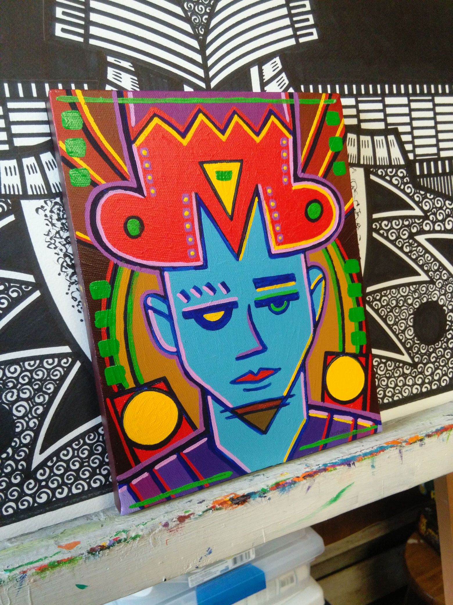
This week I’m pulling a painting off my shelf to take a look at. It’s a bit of a random process as my eight by ten inch acrylic on canvas paintings are in envelopes so I can’t see which one I’m grabbing. It’s not quite random as the first painting I grabbed was one of the few abstract paintings that I’ve done and it was not very good. I’m much better when working with images because that’s what interests me but every now and then I’ll attempt to make a painting without an image. I know enough about painting to pull it off but I don’t find them very interesting so I wasn’t about to write about one.
The one I pulled off the shelf is called “The Hold Down” and has the date on it October, 30, 2009. Six years ago. Time does keep moving along. As I look at this one I don’t remember making it yet it does look familiar. That’s probably because it has the motif of a face that I like so much. But it might be a little more than that. This face came from one of my small drawings that I do in my ink book. Those are where I do my spontaneous drawings in ink but I notice I have certain habits. Shapes that I tend to repeat when I start a drawing. Often I consciously stop myself from repeating them and sometimes I go along and see if I can vary the theme from the other times I’ve made such a shape. The headdress/hat on this fella is such a shape.
I can tell that when I first made the small drawing of this I started the pen in the upper left, dragged it dawn, and then swooped it around to form the left side of the hat. I can just tell. Straight lines and then swoops in the upper left is a motion I repeat often. I must have wanted to break that motion up after I did it because I made that “M” shape in the middle of his forehead. That is not a shape I make very often. I’m guessing that “M” shape also informed the rest of the drawing and made me decide to make the drawing symmetrical. As I’ve written before I generally use asymmetrical symmetry, the illusion of symmetry, but here I’ve got the real thing going on. Of course it’s not perfectly symmetrical but near enough so that I’d call it symmetrical.
I think there is also a familiarity to symmetry that also makes this painting seem a bit familiar. We’re used to symmetrical things so when we see them they fit into out world. Symmetry is part of the everyday industrial design of the world. From cars to TVs to phones most of the stuff we use has a symmetrical design. It’s familiar. Just like faces.
The first color I notice in this painting is the light blue of the face. Not the usual color for a human face so it right away establishes the fictional world of this painting. But it still doesn’t look especially fictional. I think the symmetry also has something to do with that. There is a general coolness to the whole painting due to that blue. The second most dominant color is the hot red of his hat but that is tempered by all the pink. If you mix blue and red you get purple and there is quite a bit of purple in this painting but it tends to be on the side of the blue.
The lines of purple and pink that surround the face both have a lot of white in them and therefor are not strong colors on their own and so can be influenced but the colors around them. Up near the hat they tend to look warm because of the red but they cool down near the blue. And since there is more blue the whited up lined help cool the painting down.
The yellow exists in a world of its own. It’s the whitest white, the brightest bright, in the painting but because of the symmetry it’s rather static. Normally, being so bright, the yellow would move a little more forward to the eye but here it’s more locked in place by the composition. Those two large circles of yellow can become like headlights if you stare at it but that takes a moment. All the yellow shines only once my eye unlocks it from the composition.
The painting sits on a neutral ground of browns. A red brown and a yellow brown are mixed in there but they all stay in place and generally don’t add to the warmness of coolness of the piece. They’re the colors that the bright ones bounce off.
The green bits are a bit odd. They seem to almost disappear. They end up framing the whole piece but in general don’t get too involved in the fight between warm and cool and the fight between foreground and background. They just exist along the edges. It’s a bit weird to me since I don’t usually use color like that but I bet it’s all a consequence of my decision to go with symmetry.
I’ve written mostly about the color and not much about the face because there isn’t much to it. The face is drawn with just about as few lines as possible and doesn’t stand out much on its own. It’s here that the asymmetrical symmetry lurks though. If I had drawn the left side of the face exactly as I had drawn the right side it would be a really boring face. That’s what I find with these faces that I draw. I can’t usually draw the different halves of the mouth or nose too dissimilar from each other so it’s the eyes that get distinct from one and other. Here I went with sort of a robot eye on the left with a yellow glow. It make the whole thing slightly otherworldly. Some sort of alien or robot is winking at you. Or that’s just how he looks.
In the end I have a lot of questions about this image. Who is he? Where is he from? What does he want? I have no answers to any of those questions and his face doesn’t give a lot away. But I never liked easy answers.
I’m back from the comic shop this week and I got ten new comics.
Check them all out here:
As of this writing I’ve posted fifteen hundred comic strips of my “Four Talking Boxes” comic strip. I started posting them back on January first of 2010 and have been posting five of them a week ever since. That’s a solid amount of comic strips and has made me want to release them digitally as a sort-of comic book. It’s something I’ve been thinking about for a while now but haven’t quite wanted to put all the work into making it happen. It’s a lot of work.
I actually figured out the format a couple of years ago. I post them on this site as a horizontal comic strip but I don’t like the way that looks on an iPad. Too much wasted space. But when I first came up with the idea for this comic I decided to make all four panels the same size so I could reformat the strip into a vertical rectangle. The first two panels would be on top and the final two on the bottom. Of course, that meant reformatting all the comics. Reformatting so many things means a lot more work.
Luckily for present me the past me figured out just what to do to reformat the horizontal strips to vertical and saved it all as an action (a macro) in Photoshop. That means all I have to do is open the horizontal strip in Photoshop, hit a button, watch as the action runs to reformat the strip, and then type the strip’s number on it (the one thing I couldn’t automate). I don’t even remember what all the steps in the formatting are so it’s a good thing it’s all saved for me. It still takes time to do all that but considerably less time than if most of it wasn’t automated.
What really takes a lot of time is proofreading the strips. It’s always tough to proofread yourself even though I do it a few times before I post the strip. First I write a strip, second I proofread it, third I proofread it a few weeks later when I make the art, and fourth I proofread it the day it posts on this site. You think that would be enough but it wasn’t. Especially for the early strips that I did back in 2010.
In the beginning of the strip I was still figuring things out. It took me a while to learn how I wanted to do my lettering. I use a font that my friend and comic book letterer Dave Sharpe made but how I wanted the balloons to look and the lettering to stack is what I had to figure out. That took time. There are certain things I needed to learn to get to look right. Since a word balloon is a horizontal ellipse I want the top and bottom sentences to be the shortest with the middle ones being the longest. This sounds easy enough but unless you’re really paying close attention it doesn’t happen. And I wasn’t paying close enough attention in the beginning. I get it right seventy five percent of the time but there was always a couple of balloons that were off per strip in my early ones.
It also took me a while to catch on the the fact that I didn’t want any dangling I’s. That’s when the capital letter I appears by itself at the end of a line. It doesn’t look right. It throws off the balance of a balloon. I’d heard of that before and knew I should get rid of them but it take a while to notice them in practice. Now I eliminate all dangling I’s as a matter of course but back in the first couple of hundred strips I had quite a few of them.
Reading the early comic strips was quite a chore in itself. The strip has always been about conversation but the conversation didn’t flow in the beginning like it does now. It’s just different. It took me a while to catch on to that and not let it bother me. I did end up changing a word or two here and there but nothing too drastic. Sometimes I saw a clumsy turn of phrase that I couldn’t let stand but most of the time things were okay.
After I had all the corrections made I had to remake all the files that I had made lone ago. I needed a new gif file for the website. As long as I was making these corrections I may as well post them in place of the old ones. Then I needed a tif file for the book that is going to be turned into a digital book. That’s the main one that I make the vertical jpeg and gif files from. Making the tif file took the longest as that is the one I use the reformatting action on. The other two types I easily make with another action that re-saves them in the jpeg or gif format.
Here is a tip for you. A Zippo lighter is good for holding down the return key. My “Four Talking Boxes” strip is initially made in Illustrator but all the reformatting of size is done in Photoshop. So I drop the files on the Photoshop icon but before Photoshop opens them I have to make sure the parameters are correct and hit the return key. That means I have to hit the return key for every file. If I’m opening twenty five of them at once I place the lighter on the return key and it holds it down for me and therefor presses return each time. Some low-tech automation for you.
It took a remarkably long time to get these done. I’m up to the first two hundred strips so far but I want to do another fifty more for the first issue. It took all of Saturday morning, about four hours, to get the first hundred finished. I had changes on nearly every single one go them. I expected to have changes on maybe ten to twenty percent of them, after all I had proofread them many times, but it ended up being more like ninety percent. That’s a bit underestimation of time. Ah well, no one else if gonna do it.
I’m back from the comic shop this week and I got eight new comics.
Check them all out here:
I’ve been working this week on some of my faux comic book covers. My “Covers to comics that don’t exist” series. I’ve got a bunch of different comics in that series with logos and trade dresses all set up for them. The Painted Lady, The Enigma Prism, The Bronzeman, and Fascist Planet are examples of my fake comics. Or maybe they’re hypothetical comics. The covers are real after all. This week I came up with another one and it came together in a different way than they normally do. What is the normal way you ask? The normal way is that I decide I want to create a new series name and logo and then that’s what I do. That’s pretty straight forward. Weirdly this one was not.
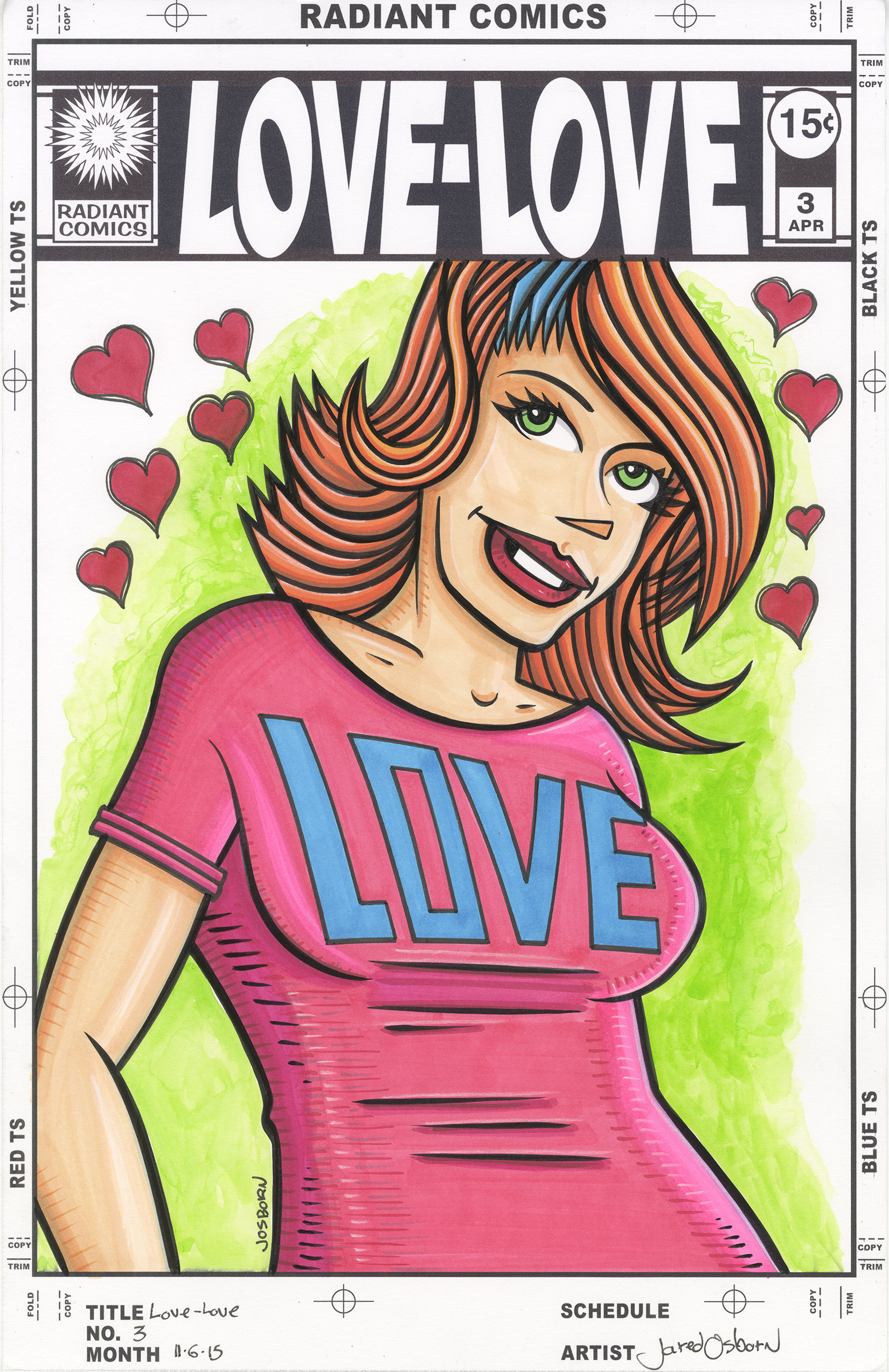
The new fake series I came up with is called “Love-Love”. I’m not sure the exact starting place for creating it but I remember wanting to work with something positive. A lot of my series are dark and strange so I wanted something more upbeat. Besides that general thought things started with my “Message Tee” comic strip. That’s the strip I run on Saturdays where a person is standing in T-Shirt that has a message on it. To do that strip I drew a lot of different characters in Tee-Shirts. I put the words onto the shirts with the computer so the drawings all have blank T-Shirts. I have about 150 nine by twelve inch ink drawings of people in T-Shirts. A few weeks ago I pulled a few of those drawings off my shelf to color them. It was something that struck my fancy at the time.
The first thing I knew I wanted to do was to put something on the shirts. I didn’t want them to be blank but I also didn’t want to be drawing a lot of words on them. Back in the 1990s I made a comic book called “Delia Charm” and she wore a shirt with the word “Love” on it. Since I was looking for something positive I thought that would do the trick. Typographically “Love” is an interesting word to deal with. It has two rectangular letters on either end with a eclipse and diagonal in the middle. It has to be balanced just right but it can be worked with. I did just that and then grabbed my markers to color the now “Love” clad person. Things went well and I colored a few drawings. I liked them. Then I stopped.
Another thing I’ve been working on lately is my “Painted Lady” faux comic book covers. I made a few of these but was tired of doing them. I wanted to make some more covers but had nothing in mind for what I wanted to do. I wanted something positive with some sort of mass appeal to it rather than my usual weird quirkiness so I cast my mind about for what interested me. I though of my punk rock romance comic cover from this summer but those are a lot of work. They take days. I wanted something quicker and that’s when I thought of those “Love” shirt drawings. They were positive and I thought I could make them into a romance comic cover. A nice single figure cover. But what to call the comic?
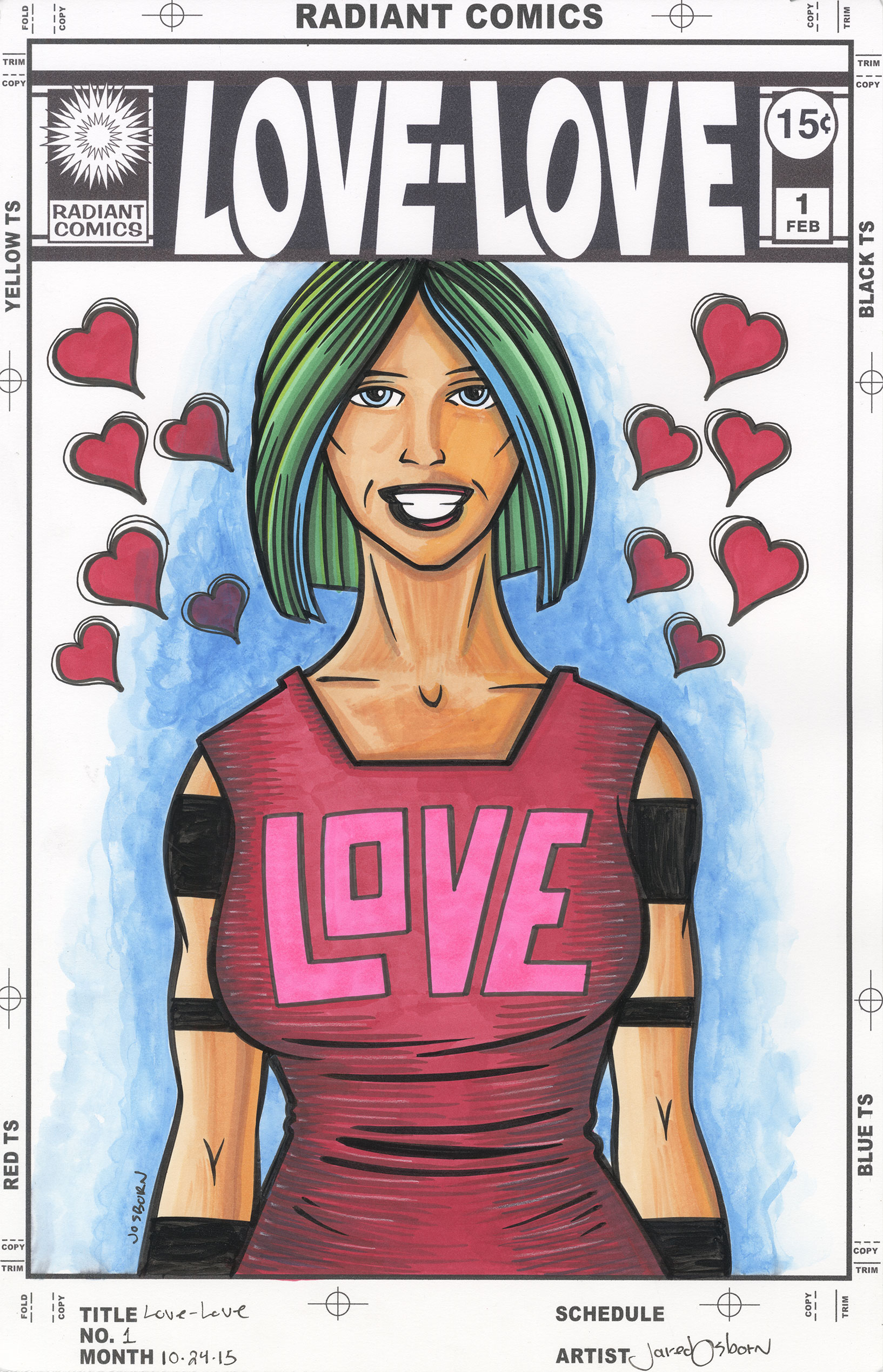
As simple as the name “Love-Love” is it took me a while to come up with it. Names can be tricky. It took me even longer to make the logo. Though the logo looks simple it took me the better part of a day to do it. I’d say six hours. Simple is often deceptively hard. A lot of comic book logos these days are really just a word in a computer font and that’s exactly what I didn’t want. I made the logo on the computer and started with a font but wanted to end up with something that was more than just the word “Love” in a display font.
My initial idea was to have the word “Love” twice with both of them tilted towards the hyphen in the middle. The left “Love” skewed to the right and the right “Love” skewed to the left. It sounded like a good idea but turned out to be impossible to do. It’s all because of the shape of the letters. The first “Love” was actually easy. It tilted to the right with barely a hitch. I even curved the bottom of the “L” to match the curve of the “O”. But when I tried to tilt the second “Love” to the left things didn’t go well. It’s all about the spacing.
Initially I tried to get the angle things tilted left to be the same number of degrees when tilted right. This opened up way too much distance between the “V” and the “O”. Y’see the “V” is symmetrical but none of the other letters are. So as the angles of the “O” and “E” changed around it the “V” remained the same. It was now too far from the top of the “O” and the bottom of the “E”. I messed around with those angles for a good long while but could never get them to look right. Sometimes symmetry makes things look unbalanced despite the math being right.
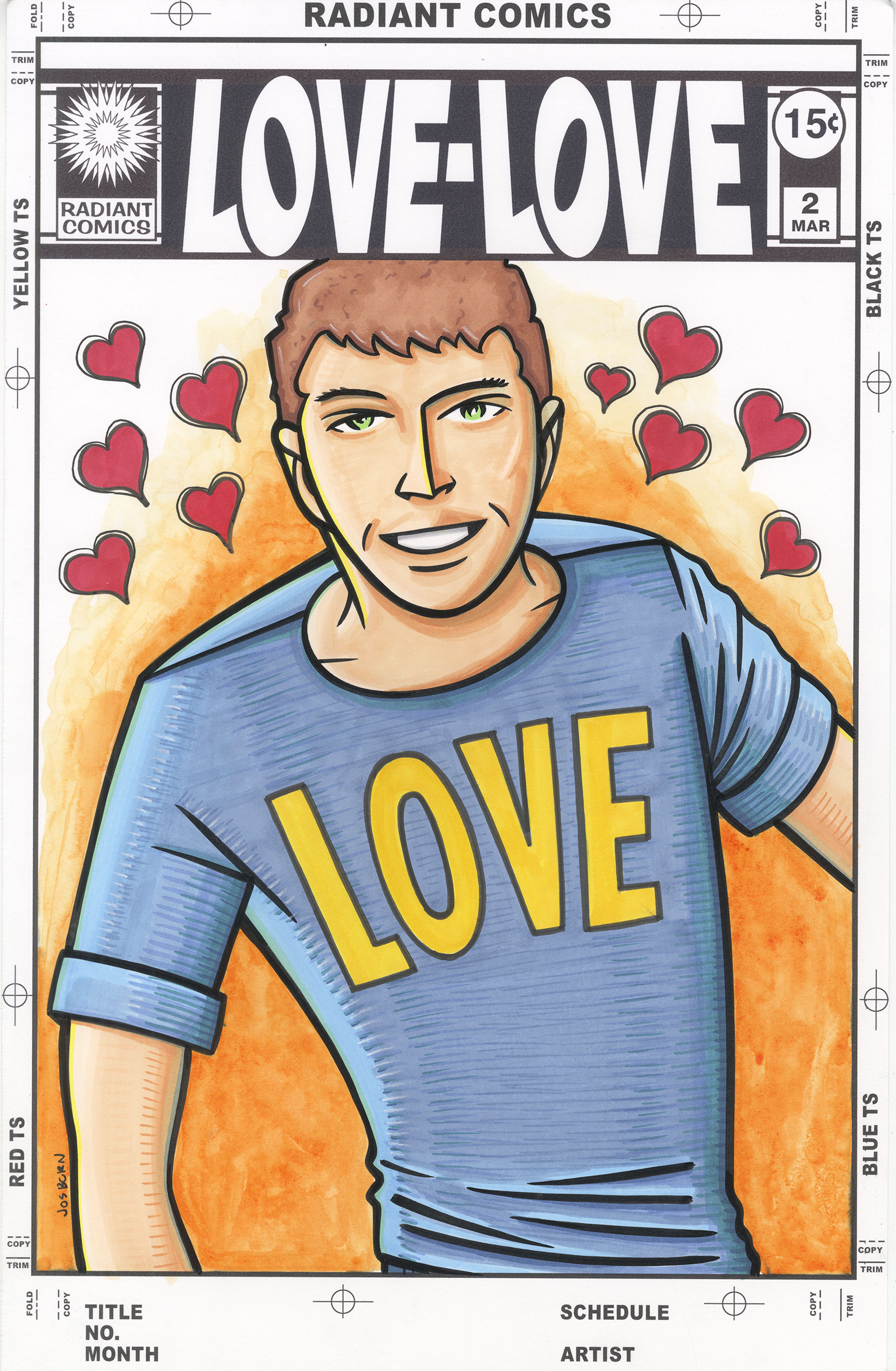
What I ended up doing was using some asymmetrical symmetry. The illusion of symmetry. The “V” is the same because it was symmetrical to begin with, I skewed both the “L” and the “E”, but then I flipped only the center hole of the “O”. There is still a lot of space between the bottom of the “V” and the “E” but with the “O” still close that distance doesn’t matter as much. I kept the relationship between the outside of the “O” and the “V” the same in both words and that seemed to solve my problem. It sounds like a simple and fast solution but it was not. It took a long time to get correct. That and I reshaped a lot of the “E” and “L”. They don’t look exactly as they started.
After getting the logo correct the rest was easy. I made a drawing, Inked it, colored it with marker, and then for a finishing touch added some colored ink to the background. In the end I like how it came out. It’s colorful and positive. I’m putting some up on eBay for people to buy too. Take a look. http://http://www.ebay.com/itm/161880808164?ssPageName=STRK:MESELX:IT&_trksid=p3984.m1555.l2649
I’m back from the comic shop this week and I got seven new comics and a hard cover collection.
Check them all out here:
Since I wrote last week about the summer TV season I thought I’d write this week about the new fall TV shows that premiered. There has been a couple of interesting news shows but mostly returning ones and some fair to middling new shows. But of course that is fair to middling in the category of shows that I actually like. A mediocre show that I don’t watch is a whole other category.
First up is “The Grinder”. This is a new Rob Lowe half hour comedy and I like it. He plays a big time actor who just came off a long running TV series where he played a lawyer. He’s moved back to his home town where his family still lives and has inserted himself into his brother’s law firm. His brother and father are actual lawyers. It’s a bit of an absurdist comedy with a good supporting cast and lots of family dynamics. I like it but it needs better ratings if it’s going to get a second season.
Then there are the conspiracy/mystery/action shows. There seem to be a lot of them these days. The first one is “Quantico”. It’s about a bunch of FBI recruits. Half of it is told in flashback and half of it in the present. The flashback part is their days at the FBI academy and the present part is just after they graduate. One of them has been framed for a terrorist attack and is on the run trying to prove her innocence. I like the present parts better than the flashbacks. The flashbacks seem a little absurd (and not in a Grinder good way) as everyone seems to be hiding a secret. It should also be called “Models Join the FBI” because the whole cast is ridiculously good looking. This one is doing well in the ratings.
Another of those shows is “Blindspot”. That’s the one with the woman who is dropped off in the middle of Times Square covered in tattoos with no memory. And the tattoos are clues to future crimes. It’s an okay show. Every week they figure out a clue and go stop a crime. I find amnesia to be a gimmicky storytelling device so I mostly ignore that part. This one is also doing well in the ratings.
The third in conspiracy/mystery/action genre is “The Player”. An ex-soldier gets dragged into stopping bad guys by a mysterious group of people who like to bet on if he can stop the bad guys or not. And someone may have kidnapped his estranged wife after faking her death. Or she’s dead. He has to fight for justice and find his wife. This one is mostly action and isn’t doing too well in the ratings. It’s not expected to last but I’ll probably watch it until the end.
I think there is only one new show in my favorite genre “The quirky detective” genre. That would be “Limitless”. It’s based on a movie I’ve never seen about a pill that can make you smarter. There is conspiracy stuff going on in this one too (I think that’s a prerequisite for crime dramas these days) but it’s mostly crime solving stuff. Like most quirky detective shows this one relies on the lead character’s wit and charm to carry the show and they do a good job of it here. I think this one is doing okay in the ratings. We’ll see if it sticks around.
The weirdest new show I’ve started watching is “Crazy Ex-Girlfriend”. I guess you’d call it a comedy/drama. It’s about a twenty-something high priced NYC lawyer who chucks it all to move to a small California town where her boyfriend from the summer she turned sixteen lives. It’s got craziness, comedy, and elaborate musical numbers. It’s so weird that I can’t imagine it’ll last very long but I like it.
Now I’ll run down some returning shows I watch.
Agents of S.H.I.E.L.D – I like this one. It’s the only Marvel or DC superhero show that I watch. It doesn’t have much super heroics in it and that’s just fine with me. It’s got a good cast and some snappy writing as they go about their adventures. That’s all I ask.
The Big Bang Theory – I know this show has worn out its welcome with some people who are too cool for the room but I’ve been watching it since the beginning and think it’s solid.
The Blacklist – This show has picked up for me every season. It’s in the conspiracy/mystery/action genre and has done a good job changing every season. I didn’t even like it at first and stopped watching but then gave it another chance with season two and kept watching. I’ve liked season three the best so far.
Bones – In its eleventh season and still plugging along solving crimes. It might not hold a lot of excitement for me and at it’s worst is pretty dull but it’s still an okay procedural and almost falls into the quirky detective genre. At least it’s got a hero that believes in reason. I’ll take that.
Brooklyn Nine-Nine – A show that has gotten funnier as it goes along. An ensemble comedy about police detectives in Brooklyn. I’ve heard it called a modern “Barney Miller” and I’ll go along with that. It’s goofy, witty, and funny.
Castle – Once again a mix between the crime procedural and quirky detective genres. In its eighth season I know what to expect from it and it delivers. Solid, light, and occasionally heavy police stuff.
Fargo – Just started a new story arc that has all new characters and the same quirky style as the first season. I’ll give it a watch.
iZombie – If you liked “Veronica Mars” (and I did) then there is a solid shot you’ll like “iZombie”. It’s more fantastical and less down to earth but has the same witty style.
The Last Man on Earth – I liked the first season of this one but didn’t love it. This second season has started out much stronger and I hope it’ll keep being good. I think this show has potential.
The Middle – Solid family sitcom. I didn’t like it much at first but it grew on me. I’ll keep watching it.
Modern Family – Still a well made, funny, witty, and creative family comedy. I can see why this one wins awards because there is a lot of talent and imagination in it. And it tries really hard. In a good way.
Scorpion – I can’t tell if this show is ridiculous on purpose or by accident. Either way I find it amusing. Not great but amusing. Some shows are fine because you can half pay attention to them while doing something else.
The Simpsons – Been watching it since season one and I still like it. I don’t care that other people think it’s not what it used to be.
Supernatural – Eleven season in and they still find a way to make it fresh. Shows like “Bones” and “Castle” I still like but know what to expect. With this one they keep coming up with new stuff even within the monster hunting formula. I admire the imagination put into it.
Undateable – A half hour comedy that is now broadcast live on Friday nights. I like it. They’re trying hard to made me laugh and succeed often enough.