This week I’m pulling a painting off my shelf to take a look at. It’s a bit of a random process as my eight by ten inch acrylic on canvas paintings are in envelopes so I can’t see which one I’m grabbing. It’s not quite random as the first painting I grabbed was one of the few abstract paintings that I’ve done and it was not very good. I’m much better when working with images because that’s what interests me but every now and then I’ll attempt to make a painting without an image. I know enough about painting to pull it off but I don’t find them very interesting so I wasn’t about to write about one.
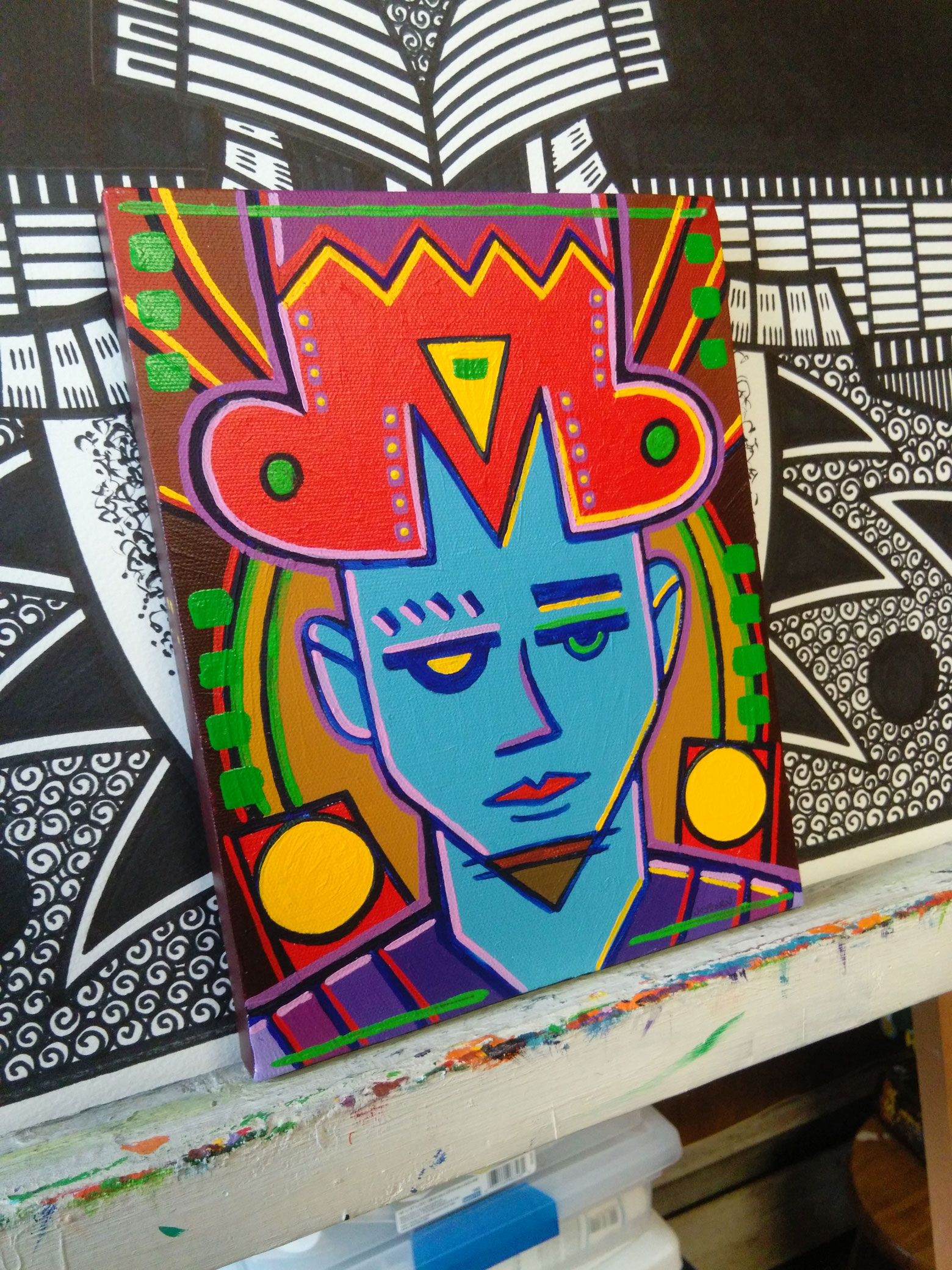
The one I pulled off the shelf is called “The Hold Down” and has the date on it October, 30, 2009. Six years ago. Time does keep moving along. As I look at this one I don’t remember making it yet it does look familiar. That’s probably because it has the motif of a face that I like so much. But it might be a little more than that. This face came from one of my small drawings that I do in my ink book. Those are where I do my spontaneous drawings in ink but I notice I have certain habits. Shapes that I tend to repeat when I start a drawing. Often I consciously stop myself from repeating them and sometimes I go along and see if I can vary the theme from the other times I’ve made such a shape. The headdress/hat on this fella is such a shape.
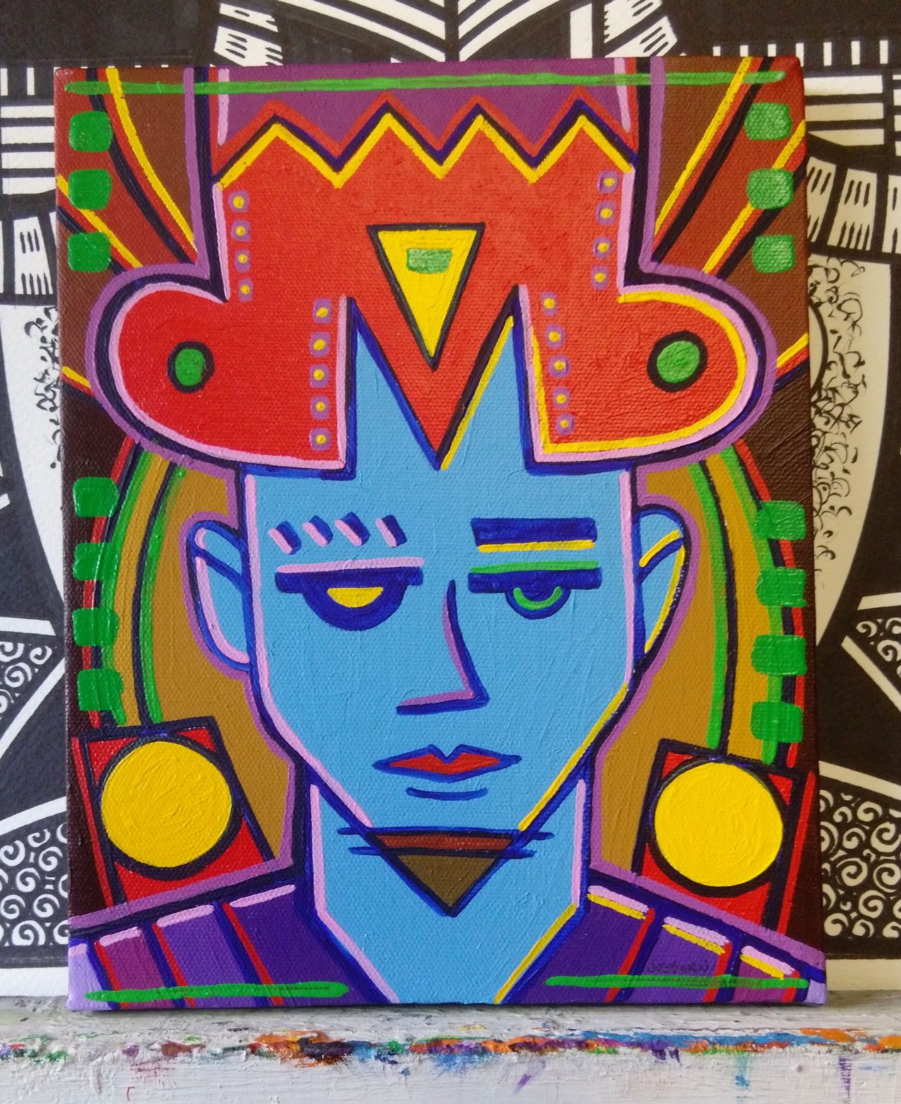
I can tell that when I first made the small drawing of this I started the pen in the upper left, dragged it dawn, and then swooped it around to form the left side of the hat. I can just tell. Straight lines and then swoops in the upper left is a motion I repeat often. I must have wanted to break that motion up after I did it because I made that “M” shape in the middle of his forehead. That is not a shape I make very often. I’m guessing that “M” shape also informed the rest of the drawing and made me decide to make the drawing symmetrical. As I’ve written before I generally use asymmetrical symmetry, the illusion of symmetry, but here I’ve got the real thing going on. Of course it’s not perfectly symmetrical but near enough so that I’d call it symmetrical.
I think there is also a familiarity to symmetry that also makes this painting seem a bit familiar. We’re used to symmetrical things so when we see them they fit into out world. Symmetry is part of the everyday industrial design of the world. From cars to TVs to phones most of the stuff we use has a symmetrical design. It’s familiar. Just like faces.
The first color I notice in this painting is the light blue of the face. Not the usual color for a human face so it right away establishes the fictional world of this painting. But it still doesn’t look especially fictional. I think the symmetry also has something to do with that. There is a general coolness to the whole painting due to that blue. The second most dominant color is the hot red of his hat but that is tempered by all the pink. If you mix blue and red you get purple and there is quite a bit of purple in this painting but it tends to be on the side of the blue.
The lines of purple and pink that surround the face both have a lot of white in them and therefor are not strong colors on their own and so can be influenced but the colors around them. Up near the hat they tend to look warm because of the red but they cool down near the blue. And since there is more blue the whited up lined help cool the painting down.
The yellow exists in a world of its own. It’s the whitest white, the brightest bright, in the painting but because of the symmetry it’s rather static. Normally, being so bright, the yellow would move a little more forward to the eye but here it’s more locked in place by the composition. Those two large circles of yellow can become like headlights if you stare at it but that takes a moment. All the yellow shines only once my eye unlocks it from the composition.
The painting sits on a neutral ground of browns. A red brown and a yellow brown are mixed in there but they all stay in place and generally don’t add to the warmness of coolness of the piece. They’re the colors that the bright ones bounce off.
The green bits are a bit odd. They seem to almost disappear. They end up framing the whole piece but in general don’t get too involved in the fight between warm and cool and the fight between foreground and background. They just exist along the edges. It’s a bit weird to me since I don’t usually use color like that but I bet it’s all a consequence of my decision to go with symmetry.
I’ve written mostly about the color and not much about the face because there isn’t much to it. The face is drawn with just about as few lines as possible and doesn’t stand out much on its own. It’s here that the asymmetrical symmetry lurks though. If I had drawn the left side of the face exactly as I had drawn the right side it would be a really boring face. That’s what I find with these faces that I draw. I can’t usually draw the different halves of the mouth or nose too dissimilar from each other so it’s the eyes that get distinct from one and other. Here I went with sort of a robot eye on the left with a yellow glow. It make the whole thing slightly otherworldly. Some sort of alien or robot is winking at you. Or that’s just how he looks.
In the end I have a lot of questions about this image. Who is he? Where is he from? What does he want? I have no answers to any of those questions and his face doesn’t give a lot away. But I never liked easy answers.
Discussion ¬