I’ve been working this week on some of my faux comic book covers. My “Covers to comics that don’t exist” series. I’ve got a bunch of different comics in that series with logos and trade dresses all set up for them. The Painted Lady, The Enigma Prism, The Bronzeman, and Fascist Planet are examples of my fake comics. Or maybe they’re hypothetical comics. The covers are real after all. This week I came up with another one and it came together in a different way than they normally do. What is the normal way you ask? The normal way is that I decide I want to create a new series name and logo and then that’s what I do. That’s pretty straight forward. Weirdly this one was not.
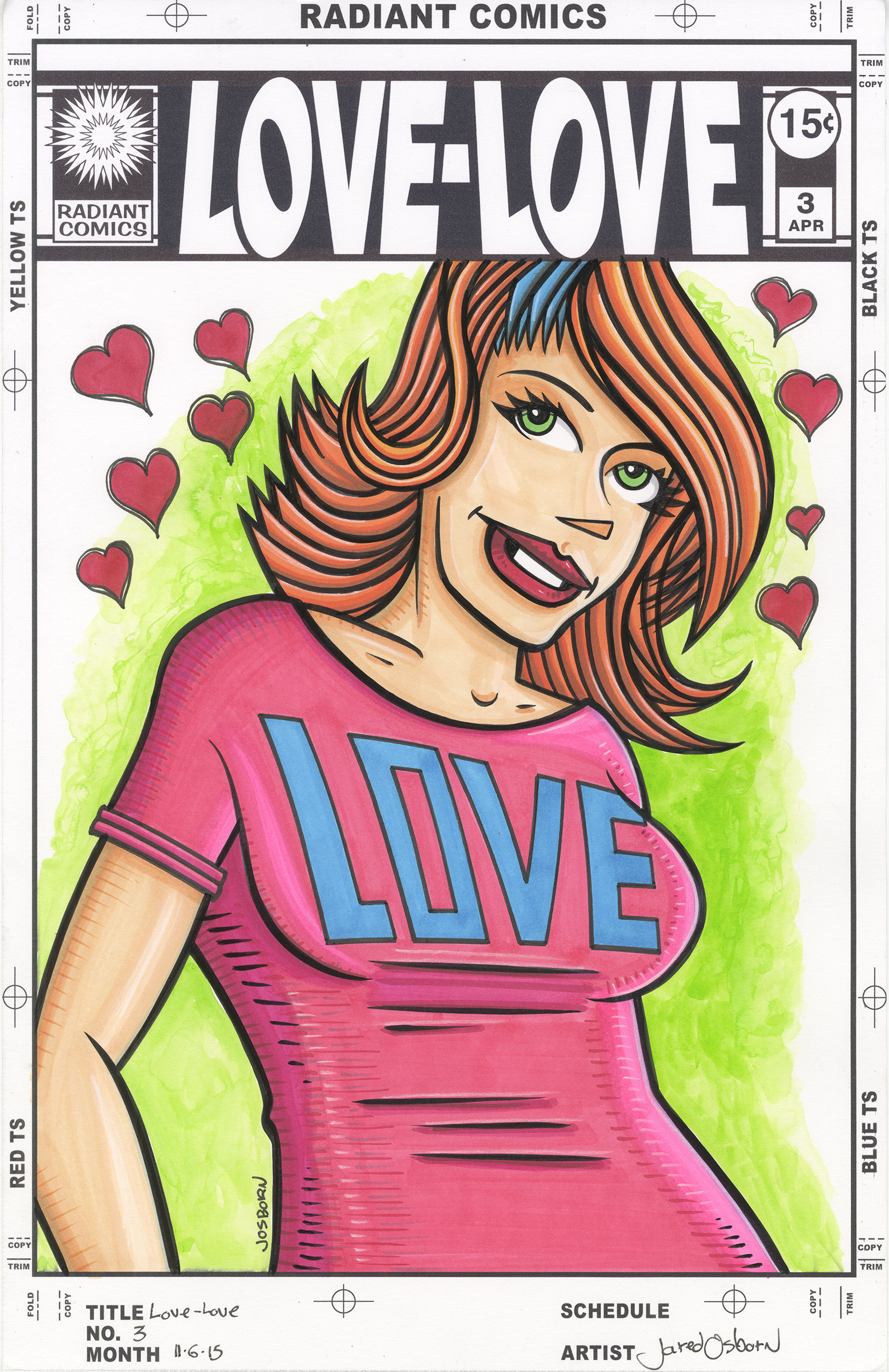
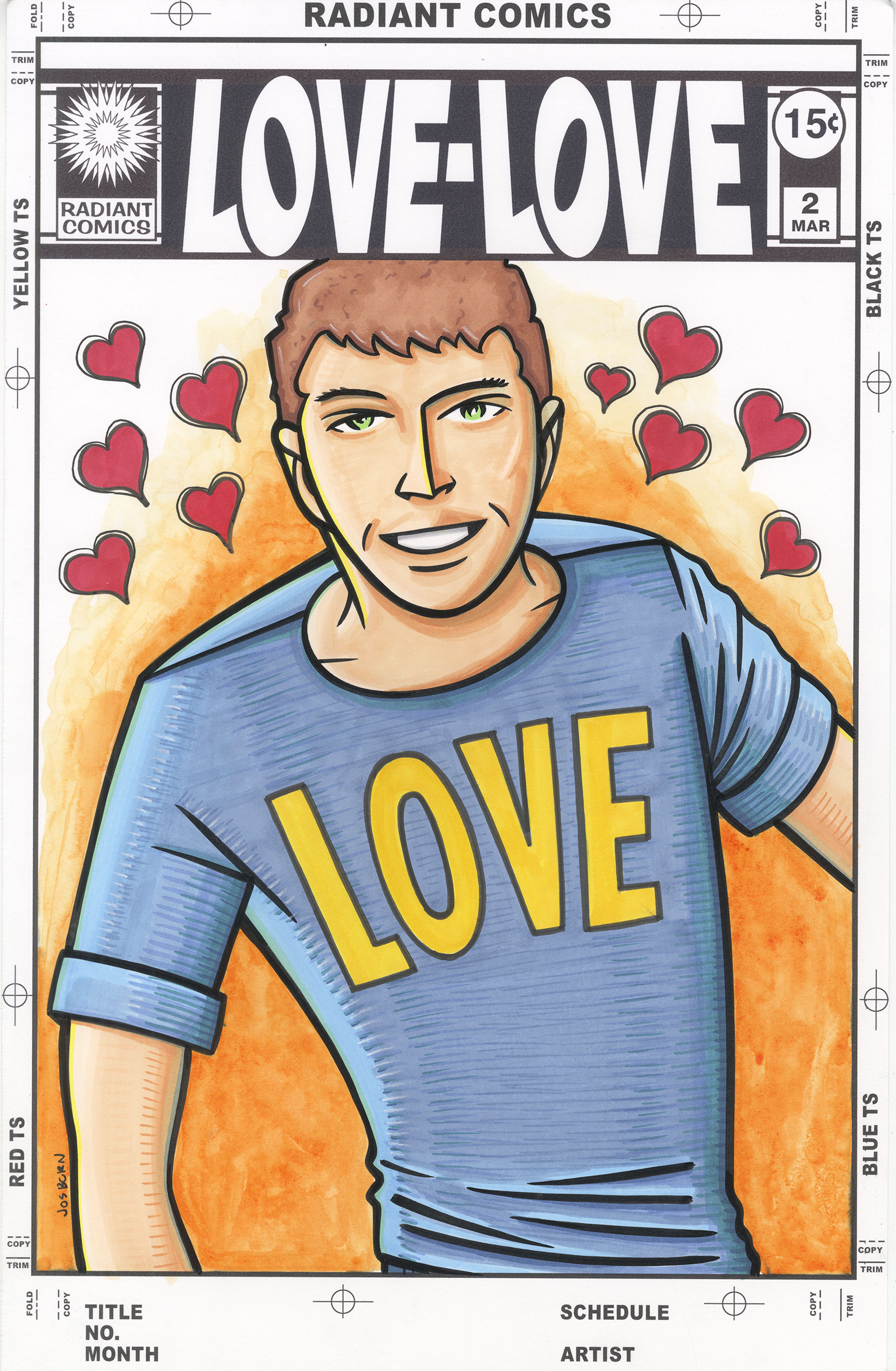
The new fake series I came up with is called “Love-Love”. I’m not sure the exact starting place for creating it but I remember wanting to work with something positive. A lot of my series are dark and strange so I wanted something more upbeat. Besides that general thought things started with my “Message Tee” comic strip. That’s the strip I run on Saturdays where a person is standing in T-Shirt that has a message on it. To do that strip I drew a lot of different characters in Tee-Shirts. I put the words onto the shirts with the computer so the drawings all have blank T-Shirts. I have about 150 nine by twelve inch ink drawings of people in T-Shirts. A few weeks ago I pulled a few of those drawings off my shelf to color them. It was something that struck my fancy at the time.
The first thing I knew I wanted to do was to put something on the shirts. I didn’t want them to be blank but I also didn’t want to be drawing a lot of words on them. Back in the 1990s I made a comic book called “Delia Charm” and she wore a shirt with the word “Love” on it. Since I was looking for something positive I thought that would do the trick. Typographically “Love” is an interesting word to deal with. It has two rectangular letters on either end with a eclipse and diagonal in the middle. It has to be balanced just right but it can be worked with. I did just that and then grabbed my markers to color the now “Love” clad person. Things went well and I colored a few drawings. I liked them. Then I stopped.
Another thing I’ve been working on lately is my “Painted Lady” faux comic book covers. I made a few of these but was tired of doing them. I wanted to make some more covers but had nothing in mind for what I wanted to do. I wanted something positive with some sort of mass appeal to it rather than my usual weird quirkiness so I cast my mind about for what interested me. I though of my punk rock romance comic cover from this summer but those are a lot of work. They take days. I wanted something quicker and that’s when I thought of those “Love” shirt drawings. They were positive and I thought I could make them into a romance comic cover. A nice single figure cover. But what to call the comic?
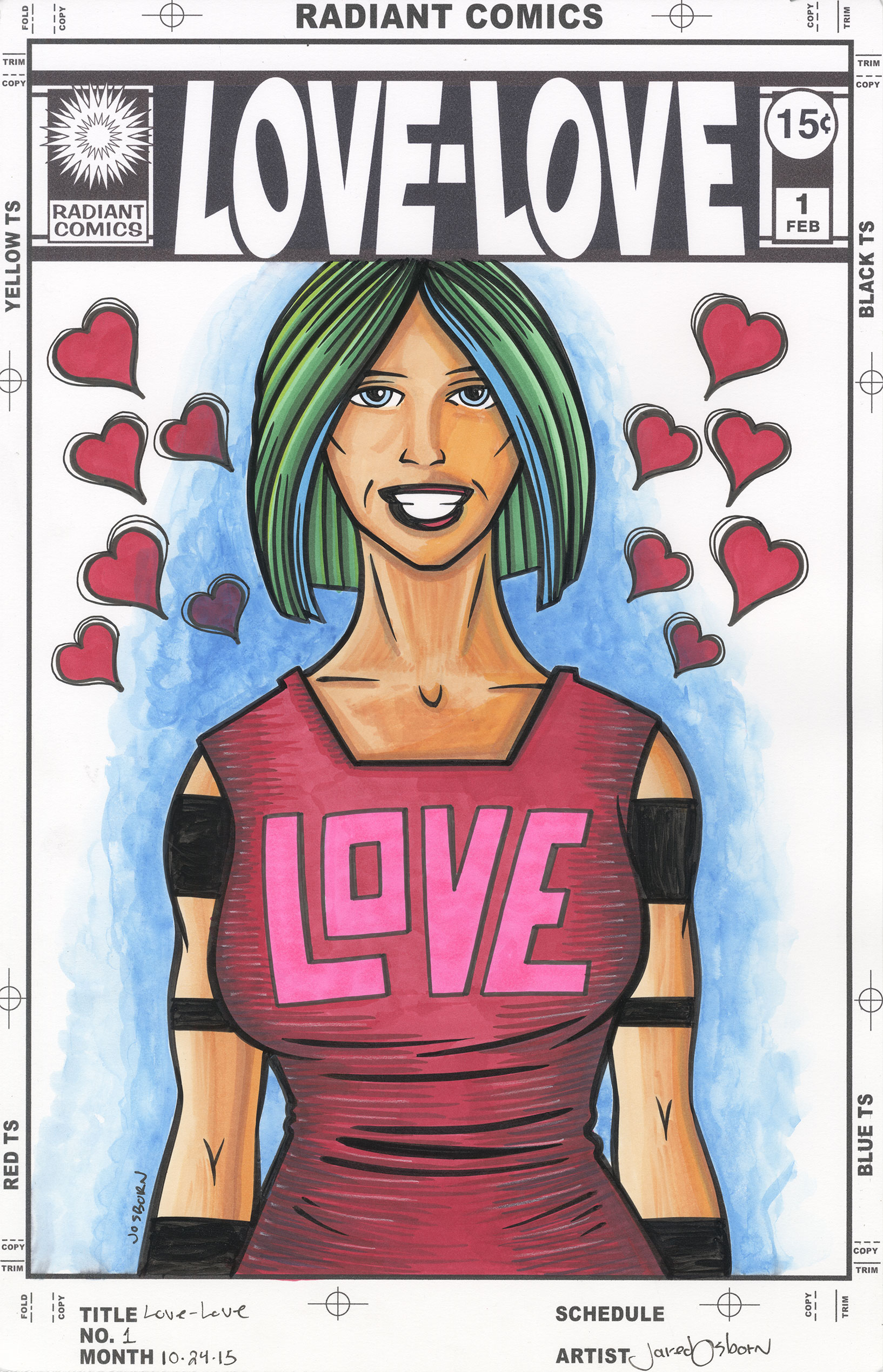
As simple as the name “Love-Love” is it took me a while to come up with it. Names can be tricky. It took me even longer to make the logo. Though the logo looks simple it took me the better part of a day to do it. I’d say six hours. Simple is often deceptively hard. A lot of comic book logos these days are really just a word in a computer font and that’s exactly what I didn’t want. I made the logo on the computer and started with a font but wanted to end up with something that was more than just the word “Love” in a display font.
My initial idea was to have the word “Love” twice with both of them tilted towards the hyphen in the middle. The left “Love” skewed to the right and the right “Love” skewed to the left. It sounded like a good idea but turned out to be impossible to do. It’s all because of the shape of the letters. The first “Love” was actually easy. It tilted to the right with barely a hitch. I even curved the bottom of the “L” to match the curve of the “O”. But when I tried to tilt the second “Love” to the left things didn’t go well. It’s all about the spacing.
Initially I tried to get the angle things tilted left to be the same number of degrees when tilted right. This opened up way too much distance between the “V” and the “O”. Y’see the “V” is symmetrical but none of the other letters are. So as the angles of the “O” and “E” changed around it the “V” remained the same. It was now too far from the top of the “O” and the bottom of the “E”. I messed around with those angles for a good long while but could never get them to look right. Sometimes symmetry makes things look unbalanced despite the math being right.
What I ended up doing was using some asymmetrical symmetry. The illusion of symmetry. The “V” is the same because it was symmetrical to begin with, I skewed both the “L” and the “E”, but then I flipped only the center hole of the “O”. There is still a lot of space between the bottom of the “V” and the “E” but with the “O” still close that distance doesn’t matter as much. I kept the relationship between the outside of the “O” and the “V” the same in both words and that seemed to solve my problem. It sounds like a simple and fast solution but it was not. It took a long time to get correct. That and I reshaped a lot of the “E” and “L”. They don’t look exactly as they started.
After getting the logo correct the rest was easy. I made a drawing, Inked it, colored it with marker, and then for a finishing touch added some colored ink to the background. In the end I like how it came out. It’s colorful and positive. I’m putting some up on eBay for people to buy too. Take a look. http://http://www.ebay.com/itm/161880808164?ssPageName=STRK:MESELX:IT&_trksid=p3984.m1555.l2649
Discussion ¬