I’m back from the comic shop this week and I got eight new comics.
Check them all out here:
Comment
I’m back from the comic shop this week and I got eight new comics.
Check them all out here:
Time to pull out a piece of my art and take a look at it. I don’t feel like digging out anything old so I’m going to give a look to a recent piece that I still have lying about the studio. I usually have a bunch of pieces around the place and it’s only after they pile up for a while that I take a day and try to organize them all and find a place for everything.
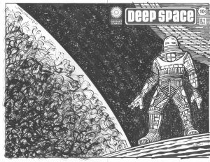
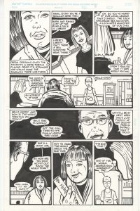
I’ve been making a lot of hand bound sketch covers lately. That’s when I attach a drawing onto a printed comic book to make it into a new cover. I draw a piece on Bristol board, cut it to size, pull the staples on a comic book, wrap the drawing around the comic, and put the staples back in. It’s a twist on the sketch covers that comic book publishers sell. They sell comic books with blank covers so a fan can get his favorite artist to sketch on.
I’ve been doing series of these comic book covers but the one I’m looking at is a singular one. It’s “Deep Space” number twenty one. That’s a pretty high issue number so it doesn’t sound like a singular one and it’s not really. It’s the only one I’ve done as a sketch cover. I’ve made a bunch of “Deep Space” drawings as part of my “Cover to Comics That Don’t Exist” series. I also refer to that type of drawing as my “Faux Conic Book Covers.” That series is 10×15 inches on 11×17 inch paper. “Deep Space” twenty one is at comic book size. About six and a half by ten inches but since it’s a wrap around cover you can double the width to thirteen inches. When it’s in a comic book bag it’s at half width.
The “Deep Space” series started as some small thumbnail sketches. Instead of my usual method of making a series of drawings that get bigger as I figure things out I worked just from my thumbnails for “Deep Space.” I wanted to keep the drawing loose and spontaneous. I wanted strange spacesuits and a sense of loneliness. I wanted to keep things simple. I think I may have erred on the side of “Too simple” for the series but I’m looking at just this one and not the series today.
I like this one better than when I finished it. I’ve know a lot of artists over the years who were their own worst critics. They hated everything they did. That’s a tough way to live as an artist. I’ve consciously tried not to do that and judge my work as objectively as possible. It’s not always easy to do. When something doesn’t come out as I wanted it to it’s tough to think of it as anything but a failure. I’m lucky that doesn’t happen to me too often but it did with this one. I finished it and then didn’t like it. I had to remove it from my sight. That’s what I do when something doesn’t come out right.
Now it’s a few weeks later and I pulled it out of the pile to give it another look. I like it better now. There is a weird awkwardness to the figure that I hated when I first finished it but now I like it. The person is having trouble standing in this strange alien landscape and so is not at ease. He has a wide stance but it’s not a very stable stance. I wonder how long he’s going to be able to stand on that spot? Adding to the awkwardness is that his arms are long and his legs are short. Strange proportions for a strange space.
In all of my “Deep Space” drawings the spacesuits are different from one and other. I make them look bulky but other than that they all have different shapes on them. I use a side-of-the-brush technique to make a rough line that is the opposite of hi-tech. Some of my spacesuits look like they are made out of hay. I like that strange dichotomy. Sometimes I think it doesn’t work though so it’s a challenge to draw one that I really like. This one is okay except that his underpants area looks like the bow of a ship. I keep noticing that and it’s bonkers.
The art takes on a different tone when I open the comic up to see the full wraparound cover. Outer space is all around him and there is a large planet or moon to his left. The space behind him opens up and he gets swallowed by it more than he was when we could only see the front cover. I also think the moon near his head grows in prominence as the space gets wider and the smaller moon can be seen in opposition the the bigger moon on the left. Now he’s caught between two large forces.
I’m not sure about the stars I made in the background. There are a couple of acceptable techniques for making stars in ink and they involve splattering ink with a brush or toothbrush. I’ve done the techniques many times but didn’t want to here. Since I was using a rough-brush technique for the planet on the left I decided to use that some rough brush to make stars. The reason I didn’t want to use the toothbrush technique is that I find it sometimes calls too much attention to itself as a technique. I don’t think I dodged that here. The stars still look “Technique-y” to me. Oh, well, you can’t have everything.
One final thing about this cover has to do with the white line around the figure. I never liked the technique of outlining a figure against a black background but for some reason I did it here. I think I was trying to give the suit a little more bulk rather than an outline as a graphic element but in the end I think I just made the figure look shaky. He seems to be trembling a little bit. I don’t hate it but it’s another uncomfortable element in a drawing that’s not about comfort. It does a good job but I’n still not sure if I like the outline. Hey, at least I can look at the cover and enjoy it a little now.
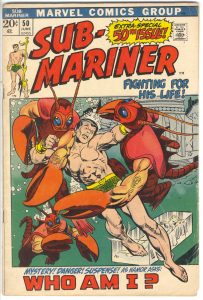
Today I feel like analyzing a comic book cover. For a short time I did this every week on this blog but these days it’s every now and then. The cover I’ll look at is Sub-Mariner #50 which has a cover date of June 1972. That means it was on the stands in March of 1972 since publishers forward-dated their comics so they could look new for longer. It’s pencilled by Gil Kane and inked by Vince Colletta. I looked it up and the cover lettering is credited to John Costanza. The lettering is a big part of this cover so I’m glad I was able to find a credit for it.
First of all this is a Marvel Tenth Anniversary cover. That was the period of time, in the early 1970s, when Marvel used a box on all of their covers as part of the design. In the early 1990s I asked John Romita why Marvel went with that design and he told me it was for a tenth anniversary. Though he couldn’t quite remember what it was the tenth anniversary of. It had to be of Fantastic Four or Spider-Man number one since they come out in the early 1960s. I’ve heard a lot people complain about the “Box covers” but I mostly like them. I think the design works plus a whole lot of them were drawn by Gil Kane and he could draw a nice cover.
I really like the drawing on this cover. Gil Kane was a master of figure drawing and he did an excellent job with the main figure. The Sub-Mariner looks like he’s swimming and fighting and that’s not easy to capture. The crab/lobster people look pretty darn bizarre but in a good way. I don’t think I’ve ever seen anything quite like them and they give me the feeling that they could give Subby some trouble. They may not be the scariest monsters ever but they’ll do. The way that human arm turns into a claw is pretty weird.
I’m not fond of the background art on this cover. There are some ruins in the upper right which are serviceable enough but it’s the woman in the giant ice cube that doesn’t work for me. It seems tacked on. The perspective of the cube is off and that throws off the whole composition. Gil Kane was usually a master of perspective so maybe the woman was drawn in later but someone else. The left side of the drawing with no background at all works fine. The bottom crab-man looks like he’s coming out of the depths of the ocean. So that’s good.
The inker, Vince Colette, is famous for being the guy editors went to when they needed a job done in a hurry. As a consequence he got the nickname “Destroyer of Armies” for his habit of erasing backgrounds and detail in a effort to get the job done on time. He was talented but under those circumstances his inks were often not very good. The problem I have with his inks are “Who knows what he could have erased and therefor affected the piece?” His inks on the Sub-Mariner’s figure are good and he captured some nice feathery detail. But did he erase things from the background? I have no idea.
There is a lot of type on this cover (called cover copy), maybe too much type, but it’s well balanced. I say “Too much type” because that’s always the question with comics of this age. So many comic book covers were brought down by too much cover copy that whenever I see a copy heavy cover I (and many other people) question it. We’ve been in the age of minimal cover copy for so long that it seems odd to see so much type. But I think I like this one.
The “Sub” in “Sub-Mariner” was shifted left to fit in the 50th issue blurb and it fits well. The “Fighting For His Life” also fills a spot left by the rise of the logo while bridging the logo and the design box. The copy on the bottom also drops in nicely. The main problem I have with all the type is that it doesn’t tell me a lot about the story. It’s generic type that could be on any cover. And what the heck does “Who Am I?” mean? Does Namor (that’s the Sub-Mariner’s real name) have amnesia? Is it an identity crisis? I don’t recall the plot of this issue at all so I have no idea. Though I think it’s well done, the type doesn’t entice me at all the look at the comic. Even the “50th Issue” blurb is only a few inches from the actual issue number so what’s the point?
I wish I could find a credit for who colored this cover but there probably isn’t one. I know that George Roussos came on staff at Marvel sometime in the 1970s and colored a lot of their covers but I’m not sure if he did this one. I think Marie Severin colored a lot of them before that so it could be her too. Either way I like the blue/green they used for the ocean with a little bit of an airbrush effect as it went up. The mix of the reds and oranges also work for me and make this a very warm cover. Warm with the coolness of the sea is an interesting juxtaposition. I dig it.
All-in-all I have to say that I like this cover. I’ve had it for a long time and used to collect Sub-Mariners from this era because there were so many good covers. They were already about five years old by the time I ever got them but since Namor was never that popular people (kids around the neighborhood actually) were always willing to sell then to me way back when an old comic would cost you a nickel or a dime. I think I found some at garage sales too. Those were the good old days.
I’m back from the comic shop this week and I got six new comics.
Check them all out here:
I’m a pretty well ordered person. A place for everything and everything in its place. Well, almost. Things are not always neat but I know where things are. Everything might not always look in place but that’s because I need a lot of stuff at my fingertips. What exact stuff isn’t always easy to figure out because they change all the time. Other things always have their place. I’ve got my large paintings stacked in a rack, small paintings lined up on a shelf, and things drawn on paper tucked away in cabinets. But there is one place where things are not quite so ordered. The flat file of orphaned pages.
I have two tables in my studio. One is my drawing table where I get my drawing done (plus any other work that needs to be done on a flat surface) and the other is in the corner of the room and holds all sorts of supplies. I have brushes, inks, rulers, and other stuff on the table. In order to save space and increase storage I put drawers under the two desks. My drawing table has two 11×17 inch drawers side by side under the drawing board that I put work in progress in. Those are easy access drawers. Under the storage table are two flat file type shelves. They don’t pull out. I just stuck a thin 16×20 inch and a 11×17 inch board with about two inches clearance between them. I can slide pages into this small shelves for storage but they’re in a cramped spot so they don’t have easy access. Over the years what got stored on those two shelves were “Out of sight, out of mind” pages. Usually unfinished stuff.
I have a lot of stuff around that is in various stages of finish but I don’t have a ton of unfinished stuff. To me unfinished means “Never to be finished.” Unfinished means abandoned. It’s a permanent state. There are a few things under that table that are unfinished. Pages and drawings from over the years. I think I put them under there so I don’t have to look at them. Unfinished bothers me.
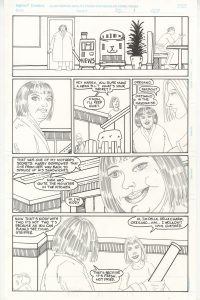
The one thing that jumps out at me from that piles of pages is my last, unfinished, “Delia Charm” story. Back in the late 1990s when my friends and I self-published our comics my part of it was “Delia Charm” stories. We put out six issues and sold almost none of them. That’s the late 1990s and indie comics for you. I made a couple more “Delia Charm” stories for my mini comics after that but those were the last ones to see any kind of print. This final story was a ten pager that I must have been making for a mini comic or some such. But then I gave up and moved onto other projects. That kinda makes me sad.
What’s weird about this ten page story is how much of it I had done. Out of the ten pages two are completely finished. The other eight are written, pencilled, lettered, and even have the background inks done on them. That means I had just the figure inking to go. I’d say it was at least 80% finished. But then I just stopped. All these years later I’m not exactly sure why. I guess it’s because I had no outlet for it. It would never see print as I was tired of making mini-comics and webcomics weren’t quite a thing yet. So it became abandoned.
I notice a couple of things about how I made these pages that are different than how I usually did things. First of all it was before I blue lined all my pages and instead I blew up my thumbnail drawings on a photocopier and used a light-box to transfer the layouts to the Bristol board I made the finished pages on. A few of the photocopies are with the pages. I think I only worked that way a few times as often I would draw on tracing paper and then light-box those onto the Bristol. I computerized in the mid 1990s and by the late 1990s I switched over to scanning in my layouts, blowing them up in Photoshop, and then printing them out in blue line for me to draw or ink over. That’s the method I use to this day.
A second odd thing about this unfinished story is the lettering. It’s a hand lettered piece over digital lettering. This might be the only time I did that. I’m guessing that I hand lettered all the other “Delia Charm” stories and so wanted to hand letter this one too but I did it in a different way. I can see on the remaining photocopies of the layouts that I typed out all the lettering on the layouts. That way when I light-boxed the layouts I could hand letter right over the top of the digital lettering. All my spacing was worked out. I was never a fan of doing hand lettering so I’m betting this made things easier. But not so easy that I didn’t switch over to digital lettering like everybody else did.
A third thing I notice about this story was that my drawing of it was more casual. I simplified things from my other “Delia Charm” stories. The forms and figures are nearly as filled with illustrative detail as the earlier stories were. I stripped things down. I even stripped the story down. It has none of the other characters or plot lines from the previous stories. Instead it’s a story of Delia at a diner when she’s out for a drive. She meets an eccentric woman and talks with the guy who runs the diner. That’s it. Or at least I think that’s it because I haven’t been able to bring myself to read the story again. I feel a little guilty for abandoning it so I’m going by memory and by looking at the pictures.
So that’s the story of the drawer of abandoned drawings. Now I think I’m going to scan in these pages. I’m pretty sure they’ve never been digitized before.
I’m back from the comic shop this week and I got six new comics.
Check them all out here:

So what have I been reading lately? Comics. Mostly new comic books at that. I often mean to go back and read some long runs of old favorite comic that I have but that’s no easy for me to find time for. I won’t go into what new comics I’ve been reading since I post what comics I get every week on this very blog. It’s usually around five or six comics a week so that’s fair amount. Plus I read them all twice. I read them once and then sit them on top of my printer to be read again a week later. I find I get more out of my new comics if I read them twice before filing them away.
The first time I read a comic it’s often about the plot. What happens next. The second time I read the comic I catch more of the nuance. I’m not rushing along headlong with the plot and stop and so I appreciate the scenery. I often see different things in a comic the second time around. That second read can be a different experience from the first. I started doing this a few years ago because I was so quick filing away my comics that is was often like I never read the thing. Out of sight. Out of mind. Now a new comic hangs around in my sight for a week or two. I find it makes me more mindful of them.
One thing I’ve read a lot of lately is a magazine I have a subscription to. It’s called “The Sun” and I’d describe it as a literary magazine. A magazine that’s about writing. It’s filled with short stories, one interview an issue, essays, poems, and some photography. Some of the stories can be heartbreaking and a little depressing because the writing is all about real life and sometimes life can be a bummer. But I really enjoy the magazine and have been a subscriber since sometime in the early 1990s. That’s a long time.
For the first time ever last fall I stopped reading the magazine and let them pile up for six months. I have no idea why. I just didn’t feel like digging into it. “The Sun” is like that sometimes with me. I look at it, remember the more depressing stories, and don’t want to read it. When I get around to reading it I always love it and am a little sad when I finish it. This past summer I was also saving the magazine to read on my train rides into Manhattan when I went to take street photos. I think I was a little disappointed the summer was over. Anyway it happened I had six issues sitting there.
I read those six issues in about two weeks. Once I started I just kept going. I’d read a little here and there but mostly I stopped putzing around reading on the internet. That can really suck up reading time because it takes some time to find something worth reading. A half an hour can easily go by surfing the web. That’s a quarter of a magazine’s worth of reading time. I dedicated that time to “The Sun” and read up everything I had. It was a lot of fun.
The other magazine I’ve been reading lately is “Archeology.” That one comes out bi-monthly as opposed to “The Sun” which comes out monthly so there are half the number of issues of “Archeology.” I kept up with those and am in the middle of the latest issue. As a history fan I really like the magazine. Plus the front half of it is filled with short stories of bits of news and so is easy to read in small bursts.
Another thing I read every morning with my breakfast is a regular bunch of webcomics. “The Devil’s Panties”, “Least I could Do”, “Wondermark”, “Girls With Slingshots”, “Oglaf!”, “Something Positive”, and “Doonesbury” are all on my list. They don’t take up a whole lot of time but over the years it adds up.
I’ve given up reading paper books. With all my paper comics I don’t have the room for them. I’l sample digital comics but it I like a comic I’ll buy a paper copy of it. Regular books get read on the iPad. I really do enjoy reading text on the iPad. I have a whole bunch of books for it too that I’ve never read. Since I’m a member of Amazon Prime I get one free book a month from a handful that they send out. I always pick the one I’m most likely to read but since I don’t have a ton of book reading time I only get to one in ten. But I have read a couple of books that I bought for the iPad.
It was a while ago, maybe in the summer, that I reread “The Great Gatsby.” That was fun. I like it better than when I first read it many years ago. I’ve meant to reread “This Side of Paradise” too but haven’t yet gotten around to it. I’ve also read some books on the history of Christianity and the origins of some famous quotes. I told you I liked history.
The book I’m reading right now is a short biography of Roy Lichtenstein entitled “Lichtenstein in New York: A Pop Art Life.” Its written by a former Marvel co-worker friend of mine, Mark Bernardo, who I keep in touch with on Facebook. He posted his book was coming out and I thought it was right up my alley. As an artist I’m, of course, familiar with Roy Lichtenstein and we studied him back in art school but I’ve never read any kind of biography on him. I still have a few more chapters to go but I’m really enjoying it. It’s written well and I’m learning quite a bit. It does a good job capturing a moment in time when Pop Art broke onto the scene. It does a good job with the other times in the book too.
So that’s what I’ve been reading. What about you?
I’m back from the comic shop this week and I got nine new comics.
Check them all out here:
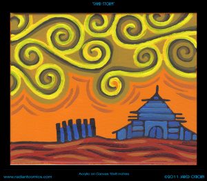
“Time really does fly” was the thought that went through my head as I looked at my painting “Sand Storm.” More accurately the thought went through my head when I flipped the painting over and looked at the date. July 25, 2007. We’re coming up on this painting being ten years old. It’s an acrylic painting done on an 10×8 inch stretched canvas. I pulled it off the shelf to look at and write about it. That’s what I do sometimes.
The first thing that strikes me about this painting is the orange. I really liked that orange paint but they stopped making it. I can’t remember anymore exactly what color it is but I think the brand is Winsor Newton. They replaced it with another orange that’s pretty good but falls just a little bit short for me. I use the new orange because it’s the best orange around but I still like this older version better. The orange is interesting in this painting because it’s the strongest color, yet it’s in the background. This means the eye fights to keep it in the background as the orange wants to come forward. It even peeks through the yellows of the sand storm. That keeps things lively.
I used two main techniques for making this painting. One was how I made the buildings and the other was how I made the sky. The building technique comes out of my sketchbook where I draw with a sign pen. That type of pen draws with a single weight marker line and over the years I started drawing buildings with it by making basic shapes and then filling those shapes with various angled parallel lines. It gives the illusion of architectural detail without being hemmed in by having to draw actual architecture. They’re art buildings. You wouldn’t want to really build them. Plus it gives the buildings a familiar but alien look. They don’t quite look like the building we know but they look like we could know them. They’re not so alien that someone might think, “What is that? Is that a Building?”
The buildings are different than the ones I draw in pen because of the color. The pen ones are all made with just a line and therefore the line is the positive shape and the space in-between the lines are the negative shapes. In the painting I used a black line to create the building but then I went in with color over the line and the color became the positive shape. Whatever brush stroke is on top becomes the positive shape. Its shape defines the shape that’s underneath it. So as you can see I use two different color blues in the house and the blue brush strokes are right overtop of the black paint. I even brought the blue into the fence on the left. I bet I was originally going to let the orange of the sky show through the fence but then decided it would look better with a touch of blue. I let the orange show through the top of the fence though.
The second technique is the spirals in the sky. I like spirals. Who doesn’t? I think Van Gogh’s painting “Starry Night” is one of his most popular painting because he has a couple of spirals in the sky. They’re more natural than my geometric spirals but they’re there. I think that may have been what gave me the idea for the spiral skies that I draw. I’ve always drawn spirals but they were usually in hair, in eyes, and in womens’ chests. I don’t think I used them in skies until right around this time. Spirals work well in paint. With ink they’re all about the graphic design but since paint has a more 3D surface you can build the spirals out of brush strokes. They sit on top of the canvas and become an object of their own. They become the subject of the painting rather than the design.
I wish I was masterful enough with the brush and paint to make those spirals with one stroke, in one motion but either my skills or the tools won’t allow it. I’ve seen videos of Chinese or Japanese brush master make all sorts of beautiful long brush strokes in ink on paper but the thicker acrylic paint that I use can’t do that. At least I don’t know how to do it. Instead I build the strokes up slowly. I go over them a few times to get the shape I want. Since the strokes are made up of three colors I moved back and forth between them until I decided on an order. The bright yellow ends up in front as the positive shape with the darkest brown helping to define the yellow’s place.
I don’t think much of the ground on the bottom of the painting. It’s just there. It’s only purpose is to provide a solid foundation for the picture. It gives the world its gravity. The color is a warm brownish red but it’s the closest thing to a neutral that this painting has. There is some action going on in the brush strokes but it’s minimal. I didn’t want it to compete with the sky and the house. The land should stay in its place.
Overall I think this is a fairly simple painting. Maybe because I think of landscapes a simpler than figurative painting. Simple isn’t bad either. I like simple. It’s not always east to achieve. We have the top third to half filled with spiraling sand, the middle with sand and orange sky, and the bottom third id the ground with a solid house on top of it. I bet there is some sort of classic landscape formula that landscape artists use for such arrangements but I don’t know of it. I more of a faces and bodies artist but every now and them I like to dabble. And I really like that orange.
I’m back from the comic shop this week and I got seven new comics.
Check them all out here: