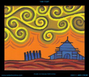
“Time really does fly” was the thought that went through my head as I looked at my painting “Sand Storm.” More accurately the thought went through my head when I flipped the painting over and looked at the date. July 25, 2007. We’re coming up on this painting being ten years old. It’s an acrylic painting done on an 10×8 inch stretched canvas. I pulled it off the shelf to look at and write about it. That’s what I do sometimes.
The first thing that strikes me about this painting is the orange. I really liked that orange paint but they stopped making it. I can’t remember anymore exactly what color it is but I think the brand is Winsor Newton. They replaced it with another orange that’s pretty good but falls just a little bit short for me. I use the new orange because it’s the best orange around but I still like this older version better. The orange is interesting in this painting because it’s the strongest color, yet it’s in the background. This means the eye fights to keep it in the background as the orange wants to come forward. It even peeks through the yellows of the sand storm. That keeps things lively.
I used two main techniques for making this painting. One was how I made the buildings and the other was how I made the sky. The building technique comes out of my sketchbook where I draw with a sign pen. That type of pen draws with a single weight marker line and over the years I started drawing buildings with it by making basic shapes and then filling those shapes with various angled parallel lines. It gives the illusion of architectural detail without being hemmed in by having to draw actual architecture. They’re art buildings. You wouldn’t want to really build them. Plus it gives the buildings a familiar but alien look. They don’t quite look like the building we know but they look like we could know them. They’re not so alien that someone might think, “What is that? Is that a Building?”
The buildings are different than the ones I draw in pen because of the color. The pen ones are all made with just a line and therefore the line is the positive shape and the space in-between the lines are the negative shapes. In the painting I used a black line to create the building but then I went in with color over the line and the color became the positive shape. Whatever brush stroke is on top becomes the positive shape. Its shape defines the shape that’s underneath it. So as you can see I use two different color blues in the house and the blue brush strokes are right overtop of the black paint. I even brought the blue into the fence on the left. I bet I was originally going to let the orange of the sky show through the fence but then decided it would look better with a touch of blue. I let the orange show through the top of the fence though.
The second technique is the spirals in the sky. I like spirals. Who doesn’t? I think Van Gogh’s painting “Starry Night” is one of his most popular painting because he has a couple of spirals in the sky. They’re more natural than my geometric spirals but they’re there. I think that may have been what gave me the idea for the spiral skies that I draw. I’ve always drawn spirals but they were usually in hair, in eyes, and in womens’ chests. I don’t think I used them in skies until right around this time. Spirals work well in paint. With ink they’re all about the graphic design but since paint has a more 3D surface you can build the spirals out of brush strokes. They sit on top of the canvas and become an object of their own. They become the subject of the painting rather than the design.
I wish I was masterful enough with the brush and paint to make those spirals with one stroke, in one motion but either my skills or the tools won’t allow it. I’ve seen videos of Chinese or Japanese brush master make all sorts of beautiful long brush strokes in ink on paper but the thicker acrylic paint that I use can’t do that. At least I don’t know how to do it. Instead I build the strokes up slowly. I go over them a few times to get the shape I want. Since the strokes are made up of three colors I moved back and forth between them until I decided on an order. The bright yellow ends up in front as the positive shape with the darkest brown helping to define the yellow’s place.
I don’t think much of the ground on the bottom of the painting. It’s just there. It’s only purpose is to provide a solid foundation for the picture. It gives the world its gravity. The color is a warm brownish red but it’s the closest thing to a neutral that this painting has. There is some action going on in the brush strokes but it’s minimal. I didn’t want it to compete with the sky and the house. The land should stay in its place.
Overall I think this is a fairly simple painting. Maybe because I think of landscapes a simpler than figurative painting. Simple isn’t bad either. I like simple. It’s not always east to achieve. We have the top third to half filled with spiraling sand, the middle with sand and orange sky, and the bottom third id the ground with a solid house on top of it. I bet there is some sort of classic landscape formula that landscape artists use for such arrangements but I don’t know of it. I more of a faces and bodies artist but every now and them I like to dabble. And I really like that orange.
Discussion ¬