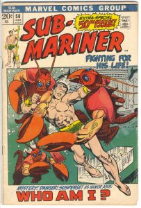
Today I feel like analyzing a comic book cover. For a short time I did this every week on this blog but these days it’s every now and then. The cover I’ll look at is Sub-Mariner #50 which has a cover date of June 1972. That means it was on the stands in March of 1972 since publishers forward-dated their comics so they could look new for longer. It’s pencilled by Gil Kane and inked by Vince Colletta. I looked it up and the cover lettering is credited to John Costanza. The lettering is a big part of this cover so I’m glad I was able to find a credit for it.
First of all this is a Marvel Tenth Anniversary cover. That was the period of time, in the early 1970s, when Marvel used a box on all of their covers as part of the design. In the early 1990s I asked John Romita why Marvel went with that design and he told me it was for a tenth anniversary. Though he couldn’t quite remember what it was the tenth anniversary of. It had to be of Fantastic Four or Spider-Man number one since they come out in the early 1960s. I’ve heard a lot people complain about the “Box covers” but I mostly like them. I think the design works plus a whole lot of them were drawn by Gil Kane and he could draw a nice cover.
I really like the drawing on this cover. Gil Kane was a master of figure drawing and he did an excellent job with the main figure. The Sub-Mariner looks like he’s swimming and fighting and that’s not easy to capture. The crab/lobster people look pretty darn bizarre but in a good way. I don’t think I’ve ever seen anything quite like them and they give me the feeling that they could give Subby some trouble. They may not be the scariest monsters ever but they’ll do. The way that human arm turns into a claw is pretty weird.
I’m not fond of the background art on this cover. There are some ruins in the upper right which are serviceable enough but it’s the woman in the giant ice cube that doesn’t work for me. It seems tacked on. The perspective of the cube is off and that throws off the whole composition. Gil Kane was usually a master of perspective so maybe the woman was drawn in later but someone else. The left side of the drawing with no background at all works fine. The bottom crab-man looks like he’s coming out of the depths of the ocean. So that’s good.
The inker, Vince Colette, is famous for being the guy editors went to when they needed a job done in a hurry. As a consequence he got the nickname “Destroyer of Armies” for his habit of erasing backgrounds and detail in a effort to get the job done on time. He was talented but under those circumstances his inks were often not very good. The problem I have with his inks are “Who knows what he could have erased and therefor affected the piece?” His inks on the Sub-Mariner’s figure are good and he captured some nice feathery detail. But did he erase things from the background? I have no idea.
There is a lot of type on this cover (called cover copy), maybe too much type, but it’s well balanced. I say “Too much type” because that’s always the question with comics of this age. So many comic book covers were brought down by too much cover copy that whenever I see a copy heavy cover I (and many other people) question it. We’ve been in the age of minimal cover copy for so long that it seems odd to see so much type. But I think I like this one.
The “Sub” in “Sub-Mariner” was shifted left to fit in the 50th issue blurb and it fits well. The “Fighting For His Life” also fills a spot left by the rise of the logo while bridging the logo and the design box. The copy on the bottom also drops in nicely. The main problem I have with all the type is that it doesn’t tell me a lot about the story. It’s generic type that could be on any cover. And what the heck does “Who Am I?” mean? Does Namor (that’s the Sub-Mariner’s real name) have amnesia? Is it an identity crisis? I don’t recall the plot of this issue at all so I have no idea. Though I think it’s well done, the type doesn’t entice me at all the look at the comic. Even the “50th Issue” blurb is only a few inches from the actual issue number so what’s the point?
I wish I could find a credit for who colored this cover but there probably isn’t one. I know that George Roussos came on staff at Marvel sometime in the 1970s and colored a lot of their covers but I’m not sure if he did this one. I think Marie Severin colored a lot of them before that so it could be her too. Either way I like the blue/green they used for the ocean with a little bit of an airbrush effect as it went up. The mix of the reds and oranges also work for me and make this a very warm cover. Warm with the coolness of the sea is an interesting juxtaposition. I dig it.
All-in-all I have to say that I like this cover. I’ve had it for a long time and used to collect Sub-Mariners from this era because there were so many good covers. They were already about five years old by the time I ever got them but since Namor was never that popular people (kids around the neighborhood actually) were always willing to sell then to me way back when an old comic would cost you a nickel or a dime. I think I found some at garage sales too. Those were the good old days.
Discussion ¬