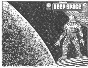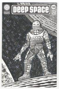
Time to pull out a piece of my art and take a look at it. I don’t feel like digging out anything old so I’m going to give a look to a recent piece that I still have lying about the studio. I usually have a bunch of pieces around the place and it’s only after they pile up for a while that I take a day and try to organize them all and find a place for everything.
I’ve been making a lot of hand bound sketch covers lately. That’s when I attach a drawing onto a printed comic book to make it into a new cover. I draw a piece on Bristol board, cut it to size, pull the staples on a comic book, wrap the drawing around the comic, and put the staples back in. It’s a twist on the sketch covers that comic book publishers sell. They sell comic books with blank covers so a fan can get his favorite artist to sketch on.
I’ve been doing series of these comic book covers but the one I’m looking at is a singular one. It’s “Deep Space” number twenty one. That’s a pretty high issue number so it doesn’t sound like a singular one and it’s not really. It’s the only one I’ve done as a sketch cover. I’ve made a bunch of “Deep Space” drawings as part of my “Cover to Comics That Don’t Exist” series. I also refer to that type of drawing as my “Faux Conic Book Covers.” That series is 10×15 inches on 11×17 inch paper. “Deep Space” twenty one is at comic book size. About six and a half by ten inches but since it’s a wrap around cover you can double the width to thirteen inches. When it’s in a comic book bag it’s at half width.
The “Deep Space” series started as some small thumbnail sketches. Instead of my usual method of making a series of drawings that get bigger as I figure things out I worked just from my thumbnails for “Deep Space.” I wanted to keep the drawing loose and spontaneous. I wanted strange spacesuits and a sense of loneliness. I wanted to keep things simple. I think I may have erred on the side of “Too simple” for the series but I’m looking at just this one and not the series today.
I like this one better than when I finished it. I’ve know a lot of artists over the years who were their own worst critics. They hated everything they did. That’s a tough way to live as an artist. I’ve consciously tried not to do that and judge my work as objectively as possible. It’s not always easy to do. When something doesn’t come out as I wanted it to it’s tough to think of it as anything but a failure. I’m lucky that doesn’t happen to me too often but it did with this one. I finished it and then didn’t like it. I had to remove it from my sight. That’s what I do when something doesn’t come out right.
Now it’s a few weeks later and I pulled it out of the pile to give it another look. I like it better now. There is a weird awkwardness to the figure that I hated when I first finished it but now I like it. The person is having trouble standing in this strange alien landscape and so is not at ease. He has a wide stance but it’s not a very stable stance. I wonder how long he’s going to be able to stand on that spot? Adding to the awkwardness is that his arms are long and his legs are short. Strange proportions for a strange space.
In all of my “Deep Space” drawings the spacesuits are different from one and other. I make them look bulky but other than that they all have different shapes on them. I use a side-of-the-brush technique to make a rough line that is the opposite of hi-tech. Some of my spacesuits look like they are made out of hay. I like that strange dichotomy. Sometimes I think it doesn’t work though so it’s a challenge to draw one that I really like. This one is okay except that his underpants area looks like the bow of a ship. I keep noticing that and it’s bonkers.

The art takes on a different tone when I open the comic up to see the full wraparound cover. Outer space is all around him and there is a large planet or moon to his left. The space behind him opens up and he gets swallowed by it more than he was when we could only see the front cover. I also think the moon near his head grows in prominence as the space gets wider and the smaller moon can be seen in opposition the the bigger moon on the left. Now he’s caught between two large forces.
I’m not sure about the stars I made in the background. There are a couple of acceptable techniques for making stars in ink and they involve splattering ink with a brush or toothbrush. I’ve done the techniques many times but didn’t want to here. Since I was using a rough-brush technique for the planet on the left I decided to use that some rough brush to make stars. The reason I didn’t want to use the toothbrush technique is that I find it sometimes calls too much attention to itself as a technique. I don’t think I dodged that here. The stars still look “Technique-y” to me. Oh, well, you can’t have everything.
One final thing about this cover has to do with the white line around the figure. I never liked the technique of outlining a figure against a black background but for some reason I did it here. I think I was trying to give the suit a little more bulk rather than an outline as a graphic element but in the end I think I just made the figure look shaky. He seems to be trembling a little bit. I don’t hate it but it’s another uncomfortable element in a drawing that’s not about comfort. It does a good job but I’n still not sure if I like the outline. Hey, at least I can look at the cover and enjoy it a little now.
Discussion ¬