I’m back from the comic shop this week and I got seven new comics.
Check them all out here:
Comment
I’m back from the comic shop this week and I got seven new comics.
Check them all out here:
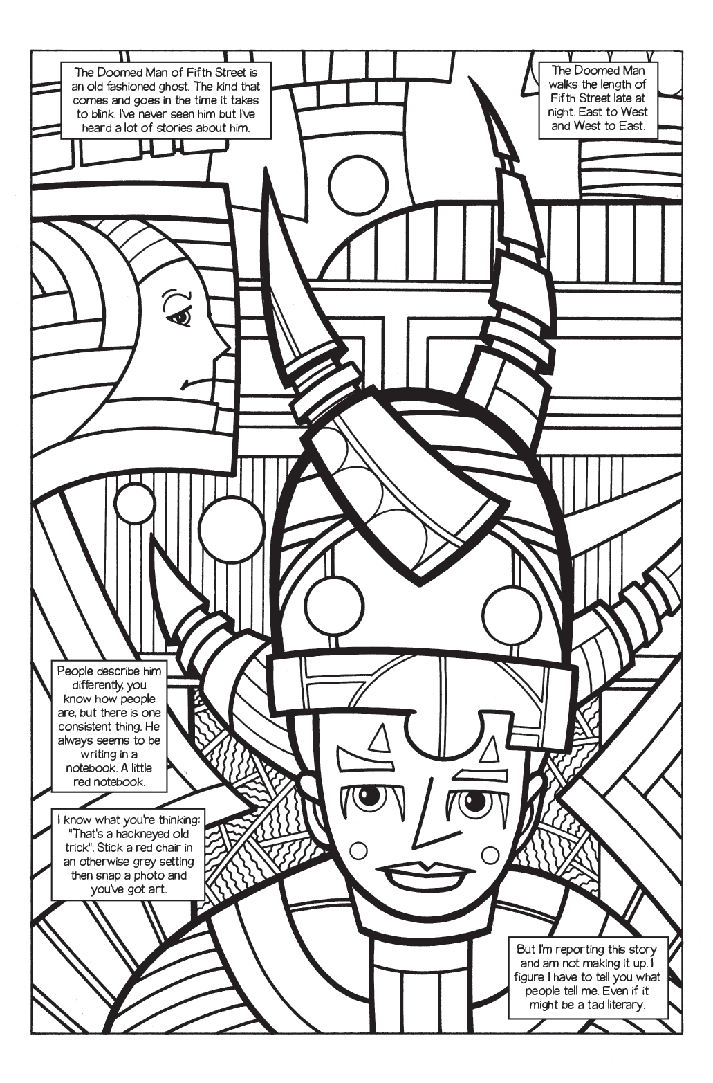
“The Ghost of Fifth Street” Page 1
I am trying to get things done but it’s not easy. Today I finally finished the first draft of the writing of my “Organics” comic. The story is called “The Ghost of Fifth Street”. This is not a comic I make in an ordinary way and I haven’t done one in a decade and a half so actually getting this far is an accomplishment for me. Most of the “Organics” stories I did back in the 1990s were eight to ten pages long but this one is forty two pages. That’s a lot more ambitious.
First off my “Organics” comics are a lot different than any other comic that I make. The way you make a comic is to write the story (or at least the plot of the story) and then draw the comic. That’s pretty standard. Generally you need to know what you are going to draw before you draw it. But not with “Organics”.
I developed this method of storytelling when I was younger and learning to draw using a Surrealist automatic drawing method. It helped me a lot because in applying it to comics I had to do a lot of drawings. Back in those days I would rule out some panel borders on an 11×17 inch piece of paper and then close my eyes and scribble on the paper. I’d move the paper around too and even scribble with my left hand to mix things up. Anything to make new and different lines. Then, like finding faces in clouds, I’d see what I could find in the scribbles and make a drawing from them. Only after I had eight pages or so done would I lay them all out on the floor, arrange and rearrange them, and see what story they told. Then I’d write that story.
My drawing was different in those days. Not as sophisticated or, at times, illustrative. I was looking for more mystery back then and to see if people could see the same things that I did. Most of the times they couldn’t. I learned the lesson of clarity from that. If I want people to see what I see then I really have to show them. It took me a while to learn that lesson though. Possibly by then I was bored of the “Organics” method I had come up with so I never really made anything exceptional with it. I remember going back a few years later to try and redraw some of my early “Organics” stories and make them more clear but I abandoned that. I had lost interest.
All these years later I was looking for some type of comic book project to work on. I didn’t know what though. Comic are exceptionally hard. They take a lot of time and drawing so if you’re not getting paid for it drawing comic can eat up your life. I needed something I could work on slowly and could break up into pieces. That’s when I thought of my old “Organics” way of doing things.
First off I’m way better at drawing than I was in the mid 90s. I’ve been drawing using a Surrealist automatic drawing method for twenty years now so it’s second nature to me. I even have a few different techniques rather than just the scribble on the page way. As a matter of fact I hadn’t done the scribble on the page way in ages. As a friend once said the scribbles are in my mind now.
The first way I have of making an “Organics” page is in pen. I made a template in Photoshop that has blue lines on it that divide up a page. I print those guides out on a piece of paper. I get two small side by side pages on a 9×12 inch piece of bristol board. Then I can easily divide the page up into panels with the blue lines as a guide and start drawing. I draw in ink with one of my sign pens. No plot or script as of yet just automatic drawing. I scan these pages into the computer, blow them up, and print them out in blue line on 11×17 inch paper. Then I draw right over top of them with pencil and ink until I have a finished page ready to scan in.
When I started this project I didn’t know how long it was going to be. I knew I wanted it to be longer than eight pages but since I had no story in mind I had no idea about the length. I think I originally wanted to go to about twenty pages. I don’t know when I decided to up that to forty but I did. As a consequence of that I wrote the story in pieces. After I had eight or ten pages done I decided to start writing the story. That way at least I’d know where it was going.
I wrote the story right over the artwork. I set it all up in Adobe Illustrator and even put down all the caption boxes and balloons first. They weren’t set in stone but I could easily see how much room I had to work with. I found the vertical format of a page in the horizontal format of the computer screen at bit awkward to works with. I had to pan and zoom a lot and I found that a lot more distracting than I would have imagined. But I got the first ten pages done and knew where the story was going. That was back in October of 2013 so this has taken a while.
I’ve squeezed in a page or two when I could and slowly built things up. The writing took nearly as long as the drawing at least in terms of me getting it done. I could draw a couple of pages in a couple of days but then it would take me weeks to get around to writing the next chunk of eight or ten. It was just a clumsy process. Now the first draft is done and I’ll have to read it all and get to work on improving it. That and the coloring. I want it in color but forty two pages is a lot. Comics take a long time.
I’m back from the comic shop this week and I got six new comics.
Check them all out here:
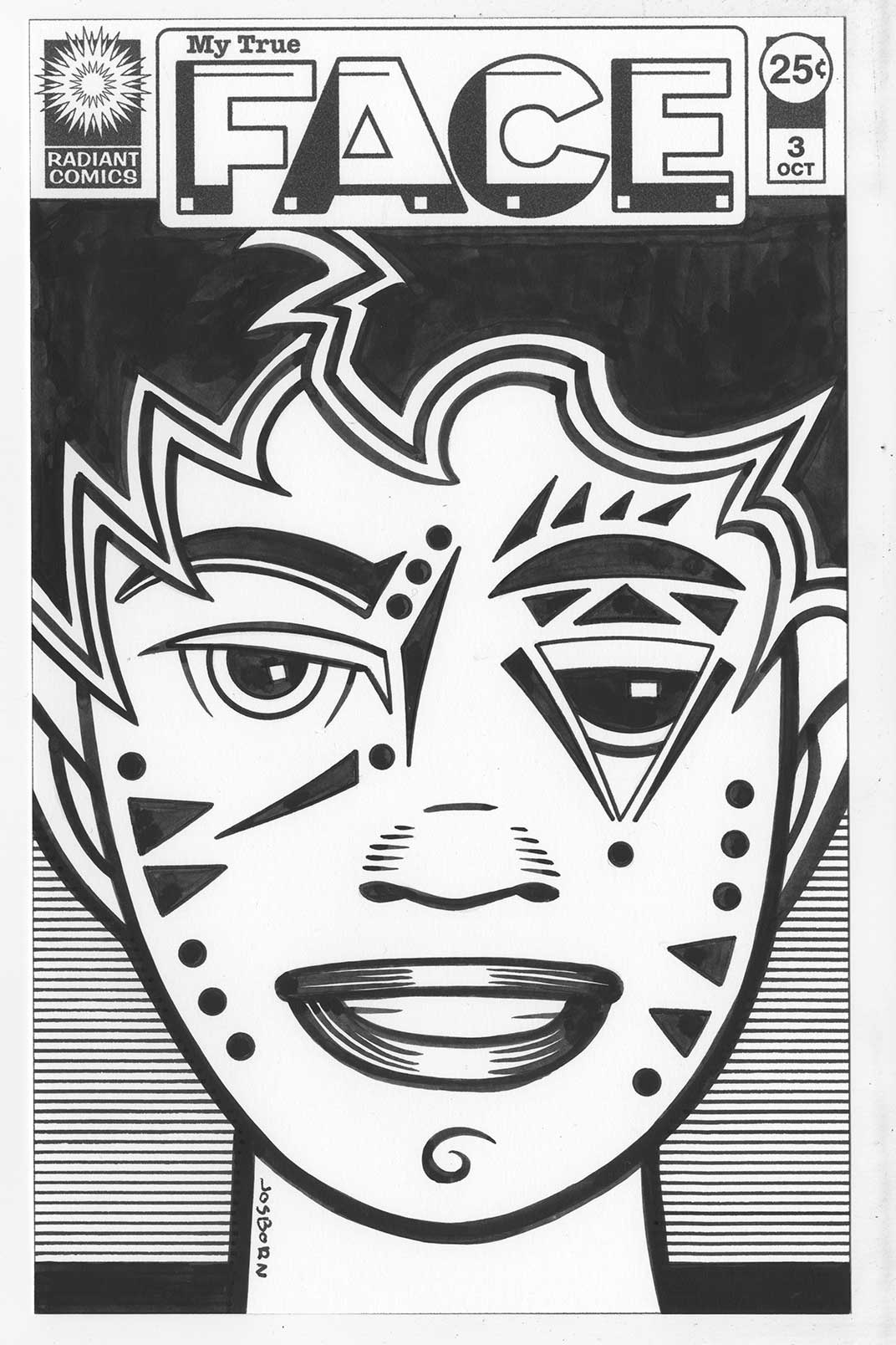
Some days I really wish the world liked what I like. Not every day but some days that’s really true. This week’s specific subset of things that I like that the world doesn’t is my faux comic book covers called “My True Face”. In my defense the world doesn’t look at my art work very much because it’s a big world and there is a lot to see so maybe more people would like my stuff if they could actually see it but things being what they are that’s far from a reality. In the small sampling of people who have seen my work there are some things that I find are more popular than others. People like color and I’m good at color so I’d have to say my color work gets the best response. Then, of course, on the rare occasion that I draw something that is already popular, like Batman, then that tends to be popular too. I think that’s one of the secrets of popularity. Latch on to something that is already popular. Even my other faux comic book cover get a little bit of love but my “My True Face” ones don’t.
I love drawing faces. I do it all the time. Not portraits or realistic faces but faces where I can play with the arrangement and shape of eyes, noses, and mouths. Faces that I can decorate and make into things other than ordinary faces. I’ve drawn tons of faces over the years and have done a lot of them in recent years at a five by seven inch size. I’ve made them in marker, ink, watercolor, and gouache. Whatever I feel like using. But then a few years ago I was trying to sell some art on Ebay and I decided to work up some faux comic book covers at a size closer to a print size comic book. I made a few different types of them on 9×12 inch paper but no one was interested in them so I abandoned the idea. But one of the types was “My True Face”.
First I developed the “My True Face” logo and integrated it into my existing Radiant Comics cover trade dress. Then I drew a couple of faces. Weird faces. Faces I added all sorts of marks, shapes, and tattoos to. I liked them because that something I always like drawing. But they seemed to draw the least interest of any of my faux comic book covers. Not that any of them drew much interest so I let the concept lay fallow for a while. Then this week after making a full size “Punk Rock Love” cover I decided to make some smaller covers too. “My True Face” came to mind.
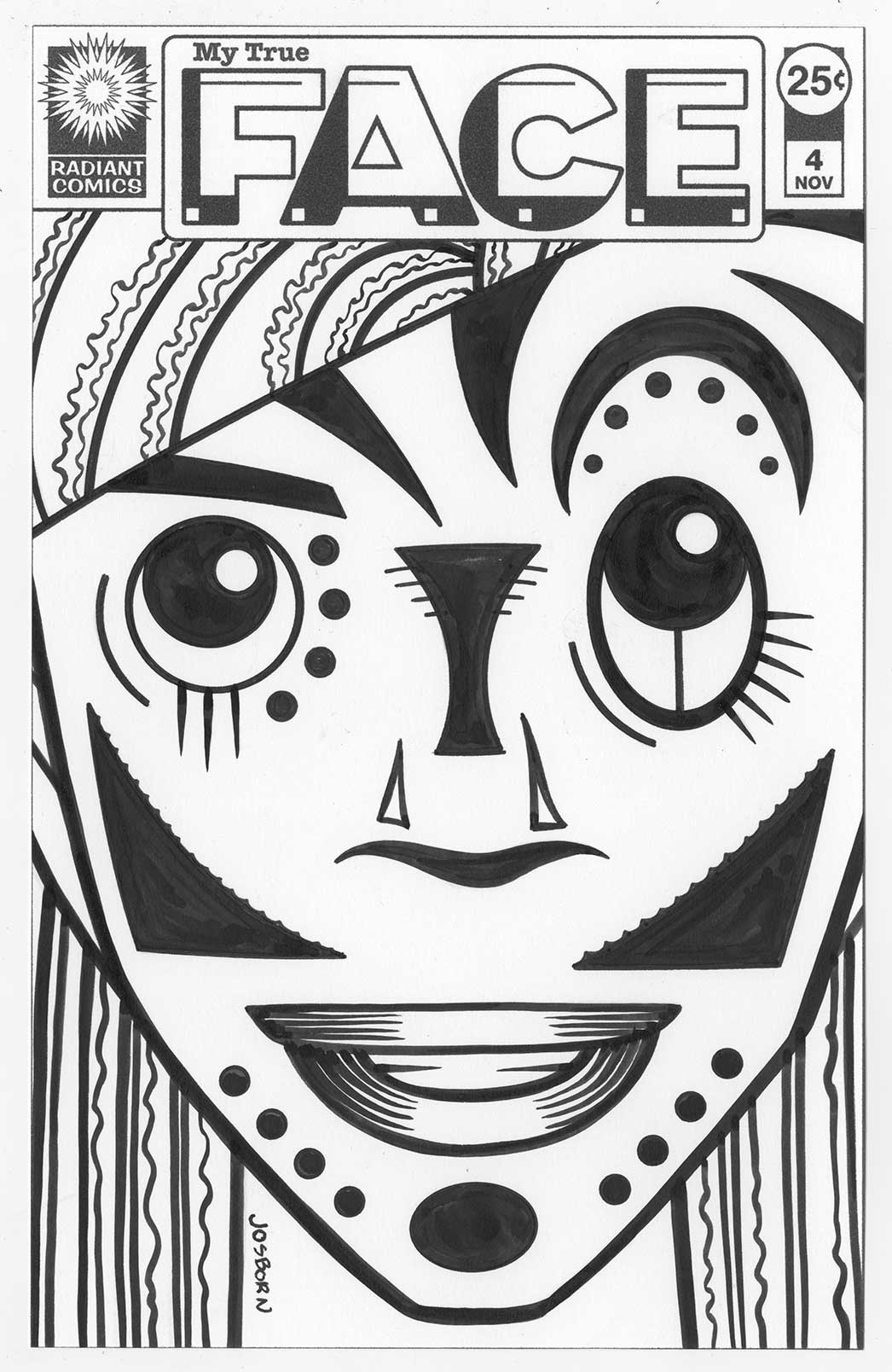
One of the reasons it came to mind was that I wanted something I could finish fairly quickly. Sure in the end it took me longer than I thought but it was still not nearly as long as a full size cover. At first I printed out the logo and trade dress at size (about 6.5 x 10 inches) and was going to draw a face in pencil on it. Then I stalled out. That was too big a size for me to quickly work out a pencil sketch of a face. Instead I turned to my archive of scanned drawings on my computer to see what I had. What caught my eye was my “Message Tee” drawings. I drew all sorts of weird faces on those characters, I had a lot of them, and they were only a couple of inches tall so there was plenty of room to develop them at a larger size. I picked out one that I liked and printed the face out at about a 5×7 inch size. Something I was very used to. Turned out that was a pretty good idea as I was able to redraw the face into something I liked with a lot less work than starting from scratch.
I then scanned in the penciled face and put that in my template than had the logos in it. After placing the pencil drawing I converted just that part into blue line. That way I could print the piece out onto a sheet of bristol with the logos in black and the pencil drawing in light blue. Then it was a matter of inking over the blue line with black India ink to make my final drawing.

Do you know what slowed me down at this point? It was my ink. About a month ago I ran out of my favorite brand of ink. Sennilier. It’s not a brand I can get at a nearby store and I’ve been short of money so I decided to just go with some other ink. I’ve got other inks around the place but I have only one favorite. The ink I was using Black Cat by Dick Blick is okay but it’s a little too thin for my taste. I had to got over certain lines twice and that takes more time. I got the first “My True Face” cover done this way (issue three since I had made one and two years before) so I didn’t like not having my favorite ink stop me but the whole time I wished I had some of it. I even switched to my second favorite ink. Unfortunately I was running out of that one too. After doing a second and third cover with those inks I broke down and ordered some more of the Sennelier. It was worth it.
So in the end I had four new faux covers. They were all the size of a comic book so I could slip them into a comic book bad with a backing board. I thought that was pretty cool. Three of them were done from “Message Tee” faces and the fourth was another drawing in my archives. Over all I like the way they come out. I might do more. Now if only the world would demand them of me.
I’m back from the comic shop this week and I got nine new comics.
Check them all out here:
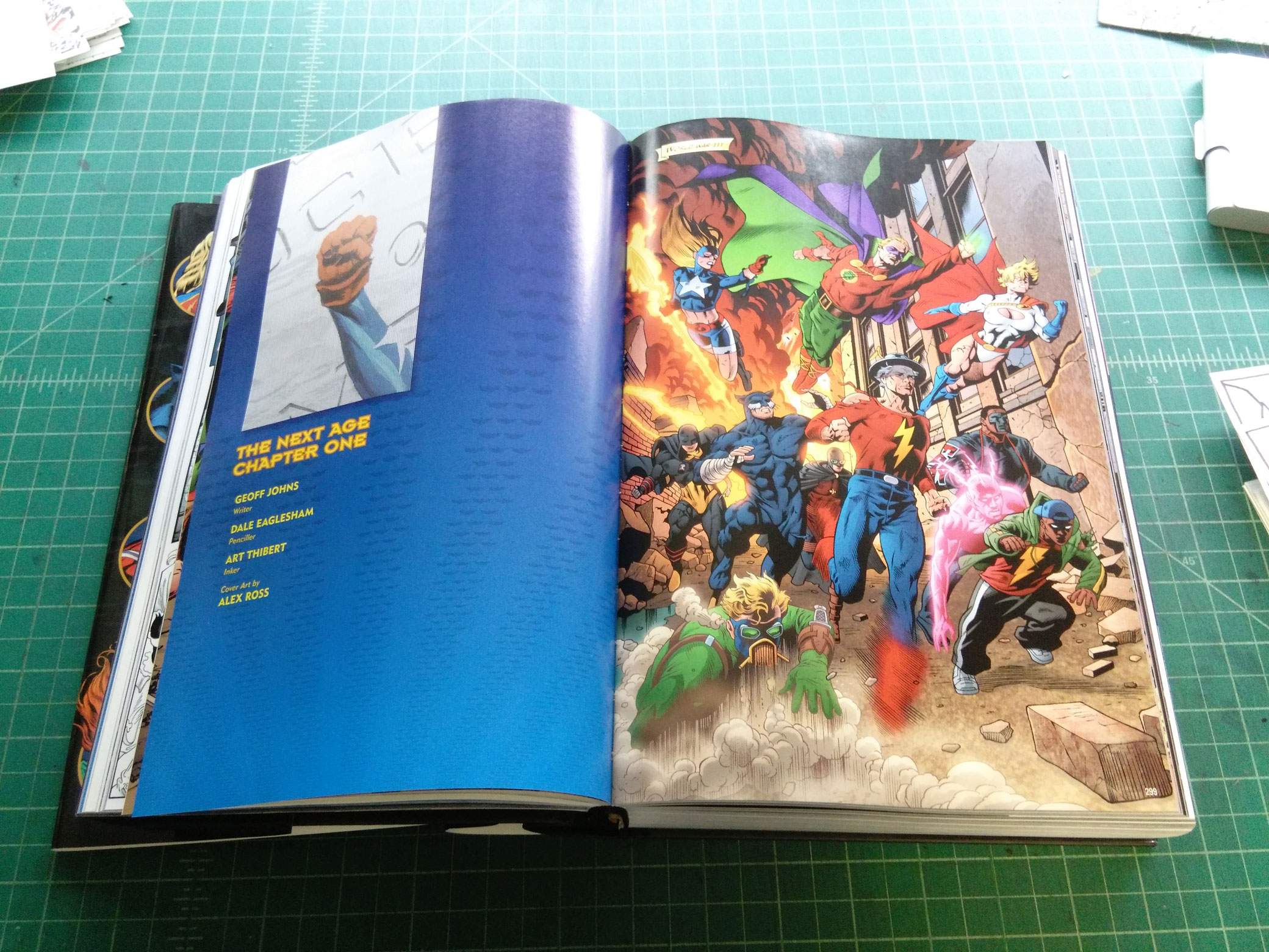
A few weeks ago I was given the gift of a comic book. I say that with a bit of understatement because it’s really more than a comic book. It’s a really big book of comic books. It’s the JSA Omnibus Volume Three. That’s the Justice Society of America and it’s an oversized collection that runs over 1200 pages. That’s a lot of comics. And by oversized I mean that a normal comic book is about 6.5×10 inches but this one is about 7.5×11.5 inches. So it’s taller and wider. That makes for a a hefty book. I was originally going to make a video for my YouTube channel about this book and I still may but first I wanted to get some thoughts down in writing about it. As much as enjoy making videos sometimes I feel like writing.
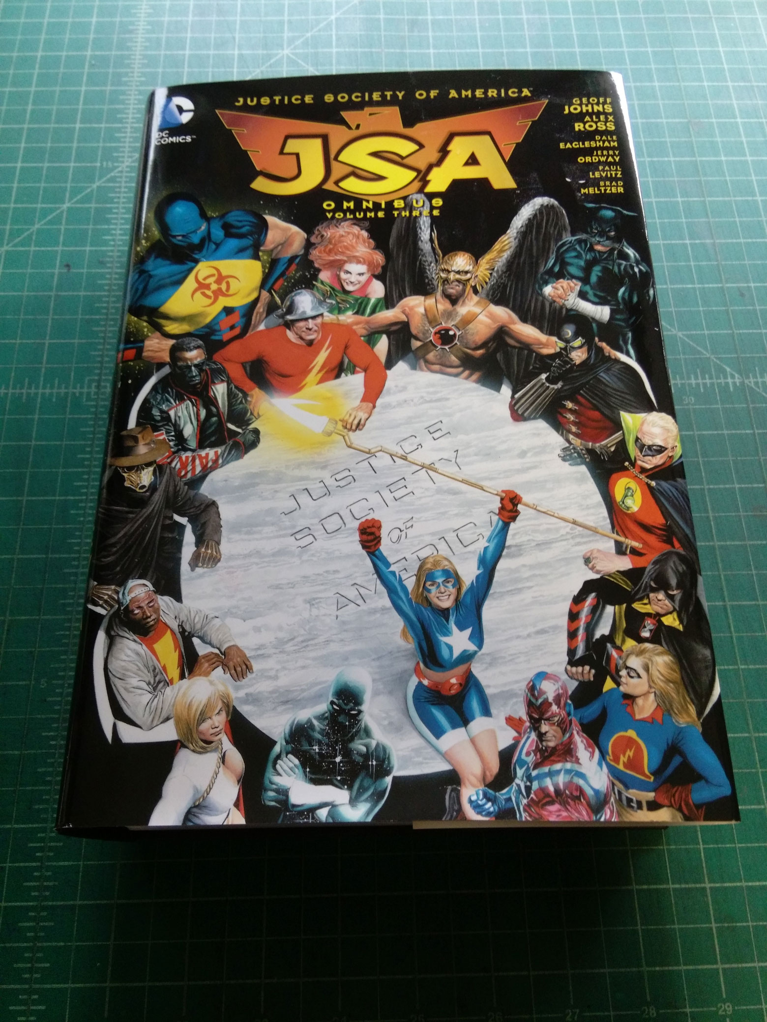
First off I haven’t even read this book. That’s why this isn’t really a review. A few years ago I did read a hand full of the issues that are reprinted in it but that’s maybe a hundred pages out of the twelve hundred. They were pretty good. Not great comics but solid super hero stories that were well crafted. I’m sure my review would be about the same if I read the whole thing but I have no plans on reading this doorstop of a book. Yet I did really enjoy flipping through it and looking at it.
I find there are generally two ways I enjoy a comic. The first is to read it and the second is to flip through it. Usually the reading comes first. Sure I can flip through a comic to see if I want to buy it buy that doesn’t really count. When I do that I’m looking for information to make a judgement on if I should buy the comic or not. The real flipping through a comic for enjoyment comes after I’ve read it and I want a closer look at some parts and to see if I missed anything. Or it’s an older comic I haven read in a while so I flip through it to remind myself how much I liked it and sort of relive that experience without really reading it. Comics are good for that because a reader can flip back and forth between scenes in a non-linear nature. Check out page 22 and then flip back to page six and then maybe over to page ten. Look at whatever part suits your fancy at the moment. It’s a fun thing that most comics readers do.
With this JSA Omnibus I discovered I could have fun flipping around without ever having read the book. Without even any plans to even read the book. As a matter of fact if I was planning on reading the book I probably never would be flipping through it first. I wouldn’t want to spoil anything. But I was freed from that. I could go wherever my eyes lead me.
I have a bunch of other Omnibus books that I’ve bought over the years and I’ve read most of them. Most recently a John Carter one that reprinted the Marvel Comics series from the 1970s. I was lucky enough to get it for dirt cheap. It was enjoyable and I flipped through it a little before I read it and some more afterwards too. Same for my Ditko and Lee Spider-Man one and a couple of Colan and Wolfman Tomb of Dracula’s.
It’s pretty impressive to think that it took only a handful of people to make the Spider-Man book. Steve Ditko, Stan Lee, plus the letterer and colorist neither of whom I can name off the top of my head. The Tomb of Dracula one had a few more contributors but not many. The John Carter one had even more than that but still within the same ballpark. There is something to be said about the impressiveness of a handful of people doing all the creative work of one of these giant omnibuses. But there is also something impressive about the opposite too.
I counted the names up in the credits of the JSA Volume three Omnibus. Writers, pencillers, inkers, letterers, and colorists. There were over sixty people on the list. That is a lot of people. Think about that for a moment. It took sixty people (not even counting the behind the scenes people) to bring this twelve hundred page book to us. That’s a crazy amount of people. Just the coordination alone it took to get all those people working is impressive. And flipping through the book I can’t help but be impressed. There is so much in it.
As the picture on the spine of the book shows there are a dozen members of the JSA. Plus there are a ton of guest stars and villains. Every page I turn to has a large cast of characters in a wide variety of colorful costumes. And all those costumes are drawn by a variety of different artists so they’re all a bit different but still they’re drawn in a colorful and highly illustrative manner. The sheer amount of drawing work in this book is staggering. I can flip through and see something different each time. It’s not even my favorite style of artwork but it’s still such a visual treat as to awe me bit. It crackles with super-hero energy.
As an extra added bonus Alex Ross did the covers for the individual issues of JSA that are reprinted here at the beginning of each individual issue. He’s well known for his hyper-realistic super-hero paintings and, once again, that’s not my favorite style but Ross is very good at what he does and it’s fun to see his paintings pop up as yet another style in this smorgasbord of super-hero drawing. It’s a delight to look at.
So there you have it. A comic book that I haven’t read nor do I even want to read still has enough power and goodness in it to impress me. A lot of people put a lot of energy into making it the best they could and it really shows. The huge cast of characters in all the different art styles is amazing to behold. Even if you don’t want to buy a book like this it’s certainly worth looking through if you can. As a coffee table art book it really works well.
I’m back from the comic shop this week and I got eight new comics plus a hardcover collection.
Check them all out here:
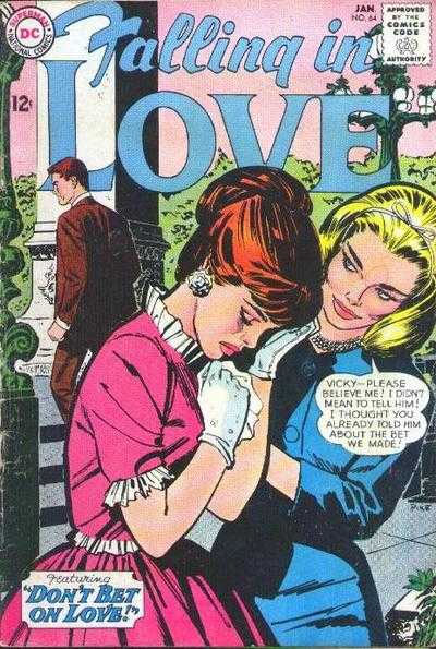
This week I have yet another tale of something taking me way longer to do than I thought it would. That story seems to repeat itself quite a bit. This time it was about one of my Punk Rock comic book covers. I haven’t done one in years but the idea is to take an old comic book cover and redraw it while replacing the characters with punk rockers. For some reason that really amuses me. I think it works because punks have a wide variety of identifiable looks and costumes that make it interesting plus there is a “Punk philosophy”, if you will, that make you look at the situations on a comic book cover in a different light. I made one from an old romance comic cover and a sci-fi comic cover in the past but this time I chose a romance cover. Those are particularly interesting on their own but make them into punk rock covers and they really get a bit nuts.
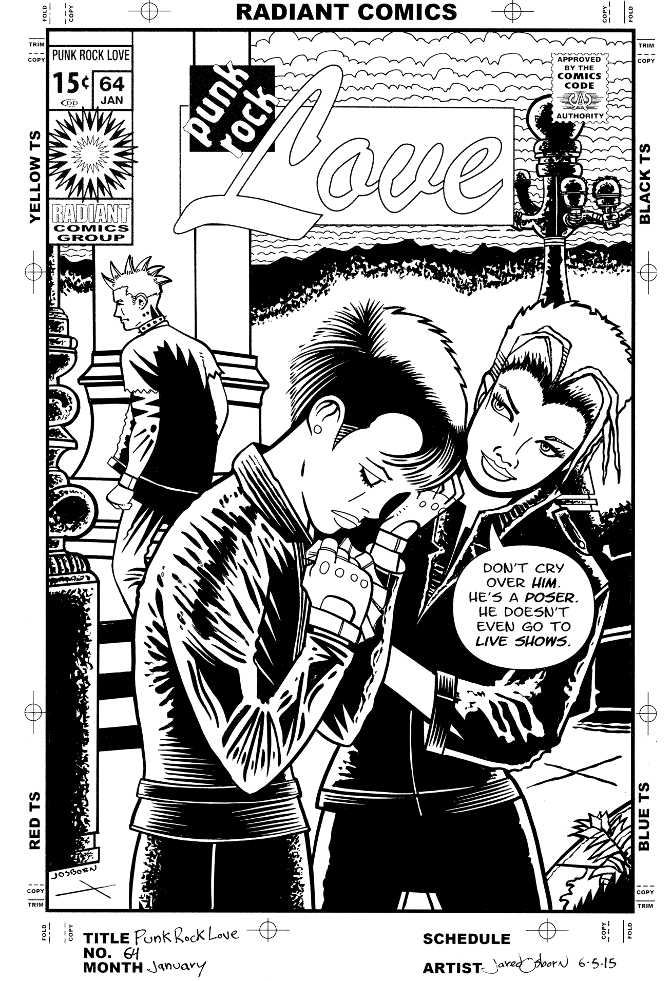
Punk Rock Love in the ink stage
I was lucky enough to find a cover I could use fairly quickly. I did an internet search for romance comics covers and found “Falling in Love” #64 published by DC comics popped up. Oddly enough I have searched for another to do but nothing has jumped out at me like that one did. I’d prefer to have the actual comic to work with but since I didn’t I could only use a low resolution jpeg that I found. I only rarely draw on the computer but for this I decided to draw right of top of the image in Photoshop. It wasn’t a finished drawing I was more or less doing a quick tracing of the original cover. I then decided to keep with the digital format and draw over that tracing in Photoshop. That only lasted a half an hour before I gave up on the technique. Drawing on the computer slows me down rather than speeds me up.
After I decided I wanted to draw it on paper I put the logo, trade dress, and word balloons on it. I had already made up a trade dress based on early 1970’s Marvel romance comics and decided to use it again. This was an old DC Comic that I was working from but I had no interest in working up a whole other logo and trade dress. This was only supposed to take me a short time to do and besides why not keep it consistent with the other one I did?
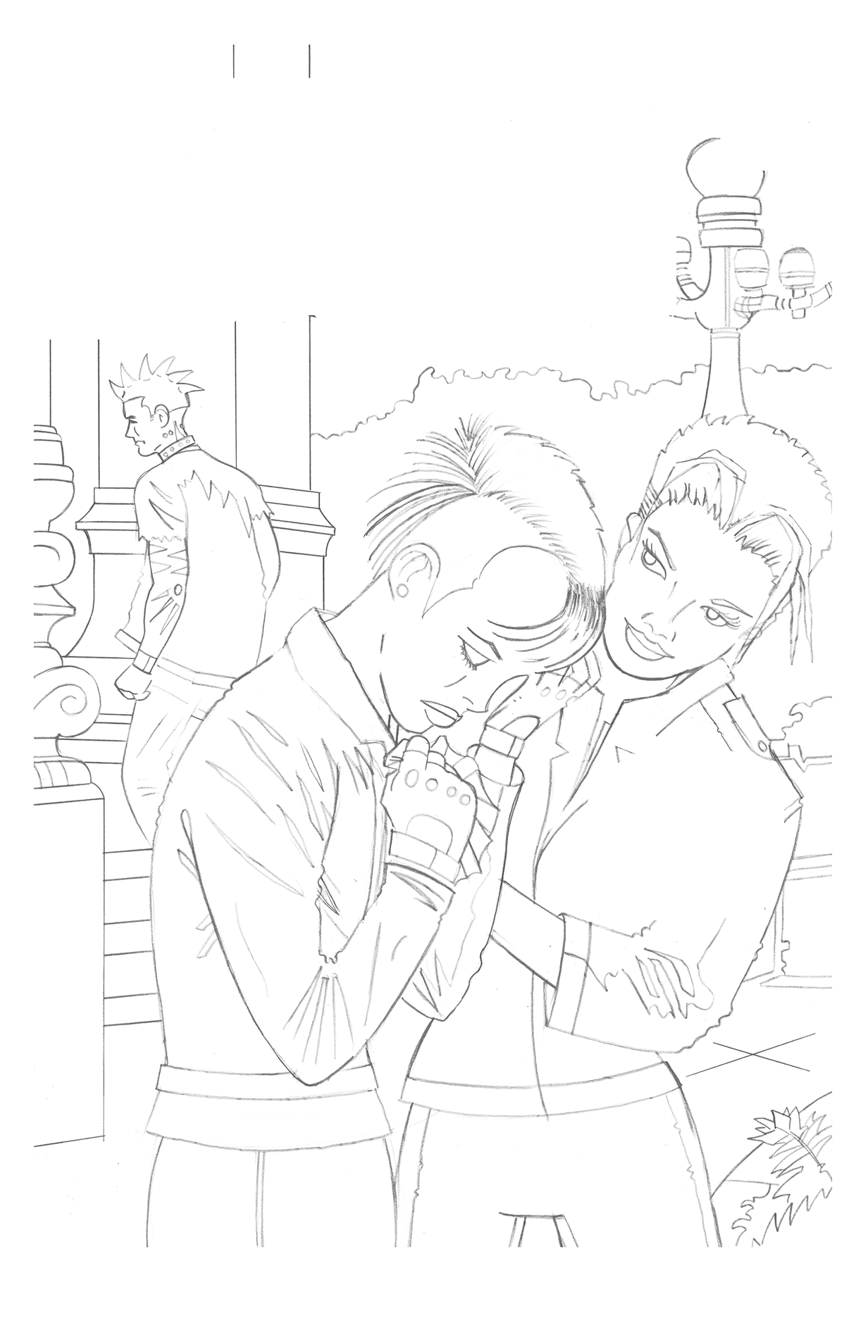
Punk Rock Love in the pencil stage
I then printed out my tracing on the cover in blue line onto bristol board and drew over that. It’s a technique I’ve done many times before. I just plain find it faster and easier to draw on paper than on the computer. The only problem I had with that technique this time was that I printed the blue lines a little too dark. At times they were darker than the pencil drawing I was making. It kept confusing my eyes as the blue and grey lines would sometimes be the exact same value. I had to keep darkening my pencil lines but I muddled through.
I also did an internet image search for punk clothing. I didn’t draw anything too elaborate but I find when drawing clothing it’s best to try and draw specific clothing rather than make up some generic clothing from my head. I find that’s a weak point for some comic book artists who are used to drawing super-heroes or other fantastical things. They draw great costumes but their regular clothes are generic and uninteresting. They’re drawing their idea of pants and a shirt rather than actual pants and shirts. I try to avoid that as much as possible. I used to have magazine clippings of clothes but thanks to the internet pictures of clothes are really easy to find these days.
It’s strange working over someone else’s drawing (Jim Pike is listed as the artist). I’m using some of his drawing but not all of it. I don’t want to change too much of it but I also don’t want to copy it. Plus I don’t want to lose whatever attracted me to the cover. That the scan was low resolution didn’t help either. Some of his lines got distorted and I couldn’t always tell what was what. Since I was drawing these three characters in dark clothing instead of light the blacks I had to spot were different than his. That made things more complicated and took more time than I thought they would. Ain’t that the way?
I then scanned my finished pencil version back into the computer. Since the logos and trade dress was now scanned in from a printed version that I was going to print out again it was no longer good enough. Too many generations from the original. So I erased the logo from the scan and put in a new one from the logo digital file. Next I printed the logo out in black and the drawing in blue line all on a nice fresh piece of 11×17 inch bristol board and was ready to ink.
The inking went smoothly though it took more time than I thought and I had to split it up over a couple of days because I didn’t have the time all in one day. That made it seem like it took even longer. It also took longer because I didn’t work out all the spotting of blacks in the pencil stage. I did most of that in the inking stage and had to figure out all the techniques I was going to use for all that leather. But I got it done.
Of course I decided to color it too. That’s where I’m stuck now and it’s taking too much time. I’m not sure exactly how I want to color it. At first I wanted clean and simple cut color like in the original but somehow I’m unsatisfied with that. I don’t even know why but I suspect it’s because I don’t like how it looks digitally. I like the original inks but scan it into a computer and it dies a little. Probably because it’s smaller and black and white on a computer looks boring. And on a computer screen flat color looks boring. I’ll have to print it out to see what it really looks like. But I’m not quite there yet. I’m still traveling with it and that is taking more time than I thought.
I’m back from the comic shop this week and I got thirteen new comics.
Check them all out here:
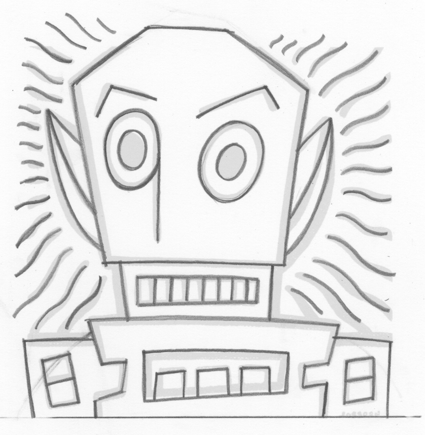
I finished a print this week that has been in the works for a long time. It’s one of those that came from a sketch I did years ago and I have reworked the image a few times since the sketch. I think I originally made a small sticker or card from the sketch but I can’t remember for sure. Another small thing that has been lost in time.
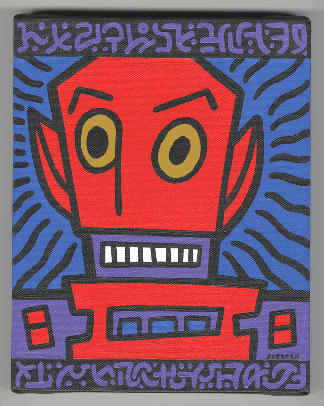
What I do have is an eight by ten inch painting I made from the sketch in May of 2006. I have to say that it’s one of my favorite little painting that I made. It’s a simple but fun image of some sort of strange person. Maybe it’s an alien or maybe it’s a demon on some kind. But it is comical. It’s done with a thick black outline and only four colors. We’ve got the dominant red of the guy’s face, the secondary purple of his shoulders and such, the lively blue in the background, and his yellow core eyes. That’s it on this one. No lines, patterns, boxes, or brush stokes of color. It does have some of my fake writing on it but that’s done in the same purple that was already there. It’s a simple and straightforward image. It works for me. I like it when things work.
I’m not sure when I came up with the word balloon for this image. It may have been before I even made the painting. “Keep those freaks away from me!” has accompanied this image for a long time even if it wasn’t in the painting. I often like to use words and images together when making art and that sentence and this image matched themselves up for me. I find it funny that a freaky looking creature would be upset and shouting that he wanted other freaky looking people to vamoose. Makes me chuckle.
The final lettering on this took me a long time. As I said before I had the sentence ready to go and I think I made a stab at lettering it but it never came out to my satisfaction. After I finished the painting I still wanted to make a print of it but could never pull it off. I had numerous starts and stops on it since May 2006 but nothing became of them. That was until July 2013 when I decided to make the image into a T-Shirt design. I was setting up a Cafe Press or some such T-Shirt site (that never went anywhere) and wanted to turn some of my art into T-shirt designs for it. “Freaks” seemed like a perfect one.
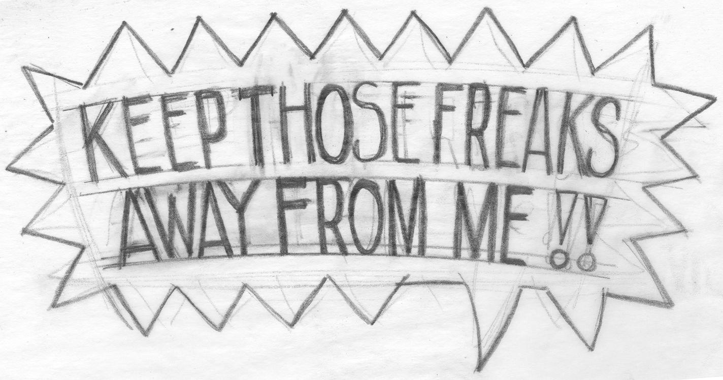
I redrew it and inked it since I couldn’t work from the painting and then went about lettering it. I didn’t want to use a computer font because I though hand lettering would go better with the image and in the end I think it did. But the end was a long time coming. I think I drew and redrew the lettering three times. And then I scanned it into the computer and cleaned it up again in Illustrator. All in all I think the lettering took longer than making the image. Not a huge surprise since I don’t do much hand lettering but make tons of images.
So now, nearly two years out from July 2013, I decided to take another crack at making a print of this image. I actually thought most of the work had already been done and with the lettering squared away I had a good jump but it turned out that for the t_Shirt I set the guy’s face on a transparent background. So I had no background worked out. I kinda need that for a print.
I went back to the original scan of the ink drawing and started over. That means turning it into a vector graphic and coloring it. Luckily that’s not too hard since I had the color worked out for the painting and I kept it nearly the same. The composition was changed since I now had a word balloon on top so I figure that I’d make the background with some colors and patterns. The first thing I did was drop in those brown piano keys on top. They take the place of the fake writing of the painting. I started with brown and went through a dozen colors before I decided brown worked best. I added the little yellow circles much later.
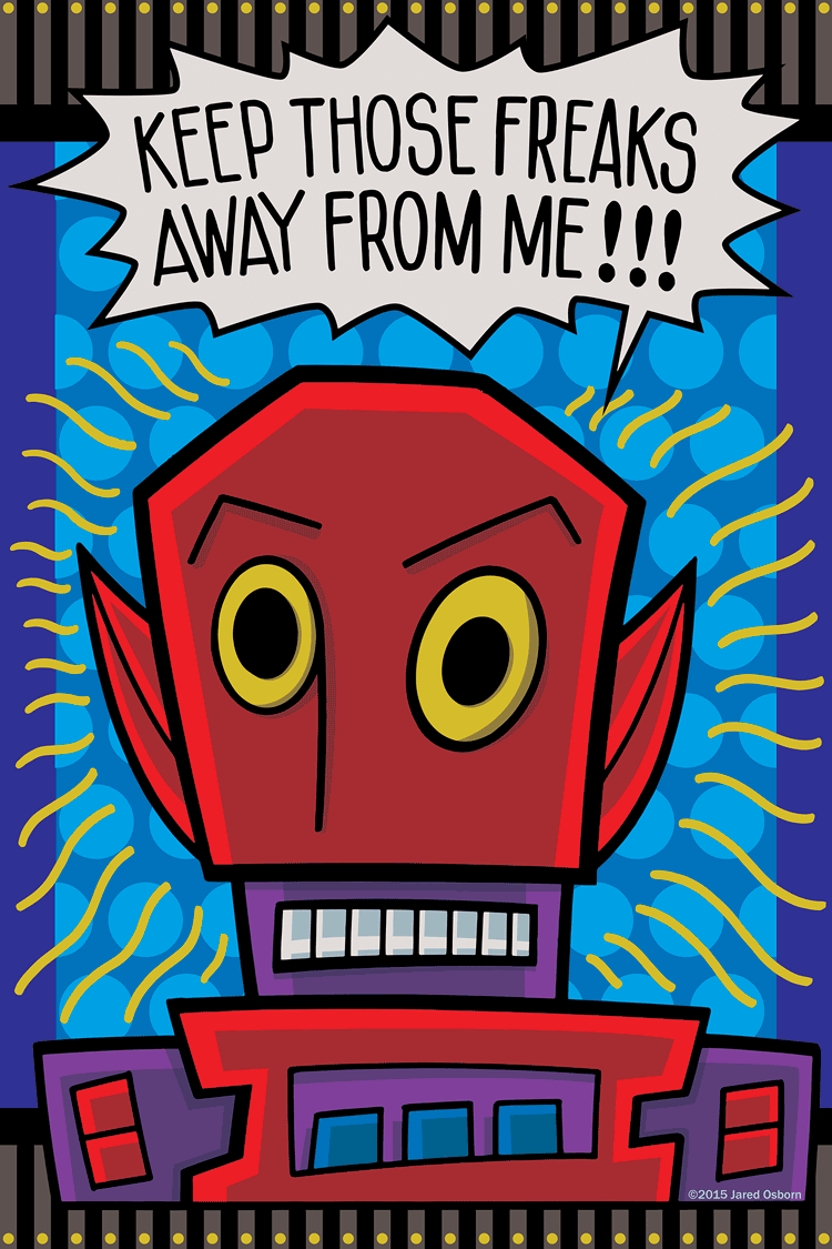
The major color change was using yellow for the anger lines. They were originally black but I didn’t like them that way in this new composition. They make more sense to me as yellow. That also opened up the blue background to have a pattern in it. I tried a few different patterns but they were all too small and busy. They ended up fighting with the yellow anger lines so I went with large circles that were a little bit brighter blue than the background. I think the circles keep it bright and happy. The humor comes through even though the guy is angry.
Finally there is the shading in the face. I was unsure of what I wanted to do at first. I was thinking about adding some texture to the piece but every time that I did it just fought with the overall image. I instead decided to go with some cut color shading that simulated some sort of under lighting. I threw his face in a bit of shadow as if he was making a scary face with a flashlight under his chin. It took a few tries to get the tones right but it works.
The very final thing was the white of his teeth and the white of the balloon. I tried them as white but didn’t like them. I tried them as a very light yellow but I didn’t like them that way either. I eventually settled on a light grey that is actually made up of light values of color rather than a tint of black. From a distance it still reads as white but it’s not. I think that works fine for me.
So there you go. The story of another image that was a long time coming into its own. Or maybe it came into its own for a second time. That first painting is nine years old.