I finished a print this week that has been in the works for a long time. It’s one of those that came from a sketch I did years ago and I have reworked the image a few times since the sketch. I think I originally made a small sticker or card from the sketch but I can’t remember for sure. Another small thing that has been lost in time.
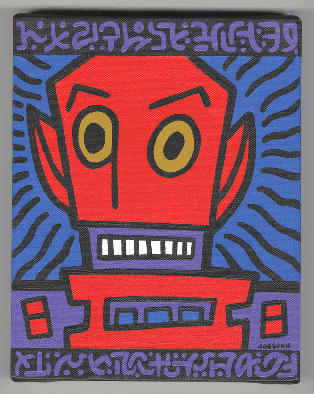
What I do have is an eight by ten inch painting I made from the sketch in May of 2006. I have to say that it’s one of my favorite little painting that I made. It’s a simple but fun image of some sort of strange person. Maybe it’s an alien or maybe it’s a demon on some kind. But it is comical. It’s done with a thick black outline and only four colors. We’ve got the dominant red of the guy’s face, the secondary purple of his shoulders and such, the lively blue in the background, and his yellow core eyes. That’s it on this one. No lines, patterns, boxes, or brush stokes of color. It does have some of my fake writing on it but that’s done in the same purple that was already there. It’s a simple and straightforward image. It works for me. I like it when things work.
I’m not sure when I came up with the word balloon for this image. It may have been before I even made the painting. “Keep those freaks away from me!” has accompanied this image for a long time even if it wasn’t in the painting. I often like to use words and images together when making art and that sentence and this image matched themselves up for me. I find it funny that a freaky looking creature would be upset and shouting that he wanted other freaky looking people to vamoose. Makes me chuckle.
The final lettering on this took me a long time. As I said before I had the sentence ready to go and I think I made a stab at lettering it but it never came out to my satisfaction. After I finished the painting I still wanted to make a print of it but could never pull it off. I had numerous starts and stops on it since May 2006 but nothing became of them. That was until July 2013 when I decided to make the image into a T-Shirt design. I was setting up a Cafe Press or some such T-Shirt site (that never went anywhere) and wanted to turn some of my art into T-shirt designs for it. “Freaks” seemed like a perfect one.
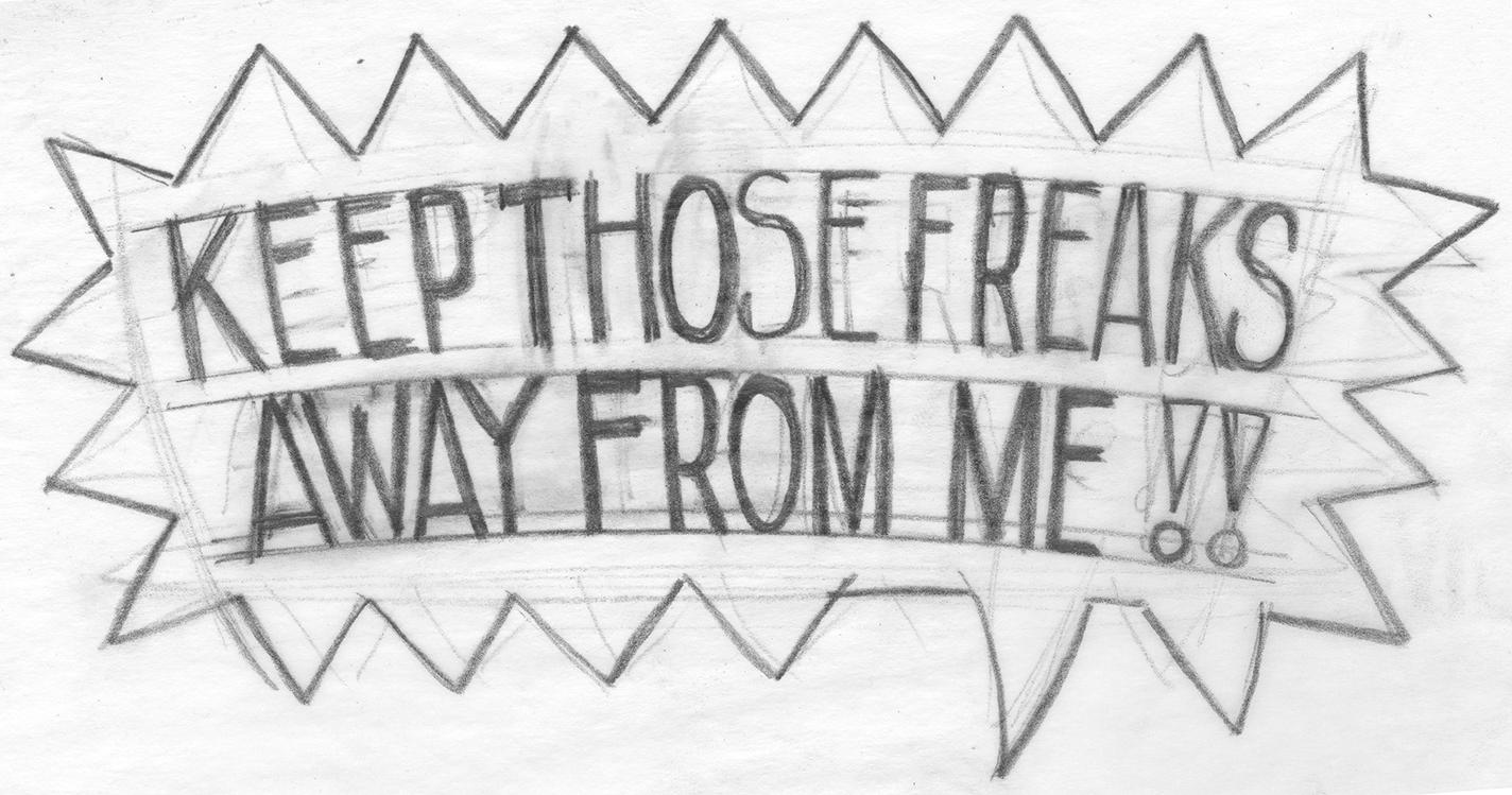
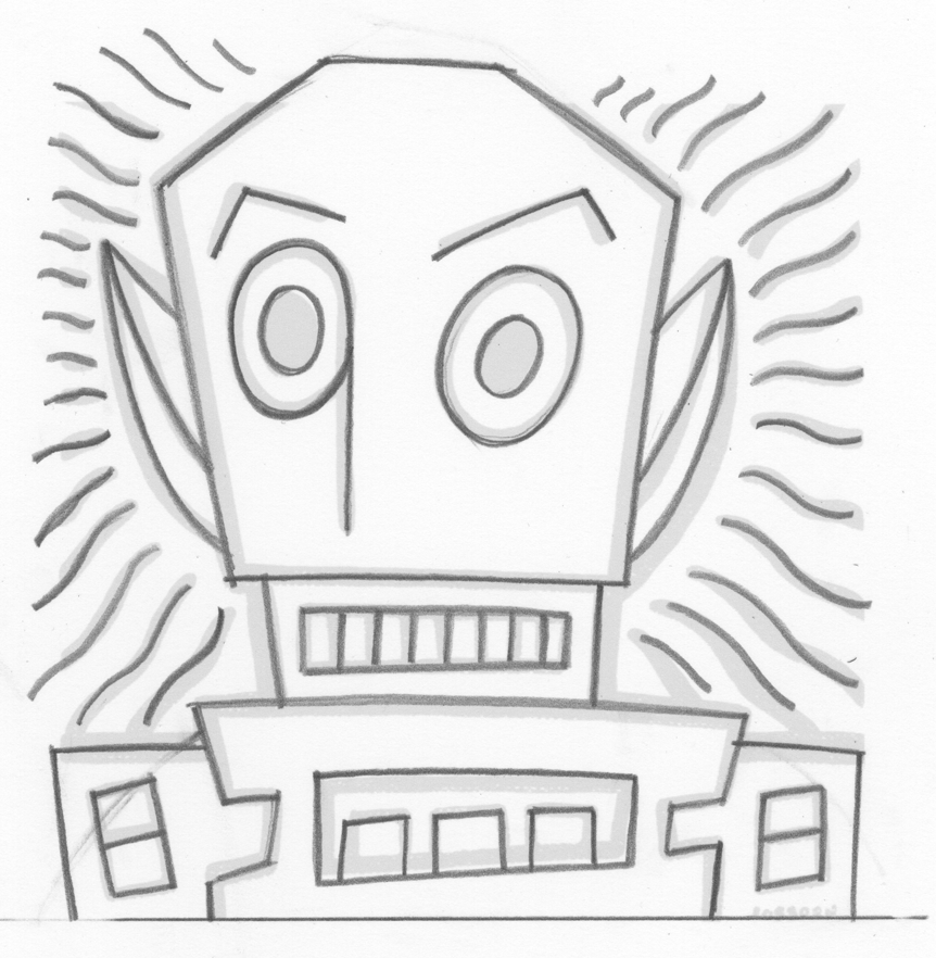
I redrew it and inked it since I couldn’t work from the painting and then went about lettering it. I didn’t want to use a computer font because I though hand lettering would go better with the image and in the end I think it did. But the end was a long time coming. I think I drew and redrew the lettering three times. And then I scanned it into the computer and cleaned it up again in Illustrator. All in all I think the lettering took longer than making the image. Not a huge surprise since I don’t do much hand lettering but make tons of images.
So now, nearly two years out from July 2013, I decided to take another crack at making a print of this image. I actually thought most of the work had already been done and with the lettering squared away I had a good jump but it turned out that for the t_Shirt I set the guy’s face on a transparent background. So I had no background worked out. I kinda need that for a print.
I went back to the original scan of the ink drawing and started over. That means turning it into a vector graphic and coloring it. Luckily that’s not too hard since I had the color worked out for the painting and I kept it nearly the same. The composition was changed since I now had a word balloon on top so I figure that I’d make the background with some colors and patterns. The first thing I did was drop in those brown piano keys on top. They take the place of the fake writing of the painting. I started with brown and went through a dozen colors before I decided brown worked best. I added the little yellow circles much later.
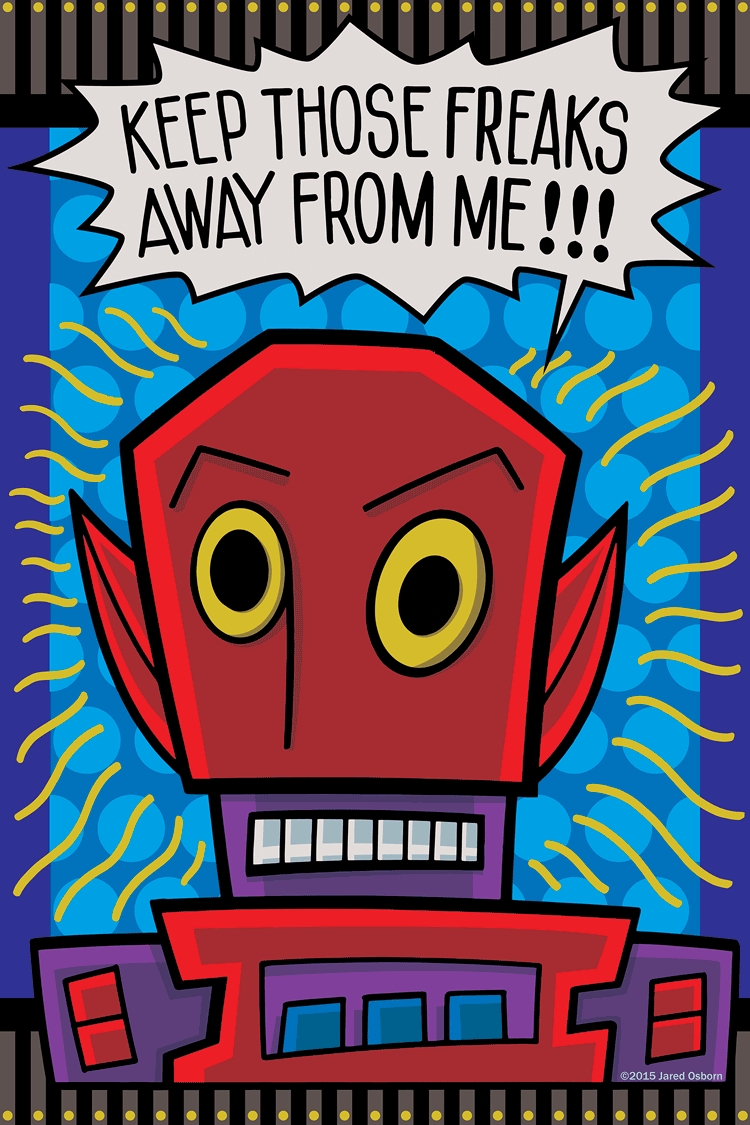
The major color change was using yellow for the anger lines. They were originally black but I didn’t like them that way in this new composition. They make more sense to me as yellow. That also opened up the blue background to have a pattern in it. I tried a few different patterns but they were all too small and busy. They ended up fighting with the yellow anger lines so I went with large circles that were a little bit brighter blue than the background. I think the circles keep it bright and happy. The humor comes through even though the guy is angry.
Finally there is the shading in the face. I was unsure of what I wanted to do at first. I was thinking about adding some texture to the piece but every time that I did it just fought with the overall image. I instead decided to go with some cut color shading that simulated some sort of under lighting. I threw his face in a bit of shadow as if he was making a scary face with a flashlight under his chin. It took a few tries to get the tones right but it works.
The very final thing was the white of his teeth and the white of the balloon. I tried them as white but didn’t like them. I tried them as a very light yellow but I didn’t like them that way either. I eventually settled on a light grey that is actually made up of light values of color rather than a tint of black. From a distance it still reads as white but it’s not. I think that works fine for me.
So there you go. The story of another image that was a long time coming into its own. Or maybe it came into its own for a second time. That first painting is nine years old.
Discussion ¬