Some days I really wish the world liked what I like. Not every day but some days that’s really true. This week’s specific subset of things that I like that the world doesn’t is my faux comic book covers called “My True Face”. In my defense the world doesn’t look at my art work very much because it’s a big world and there is a lot to see so maybe more people would like my stuff if they could actually see it but things being what they are that’s far from a reality. In the small sampling of people who have seen my work there are some things that I find are more popular than others. People like color and I’m good at color so I’d have to say my color work gets the best response. Then, of course, on the rare occasion that I draw something that is already popular, like Batman, then that tends to be popular too. I think that’s one of the secrets of popularity. Latch on to something that is already popular. Even my other faux comic book cover get a little bit of love but my “My True Face” ones don’t.
I love drawing faces. I do it all the time. Not portraits or realistic faces but faces where I can play with the arrangement and shape of eyes, noses, and mouths. Faces that I can decorate and make into things other than ordinary faces. I’ve drawn tons of faces over the years and have done a lot of them in recent years at a five by seven inch size. I’ve made them in marker, ink, watercolor, and gouache. Whatever I feel like using. But then a few years ago I was trying to sell some art on Ebay and I decided to work up some faux comic book covers at a size closer to a print size comic book. I made a few different types of them on 9×12 inch paper but no one was interested in them so I abandoned the idea. But one of the types was “My True Face”.
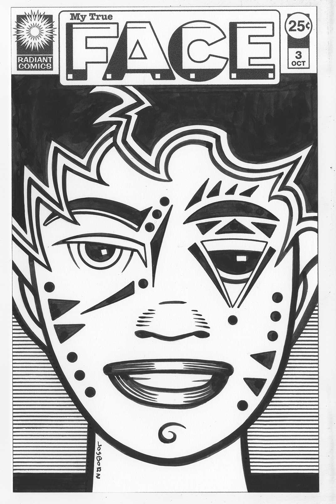
First I developed the “My True Face” logo and integrated it into my existing Radiant Comics cover trade dress. Then I drew a couple of faces. Weird faces. Faces I added all sorts of marks, shapes, and tattoos to. I liked them because that something I always like drawing. But they seemed to draw the least interest of any of my faux comic book covers. Not that any of them drew much interest so I let the concept lay fallow for a while. Then this week after making a full size “Punk Rock Love” cover I decided to make some smaller covers too. “My True Face” came to mind.
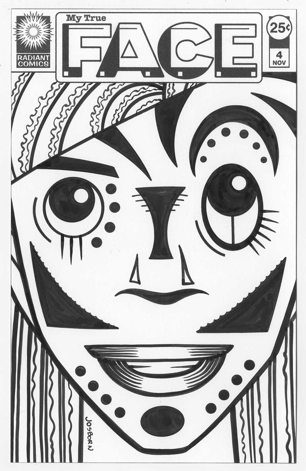
One of the reasons it came to mind was that I wanted something I could finish fairly quickly. Sure in the end it took me longer than I thought but it was still not nearly as long as a full size cover. At first I printed out the logo and trade dress at size (about 6.5 x 10 inches) and was going to draw a face in pencil on it. Then I stalled out. That was too big a size for me to quickly work out a pencil sketch of a face. Instead I turned to my archive of scanned drawings on my computer to see what I had. What caught my eye was my “Message Tee” drawings. I drew all sorts of weird faces on those characters, I had a lot of them, and they were only a couple of inches tall so there was plenty of room to develop them at a larger size. I picked out one that I liked and printed the face out at about a 5×7 inch size. Something I was very used to. Turned out that was a pretty good idea as I was able to redraw the face into something I liked with a lot less work than starting from scratch.
I then scanned in the penciled face and put that in my template than had the logos in it. After placing the pencil drawing I converted just that part into blue line. That way I could print the piece out onto a sheet of bristol with the logos in black and the pencil drawing in light blue. Then it was a matter of inking over the blue line with black India ink to make my final drawing.

Do you know what slowed me down at this point? It was my ink. About a month ago I ran out of my favorite brand of ink. Sennilier. It’s not a brand I can get at a nearby store and I’ve been short of money so I decided to just go with some other ink. I’ve got other inks around the place but I have only one favorite. The ink I was using Black Cat by Dick Blick is okay but it’s a little too thin for my taste. I had to got over certain lines twice and that takes more time. I got the first “My True Face” cover done this way (issue three since I had made one and two years before) so I didn’t like not having my favorite ink stop me but the whole time I wished I had some of it. I even switched to my second favorite ink. Unfortunately I was running out of that one too. After doing a second and third cover with those inks I broke down and ordered some more of the Sennelier. It was worth it.
So in the end I had four new faux covers. They were all the size of a comic book so I could slip them into a comic book bad with a backing board. I thought that was pretty cool. Three of them were done from “Message Tee” faces and the fourth was another drawing in my archives. Over all I like the way they come out. I might do more. Now if only the world would demand them of me.
Discussion ¬