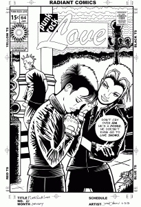
This week I have yet another tale of something taking me way longer to do than I thought it would. That story seems to repeat itself quite a bit. This time it was about one of my Punk Rock comic book covers. I haven’t done one in years but the idea is to take an old comic book cover and redraw it while replacing the characters with punk rockers. For some reason that really amuses me. I think it works because punks have a wide variety of identifiable looks and costumes that make it interesting plus there is a “Punk philosophy”, if you will, that make you look at the situations on a comic book cover in a different light. I made one from an old romance comic cover and a sci-fi comic cover in the past but this time I chose a romance cover. Those are particularly interesting on their own but make them into punk rock covers and they really get a bit nuts.
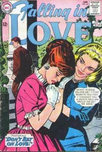
I was lucky enough to find a cover I could use fairly quickly. I did an internet search for romance comics covers and found “Falling in Love” #64 published by DC comics popped up. Oddly enough I have searched for another to do but nothing has jumped out at me like that one did. I’d prefer to have the actual comic to work with but since I didn’t I could only use a low resolution jpeg that I found. I only rarely draw on the computer but for this I decided to draw right of top of the image in Photoshop. It wasn’t a finished drawing I was more or less doing a quick tracing of the original cover. I then decided to keep with the digital format and draw over that tracing in Photoshop. That only lasted a half an hour before I gave up on the technique. Drawing on the computer slows me down rather than speeds me up.
After I decided I wanted to draw it on paper I put the logo, trade dress, and word balloons on it. I had already made up a trade dress based on early 1970’s Marvel romance comics and decided to use it again. This was an old DC Comic that I was working from but I had no interest in working up a whole other logo and trade dress. This was only supposed to take me a short time to do and besides why not keep it consistent with the other one I did?
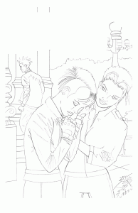
I then printed out my tracing on the cover in blue line onto bristol board and drew over that. It’s a technique I’ve done many times before. I just plain find it faster and easier to draw on paper than on the computer. The only problem I had with that technique this time was that I printed the blue lines a little too dark. At times they were darker than the pencil drawing I was making. It kept confusing my eyes as the blue and grey lines would sometimes be the exact same value. I had to keep darkening my pencil lines but I muddled through.
I also did an internet image search for punk clothing. I didn’t draw anything too elaborate but I find when drawing clothing it’s best to try and draw specific clothing rather than make up some generic clothing from my head. I find that’s a weak point for some comic book artists who are used to drawing super-heroes or other fantastical things. They draw great costumes but their regular clothes are generic and uninteresting. They’re drawing their idea of pants and a shirt rather than actual pants and shirts. I try to avoid that as much as possible. I used to have magazine clippings of clothes but thanks to the internet pictures of clothes are really easy to find these days.
It’s strange working over someone else’s drawing (Jim Pike is listed as the artist). I’m using some of his drawing but not all of it. I don’t want to change too much of it but I also don’t want to copy it. Plus I don’t want to lose whatever attracted me to the cover. That the scan was low resolution didn’t help either. Some of his lines got distorted and I couldn’t always tell what was what. Since I was drawing these three characters in dark clothing instead of light the blacks I had to spot were different than his. That made things more complicated and took more time than I thought they would. Ain’t that the way?
I then scanned my finished pencil version back into the computer. Since the logos and trade dress was now scanned in from a printed version that I was going to print out again it was no longer good enough. Too many generations from the original. So I erased the logo from the scan and put in a new one from the logo digital file. Next I printed the logo out in black and the drawing in blue line all on a nice fresh piece of 11×17 inch bristol board and was ready to ink.

The inking went smoothly though it took more time than I thought and I had to split it up over a couple of days because I didn’t have the time all in one day. That made it seem like it took even longer. It also took longer because I didn’t work out all the spotting of blacks in the pencil stage. I did most of that in the inking stage and had to figure out all the techniques I was going to use for all that leather. But I got it done.
Of course I decided to color it too. That’s where I’m stuck now and it’s taking too much time. I’m not sure exactly how I want to color it. At first I wanted clean and simple cut color like in the original but somehow I’m unsatisfied with that. I don’t even know why but I suspect it’s because I don’t like how it looks digitally. I like the original inks but scan it into a computer and it dies a little. Probably because it’s smaller and black and white on a computer looks boring. And on a computer screen flat color looks boring. I’ll have to print it out to see what it really looks like. But I’m not quite there yet. I’m still traveling with it and that is taking more time than I thought.


Discussion ¬