I’m back from the comic shop this week and I got six new comics.
Check them all out here:
I’m back from the comic shop this week and I got six new comics.
Check them all out here:
I’m on social media. That’s not exactly news since a whole lot of people are there these days but I have a mildly amusing story about it today. On most social media you have to pick a name to go by. Since I’m an artist who wants people to know who I am I generally go by my own name. I use “jaredosborn” in as many places as possible but I’m not always the first one there with that name so sometimes I go with “artbyosborn.” As an artist that makes sense and is easy for people to find.
Instagram has been the best for me. It’s not great but at least I have 900 people who follow me there. Only my YouTube channel has more subscribers at about 2000 (I’m jaredosborn there). I don’t get a ton of likes for any given post on Instagram but with the new Reels feature it says that a bunch of people (5000) have seen my videos. I’m not sure how real that number is but it’s a bigger number than anyplace else.
I’m relatively new to TikTok. I signed up for it years ago but didn’t find it very interesting or useful. That combined with the reports that the app collected tons of information on its users made me stop using it. I didn’t even miss it.
Years had passed since I abandoned TikTok and Apple put new privacy filters in place that let us tell apps that they weren’t allowed to collect info on us. That got me a little more interested in TikTok again so I reinstalled the app. Then I didn’t do much with it. It just sat there.
Sometime over the years TikTok must have upped the length of time that videos were allowed to use. I think it’s around three minutes now. At the beginning of the summer 0f 2022 I tried out TikTok again and discovered there were a lot of people making interesting videos that taught me stuff. I got back on again to watch them.
At this point I don’t even remember what my user name was a TikTok at the beginning of summer. I wasn’t posting much there and just watching so my user name was unimportant to me. But then I decided to post some stuff there so I thought that I’d better sync up my user name with the rest of my social media. JaredOsborn was already taken so I decided to go with Art By Osborn. Except artbyosborn was also taken.
It was really odd that artbyosborn was taken since that was usually the one I could get. I clicked on the artbyosborn user and he had zero videos. There was no activity on his channel. I suspected that I may have signed up under that user name a long time ago and had forgotten about it.
I decided to look in an old book where I used to write down passwords but couldn’t find anything there. Then I used the “Reset password” feature to try and find out if the account was mine. I used about half a dozed email addresses that I use but none of them were recognized by TikTok. That put an end to my investigations.
Despite me being an Apple user for about thirty years I didn’t have an iPhone until a year ago. I don’t even use the phone a whole lot. For working I use my desktop, for writing and some web surfing I use my laptop, and for going on social media and goofing around in general I use my iPad. My phone is for when I’m out and need to stay in touch.
This week the fall semester started and I have to commute into NYC and do some teaching. This means I need to bring some gear with me. I have an “Art go bag” with a bunch of art supplies in it so I can do a little bit of drawing on my commute. It also holds my camera for taking street photos, my food, my water, and my phone.
As I was double checking my bag the morning of my commute I saw that I didn’t have TikTok on my phone. It was no big deal. I had noticed that before and not done anything about it because I don’t watch TikTok on my phone. But I decided since it was a new semester and that meant some new habits that I may as well put it on my phone.
After installing TikTok it asked me how I wanted to sign in. I could sign in with an email address, an Apple ID, a Facebook name, or a Twitter name. For most things I use an email address but not always. Sometimes I sign in with an Apple ID because that means I can use my fingerprint instead of a password. That’s convenient.
Not knowing how I originally signed up for TikTok I decided to go with my Apple ID. After all I just had to use my fingerprint that way. It worked but guess what? I signed in and saw that I was indeed “artbyosborn.” I must have originally set up TikTok with my Apple ID because here was the “No Posts” identity that I found when looking for “artbyosborn” on my iPad.
The first thing that I did was go to the section where I could change my user name and changed it to “artbyosbornold.” That way I could use the the TikTok identity that I’ve been using this year with no idea that I already had one. I moved a little bit fast though. Since I was doing this just a little while before I had to head out for my commute I couldn’t set up my second identity to use the name. There was a bit of a lag.
I had to head out for the train without claiming the “artbyosborn” name for my second identity. I knew the odds of anyone else claiming the name wasn’t really very high but still I was like, “C’mon, I can’t believe this.” It wasn’t until the end of the day when I was waiting in the Secaucus Junction train station that I got a chance to claim the name. It was still there of course.
So now things are synced up. On both Instagram and TikTok I’m “artbyosborn.” Stop on by and say hello.
I’m back from the comic shop this week and I got nine new comics.
Check them all out here:
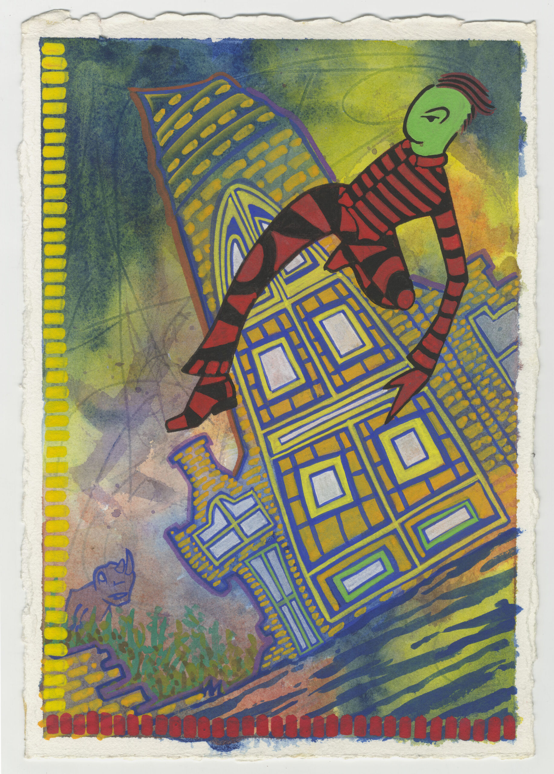
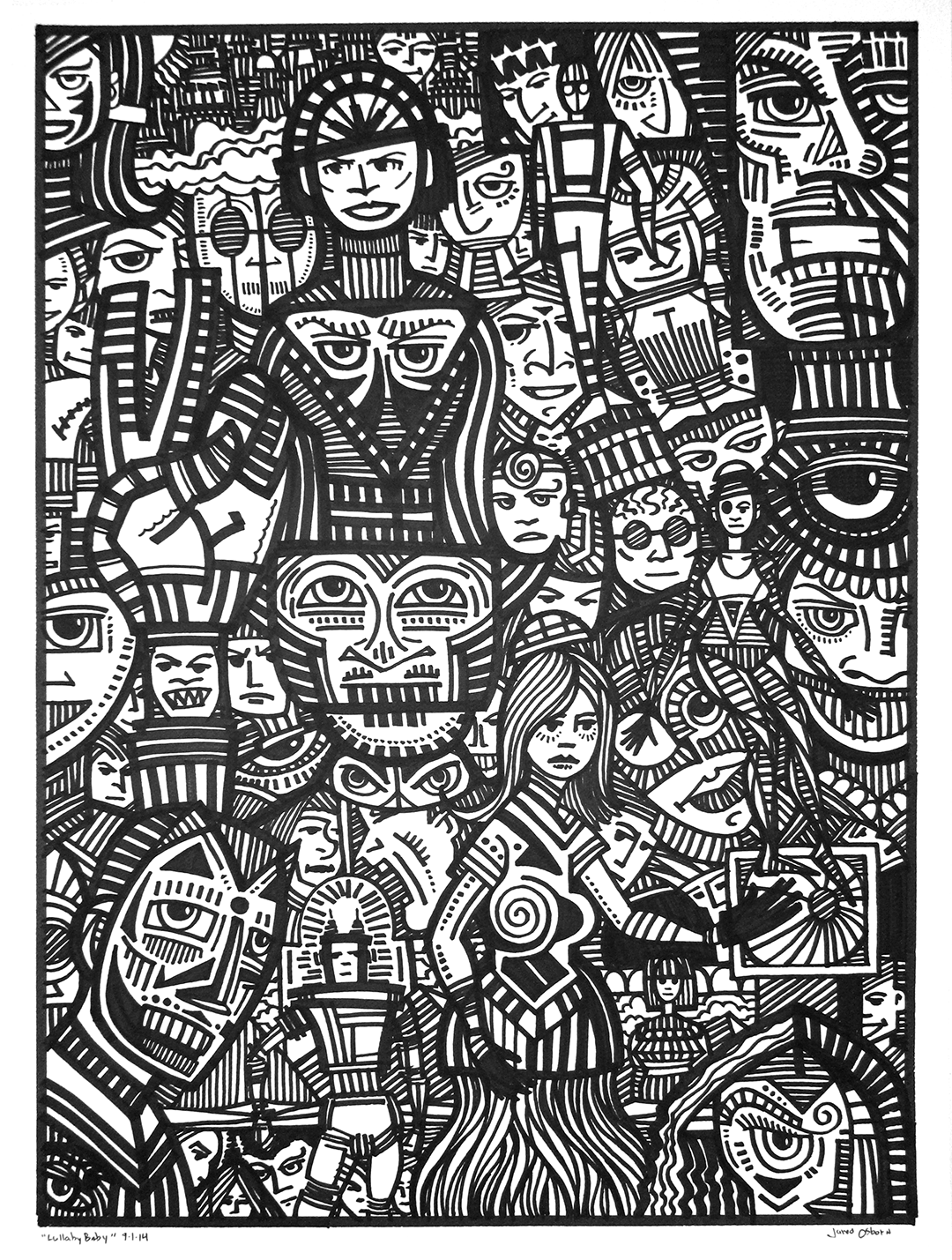
Dancing Man
I’m feeling nostalgic this morning so I decided to pull out an old painting and write about it. I’ve written a few pieces on my 8×10 inch acrylic on canvas paintings from the first decade of the 2000s but this time I decided to look at one of my gouache on paper paintings from the 1990s. It’s called “Dancing Man.” A literal title. I didn’t always date everything in the 1990s but this one I did. It’s from January 1, 1999. I guess by then I had finally learned to write a date on my work.
I first started learning to paint with gouache in the early to mid 1990s. Gouache is an opaque watercolor. That opaque part is key for me and what makes me like gouache better than regular watercolor. I like being able to go from solid color to transparent color. Regular watercolor is just transparent color.
Looking at this 7.5×11 inch painting (it’s on 300 pound watercolor paper) there is a main figure, some buildings, a bit of a landscape, and some kind of dinosaur in the background. The view is from below and the horizon line is tilted so the whole painting is on the diagonal. I find it an interesting image.
In looking at this piece I can tell that I was using a surrealist automatic drawing method but not quite in the same way I do today. Back when I started using that method I would draw scribbles on a piece of paper and then draw what I could find in those scribbles. It’s sort of like finding faces in clouds. This is how Surrealists got their dream like images and how I get mine. Except now the scribbles are mostly in my head.
It looks like for this one I painted on the paper with watercolor before I ever drew anything. All that blended together watercolor that makes up the background was painted first. The blue and yellow in the sky and the blue and red on the bottom were put down and left to dry and then I went in and painted on top with opaque gouache. That’s why I like the solid opacity of gouache.
I can also see that instead of scribbling on the paper with a pencil I drew lines in the wet water color with the stick end of a brush. See all those dark lines in the background sky? Those were made with the handle of the brush. Rub the wet watercolor paint with a pointed stick and it will darken the paint. It gives a nice sense of action to the sky.
I’m guessing that I drew the rest of the piece from the design I saw in those lines in the watercolor. That’s how I worked in those days. The main figure certainly seems so because the dancing man is in a position that I don’t think my conscious mind would come up with. He is up in the air and twisted in a strange way. But that’s the whole point of surrealist automatic drawing. To come up with images that the conscious mind wouldn’t think of.
The dinosaur is another thing that I don’t think my conscious mind would think of. The shape of the watercolor blob probably sparked the image of a dinosaur to me. I think he represents danger lurking in the background. The man is dancing recklessly and danger is watching him from the cover of some shrubs, waiting. Maybe the danger will make itself know, maybe it won’t, but the danger is present nonetheless. It adds some spice to the picture.
After the basic image comes the graphic design quality of the painting. Gouache is often branded as “Designer’s Gouache” because before computers and desktop publishing graphic designers would often use gouache to make their designs if paint was needed. Gouache dries flat, even, and opaque so you can make nice patterns of color with it.
The dancing man really pops out at the viewer because of the red and black pattern in his clothes. Lots of black and red stripes that are pleasing to the eye. The patterns continue with the bricks and shapes in the buildings as well as the color brush strokes on the left and bottom of the painting. Gouache is really good for making patterns.
The yellow and red brush strokes on the bottom and left look fairly simple to my eye in 2022. I’m not 100% sure if that was a choice (I think it was) only because most of my gouache paintings (and plenty of my acrylic on canvas ones) have complex series of brush strokes like this. Instead of being just the single color they’d be made up of three or four colors. I’m not sure if this one was the beginning of developing that style or I just toned it down for this painting. I’d have to look at it in the context of other stuff done at the same time. I think it was a deliberate toning down.
The rest of the painting is all about technique, especially those buildings. Some parts of the building are opaque and some are semi-transparent. That’s what I consider technique. What do I want to show through? What do I want to be solid? What do I want to keep as watercolor wash? Those were all the technique questions that I had to decide.
I made the middle part of the biggest building opaque and solid. There are shapes of yellow, orange, and a little green that are the same opacity as our dancing man. The bottom and left side brush strokes are also this solid opacity and it puts all those elements on the same level and floats them in front of the thinner watercolor. The bricks are semi-transparent and that makes them one level behind the opaque parts.
Watercolor background, semi-transparent bricks, and a solid dancing man. These are the basic three levels of transparency in this piece that define the space. They all work together to make an interesting space. I like this piece. I like the figure dancing through the space.
I used dancing people as the subject of many piece of art but this might be my favorite one. Sometimes the subconscious really knows what it’s doing.
I’m back from the comic shop this week and I got seven new comics.
Check them all out here:
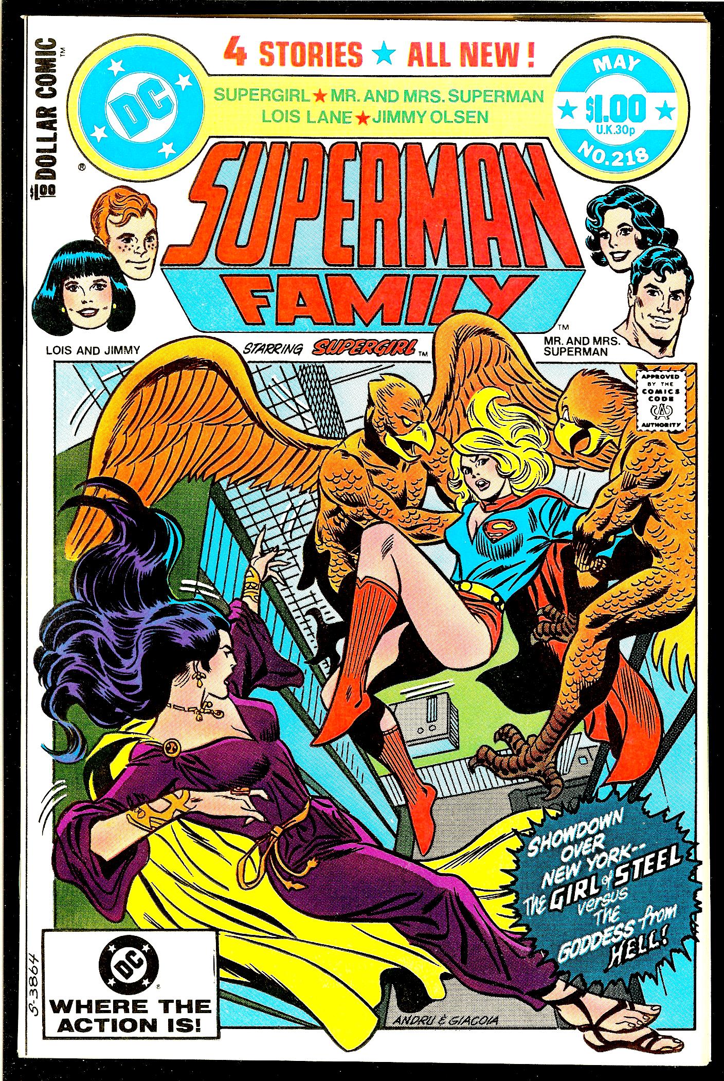
I haven’t written about a comic book cover in a long time so I thought I would today. If you’ve been watching my comic book haul videos then you know about my comic book covers of the week. Those are the two comic books that I pull out from my collection and sit on top of my printer for the week. That’s my little museum. I walk by them and look at them all week. It’s a way for me to see and interact with comic books that are buried in my collection.
This week one of those comic books, I usually have a mainstream comic and an indie comic out, is Superman Family number 218 from May 1982. I’m not sure where or when I got this comic. I was a Marvel Comics’ kid and didn’t buy many DC comics but I had started buying some around the time of New Teen Titans #1 in 1980. I could have bought this one off the stands except that I still have it in its original comic bag and that bag has a $2 price tag on it. That means it probably came from my local comic shop at the time. But why would I buy it as a back issue? I have no idea why.
The first thing I notice is that this is a really well designed cover. There are a lot of elements to it and they all seem to be in the right place. The trade dress is complicated with the DC logo, price bullet, Superman Family logo, list of characters, “All New” blurb, second list of characters (?), floating heads, dollar comic logo, and some cover copy. That’s way more than most comics have on their covers. The top third of the cover is jammed with stuff but it all works.
In the early 1970s Marvel Comics put out a whole bunch of covers where the art was in a box under the logo. It was a graphic design thing. In the early 1990s I asked John Romita why they did that. He told me that it was to celebrate the tenth anniversary of something. He couldn’t remember if it was the Fantastic Four or Spider-Man. We settled on calling it the tenth anniversary of “Marvel” in general. I always liked those “Covers in a box” but other fans didn’t.
This comic book uses that same type of cover in a box design. I can’t remember but that may be why I bought this issue. I’ve always collected covers from that Marvel tenth anniversary period so maybe I saw this one in my LCS’s back issue bin and bought it because it reminded me of those. This is one of those comics I didn’t even remember that I had in my collection let alone why I bought it.
The cover artists are Ross Andru and Frank Giacoia. Their signatures are on the bottom of the cover so it’s easy to identify. By this time the two of them were veterans of many comic books so they really knew what they were doing. The drawing and inking is all solid and on point.
The first think I notice about this cover is the perspective. We’re looking down at the ground in a one point perspective and the horizon line is even tilted at an angle. That’s some unusual stuff. It gives the viewer a sense of being high in the air. Even though the background is in an extreme perspective the figures aren’t. Their perspective is much more slight which lets the viewer get involved with the characters more. We are right there with them. The figures are on a flatter plane which emphasizes the height.
This cover is a good example of the artists playing with perspective to get maximum impact for the cover. A drawing doesn’t have to look like a 3D model with everything in the “Correct” perspective. Sometimes “Correct” is hard to work with and fails the eye test. It doesn’t always look right.
Another graphic design element that I like is that the art breaks out of the box it’s in on all four sides. This adds to the complexity of the drawing’s space. We have the two wings breaking out on top, one is even over the logo, hair breaking the left side, feet and a cape on the bottom, and the burst on the right.
These breaks tend to emphasize that we are looking at a flat drawing on a page while the deep perspective fools us into thinking we’re looking into a space. These elements together give the eye a lot to look at and ponder. The top logo and trade dress do a similar thing. The white background gives a sense of empty space that the flat trade dress sits on. I really like the sense of space on this whole cover.
The figures are also terrific. Supergirl, being at the center of the composition, has the most perspective to her. Her cape and back foot are falling down the perspective hole. The two bird men holding her also have a bit of perspective to them but their bulky upper halves dominate. These three fit right into the space.
The villain in purple’s name is Hecate. I find her figure the most interesting. She seems to be static and in motion at the same time. I think this has to do with the way her figure is drawn plus its place in the composition. She’s on a diagonal across the bottom left corner and the UPC box so that alone seems to put her in motion.
Now look at how she is drawn. Look at her left hip. From the perspective and the way it’s drawn that leg should follow the perspective down and disappear from view behind her body. But as the eye follows her right leg down we suddenly see both of her feet. Her left leg isn’t hidden behind her body after all.
For me this makes me feel like her body is in motion and is “Sliding” across the bottom of the cover. My perception of the figure changes as her foot comes into my view. I have no idea if this is on purpose or not but either way it works for me.
Also as her feet break the box it flattens out the design. There is a constant tension in this cover between the flatness of the design elements and the space of the picture perspective. I find that tension lively and enjoyable.
So there you go. That’s a look at a cover I didn’t even know was in my collection. It’s a good one.
I’m back from the comic shop this week and I got nine new comics.
Check them all out here:
It was a tumultuous bike ride this morning. No injuries so it wasn’t the worst ride ever but there were problems. Back before I rode my bike all winter long (over a decade now) I used to have to take a month in the spring and build up my stamina. I had five routes. One being the easiest and five being the one I eventually rode all summer long.
Now I ride route four in the cold months and route five in the warm ones. The names don’t make sense anymore since there are no longer routes one through three. So I decided to rename them. Now I take “The Ride of the Nine Hills” and “The Ride of the Seven Hills.” It’s much more poetic.
Today I was on “The Ride of the Nine Hills” and I was just coming off the biggest hill and turning onto Route 9W South. There is a tricky spot ten or twenty yards from that turn. Most of the section of 9W that I ride has a wide shoulder so I can ride on the shoulder and that makes things safer. But there is a part of the shoulder right after the turn that has a break in it. There is a crack and the south side of the crack is about two inches higher than the north side. It’s like hitting a little two inch cliff. That cliff can pop a tire.
Normally I swing out onto the road a foot or two and avoid the crack all together. Easy enough. But today as I was heading towards the crack (it’s on a downhill by the way) there was a big truck bearing down on me. An eighteen wheeler. That was not the time to swing a foot or two out into the road so I decided to turn further into the shoulder and try to avoid the crack. If I hit it at just the right diagonal angle and then swing back I can miss it.
My front tire went trough just fine but I flinched as the truck went by me and at that moment my back tire swung too early and hit the crack. Sure enough it popped. I was completely annoyed.
But I carry with me a spare tube and have a portable air pump strapped to my bike for just such an occasion. I pulled over onto a lawn at the bottom of the hill and proceeded to change the tube. Everything went well until I tried to put air in the tire. As I attached the head of the pump to the stem of the tire and started to pump air the head went flying off. That happens sometimes as it takes a lot of air pressure to fill a bike tire. No big deal I thought.
As I went to put the head of the pump back on I noticed something wasn’t right. Where there should be a connector there was a hollow. I looked around at the ground and found two plastic pieces that had fallen out of the pump. How did that happen?
I couldn’t figure out what went wrong. I could put the two pieces back but when I went to pump air they flew off pretty quickly. What I didn’t know until I eventually got home and looked it up is that there is a metal piece that screws onto the head and keeps those other two pieces in place. Mine had unscrewed and fallen off. When and where that happened is a mystery. It could have been a minute before or a month ago. I only uses that pump in emergencies like this one.
It took me three or four tries but I got some air in the tire. My left hand had to take the place of the metal piece as I held the head of the tire onto the tube stem. It wasn’t easy. The air pressure of a road bike tire is about 90PSI. I probably only got about 40-50PSI in there but still it took a lot to hold the pump head in place as I pumped with my right hand and held the other end of the pump against my thigh.
As an aside a couple of fellow bike riders asked if I was okay as they rode by. They problem was that they asked as they flew by. I didn’t even see them coming. It would have been easier if I could borrow a pump from them but I didn’t even have a chance to ask. It was a strange situation.
Meanwhile after I got enough air in the tire I went on with my ride and headed home. I was mostly thinking about what broke on my pump and how that could happen. Then, as I was a mile or so from home, I made a turn onto Central Highway and I got another flat tire! This time it was a pinprick flat (as I discovered when patching the tire at home) so I didn’t hear anything pop. I was flabbergasted. I don’t think I’ve ever gotten two flats on one ride.
I decided to just walk the bike home from there. It wasn’t much of a decision because I only carry one spare tube with me on my rides and pumping up the tire to see if it would hold any air seemed a futile gesture. It’s August 12 as I write this and we’ve been having a heat wave in recent weeks but today it was a pleasant 77ºF out. So at least I had nice weather for my walk.
I was going to go onto Amazon and leave a bad review for about my broken pump but oddly I couldn’t find it among my past orders. I must have put the pump on my wishlist and someone got it for me for a birthday or Christmas. I kept digging for info on the pump and that’s when I discovered that there was a piece that fell off mine. I couldn’t buy just that piece so I ended up getting a whole new pump for $35. I bought the same one because all the others I could find weren’t nearly as good. When the new one arrives I’m really going to have to keep track of that piece.
I’m back from the comic shop this week and I got eight new comics.
Check them all out here:
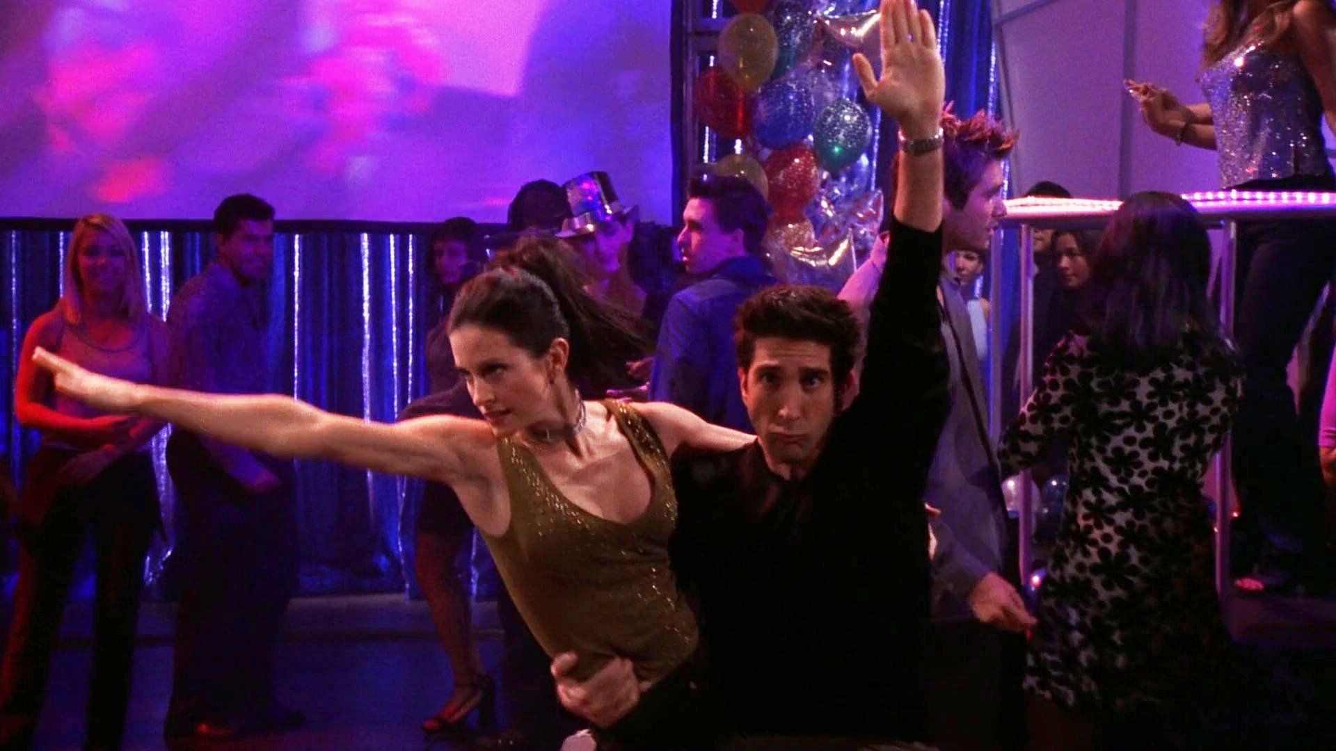
As I write this it’s a mellow summer Sunday afternoon and I feel like writing a “Friends” walkthrough. I think I’ve only watched a single episode since my last walkthrough so let’s see what episode I’m up to. It’s “The One With the Routine” from season six and it is episode ten. It’s a New Year’s Eve episode if memory serves.
It first ran on December 16, 1999 so let me check my calendar to see what I was doing that day besides sitting down on a Thursday night to watch this episode. I’t looks like I was up to a few things that day including starting my Christmas shopping. I even spent $30 at Kaybee Toys. I have no idea what I bought but it had to be a toy of some type. I also worked on some animated gifs for an old site called Uproar. It was the time on the Internet bubble so there was a lot of web graphics work to go around and even I got some. I also started work on one of my photographs. That sounds like a pretty good day.
Now let’s start the show. The gang is decorating a Christmas tree at Monica and Chandler’s. Chandler has an observation about the tree lights. No one appreciates it and in walks Ross. Monica’s controlling neatness jokes ensue. Here comes the theme song.
Here they are at Central Perk and Ross is telling historical stories that no one appreciates. I feel for him. I like history! Joey walks in. He has a crush on his new roommate, Janine, and she isn’t feeling the same. Joey isn’t used to unrequited love. That’s Chandler’s area of expertise.
Janine walks in and announces that she’s going to be on Dick Clark’s New Year’s Rockin’ Eve. She’s English and doesn’t know what it is but Monica and Ross are psyched! That show was a big part of their childhood. Chandler makes a mean fat joke. Ross is such a geek (another reason I like him). Janine invites Ross and Monica to the show and they jump at the chance. This is the main plot for the episode. All the other plots pale in comparison.
Since Janine asked Joey to be her dance partner on the show a discussion happens after she leaves as to if it’s a date or not. The friends are split. Joey plans a midnight kiss even though the show is taped before NYE.
Next we’re on the set of the Dick Clark show and Joey is handing out advice which is to stay cool. Of course Ross and Monica can’t. They both rush up to the director and annoy him with their jokes and enthusiasm. Ross and Monica, as brother and sister, weren’t planning on dancing together but now they have to. That’s a key plot point.
Now we’re at Chandler’s place and a new plot emerges. Phoebe and Rachel rush in to try and look for the spot where Monica is hiding their Christmas presents. Though this is a rather minor plot it’s pretty funny. I remember them milking a lot of solid jokes out to the situation. Chandler stops them but eventually they wear him down and he starts searching too. There is really some good stuff in here.
Back to Ross and Monica dancing. The camera never points at them so they plot to get noticed. Plus Joey is trying to impress Janine with his dancing but the director stops by and gives then each a new dance partner. Now Joey has to plot to get near her so her can kiss her at fake midnight. Lots of sitcom type scheming in this plot line.
Back to the present hunt and they found them. Rachel and Phoebe are disappointed the presents are crappy. Turns out those are the presents Chandler bought. Oops! They don’t appreciate bookends. A couple of Philistines!
More dancing with Joey. Janine is off with “Tall Guy” so Joey tries to sabotage Tall Guy with the old “Throw water on his pants to make it look like he wet himself” gag. This is the weakest of the three plots. I was never interested in the Joey and Janine plot. She was hot but never had much personality. Ross and Monica continue to try and impress. It doesn’t work.
Central Perk again and Chandler, Phoebe, and Rachel continue the present talk. They actually think Gunther might know something so Rachel tries to sweet talk him. He has always had a crush on Rachel so he is flabbergasted as Rachel lays it on thick with the flirting. Then he faints. I generally appreciate the Gunther material.
Back to the dancing and Ross comes up with a new plan. They’re going to do “The Routine” from their childhood. A dance number they thought up as kids. Hence the name of the episode. Monica agrees. They break into it and impress me but no one else. The director likes their goofiness and unbeknownst to them wants it for the blooper reel.
Once again it’s Joey and Janine. Joey’s wet pants prank worked and he’s back with Janine. The director yells cut and there is no kiss. End of dance show except Monica and Ross keep going!
Back at Joey’s apartment it’s a chicken and duck appearance! I wonder if this is the last one? More present hunting and this time they find the real ones. Chandler has second thoughts. A Peanuts joke! Go Sparky! Monica walks in and the plot line ends. It was fun while I lasted but we all knew Chandler wasn’t goin to feel good in the end.
Here comes some awkwardness and Janine gives Joey the New Years kiss they missed out on. They finally hook up. Joey getting the girl really isn’t that funny or interesting. He’s the one who always gets the girl.
Back to Monica and Chandler’s apartment and they are recapping the dance show for the three who weren’t there. They’re telling how Joey didn’t get his kiss (little do they know) and a little “Routine” talk. And the end.
Time to look at what was cut from this episode for syndication. They cut the lines with Ross and Monica explaining they were brother and sister. I guess it wasn’t really that important to the plot. They cut the entire scene with Gunther fainting (no way). So they never went to Central Perk to look for the presents in the syndicated version. That’s a huge cut. They also cut the end of the dance scene where only Ross and Monica keep dancing. No big loss there. They also cut the lines where they tell that Joey didn’t get his kiss. There were some good Ross moments in there.
If I were to rate this one today I’d give it four out of five stars. Above average. Let’s see what I rated it in 2013. I rated it four stars then too. It’s a good episode.