Experimental Painting 01
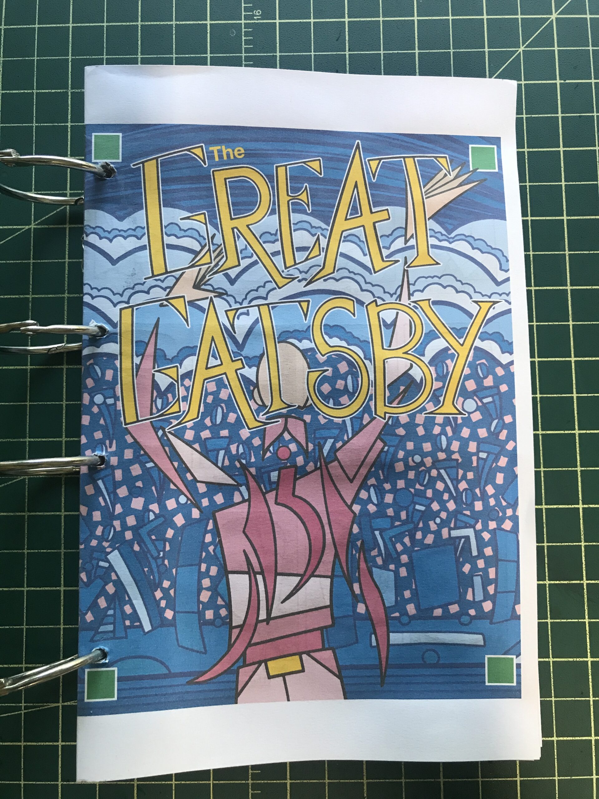
It’s not east trying new things. That statement can be attached to things in general but what I mean by it is that it’s hard to try new artistic things. That is what I was doing this week. I’ve been finishing up my Gatsby project this month. It’s still not done but it is a big project and I have no new big project in the works to replace it.
In recent years I’ve done big projects such as a series of 24×36 inch paintings or a series of 22×30 inch Big Ink drawings but I’m not in the mood for either of those. So what I’ve been getting done is a series of smaller things. They are the things I’ve always managed to get done such as my web comic, small 6×9 inch ink drawings, and my “Dreams of Things” covers to comic books that don’t exist.
It’s not like I haven’t gotten stuff done but it isn’t as satisfying as it could be. But I’m also not in the mood for anything big. It’s a conundrum. Then I had the idea to do something new. I’ve been seeing these videos online of people making art by layering the paper with images and paint and tape and whatever. They start with one thing and just go. The piece transforms many times until it reaches its final form. It looks cool in a video. I decided I wanted to give something like that a try. Without the video part.
I like to buy art supplies and I like to try out new art supplies. Usually when I put a big order in with an art supply website I throw in a few little things to try out. So I have a backlog of papers, pencils, pens, and other such things kicking around the place.
The first thing I did was to look through a pile of pads of paper that I have. I had black paper, plastic paper, watercolor paper, acrylic paper, grey paper, mixed media paper, and toned paper. The pages were anywhere from 10×15 inches to 5×7 inches. I picked out a few sheets of paper on the small side.
Experimental Painting 02
The next thing I did was to organize what paints and pens I wanted to use. I pulled out some black brush pens, a big black marker, a few sets of watercolor paints, a silver pen, white and black acrylic paint pens, and a set of Sharpie paint pens. I also pulled out a pouch of sample art supplies from Strathmore that were given to me.
I’m used to starting a piece with no idea of what I’m going to draw but this was a little different. I like making images. That’s the main thing I like in art. Usually I decide what kind of piece I want to make and then draw an image that goes with what I want to finished piece to look like. I say to myself, “I want to make a ‘Dreams of Things’ cover” or “I want to make a Big Ink Drawing.” Then I create the image and do all the steps that are necessary to finish the piece.
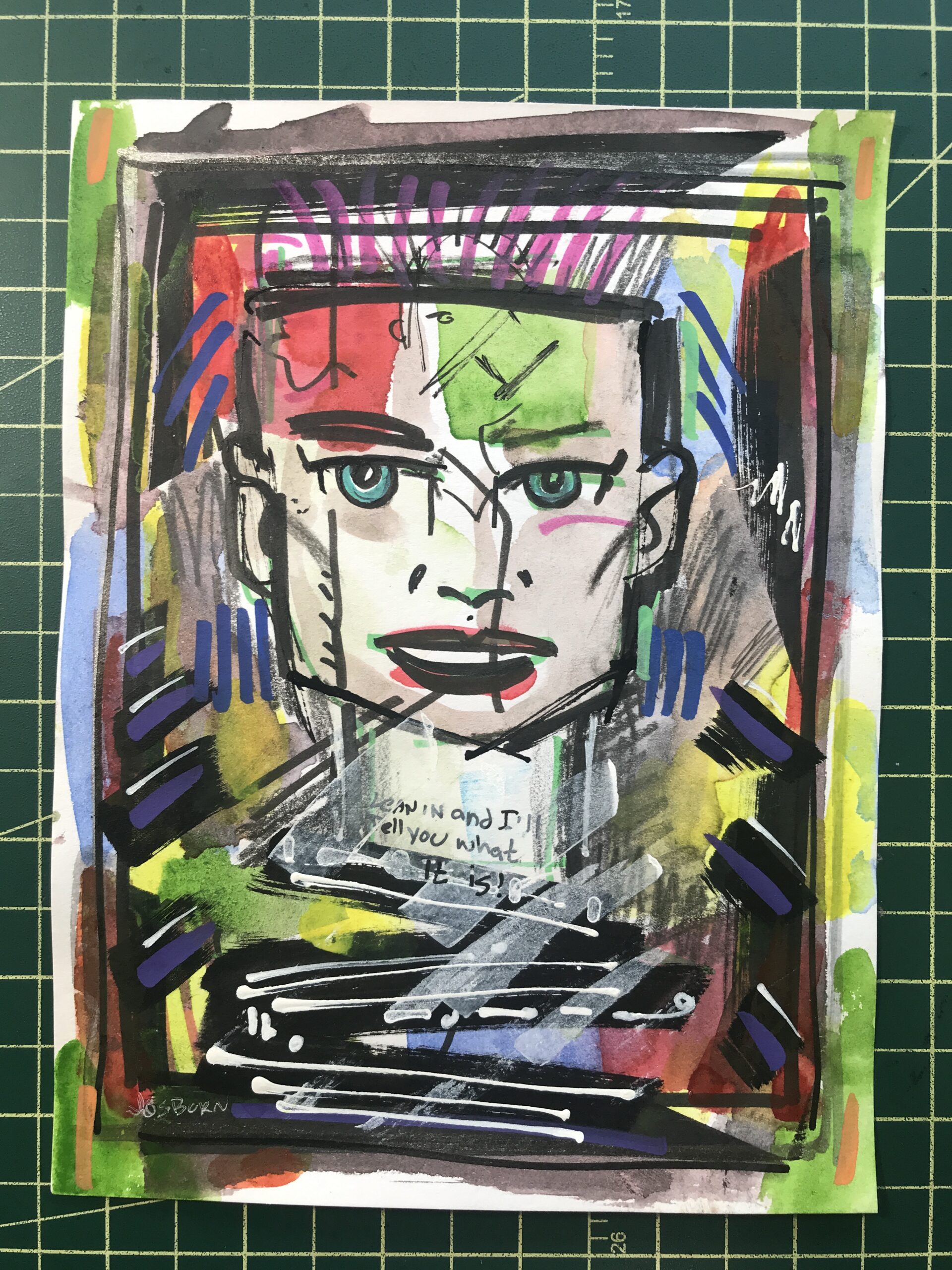
When I’m trying something new I have no idea what steps are necessary to finish the piece. That’s what I was doing on Friday. I didn’t start with any idea in mind how the piece was going to look in the end and therefore had no idea how to make an image for it. So I just grabbed some paint and threw it on the paper. Then I grabbed a marker and added to it. I also added some pencil drawing after that. I had no idea where any of it was going.
At some point after flailing around like this I decided I had to draw something. I didn’t want to make an abstract painting. So I started drawing a figure. It wasn’t a very good figure so I drew over it. After drawing a bunch of stuff with a bunch of different tools I decided to draw a face over the top of it. Faces are kind of my default subject matter so it was comfortable going to them but it didn’t make me happy. I was, after all, trying something new.
For the second one I threw down some watercolor paint but since I tried out the plastic paper I had to put it aside to let the paint dry. It didn’t sink into the paper. It sat on top of the plastic.
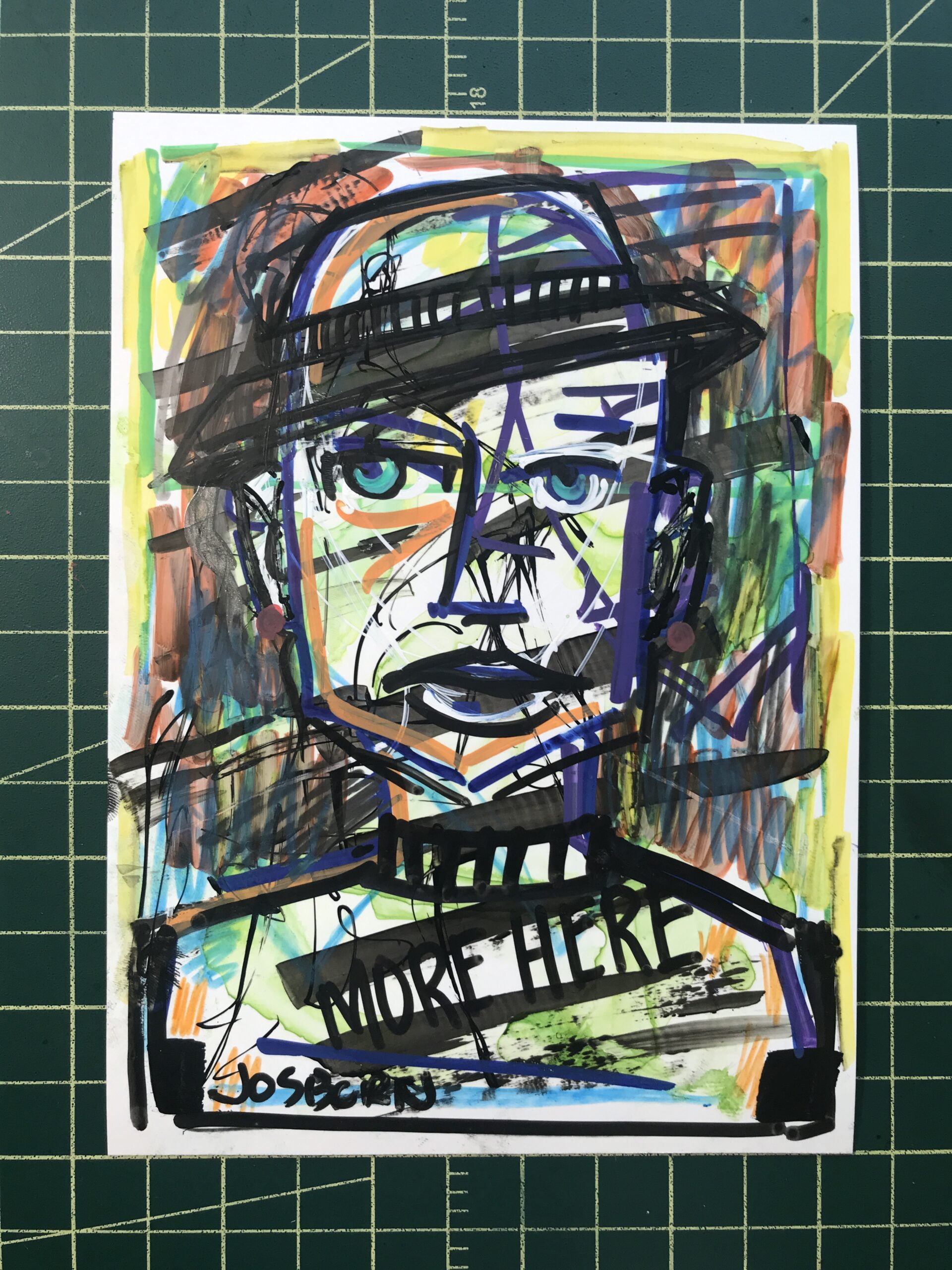
With the third one I went straight to drawing a face. I used various tools to draw the face but I didn’t like it much. So then I drew another face right over it. There is also lots of brush strokes, pencil lines, and color blobs that have nothing to do with the face. I was just trying stuff.
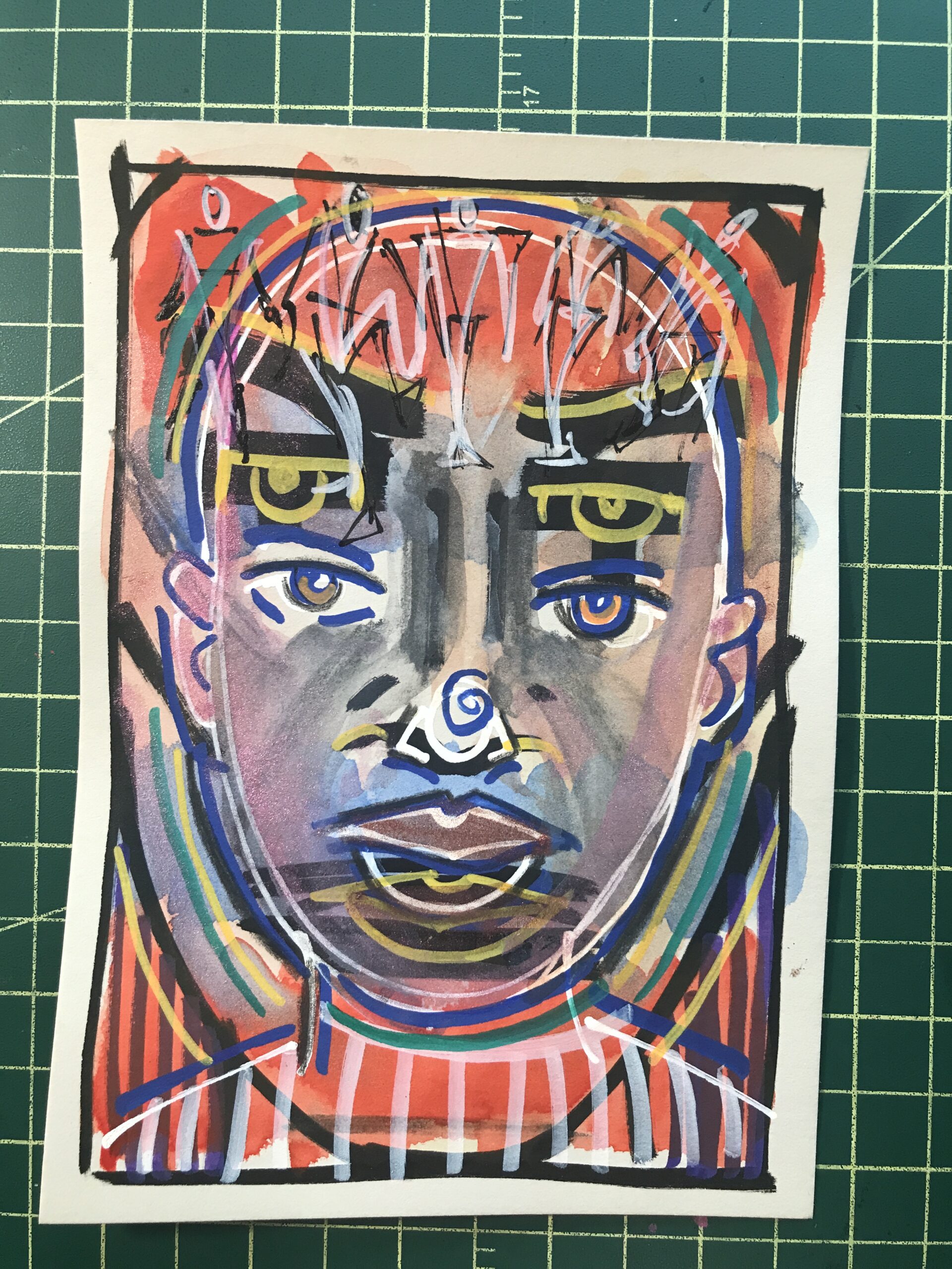
Experimental Painting 03
Eventually I was switching off working on all three paintings to give the paint time to dry and to let me get new ideas. I worked from about eight in the morning until about three in the afternoon on these three paintings. In the end they looked okay but I wasn’t very satisfied with them. After all I had no image in my head of what they could be so there was no satisfaction of making that idea come to life. They just were.
I was so unsatisfied with them that afternoon that I cleaned up really fast. All the paper and tools went away back to their spots and soon my drawing table was cleaned off and looked like it usually looks. It was like I couldn’t stand the disorder that the “New” imposed on me.
When I looked at the three small paintings the next day they weren’t half bad. They looked okay and there was the occasional nice idea in there. But I still wasn’t sure what they were and what good they did me. They were too new. I’m going to have to sit with them for a while.
Over the years as I’ve come up with new ideas and new techniques they rarely come quickly. Some have sat for months or years percolating in my brain. Usually it’s a mixture of new tools and techniques that I try out but don’t know what to do with until I get the idea to mix them with something else. So that day of trying all that new stuff is really just step one. But I have no idea how many, if any, more steps there will be.
Trying new stuff is hard.