I haven’t written about a comic book cover in a long time so I thought I would today. If you’ve been watching my comic book haul videos then you know about my comic book covers of the week. Those are the two comic books that I pull out from my collection and sit on top of my printer for the week. That’s my little museum. I walk by them and look at them all week. It’s a way for me to see and interact with comic books that are buried in my collection.
This week one of those comic books, I usually have a mainstream comic and an indie comic out, is Superman Family number 218 from May 1982. I’m not sure where or when I got this comic. I was a Marvel Comics’ kid and didn’t buy many DC comics but I had started buying some around the time of New Teen Titans #1 in 1980. I could have bought this one off the stands except that I still have it in its original comic bag and that bag has a $2 price tag on it. That means it probably came from my local comic shop at the time. But why would I buy it as a back issue? I have no idea why.
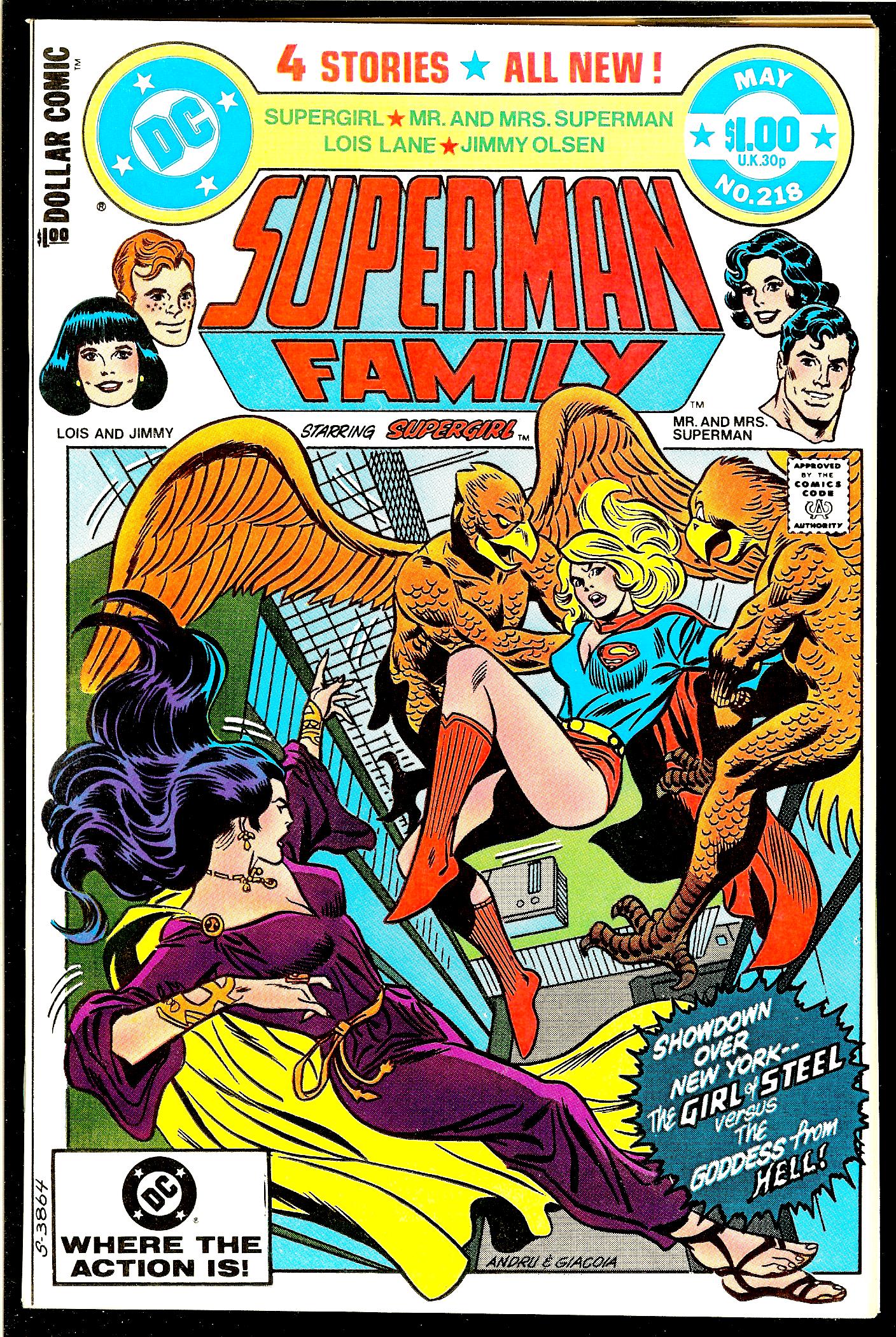
The first thing I notice is that this is a really well designed cover. There are a lot of elements to it and they all seem to be in the right place. The trade dress is complicated with the DC logo, price bullet, Superman Family logo, list of characters, “All New” blurb, second list of characters (?), floating heads, dollar comic logo, and some cover copy. That’s way more than most comics have on their covers. The top third of the cover is jammed with stuff but it all works.
In the early 1970s Marvel Comics put out a whole bunch of covers where the art was in a box under the logo. It was a graphic design thing. In the early 1990s I asked John Romita why they did that. He told me that it was to celebrate the tenth anniversary of something. He couldn’t remember if it was the Fantastic Four or Spider-Man. We settled on calling it the tenth anniversary of “Marvel” in general. I always liked those “Covers in a box” but other fans didn’t.
This comic book uses that same type of cover in a box design. I can’t remember but that may be why I bought this issue. I’ve always collected covers from that Marvel tenth anniversary period so maybe I saw this one in my LCS’s back issue bin and bought it because it reminded me of those. This is one of those comics I didn’t even remember that I had in my collection let alone why I bought it.
The cover artists are Ross Andru and Frank Giacoia. Their signatures are on the bottom of the cover so it’s easy to identify. By this time the two of them were veterans of many comic books so they really knew what they were doing. The drawing and inking is all solid and on point.
The first think I notice about this cover is the perspective. We’re looking down at the ground in a one point perspective and the horizon line is even tilted at an angle. That’s some unusual stuff. It gives the viewer a sense of being high in the air. Even though the background is in an extreme perspective the figures aren’t. Their perspective is much more slight which lets the viewer get involved with the characters more. We are right there with them. The figures are on a flatter plane which emphasizes the height.
This cover is a good example of the artists playing with perspective to get maximum impact for the cover. A drawing doesn’t have to look like a 3D model with everything in the “Correct” perspective. Sometimes “Correct” is hard to work with and fails the eye test. It doesn’t always look right.
Another graphic design element that I like is that the art breaks out of the box it’s in on all four sides. This adds to the complexity of the drawing’s space. We have the two wings breaking out on top, one is even over the logo, hair breaking the left side, feet and a cape on the bottom, and the burst on the right.
These breaks tend to emphasize that we are looking at a flat drawing on a page while the deep perspective fools us into thinking we’re looking into a space. These elements together give the eye a lot to look at and ponder. The top logo and trade dress do a similar thing. The white background gives a sense of empty space that the flat trade dress sits on. I really like the sense of space on this whole cover.
The figures are also terrific. Supergirl, being at the center of the composition, has the most perspective to her. Her cape and back foot are falling down the perspective hole. The two bird men holding her also have a bit of perspective to them but their bulky upper halves dominate. These three fit right into the space.
The villain in purple’s name is Hecate. I find her figure the most interesting. She seems to be static and in motion at the same time. I think this has to do with the way her figure is drawn plus its place in the composition. She’s on a diagonal across the bottom left corner and the UPC box so that alone seems to put her in motion.
Now look at how she is drawn. Look at her left hip. From the perspective and the way it’s drawn that leg should follow the perspective down and disappear from view behind her body. But as the eye follows her right leg down we suddenly see both of her feet. Her left leg isn’t hidden behind her body after all.
For me this makes me feel like her body is in motion and is “Sliding” across the bottom of the cover. My perception of the figure changes as her foot comes into my view. I have no idea if this is on purpose or not but either way it works for me.
Also as her feet break the box it flattens out the design. There is a constant tension in this cover between the flatness of the design elements and the space of the picture perspective. I find that tension lively and enjoyable.
So there you go. That’s a look at a cover I didn’t even know was in my collection. It’s a good one.