Dancing Man
I’m feeling nostalgic this morning so I decided to pull out an old painting and write about it. I’ve written a few pieces on my 8×10 inch acrylic on canvas paintings from the first decade of the 2000s but this time I decided to look at one of my gouache on paper paintings from the 1990s. It’s called “Dancing Man.” A literal title. I didn’t always date everything in the 1990s but this one I did. It’s from January 1, 1999. I guess by then I had finally learned to write a date on my work.
I first started learning to paint with gouache in the early to mid 1990s. Gouache is an opaque watercolor. That opaque part is key for me and what makes me like gouache better than regular watercolor. I like being able to go from solid color to transparent color. Regular watercolor is just transparent color.
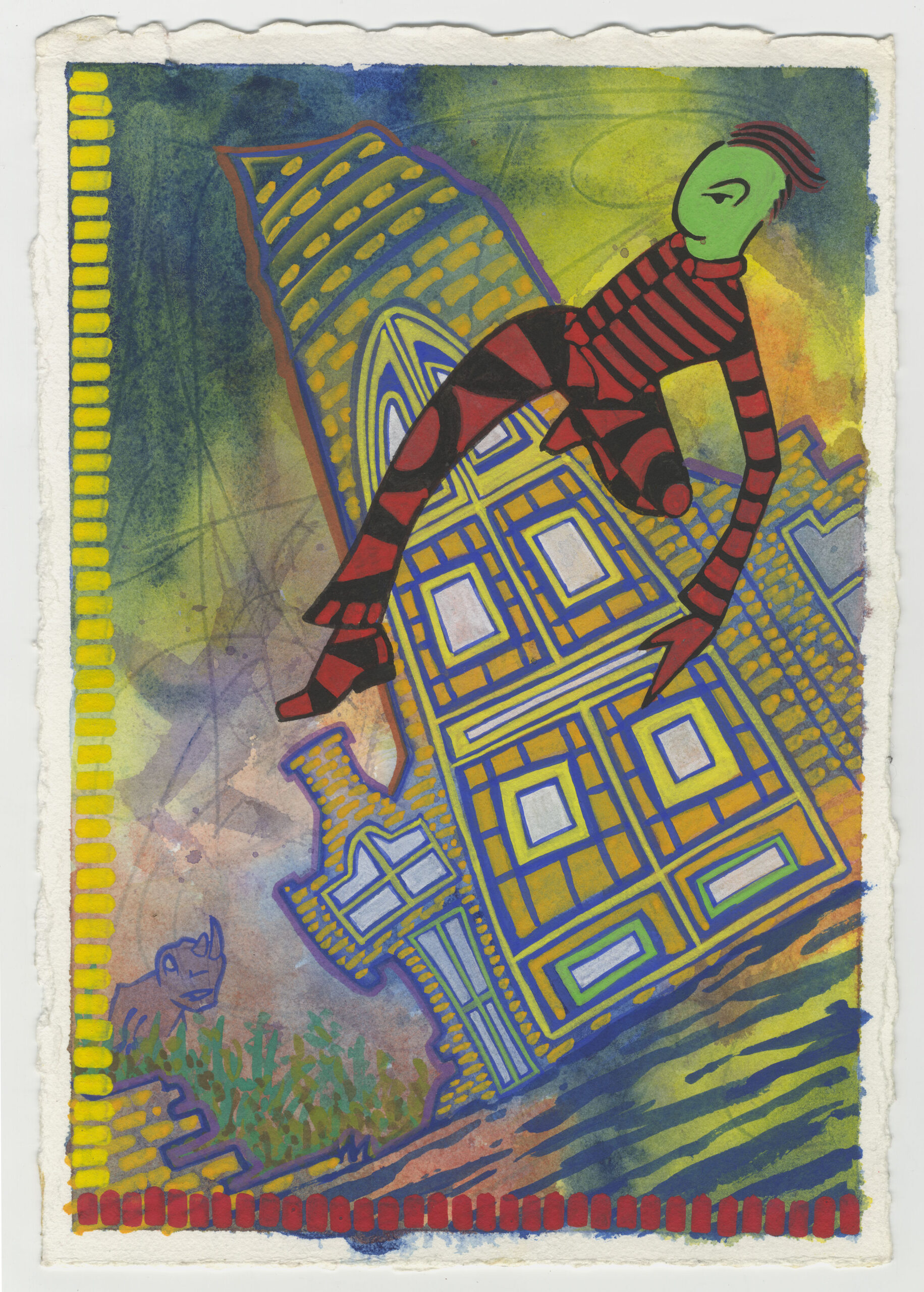
Looking at this 7.5×11 inch painting (it’s on 300 pound watercolor paper) there is a main figure, some buildings, a bit of a landscape, and some kind of dinosaur in the background. The view is from below and the horizon line is tilted so the whole painting is on the diagonal. I find it an interesting image.
In looking at this piece I can tell that I was using a surrealist automatic drawing method but not quite in the same way I do today. Back when I started using that method I would draw scribbles on a piece of paper and then draw what I could find in those scribbles. It’s sort of like finding faces in clouds. This is how Surrealists got their dream like images and how I get mine. Except now the scribbles are mostly in my head.
It looks like for this one I painted on the paper with watercolor before I ever drew anything. All that blended together watercolor that makes up the background was painted first. The blue and yellow in the sky and the blue and red on the bottom were put down and left to dry and then I went in and painted on top with opaque gouache. That’s why I like the solid opacity of gouache.
I can also see that instead of scribbling on the paper with a pencil I drew lines in the wet water color with the stick end of a brush. See all those dark lines in the background sky? Those were made with the handle of the brush. Rub the wet watercolor paint with a pointed stick and it will darken the paint. It gives a nice sense of action to the sky.
I’m guessing that I drew the rest of the piece from the design I saw in those lines in the watercolor. That’s how I worked in those days. The main figure certainly seems so because the dancing man is in a position that I don’t think my conscious mind would come up with. He is up in the air and twisted in a strange way. But that’s the whole point of surrealist automatic drawing. To come up with images that the conscious mind wouldn’t think of.
The dinosaur is another thing that I don’t think my conscious mind would think of. The shape of the watercolor blob probably sparked the image of a dinosaur to me. I think he represents danger lurking in the background. The man is dancing recklessly and danger is watching him from the cover of some shrubs, waiting. Maybe the danger will make itself know, maybe it won’t, but the danger is present nonetheless. It adds some spice to the picture.
After the basic image comes the graphic design quality of the painting. Gouache is often branded as “Designer’s Gouache” because before computers and desktop publishing graphic designers would often use gouache to make their designs if paint was needed. Gouache dries flat, even, and opaque so you can make nice patterns of color with it.
The dancing man really pops out at the viewer because of the red and black pattern in his clothes. Lots of black and red stripes that are pleasing to the eye. The patterns continue with the bricks and shapes in the buildings as well as the color brush strokes on the left and bottom of the painting. Gouache is really good for making patterns.
The yellow and red brush strokes on the bottom and left look fairly simple to my eye in 2022. I’m not 100% sure if that was a choice (I think it was) only because most of my gouache paintings (and plenty of my acrylic on canvas ones) have complex series of brush strokes like this. Instead of being just the single color they’d be made up of three or four colors. I’m not sure if this one was the beginning of developing that style or I just toned it down for this painting. I’d have to look at it in the context of other stuff done at the same time. I think it was a deliberate toning down.
The rest of the painting is all about technique, especially those buildings. Some parts of the building are opaque and some are semi-transparent. That’s what I consider technique. What do I want to show through? What do I want to be solid? What do I want to keep as watercolor wash? Those were all the technique questions that I had to decide.
I made the middle part of the biggest building opaque and solid. There are shapes of yellow, orange, and a little green that are the same opacity as our dancing man. The bottom and left side brush strokes are also this solid opacity and it puts all those elements on the same level and floats them in front of the thinner watercolor. The bricks are semi-transparent and that makes them one level behind the opaque parts.
Watercolor background, semi-transparent bricks, and a solid dancing man. These are the basic three levels of transparency in this piece that define the space. They all work together to make an interesting space. I like this piece. I like the figure dancing through the space.
I used dancing people as the subject of many piece of art but this might be my favorite one. Sometimes the subconscious really knows what it’s doing.