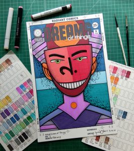
I’m back from the comic shop this week and I got eight new comics.
Check them all out here:
Comment
I’m back from the comic shop this week and I got eight new comics.
Check them all out here:
I like using magic markers for drawing. They’re fun for me because they offer instant color. With paint or watercolor I have to wait for them to dry so the color isn’t as instant. I still use paint but I’ve been using a lot of marker over the last six years. When I started using them the main challenge I had, besides figuring out a technique for them, was choosing which markers to use and then building a set of them.
The choosing was fairly painless but took some time. I started out buying some cheap markers and developing a finished art technique with them. First I bought many a Sharpie marker and ended up with about thirty different colors. I even bought a set of twenty Bic Mark-It markers that are Sharpie-like. Being that Sharpies and Bics are cheap I probably didn’t spend more than a dollar a marker on that set. Sharpies are limited though. The tips available and type of ink really doesn’t allow for a lot of different techniques. Though they gave me many ideas before I moved on to more expensive art markers.
The second method I tried for building a marker set was to go cheap and only buy one color. I had worked some stuff out with the Sharpies but still didn’t have a full grasp on a finished technique. What I mean by that is I had always used markers for color sketches and things like that but I had never used them as I would paint to make a finished piece of art. Markers were for working drawings and not the end piece of art. That is a totally different mindset. So I bought a bunch of blue ShinHan Touch markers that were on sale. I only spent about two bucks a piece on them. They had a chisel tip on one end and a fine, round tip on the other. I kept it monochromatic because I wanted to work on technique without worrying about getting the color right. It took a while and I ended up with about twenty different blue markers. That was still a pretty cheap set.
My next step was to get some color markers. I wasn’t 100% sold on the ShinHan Touch markers I was using but I ended up getting more of them because, once again, they were cheap. ShinHan was discontinuing this set of sixty markers and I got it for under a hundred dollars. It was a good buy and helped me nail down the finished technique I was looking for but I learned a lesson about marker sets. The lesson was that about a third of the colors in a pre-made set are ones I’ll never use. They’re just not the right colors for me. That’s a high rate of failure. I guess the same would apply for any set of colors but paint sets aren’t usually sold with that many colors in them.
After I finished figuring out my technique I went on to sample more types of markers. Sometimes I’d buy cheap sets of markers but soon found that was generally overkill. Since I was no longer concerned with technique I found the best way to sample markers was to buy four of them. Black, red, yellow, and blue were my choices. The primary colors and a black. The choices are pretty obvious. I even skipped the black every now and again because I normally use black ink with all my marker drawings.
After trying out lots of different brands I settled on the one that was generally considered the best. Copic markers. Copic Sketch Markers to be more specific. The sketch ones have a chisel tip on one side and a brush tip on the other. I almost alway use the brush side. I’m a brush guy and that works best with my technique. The second thing that sold me on the Copic markers is that they are refillable. You can buy ink for them and when the marker runs dry you can put more ink in them. But they’re not cheap. A marker is about seven dollars and the refill ink is about seven dollars. The ink refills the marker about ten times which brings the long term price of the marker way down but the upfront cost is still there. Plus with the Copics you can replace the marker tips too. The extend the life of them even more and keeps the cost down.
So how did I build my set of Copies? One piece at a time. Or maybe a few pieces at a time. It all depends on how much money you have but you can start with just three makers. Blue, red, and yellow just as I said before. Make them a medium blue, red, and yellow too. After that add one each of the secondary colors: green, purple, and orange. Don’t even buy any refills yet. Make sure you like the colors and they work for you and then buy the refills once you’re sure you like them. Purchase number three is skin tones. I’d go with four or them if possible. From pink to dark brown. That’s a good range.
So now you have ten markers and maybe ten refills. That’s about $150 worth of supplies but spread out over time it’s not so bad. Sometimes you can catch stuff on sale too. I’d spend about $20 at a time to get three markers and it took me a couple of years to build my whole set of about eighty markers. So be patient.
The next thing on my list is three shading markers. These are neutrals or light colors that I can use with most of the other colors. A light blue, a yellow ochre, and a light grayish purple. With these I can make all the other colors work a little bit better.
So there you go. Thirteen markers. If you got that far into building you marker set then maybe you really like them. If so add more markers over time. The best way to do that is with lighter and darker versions of the original colors you bought. A dark, medium, and light blue will serve a lot of you blue needs. Same with every other color. Goal number two is to turn one color into three colors. That takes some doing so buy one light blue, see if you like it, and then go buy a refill for it. Or maybe a couple of colors at a time and save the refills for next time. No need to rush.
After you have three versions of all six of your basic colors you’ll have about forty markers. That’s a pretty big set. After that you can try new markers out. There are lots of browns and earth colors to try, all sorts of greys, plus various one-off colors that don’t quite fit in but can be useful.
I’m going to leave you with this list of Copic markers. If you don’t like that brand then look for these colors in another brand. They work for me as a pretty good starter set.
Primary Colors:
Red – R29 Lipstick Red
Blue – B04 Tahitian Blue
Yellow – Y18 Lightning Yellow
Secondary Colors:
Green – G07 Nice Green
Purple – V17 Amethyst
Orange – YR68 Orange
Skin Tones
Skin 1 – E15 Dark Suntan
Skin 2 – E21 Baby Skin Pink
Skin 3 – E27 Africano
Skin 4 – E97 Deep Orange
Shading
Pale Blue – B91 Pale Greyish Blue
Grey Purple – V95 Light Grape
Yellow Ochre – Y28 Lionel Gold
I’m back from the comic shop this week and I got nine new comics.
Check them all out here:
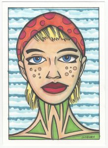
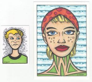
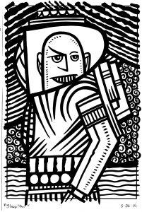
As I’ve said before I like drawing faces. This week I drew two faces of note. At least they’re of note to me because they were sitting side by side on my drawing table this evening. They’re not the greatest drawings of all time but I like them both and think they are worthy of a little further examination.
The drawings are two different sizes and for two different purposes. The first one is five by seven inches and the second one is two and a half by three and a half inches (baseball card/art cart size). The first one I drew just because I wanted to draw a face. In the past I’ve drawn a bunch of faces at this size. It’s on a pre-cut piece of watercolor paper. I bought a bunch of 5×7 watercolor paper because I found it works well for small ink and marker drawings. It’s heavy paper. It’s 140lb watercolor paper and feels like a very thick card stock. Since it’s watercolor paper the marker ink gets sucked right out of the tip of the marker and I can get really saturated color with it. Sometimes I also like to make a toned ground watercolor background on it. I blend together a trio of light colors on the paper and let it dry before I draw on it with ink and marker. I didn’t do that here but it’s another reason I like watercolor paper to make these drawings on.
With this drawing, which I have yet to name, I started with a pencil. I grabbed my 4B drawing pencil and roughed out a face. Thinks went pretty well at first but then I had problems with the eyes. I didn’t want to draw normal eyes so I came up with those black wings around her eyes. But as is often the case when I’m drawing unusual eyes I could get them to match correctly. So then I used an old trick. Get a piece of tracing paper, trace one eye plus a few reference marks on the face, flip the tracing paper over, and then transfer the graphite from the back of the tracing paper onto the drawing by drawing over it. That’s an easy way to draw a reflection of something and get symmetry. After doing that I redrew both eyes until I got them right.
One of the first things I drew was her head scarf. I’m not sure why. I think I just wasn’t interested in drawing hair that day. The scarf started out as hair but the shape didn’t work and I quickly adapted it into a head covering. That let me get some extra color and shapes into the drawing and that was okay by me. The orange and red go nicely with the greens at the bottom of the drawing. Those greens were almost blacked in as I do with my “Painted Lady” series but I didn’t think that would work. It would make her neck too heavy and I wanted some more color in the piece. I’m glad I didn’t blacken them in.
The background is made with my side-of-the-brush technique. I use this a lot when I want a non-subjective background. I take various colors and create a pattern with them in the background. In this case it was three blues and some horizontal lines. The key is to use just color with no black and vary the pattern from piece to piece.
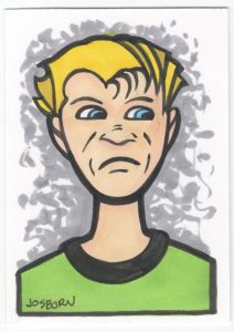
The second, art card size, drawing didn’t start out as an art card. I wanted to make a drawing for a joke Magic the Gathering card I was working on and I needed a face. Oddly this was the first idea I had for the face I needed, a straight on shot of a guy giving the side-eye, but then I changed my mind and tried something different. That something different took up two hours of my time and came out terribly. After much frustration I abandoned it and went back to my original idea. Remarkably the drawing came quickly then.
I drew the bad drawing on an art card piece of paper and then blew it up to a six by nine inch piece of paper. After abandoning that drawing I decided to stick with the art card size and go from there. I pencilled it quickly and then inked it quickly too. After wasting an entire morning I was finished with the drawing in about half an hour. It was only in black and white at this point as I was planning to scan it in and color it on the computer. After doing that I went back to the original and duplicated the digital colors on the original with markers. I did the background on the paper differently than I did it on the computer. Here I went with a one color neutral grey background. It’s as simple as it gets but made with little strokes that blend together in the middle for a bit more visual interest.
I like this little drawing. It’s simple and straight forward. I think I captured the side-eye look well and we can all relate to how he’s feeling. I also thing the simple bold lines of this one came out well. I often use those type of lines but I really like them here. Maybe because the bad drawing made me appreciate it when a good drawing comes together.
I wrote about these two drawings together because I think they go together pretty well. Just sitting there on my drawing table they seemed to match up. Similar skin tones, hair color, eye color, and shirt colors certainly help but so do their long necks, round jaws, and short hair. Though their sizes are different, the small drawing fits into the face of the larger one, they complement each other. My eye automatically compares and contrasts them more then two other random drawings. I think that’s pretty neat and some days “Pretty neat” is enough to get me through.
I’m back from the comic shop this week and I got three new comics and a back issue.
Check them all out here:
 ld occasionally do stuff like that because it’s fun. I sent him a copy of a hand bound (or re-bound as the case may be) comic I made with an alternate Hulk #181 Herb Trimpe drawing on it. A friend of mine once commissioned Trimpe to do a new interpretation of his classic Hulk #181 cover. I scanned in the original art, colored it, printed it out, pulled the staples on a reprint edition of Hulk #181, and bound my new cover to it. It makes for a fun new edition of the book. Herb did a great job with the cover after all. In return for this he sent me 15 comics. One of those comics has a cover that I am going to write about today. “Zody and the Mod Rob.”
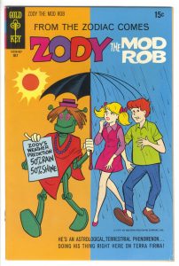
“Zody” only has one issue to his name and it was printed by Gold Key back in 1970. It’s a comic that I’ve never seen, or heard of, before but that’s not a huge surprise since it’s a pretty obscure book. The story inside is about a teenager who accidentally created a Mod Robot. Like that doesn’t happen every day. It’s a fairly typical comic about a teen but it has a late 1960s swinging hipster astrological vibe to it. I enjoyed the comic but it’s the cover (the Grand Comic Book Database says its drawn by Roger Armstrong) that I really like. I’ve never heard of Armstrong but he’s done a fine job here.
The first thing that’s jumps out at me is, of course, the color. The left half is orange and the right half is blue. Not only does that work with the cover’s concept of simultaneous sun and clouds but orange and blue are complimentary colors. This means that when placed next to each other they create strong contrast. They make your eyes wig out a little bit when you stare at the. Blue next to green, for example, is a much more calm combination than blue and orange. So right away the color on this cover has our rods and cones vibrating.
Because of that crazy color combination I have to focus my eyes a bit and concentrate on what’s going on in the cover. There is a crazy story happening. The hippy dippy robot weatherman is predicting both rain and shine and sure enough both are happening at the same time. I like the umbrella a lot. The choice to have the sunshine side a full umbrella and the rain side just the skeleton of the umbrella was inspired. It doesn’t pile too much blue on blue and lets the teenagers heads breath a little.
I like the variety of walking poses for the three characters. The robot is marching along, the girl is striding, and the boy has a goofy toes-out walk going on. A solid bit of cartooning. The colors on all the clothes are good. The robot pulls off red and green without seeming too much like Christmas. Maybe that’s the close proximity to the dark orange sun or the big blue swatch of the sign the robot is holding but either way it works. I also like the girl’s magenta and violet dress and yellow hair. Add in the orange hair, green shirt, and blue of the boy’s pants and we’ve got the full color wheel. That is not an easy bit of color to organize.
The type work on the cover is interesting too. Since the image is so stripped down an devoid of background art there is room for a lot of type and it doesn’t crowd up the space of the cover as happens so often on comic book covers. There is also a lot of mechanical type on the cover compared to hand lettered type. I’m not familiar enough with Gold Key comics to say if this was unusual or not but the Silver Age comic that I’m used to has mostly hand lettered type. The “Zody” logo looks like it might be a hand done logo but it’s so slickly done that I’m not sure. It’s a nice logo either way.
The type that is mechanical is the “From the Zodiac Comes” and the “Zody and the Mod Rob” above it. I find it weird to have the comic’s name in type right above the logo but that must have been the way Gold Key set up their comic’s trade dress. I like the font they picked too. I’m not sure what it is. In those days mostly Helvetica was used but this type look different. Or maybe I’m not used to seeing it in all caps. I found it interesting that the type down the bottom serves as a floor for the characters to walk on. With no horizon line or floor plane defined by the drawing the length and straightness of the words form a kind of floor. It even looks like the boy is hopping over the little copyright line that’s under his feet. Incidentally the copyright line says the copyright belongs to Western Publishing Company Inc. I guess Gold Key was just a name on a logo.
A few observations to end with. I love the swirls in the robot’s eyes. Not only because I uses swirls a lot in my work but also because they make the robot look even more weird and far out. I’d say he looks a little stoned. The type on the piece of paper that the robot is holding is really well done. It’s as clear, concise, and bold as I imagine it could ever be. I also find it interesting that the girl’s lips were done in a red color hold. They were not outlined in black. That little detail means to me that whoever the designer or colorist was on this book really cared and sweated the details. And it shows.
I’m back from the comic shop this week and I got four new comics.
Check them all out here:
Time to talk TV shows again. I like to do that every now and again and I haven’t since last fall. As I write this summer is about to begin so let me think back on what I was watching this past winter and spring.
Agents of SHIELD – This is the only Marvel or DC TV show that I watch. A lot of my comic book friends don’t like it but I do. I hear complaints that it’s too mundane but that’s why I like it. It’s mostly a cop/spy show with some occasional super-stuff thrown in. That’s more up my alley than super-hero stuff so it suits me fine. This season had a few main stories going on and I liked them all. Ghost Riders, killer robots, and virtual reality. Fine by me.
Legion – I just remembered this Marvel-based show that I watched and enjoyed too. It was only a ten episode season so it slipped my mind. It was about a mutant with mental powers that thought he was mad. A group of other mutants who were trying to stay off the radar of a secret anti-mutant group were trying to help him out. The main problem I had with the show was that the first episode was very skip-able. Thing didn’t get good until episode two. It was a beautifully filmed show. A lot of shows I half watch but this one held my attention from start to finish with it’s beautiful visuals.
The Night Manager – A six part series that I watched on Amazon Prime. A spy story based on a novel. It was well done except that its first episode was also very skip-able. Other than that it had lots of tension plus some derring-do. I even watched the final fifteen minutes again a day after I finished watching the show just to see the payoff once more.
Chance – Hugh Laurie played the heavy in “The Night Manager” but in this Hulu show he was the hero. He was some kind of consulting brain doctor who got mixed up with a femme fatale and a crooked cop. It was a tense “Fish out of water and caught up in a world not his own” story. Ethan Suplee, who played the brother in “My Name is Earl” was good in it. A solid bit of entertainment.
Brockmire – A Hank Azaria half hour comedy with eight episodes. You’d better like some cursing and blue humor if you’re going to watch this baseball comedy. Hank is a disgraced baseball announcer who is trying to make a comeback by calling a minor league team’s games. Not even on the TV or radio he calls the games over the stadium’s PA system. It was dark and funny.
Nobodies – Another half hour comedy (twelve episodes) this time about three writers who write for a kids’ cartoon series trying to get a movie made. All three stars are from the “Groundlings” comedy troupe and other, more famous, members make appearances in the show. It’s a little bit “Inside Hollywood” but not too much so. It has a lot of wackiness that’s fun.
Training Day – I was enjoying this cop show based on the movie of the same name and then one of the stars of the show, Bill Paxton, up and died. It’s an odd thing watching a TV show after that happens. It’s tough not to think of the actor as a person at that point instead of the character he is playing. It was a pretty good show none the less and I enjoyed it. No second season for it though. I guess they didn’t want to retool it.
Red Oaks – Another Amazon show that takes place in 1985-1986 and is about a twenty year old who works at a country club and is trying to find himself. It started slow but I kept watching it and it grew on me. There are two seasons of ten episode each with a third season on the way. It’s a half hour slice-of-life coming of age story. It was good in the end.
Bones – This show finally ended after twelve seasons. I watched them all but kind of only with one eye the last few seasons. It was an okay final season if not spectacular.
Better Call Saul – I didn’t watch “Breaking Bad”, which this show is a prequel to, but I still like this show. It’s about a not very successful lawyer trying to get by. As I watch it I often wonder what I’m missing compared to people who have seen “Breaking Bad.” They all know the futures of these characters and so they know where they are headed and the ends of their story arcs. I’m along for the ride without knowing where it’s going. Strange.
The Blacklist – This show returned for its fourth season and I liked it. It’s another cop show but this time the FBI and a high profile criminal that’s informing for them. There was even a six episode spinoff series that wasn’t nearly as good as “The Blacklist.” The spinoff won’t be back for another season but this one will. I’ll keep watching.
Elementary – I like Sherlock Holmes stories. I like quirky detective shows in general and this show is good at both. It’ll be back for one last season next year and so will I.
Fargo – Another returning favorite comes back for its third season. This one turns the quirky detective genre up a notch by making almost everyone in the show quirky to some extent. It’s fun to follow along with the crazy twists and turns of the story.
Brooklyn Nine-Nine – The fourth season just finished up of this wacky police comedy and it still tickles my funny bone. It has a good ensemble cast and lots of laughs.
New Girl – A show I’ve found funny since the beginning and it hasn’t let up. Lots of crazy fast back and forth dialogue keeps me interested. Next year will be its last season and I’ll miss it when it’s gone.
There you go. What have you been watching?
I’m back from the comic shop this week and I got seven new comics.
Check them all out here:
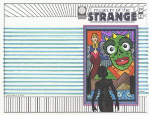
With all of the twenty five cent Walking Dead and Invincible comics that I got this past Spring I’ve been making a lot of sketch covers. I wrap a piece of Bristol board around the comic and draw on it. That creates a whole new original art cover for the comic. Sometimes I stick to the Walking Dead theme and sometimes I come up with my own. Recently I came up with a new “Comic book that doesn’t exist” to make some sketch covers of. “The Museum of the Strange.”
I’m sure there have been lots of museums of the strange over the years. In movies, TV, comic books, novels, or whatever it’s not a rare concept. There are plenty of stories to be told that have to do with getting a whole bunch of weird things in a room and calling it a museum. My particular take on the concept was to go literal with it. I wanted to draw a picture of a picture that was in a museum. It was a simple concept but it took a while to come together. Figuring out how to represent the museum was the hardest part.
First I had the idea that the drawings should be in drawings of frames. But unless I wanted to draw an ornate frame, which I didn’t want to, a frame is just a series of rectangles. It could easily be mistaken for a window or something else. Even with the “Museum of the Strange” logo I wanted to make sure the “Museum” part was clear. It popped into my head that I could have people standing in front of the painting and looking at it to make the museum part clear. The problem I ran into with that was that drawings of the backs of people’s heads are really boring and were distracting. Plus they ate up too much room on the cover. A cover that’s one third boring isn’t going to cut it.
Eventually I landed on the single figure silhouette. Once again a solution that I am not the first to arrive at but it works well. A silhouette says that a person is in the picture but offers no more detail than that because no more detail is needed.
It’s not as easy to draw a silhouette of somebody from the back as you might think. You have to capture some sort of gesture or stance when really most of us look like blobs from the back. With our arms at our sides all our shapes blend together. Plus all the characters need short haircuts in general. Otherwise things blur together even more. So short hair, arms akimbo, shoulders tilted, and hips slanted. That’s what I went for. It’s not hard but I had to find the path.
Taking a look at “Museum of the Strange” #5 you can see my basic approach to these covers. They’re all about my weird drawings of weird faces. And those weird faces are looking at you. I made the logo and picture frame on the computer and printed those out on a blank piece of paper. I even drew the silhouette before hand, scanned it in, and printed that out on the paper along with the other stuff. Then I drew the picture in the frame. I like to keep it spontaneous but not as spontaneous as one of my ink drawings. I draw it in pencil first. I keep the pencils loose to give myself more room when I come in with the ink but I do nail down the basics.
That creature with the bright green face came first and I had all of his face down in pencil except for those round markings. That’s the sort of thing I leave for later. I even leave other things, like the small tick marks on his jaw, for after I color it in marker. If I try to put those in before the color I find they smear a little sometimes. Not always but I can’t count on them not smearing. It’s odd that the little ink marks smear but the bigger ink marks almost never smear. I think it’s easier for the alcohol from the marker to surround the little marks and lift a little bit of ink off the paper. I like little tick marks when not overdone. They add a little bit of texture things.
The woman on the left came second. Big head in front and slim body off to the side is a composition I used a lot. It works for me. It helps with scale and depth plus it allows me variety. I get to draw a big face and a torso. The background also has some of my usual elements. Pyramids are something I always use in drawings. They have a few things going for them. They’re familiar but exotic, they add a sense of scale since we know they’re big, and they’re a basic shape. Basic is always relatable. I also put a circle behind the woman’s head. I’ve been into background circles lately. Once again a basic shape that always works. Plus it can reference the sun or a halo if the circler is in the right spot.
The part where things got unfamiliar is the very bottom part of the drawing. The blue strip with the vague sort of machinery on it. After defining every little shape in the rest of the drawing I kept those for legged buttons loose. Unlike the rest of the drawing the lines that make them up don’t even connect. They land sketchily near each other instead. They make up a different world. I was going to draw them like the rest of the drawing but then I said no and changed course. I’m not even sure why but I like the decision.
After the inks I colored it with marker. That’s something I’m good at so it didn’t take long. I kept things bright and clear. I let the greens and blues dominate, threw in some hot oranges to bounce around, and ground it all with neutrals. That may sound like gibberish to some but I’ve got it down.
The last thing I added was the colored stripes in the background. I used my hatching guide and figured out a pattern. It added just the right finishing touch. I’m always happy with a nice pattern.