As I’ve said before I like drawing faces. This week I drew two faces of note. At least they’re of note to me because they were sitting side by side on my drawing table this evening. They’re not the greatest drawings of all time but I like them both and think they are worthy of a little further examination.
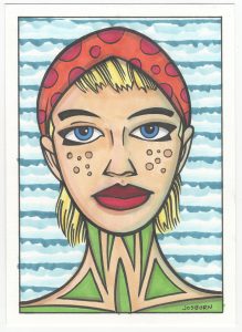
The drawings are two different sizes and for two different purposes. The first one is five by seven inches and the second one is two and a half by three and a half inches (baseball card/art cart size). The first one I drew just because I wanted to draw a face. In the past I’ve drawn a bunch of faces at this size. It’s on a pre-cut piece of watercolor paper. I bought a bunch of 5×7 watercolor paper because I found it works well for small ink and marker drawings. It’s heavy paper. It’s 140lb watercolor paper and feels like a very thick card stock. Since it’s watercolor paper the marker ink gets sucked right out of the tip of the marker and I can get really saturated color with it. Sometimes I also like to make a toned ground watercolor background on it. I blend together a trio of light colors on the paper and let it dry before I draw on it with ink and marker. I didn’t do that here but it’s another reason I like watercolor paper to make these drawings on.
With this drawing, which I have yet to name, I started with a pencil. I grabbed my 4B drawing pencil and roughed out a face. Thinks went pretty well at first but then I had problems with the eyes. I didn’t want to draw normal eyes so I came up with those black wings around her eyes. But as is often the case when I’m drawing unusual eyes I could get them to match correctly. So then I used an old trick. Get a piece of tracing paper, trace one eye plus a few reference marks on the face, flip the tracing paper over, and then transfer the graphite from the back of the tracing paper onto the drawing by drawing over it. That’s an easy way to draw a reflection of something and get symmetry. After doing that I redrew both eyes until I got them right.
One of the first things I drew was her head scarf. I’m not sure why. I think I just wasn’t interested in drawing hair that day. The scarf started out as hair but the shape didn’t work and I quickly adapted it into a head covering. That let me get some extra color and shapes into the drawing and that was okay by me. The orange and red go nicely with the greens at the bottom of the drawing. Those greens were almost blacked in as I do with my “Painted Lady” series but I didn’t think that would work. It would make her neck too heavy and I wanted some more color in the piece. I’m glad I didn’t blacken them in.
The background is made with my side-of-the-brush technique. I use this a lot when I want a non-subjective background. I take various colors and create a pattern with them in the background. In this case it was three blues and some horizontal lines. The key is to use just color with no black and vary the pattern from piece to piece.
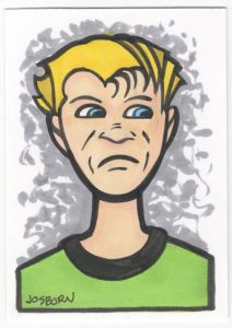
The second, art card size, drawing didn’t start out as an art card. I wanted to make a drawing for a joke Magic the Gathering card I was working on and I needed a face. Oddly this was the first idea I had for the face I needed, a straight on shot of a guy giving the side-eye, but then I changed my mind and tried something different. That something different took up two hours of my time and came out terribly. After much frustration I abandoned it and went back to my original idea. Remarkably the drawing came quickly then.
I drew the bad drawing on an art card piece of paper and then blew it up to a six by nine inch piece of paper. After abandoning that drawing I decided to stick with the art card size and go from there. I pencilled it quickly and then inked it quickly too. After wasting an entire morning I was finished with the drawing in about half an hour. It was only in black and white at this point as I was planning to scan it in and color it on the computer. After doing that I went back to the original and duplicated the digital colors on the original with markers. I did the background on the paper differently than I did it on the computer. Here I went with a one color neutral grey background. It’s as simple as it gets but made with little strokes that blend together in the middle for a bit more visual interest.
I like this little drawing. It’s simple and straight forward. I think I captured the side-eye look well and we can all relate to how he’s feeling. I also thing the simple bold lines of this one came out well. I often use those type of lines but I really like them here. Maybe because the bad drawing made me appreciate it when a good drawing comes together.
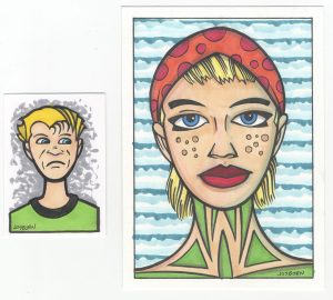
I wrote about these two drawings together because I think they go together pretty well. Just sitting there on my drawing table they seemed to match up. Similar skin tones, hair color, eye color, and shirt colors certainly help but so do their long necks, round jaws, and short hair. Though their sizes are different, the small drawing fits into the face of the larger one, they complement each other. My eye automatically compares and contrasts them more then two other random drawings. I think that’s pretty neat and some days “Pretty neat” is enough to get me through.
Discussion ¬