 ld occasionally do stuff like that because it’s fun. I sent him a copy of a hand bound (or re-bound as the case may be) comic I made with an alternate Hulk #181 Herb Trimpe drawing on it. A friend of mine once commissioned Trimpe to do a new interpretation of his classic Hulk #181 cover. I scanned in the original art, colored it, printed it out, pulled the staples on a reprint edition of Hulk #181, and bound my new cover to it. It makes for a fun new edition of the book. Herb did a great job with the cover after all. In return for this he sent me 15 comics. One of those comics has a cover that I am going to write about today. “Zody and the Mod Rob.”
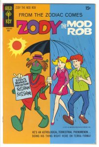
“Zody” only has one issue to his name and it was printed by Gold Key back in 1970. It’s a comic that I’ve never seen, or heard of, before but that’s not a huge surprise since it’s a pretty obscure book. The story inside is about a teenager who accidentally created a Mod Robot. Like that doesn’t happen every day. It’s a fairly typical comic about a teen but it has a late 1960s swinging hipster astrological vibe to it. I enjoyed the comic but it’s the cover (the Grand Comic Book Database says its drawn by Roger Armstrong) that I really like. I’ve never heard of Armstrong but he’s done a fine job here.
The first thing that’s jumps out at me is, of course, the color. The left half is orange and the right half is blue. Not only does that work with the cover’s concept of simultaneous sun and clouds but orange and blue are complimentary colors. This means that when placed next to each other they create strong contrast. They make your eyes wig out a little bit when you stare at the. Blue next to green, for example, is a much more calm combination than blue and orange. So right away the color on this cover has our rods and cones vibrating.
Because of that crazy color combination I have to focus my eyes a bit and concentrate on what’s going on in the cover. There is a crazy story happening. The hippy dippy robot weatherman is predicting both rain and shine and sure enough both are happening at the same time. I like the umbrella a lot. The choice to have the sunshine side a full umbrella and the rain side just the skeleton of the umbrella was inspired. It doesn’t pile too much blue on blue and lets the teenagers heads breath a little.
I like the variety of walking poses for the three characters. The robot is marching along, the girl is striding, and the boy has a goofy toes-out walk going on. A solid bit of cartooning. The colors on all the clothes are good. The robot pulls off red and green without seeming too much like Christmas. Maybe that’s the close proximity to the dark orange sun or the big blue swatch of the sign the robot is holding but either way it works. I also like the girl’s magenta and violet dress and yellow hair. Add in the orange hair, green shirt, and blue of the boy’s pants and we’ve got the full color wheel. That is not an easy bit of color to organize.
The type work on the cover is interesting too. Since the image is so stripped down an devoid of background art there is room for a lot of type and it doesn’t crowd up the space of the cover as happens so often on comic book covers. There is also a lot of mechanical type on the cover compared to hand lettered type. I’m not familiar enough with Gold Key comics to say if this was unusual or not but the Silver Age comic that I’m used to has mostly hand lettered type. The “Zody” logo looks like it might be a hand done logo but it’s so slickly done that I’m not sure. It’s a nice logo either way.
The type that is mechanical is the “From the Zodiac Comes” and the “Zody and the Mod Rob” above it. I find it weird to have the comic’s name in type right above the logo but that must have been the way Gold Key set up their comic’s trade dress. I like the font they picked too. I’m not sure what it is. In those days mostly Helvetica was used but this type look different. Or maybe I’m not used to seeing it in all caps. I found it interesting that the type down the bottom serves as a floor for the characters to walk on. With no horizon line or floor plane defined by the drawing the length and straightness of the words form a kind of floor. It even looks like the boy is hopping over the little copyright line that’s under his feet. Incidentally the copyright line says the copyright belongs to Western Publishing Company Inc. I guess Gold Key was just a name on a logo.
A few observations to end with. I love the swirls in the robot’s eyes. Not only because I uses swirls a lot in my work but also because they make the robot look even more weird and far out. I’d say he looks a little stoned. The type on the piece of paper that the robot is holding is really well done. It’s as clear, concise, and bold as I imagine it could ever be. I also find it interesting that the girl’s lips were done in a red color hold. They were not outlined in black. That little detail means to me that whoever the designer or colorist was on this book really cared and sweated the details. And it shows.
Discussion ¬