With all of the twenty five cent Walking Dead and Invincible comics that I got this past Spring I’ve been making a lot of sketch covers. I wrap a piece of Bristol board around the comic and draw on it. That creates a whole new original art cover for the comic. Sometimes I stick to the Walking Dead theme and sometimes I come up with my own. Recently I came up with a new “Comic book that doesn’t exist” to make some sketch covers of. “The Museum of the Strange.”
I’m sure there have been lots of museums of the strange over the years. In movies, TV, comic books, novels, or whatever it’s not a rare concept. There are plenty of stories to be told that have to do with getting a whole bunch of weird things in a room and calling it a museum. My particular take on the concept was to go literal with it. I wanted to draw a picture of a picture that was in a museum. It was a simple concept but it took a while to come together. Figuring out how to represent the museum was the hardest part.
First I had the idea that the drawings should be in drawings of frames. But unless I wanted to draw an ornate frame, which I didn’t want to, a frame is just a series of rectangles. It could easily be mistaken for a window or something else. Even with the “Museum of the Strange” logo I wanted to make sure the “Museum” part was clear. It popped into my head that I could have people standing in front of the painting and looking at it to make the museum part clear. The problem I ran into with that was that drawings of the backs of people’s heads are really boring and were distracting. Plus they ate up too much room on the cover. A cover that’s one third boring isn’t going to cut it.
Eventually I landed on the single figure silhouette. Once again a solution that I am not the first to arrive at but it works well. A silhouette says that a person is in the picture but offers no more detail than that because no more detail is needed.
It’s not as easy to draw a silhouette of somebody from the back as you might think. You have to capture some sort of gesture or stance when really most of us look like blobs from the back. With our arms at our sides all our shapes blend together. Plus all the characters need short haircuts in general. Otherwise things blur together even more. So short hair, arms akimbo, shoulders tilted, and hips slanted. That’s what I went for. It’s not hard but I had to find the path.
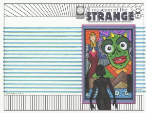
Taking a look at “Museum of the Strange” #5 you can see my basic approach to these covers. They’re all about my weird drawings of weird faces. And those weird faces are looking at you. I made the logo and picture frame on the computer and printed those out on a blank piece of paper. I even drew the silhouette before hand, scanned it in, and printed that out on the paper along with the other stuff. Then I drew the picture in the frame. I like to keep it spontaneous but not as spontaneous as one of my ink drawings. I draw it in pencil first. I keep the pencils loose to give myself more room when I come in with the ink but I do nail down the basics.
That creature with the bright green face came first and I had all of his face down in pencil except for those round markings. That’s the sort of thing I leave for later. I even leave other things, like the small tick marks on his jaw, for after I color it in marker. If I try to put those in before the color I find they smear a little sometimes. Not always but I can’t count on them not smearing. It’s odd that the little ink marks smear but the bigger ink marks almost never smear. I think it’s easier for the alcohol from the marker to surround the little marks and lift a little bit of ink off the paper. I like little tick marks when not overdone. They add a little bit of texture things.
The woman on the left came second. Big head in front and slim body off to the side is a composition I used a lot. It works for me. It helps with scale and depth plus it allows me variety. I get to draw a big face and a torso. The background also has some of my usual elements. Pyramids are something I always use in drawings. They have a few things going for them. They’re familiar but exotic, they add a sense of scale since we know they’re big, and they’re a basic shape. Basic is always relatable. I also put a circle behind the woman’s head. I’ve been into background circles lately. Once again a basic shape that always works. Plus it can reference the sun or a halo if the circler is in the right spot.
The part where things got unfamiliar is the very bottom part of the drawing. The blue strip with the vague sort of machinery on it. After defining every little shape in the rest of the drawing I kept those for legged buttons loose. Unlike the rest of the drawing the lines that make them up don’t even connect. They land sketchily near each other instead. They make up a different world. I was going to draw them like the rest of the drawing but then I said no and changed course. I’m not even sure why but I like the decision.
After the inks I colored it with marker. That’s something I’m good at so it didn’t take long. I kept things bright and clear. I let the greens and blues dominate, threw in some hot oranges to bounce around, and ground it all with neutrals. That may sound like gibberish to some but I’ve got it down.
The last thing I added was the colored stripes in the background. I used my hatching guide and figured out a pattern. It added just the right finishing touch. I’m always happy with a nice pattern.
Discussion ¬