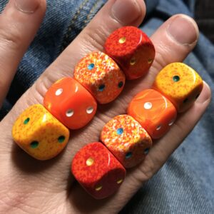
Today I got two new sets of dice for my collection. Yes, I have a dice collection. They’re mostly Chessex brand dice but I have some others thrown in. I don’t collect them as historical objects or even to game with them (though I used to game with some of them). These days I collect them as art objects.
I originally bought some of these colorful dice back in the early 1990s at a store in Manhattan called The Compleat Strategist. At that time I was working in the Marvel Comics Bullpen and a bunch of us had gotten into playing the collectable card game Magic: The Gathering. We’d walk over to The Strategist at lunchtime to buy some packs of cards and browse around.
The Compleat Strategist was a gaming store that had a lot of different games packed into their relatively small store. Since lots of games use dice they had a selection of dice up by the front register. Though the Chessex dice I get online these days come in packs of twelve I remember the dice at The Strategist being loose. They had a rack of them with the various colors and styles being in separate boxes. I could pick out one, six, or ten of any style of six sided dice and buy some. The D&D style three, six, eight, ten, and twenty sided dice came in sets.
At that same time I started to get more into photography. I got it in my head to make some photos of collections of small and colorful objects. This bought the dice to mind. Over about a year’s time I bought about fifty individual dice. Mostly I bought them in my favorite colors. Anywhere from two to ten of a given design. I used the dice in my still life photos but nothing ever really became of those pictures. I kept the dice though and every now and then I’d take them out and look at them.
My dice collection was stagnant until around 2011. That’s when I pulled them off the shelf for my nephew and I to play with. We had a good time. I find dice to be fun little objects. We played games and arranged them into shapes based on colors and amounts of dice. That got me more interested in them and I started getting new ones every now and again.
I began keeping the dice out next to my chair in a plastic container. That way I could absentmindedly pick them up and play with them. I used to arrange them on the arm of my chair until I got rid of that chair because it got old and worn out. The next chair wasn’t nearly as good for arranging dice.
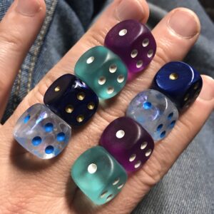
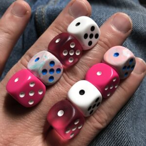
After a long time of the dice laying fallow because I got rid of a chair I eventually started putting the dice on the back of my hand. I’d reach down into the container, pull out eight dice, and arrange them four by four in between my three largest fingers on the back of my left hand. I’d make color compositions with the dice. It became a relaxing art exercise.
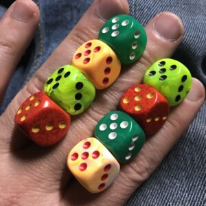
I started buying new sets of dice because of their colors so that I’d have more choices for my color compositions. I found out that it’s best to keep my dice colors even in number too. If there were twelve of one color in the box but only four of another then it was hard to find the four. So I kept six of each at hand.
Over the years I got more and more dice. I think have over three hundred dice these days. I had to adapt my system for them once again. Now I have smaller box inside the bigger box of dice. I keep three of each color in the smaller box and the rest go in the bigger box underneath. This way everything is even and I can find each color easily.
Somewhere along the way of my collecting dice Instagram was invented. I joined it and would post pictures of my art. I don’t have a ton of followers and mostly nobody cared but I still kept it up. I was always looking for things to post. I had developed my back of the hand dice color compositions to pass the time as I watched TV at night but it didn’t occur to me for about six months to take a photo of the dice. Then one day it did and I started posting them on Instagram.
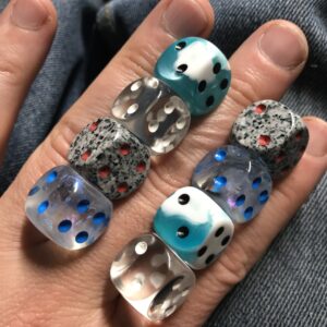
I post one dice photo a day. I take a lot more than that as I sit and watch TV but only one gets posted. I still don’t have a lot of people looking at my Instagram but those that do seem to like the dice photos more than anything else I’ve ever posted. I’ve had friends tell me they find the dice photos very peaceful and calming.
A set of twelve dice costs anywhere from 8 to 13 dollars. Not the most expensive thing in the world but if can add up. Last year, in 2021, I decided to get one set a month but I’m not sure if I actually did. In the beginning of the year I got two and sometimes three sets a month but then I fell off. I only got a couple of sets from August to December. Maybe it was twelve sets overall but I’m not even sure. I had enough to make plenty of color compositions out of so there was no hurry.
I didn’t get any new dice in January 2022 but now that it’s February I went crazy and got three new sets. I don’t know why except that I had some credit card points so the $36 worth of dice onto cost me $10. That’s not so bad. All three sets are what Chessex calls Nebula Dice and are a mixture of two colors and transparent plastic. They look cool plus they also glow in the dark.
These days I’ve got solid dice, speckled dice, transparent dice, frosted dice, translucent dice, marbled dice, and probably a few other styles I’m forgetting. They make for some cool color compositions and fun photos. It’s certainly easier to share the photos than when I was shooting still lives back in 1992. That’s a good thing.
