
I made two color ink drawings recently. One I like and the other I like less. Trying to figure out why I’m a little disappointed with one is not always easy.
First off one of the lessons I learned a long time ago is not to tell people, in general, if I don’t like a particular piece of mine. That’s because they might like it and me telling them that I don’t like it could make them feel foolish. You don’t want to make anyone who likes your art feel foolish for liking it. It’s a bad feeling for them to walk away with.
I will talk about what I like or don’t like about a piece with my friends who are also artists. Talking about each other’s work is part of being fellow artists and we’ve all done it enough, know the score, and won’t walk away feeling foolish. So I’m going to talk to you like you’re a fellow artist.
The first drawing is called “Toledo Troop” and it’s a drawing I used for one of my “Painted Lady” faux comic book covers. With these color ink drawings I’ve been recycling drawings from the past as I’ve tried to develop the style. As I look at it now, two weeks after I finished it, I’m a little more forgiving than I was two weeks ago. Maybe it’s not so disappointing.
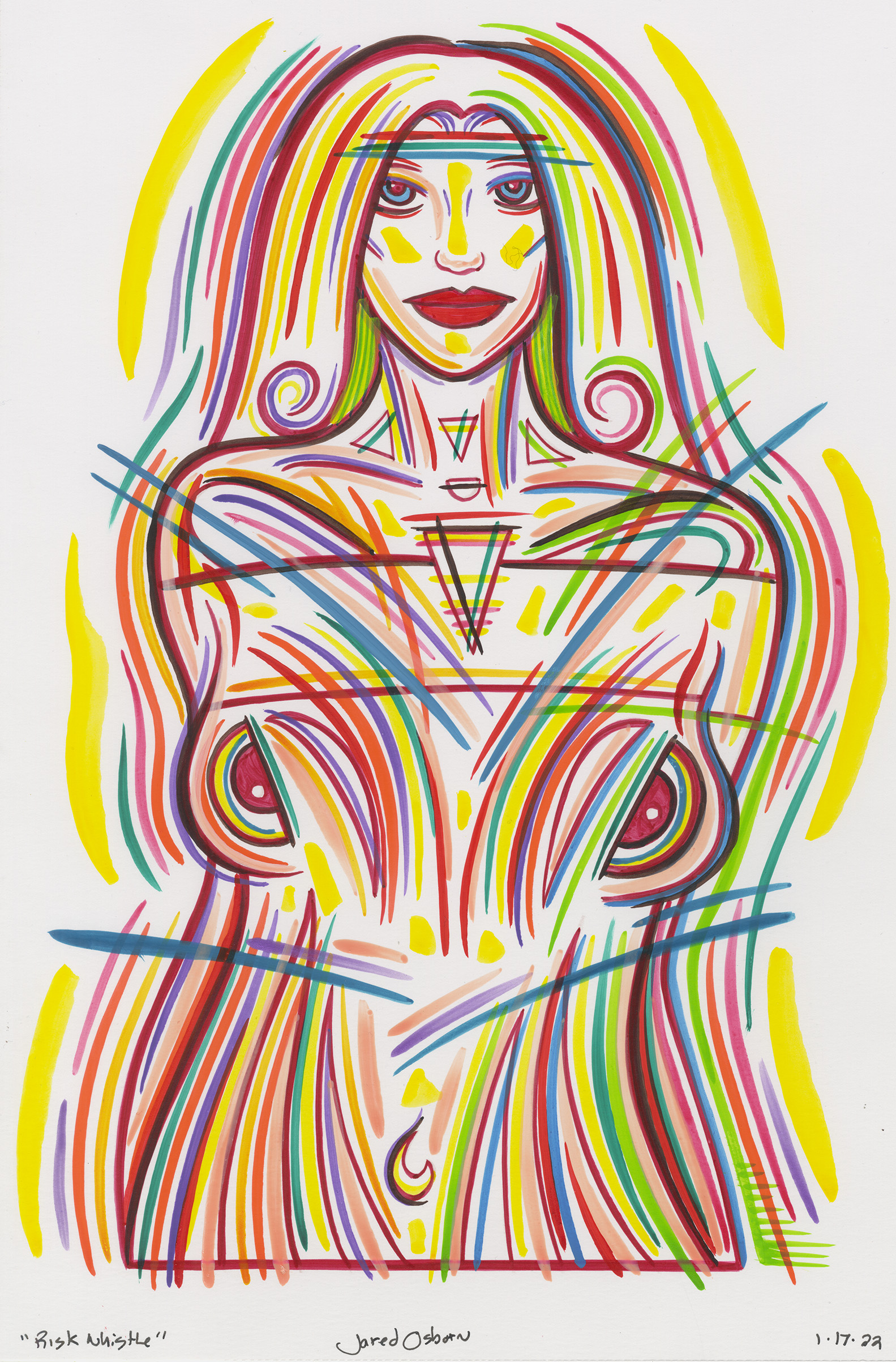
I think this was the first color ink drawing that I made with borders on all four sides. The second drawing “Risk Whistle” only has a border on the bottom and is open on the other three sides. This is how I’ve made most of my color ink drawings. “Toledo Troop” also has a background pattern unlike the others I’ve done. At first I really didn’t think the background came out well. Now, on second glance, it looks okay. Not great, but solid.
Right before I drew “Toledo Troop” I bought some new colors of ink. I had around 24 colors that I bought in 2021 but then at the very end of the year I bought eight new colors and added them into the set. A lot of the new colors were dark and I used a few of the new dark colors in this drawing. One too many? Maybe. With the dark colors and background this drawing gets a bit dense.
With “Risk Whistle” I started with a drawing I made for another faux comic book cover. I can’t remember the name but I think it was a “Painted Lady.” I’ll have to check. The one thing I changed from the initial drawing is that the top of her head was originally cut off by a border. I rounded off her hair so that I only had a border on the bottom.
“Toledo Troop” has at least two dark inks that I can see. A dark red and a dark blue. There may also be a dark purple in there too but I’m looking at it form a distance right now and can’t tell for sure. Red and blue stand apart from each other even if they are the two darkest colors.
“Risk Whistle” has two dark colors but they’re dark red and a reddish brown. These two color blend together. Especially when they’re next to each other. This makes the two drawings different as one has its darkest darks fighting each other and the second has its darkest darks working in harmony. Two different moods.
“Risk Whistle” also has a lot more air in it. The lack of borders and lack of background let a lot more of the white of the paper show through giving it a lighter feeling. Even with all the brush strokes outside the figure it doesn’t look heavy. The figure is a little bit pulled back from the viewer and is not as close up as “Toledo Troop” so that makes it look lighter too.
I think the point of view may also have something to do with the airiness of “Risk Whistle” compared to “Toledo Troop.” The former is on the same eye lever as us but the latter is taller than us and looking down. She is the more dominating presence.
The lack of borders and the pulled back point of view left more room in “Risk Whistle” to make those color brush strokes that cut across her body. They add action to the painting. Most of the brush strokes in both drawings follow the contours of the drawing but not these ones. They cut through things. There wasn’t room for that in “Toledo Troop.”
One thing that I should have done while making “Toledo Troop” but didn’t was to tape the edges. For a lot of my drawings in which I have borders I’ll run a piece of removable tape along the border to mask out the white are on the very edges of the paper. That way I can put down a brush stroke without stopping it at the border and keep going with the ink over the tape. At the end I pull up the tape and have a clean border.
I didn’t tape my borders for “Toledo Troop” and I can see when I made the background I had to stop my hand as I reached border so as not to go into the white area at the edge. I don’t know if this matters to anyone else but to me they make two different gestures. One with a sudden stop and one that continues in out in my imagination. I’ve been taping my edges so often lately that not taping them looks funny to me.
One final thought about these ink drawings is that now I want to figure out a way to use this style for some sort of purpose. I’m thinking about illustrating a book in this style. The main problem is that I’m not much of an illustrator. I’m used to making up my own scenes and such for my paintings and drawings so that using someone else’s imagery is forcing to me. But I think this would make a nice style for an illustration. We’ll have to see.