I’m back from the comic shop this week and I got six new comics and a giant book.
Check them all out here:
Comment
I’m back from the comic shop this week and I got six new comics and a giant book.
Check them all out here:
Along with comics books, one of the things I like to collect is original comic book art. I don’t have any particular theme to my original art collection, as many do, except maybe “Inexpensive”. A page of comic book art can cost anywhere from twenty dollars to twenty thousand dollars (and up). The stuff I buy is on the twenty dollar side. Well, maybe double that to forty dollars. There aren’t a ton of pages to be had for twenty dollars these days. I think the most I’ve paid for a piece is about a hundred dollars. Almost all the pages that I’ve purchased over the years probably cost between fifty and a hundred dollars per page. Before this week I haven’t bought a piece in a long time though. Y’see, four and a half years ago I bought a car for the first time in my life and that meant a car payment. So there went any extra money I might have had to buy art. With the end of my payments in sight I splurged and bought a new piece.
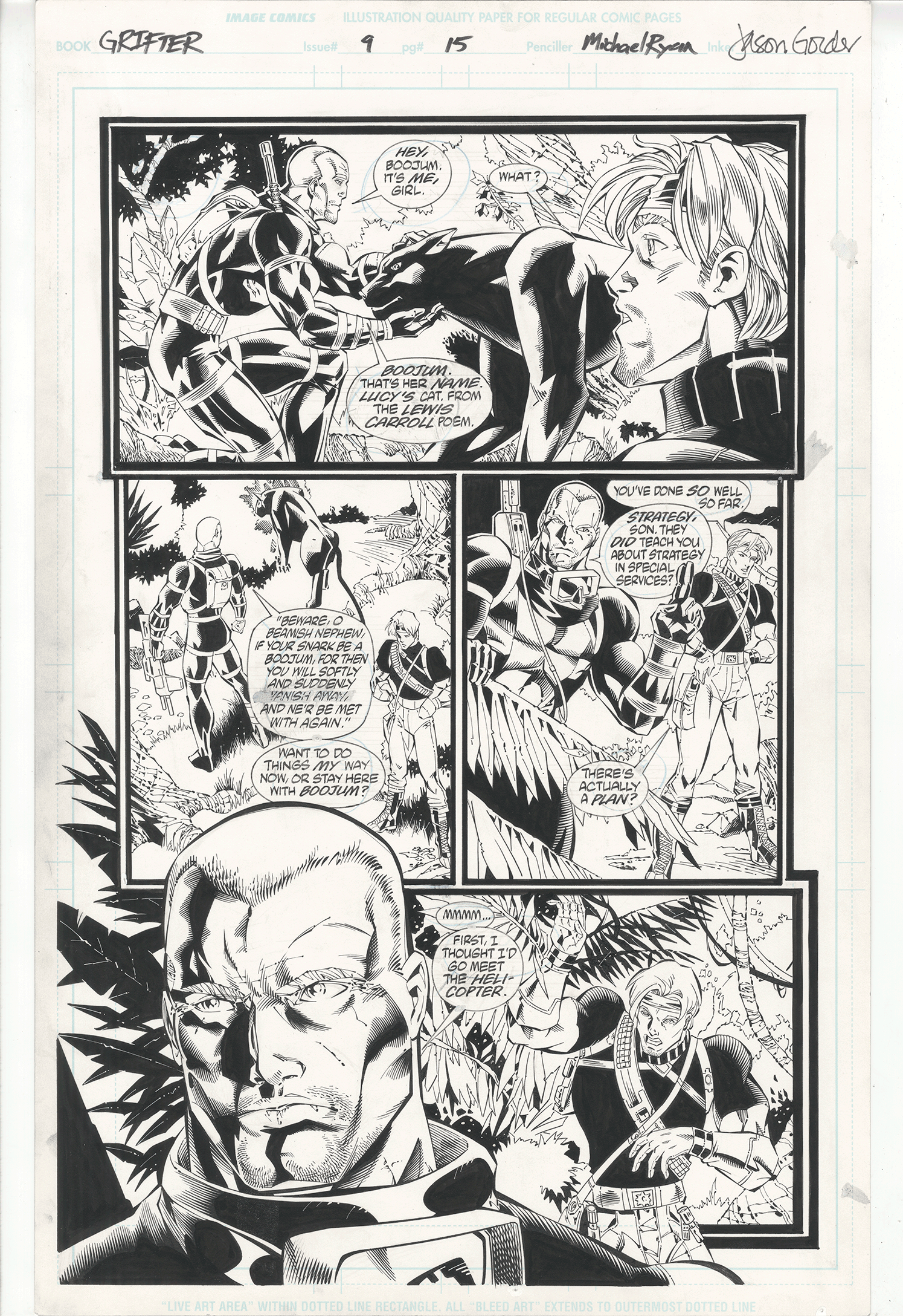
The page I got is from “Grifter” volume 2 issue 9 which was published in 1997. It’s story page 15 and was pencilled by Michael Ryan, inked by Jason Gordon, lettered by Clem Robins, with a Steven Grant script. Oddly enough I’ve never seen this issue before nor am I familiar with the artists involved. I was looking on Ebay for some comic book art, as I often do even though I don’t buy, and this page caught my eye. I always kind of liked Grifter as a character, didn’t have any Wildstorm art from this time period, and liked the look of the page. Plus it was only a starting bid of twenty five dollars with twelve dollars shipping. Thirty seven dollars was doable. I put in a bid and no one else did so I ended up getting it for the thirty seven bucks.
Why did no one else bid? That’s the way things go on Ebay sometimes. It’s not a page that a lot of people would be interested in. Grifter isn’t a very well known character and on this page he isn’t even wearing his rather distinctive mask. Just like more people are interested in Spider-man in costume than plain Peter Parker this page probably got less interest because of the lack of Grifter’s mask. And though the artists involved are talented they’re certainly not household names. They’re more the journeyman type drawing comics because it’s what the love to do and try their best to make a living at it. It’s not an easy gig.
The first thing I notice about this page is the way the blacks are spotted. It’s the solid black areas of ink that often anchor the visual look of a page. Some artists can so effectively create mood with blacks that there is hardly a need for color. Some artists use the black areas to move the reader’s eyes around the page. In the case of this page I’d say it’s the latter. Except here the blacks are used almost like in the composition of an abstract piece art.
We begin with the areas of black that are dictated by the colors of the costumes. Grifter’s shirt is mostly in a black silhouette, the short haired guy’s costume is half black, plus there is a black cat. Those areas have to be black. Then other black areas are peppered throughout the page. In panel one the leaves in the upper left are black and create a diagonal of black in across the panel. In panel two we get another diagonal of black with the leaves and grass. Then we come to panel three and there is a right angle of black made up of the guy on the left and across to the sky and Grifter. In the final panel we again have a diagonal of black from the leaves to the front guy’s shoulder with Grifter as an island of black in a square of white. It’s this arrangement of the blacks that initially attracted me to this page when I saw it on Ebay. It keeps my eyes moving around the page as they follows the path of the ink.
I also like the black panther or whatever the heck that animal is. The anatomy doesn’t seem to be anything close to an actual animal but it still looks interesting. I like interesting. In panel one the cat appears to be made out of stone. I think that’s because of the large areas of black and that it’s drawn very angular. The shapes are important not because they are trying to form an anatomical cat but because they are trying to be interesting on their own. And look at the way the shapes dance around in the man who is petting the cat. All those little black shapes are no so much describing his muscles as they are trying to make his muscles look interesting. I like that. I also like the smaller drawing of the cat in the second panel. It becomes almost an abstract drawing. I like the arrangement of shapes even though they nearly abandon the land of the literal.
I find it interesting that there is a lot of hatching going on in this page rather than crosshatching. Crosshatching defines the excesses of the early 1990s to me but I guess by 1997 comics had moved on from it. We still have lots of little fine lines in this page but no crosshatching. The inker had quite a bit of skill with the pen to make all those little lines so precisely. He brings a lot of order to the page.
I like the left side of the large face on the bottom with its array of shapes and lines but the right side starts to flatten out and fade away. I don’t have a copy of the comic that this page is from but I guess he left that part of the face more open for color. It may have worked fine on the printed page but here it’s only okay. It’s no where near a deal-breaker though. I also appreciate that this page has the lettering right on it. With comic book lettering being digital these days the original art no longer has the lettering on it. A page looks so much better with the words.
All in all I’m really glad I got this page. It’s not one that has big brand names attached to it but I like it because I find it interesting. In the end that’s why I collect things in general.
I’m back from the comic shop this week and I got seven new comics.
Take a look at the comic books I bought:

This long, cold winter sure has been hard on my bicycle. Road salt and sand take their toll. The fact that it was an extra cold and snowy winter didn’t help. Normally I cycle five mornings a week. That’s through all four seasons. I don’t miss many days except in the spring through fall if it’s raining or in the winter if it’s snowing And even on rainy days I can usually get a ride in latter on in the day when the rain stops. Or early before it starts. Sometimes it’s a fake stop and the rain starts up again as I’m riding. I’ve ended up on plenty of rain-rides that way. And if a day does get rained or snowed out I can ride on one of my off days to keep up. But not this winter.
This was my fourth year of winter riding and it was, by far, the winter with the worst weather. I had to skip more days this winter than the three previous winters combined. And it wasn’t even close. There were a couple of occasions this winter where I wasn’t able to ride for a more than week. Normally if it snows a lot I’ll wait until the second morning after is snows to get on the bike. A day of snow, a day for the roads to get cleared, and then I cycle. That means it has to snow every three days to keep me home for a week. And that happened more than once. Not our usual weather.
So this week I decided to do a little work on my bike. It still needs some more but at least I got most of the winter grime off of it. I broke out my bike stand for the first time since the fall, hung my bicycle up on it and had at it with one of my larger bristle brushes. At first I though I could just brush the road sand off my bike but it turned out that the sand, dirt, and road grime was way more tenacious than that. I was barely moving the dirt around. So I grabbed a rag and that got most of the sand off but there was some real mud and dirt under the sand. I had to get some spray cleaner to get that off.
The only repairs I did were to the brakes. Like most bike riders I mostly use the rear breaks so they get worn down faster than the front brakes. So my rear brake pads needed replacing. They were nearly gone. It’s a pretty easy thing replacing brake pads but then you have to adjust them to the proper tension and that can be annoying. Not hard just annoying. It mainly means pulling on the brake cable with vice-grips while turning wrench to lock the brake cable in place. But the brakes always end up too tight or too loose and it takes a couple of tries to get correct. After that there are some screws and little wheels to turn to make fine adjustments.
The rear brake was giving me trouble by not snapping back into the ready position after I released the tension on the cable but the front brake was far worse off. It’s been a problem for the back half of this winter. If I apply pressure on the front brakes they’ll grip the tire to stop me but then they won’t let got and get back to the ready position. I have to pull them apart by hand. It’s easy to do but not as I’m riding. I decided to take apart the front brake assembly to clean it out and see if I could get it working properly. There was a lot of road grime stuck in the assembly. But as I tried to get the brake assembly off the bike frame I couldn’t. Four years of road salt and grime made the allen wrench nut lock in place and then I stripped it trying to get it loose. No fun.
I tried cleaning up the brake assembly the best I could without removing it but nothing I did would make the brake work correctly. I think the tension spring that moves the brakes back in place doesn’t have enough tension left in it. I’m going to need a new front brake assembly. I’m not even going to try to get the brake assembly off until I get a new one because I’ll probably have to break it off. The front brake will still stop me right now if I need it to so there isn’t a huge hurry. Plus it’s the back break that’s the work horse.
I also put a little more decoration on my bike. Back when I first bough this bicycle I thought it was boring looking. It’s grey and ugly. Repainting the bike was too much work so I bought some half inch electrical tape in a variety of colors. I used the colored tape to make rings of color around the frame’s tubes. It worked pretty well. I got bored doing it though and only ended up decorating the bike about half way with colored rings and planned on getting back to it later. Now five years have gone by and it’s finally later. I still haven’t quite finished it but it has some more color rings on it.
The electrical tape has held up remarkably well. Some of it that’s on the underside of the bike gets a lot of spray from the road looks a bit weathered but most of it looks as bright and colorful as the day I put it on. When I cleaned up the bike with soap and water the tape shined right up too. I never would have guesses that stuff was so durable and lightfast.
One final tale of the winter that wouldn’t leave. We were finally into the first week of April and things had started to warm up a bit. I shed my full winter gear and even had a couple of days of 60ºF riding. Then the second week of April hit and the temperature dropped back down below freezing most of the week. I had to put on my full winter riding clothes again. I sit writing this during the third week of April and it’s barely reaching the fifties. That’s not full winter gear weather but still I could use some sunny and 60º mornings. Oh well, they’ll come eventually.
I’m back from the comic shop this week and I got four new comics.
And here is a look at them.
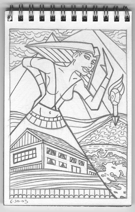
This week I’m pulling out a piece from one of my larger projects that took me years to complete. I made a set of fortune telling cards. I’ve always been fascinated by systems in general and especially systems that are based on nothing. Like fortune telling systems. I don’t believe anyone can see into the future but I find it interesting that the people who say they can have systems and rituals that they have to do a certain way in order to predict the future. You can’t throw Tarot cards down willy-nilly and make up what the cards mean on a whim. There has to be a way to do things. So I made up my own way.
Being a fan of art cards, sketch cards, playing cards, and cards in general I decided to go the card route with my fortune telling system. Lot’s of people have illustrated their own versions of the Tarot deck buy I wanted to start from the ground up. I wanted different cards with different meanings then the Tarot and a modern slant. So that’s what I set out to do. It’s working title was “The Tourmaline Mystique” and it still has its working title because I never though of a better one. I have the finished deck posted on my jaredosborn.com website but now I’m going to look at one card from start to finish.

This card is named “The Brat” and it started with a small sketchbook filed with 4×6 inch paper. This was drawn in 2003 which was a couple of years after I started drawing in my spontaneous ink style that is the basis for a lot of my work now but for these drawings I went back to an earlier surrealist automatic drawing method. That means I scribbled on the sketchbook page in pencil and then, like finding faces in clouds, I looked for the images I draw. What I found was a woman, a couple of pyramids, a house, and a strange landscape-man. It all became “The Brat”. From the dates on the drawings I can see that it took me about a month and a half to fill the twenty four page book.
The second step was to draw the image again at a larger 7.5×10.5 inch size. I did my usual meted of scanning the sketch in and then printing it out in blue line to draw over. I notice that I didn’t change much when I made the larger drawing. I defined her eyes more and gave her a gaze but other than that most is about the same. I reordered the wavy lines under the house and straightened out some of the windows too but other than that the sketch was a pretty tight drawing so I didn’t.
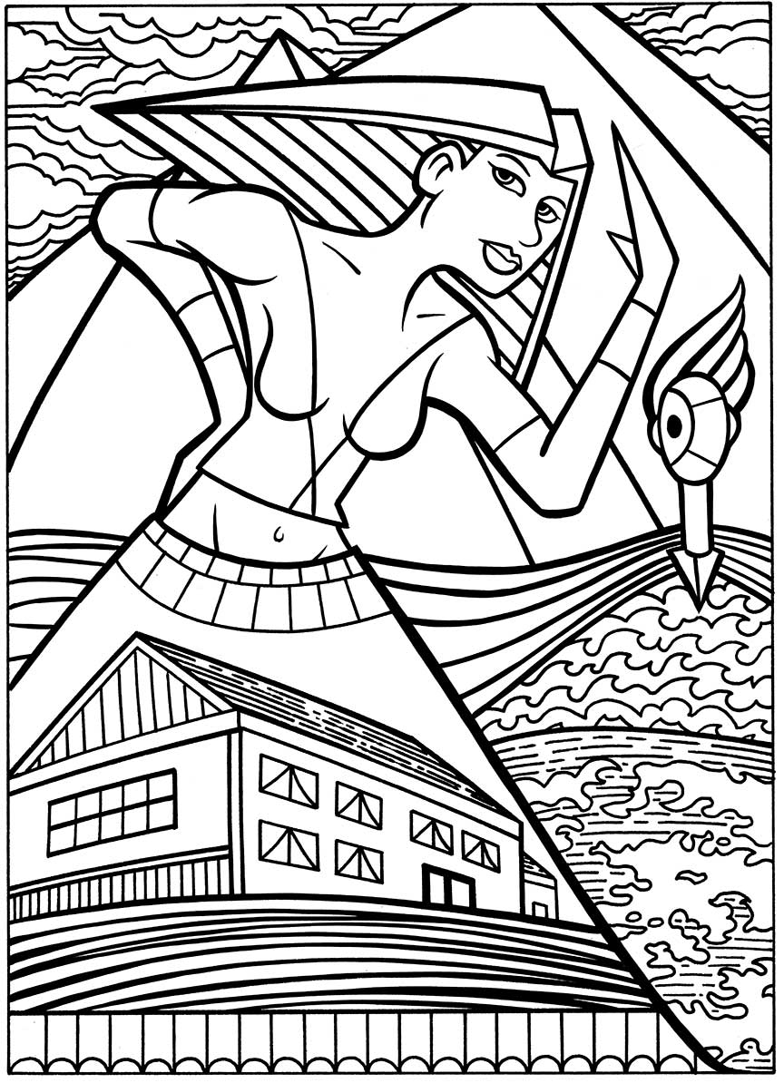
If you’ve read any of my other writings about my process then you know that after the pencils are done the next step is the inks. I scanned the pencils in and printed them out in blue line, This time at 10×15 inches. That’s the size I like to ink at. I kept things fairly simple in the inking. Since the final card size was going to be 2.5×4.5 inches I wanted the inking to be bold without any little skritch-skratchy lines or hatching. I notice that I emphasized the woman dress that turns into a triangle thus repeating the shape of the pyramids above her. The ink line of the triangle of her hair is also strong. That’s a lot of triangles. Other than that there is not a lot of technique in the inks. Just bold lines that’ll hold the color well when things get shrunk down to finished size.
The next step is the color. Once again I kept things simple because of the small size that these were going to end up at. No shading or modeling here just pure cut color. The Egyptian influence on this drawing shows up even more clearly with the color. The woman’s skin is a dark tan that ties her into the brown pyramid behind her. Plus the multi-colored strips in her hair make it look even more like an ancient Egyptian headdress. Her red dress with its boxes of color looks more modern with a bit of old-time Mexico in it. My artistic influences really do go back a ways. I find the blues in this piece particularly interesting. They’re layered in such a way as to flatten the space but they also unify it. It was an odd choice to make the front pyramid blue but it give us layers. Brown skin, blue pyramid, brown pyramid, and then the blue sky. That is not a usual color composition for me. That green head really floats in the composition too.
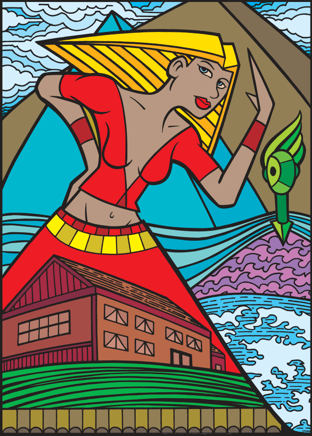
The final, obvious, step was to make it into a card. That was my goal all along. It took me awhile to settle onto the design of the card because not only did I want it to look good but I also wanted to throw a few extras in there too. For the system I was making up. I decided to have two groups of cards. Twenty four each of “The Hidden” and “The Revealed” for a final tally of forty eight cards. “The Revealed” means that the illustrations are literal. One of the cards is called “Sky Blue Tie” and its a picture of a sky blue tie. This card “The Brat” is one of “The Hidden” so it’s not literal. It’s left up to the viewer to find their own connections between the name and the drawing. The middle number on the card is its number in the set. This card is number 15 of “The Hidden”. The numbers don’t go higher than 24 so each card has a match in the other half of the set. “The Revealed” number 15 is called “The Half Pipe”.
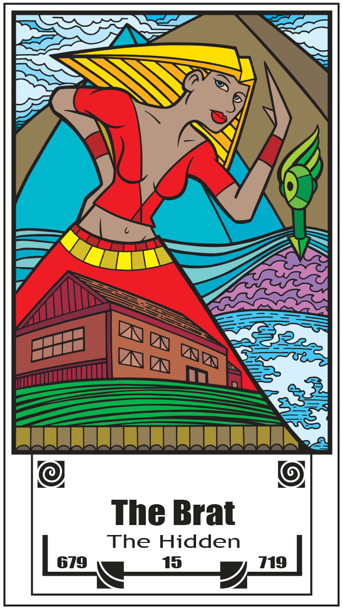
The spirals and wavy lines are just there for decoration. I like spirals a lot so I was glad to get them in there. I ended up putting a three digit number on the left and the right of the cards for no specific meaning but because I, and numerologists, like numbers. I took a bit of care to pick numbers that I thought looked good decoratively and I tried not to repeat myself or fall into a pattern. I figure maybe someday they’ll mean something to someone. After all I can’t figure out every part of the system. The future too uncertain for that.
I’m back from the comic shop this week and I got ten new comics.
And for the second time you listen to me ramble about the comic books I bought this week.

I’ve been working this week on some of my cartoon art cards. That’s what I call those little drawings that are found on the left and right side of my Sunday comic strip “Drifting and Dreaming”. They consist of a person’s face looking out at the reader and saying something odd, amusing, funny, and clever. At least that’s what I aim for. I’ll settle for any one of the four.
It all starts with my pieces of scrap bristol. Bristol board is the name of the paper I like to draw on. I usually buy it in pads of 14×17 inch pieces of paper but I like to draw on 11×17 inch paper. So I cut three inches off the side and end up with an extra 3×17 inch piece of paper. I then cut that piece into a bunch of 2.5×3.5 inch baseball card size pieces. I’ve got a lot of them hanging around. For a decade I cut up the paper into the smaller pieces with an x-acto knife and a straight edge but recently switched over to my Dahle Rolling Trimmer paper cutter. I’ve had the paper cutter for about ten year but have never used it for cutting my art cards. Despite the guide lines on the cutter I could never get consistent accuracy in card size with it. Last month I finally just drew my own guide lines with a marker on the Dahle and it’s been smooth sailing ever since. I don’t know why I didn’t think of that ten years ago.
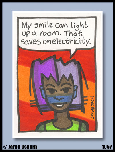
I make these cartoon art cards in sets of ten. So I grabbed ten blank cards. I use a sign pen marker that has been refilled with India ink and the first thing I do is draw the border and the word balloon. Then I clear my mind. That’s because I don’t do any preparatory drawings in pencils for these. They’re drawn right in ink so a clear mind and spontaneity is essential. I’m looking for weird little faces that I’d never be able to draw with my conscious mind. At least that’s how the first lines are drawn. About halfway through the drawing I have to turn my mind on and make it into a coherent face. Usually the face is accompanied by a weird hat or some weird hair. I do this for ten faces in a row. Then I write them.
The start of my writing process for my cartoon art cards is to make lettering guidelines inside the word balloons. I hand letter these because I want the lettering right on the original art and I also want a rough look to match the art. I use my Haff hatching machine to make the parallel lines rather than the traditional Ames lettering guide because the Haff is easier to use. And because I have one. The Haff is kinda an obscure piece of equipment.
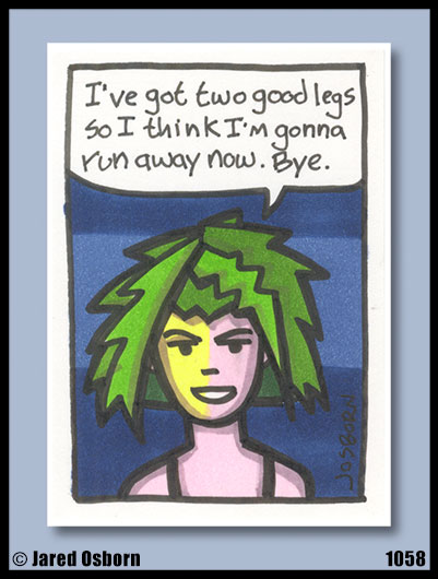
After the guide lines are in place I lay out the ten cards in front of me on my drawing table and think. Once again I clear my mind and try to make the writing come into my head. I come up with some silly phrase or sentence and then look at the faces to see who I think said it. You couldn’t tell from my rough lettering but I first do the lettering in pencil. That helps me fit all the words in the balloon especially because the phrases I come up with are often too long for the space and I have to rephrase or edit them down. It’s better to erase than to white out.
Once I’ve finally got all ten cards written and pencilled into the balloons I letter them in ink. It took me a long time to settle on a pen I like for the job since the lettering is kind of small and I was lettering in upper and lower case rather than the traditional all upper case comic book lettering. I ended up using a Copic Multiliner size .5mm for the letter. I tried all different brands of .5 and .7mm pens but that one worked the best for me. I letter all ten in ink, wait for them to dry, and then erase the pencil guide lines.
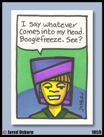
Next come the colors. I use markers for those. This week I actually colored twenty cartoon art cards since I wrote and drew two sets of ten without coloring the first set. That happens sometimes. I put all twenty cards in front of me on my drawing board and one by one I colored in the background designs. I’m not sure why but I like to do all the backgrounds before I start on any of the faces. The backgrounds are all basic shapes drawn in two colors. I like to keep them simple.
After the backgrounds are done I color the figures. I like to make the faces two tone and with a simple design on them. That makes things a little more interesting to me. Once I have all the colors down I come back with one final dull purple marker and add just a little shading in. Not too much since everything is small and colorful. I just like a little bit of rounding.
The cartoon art cards journey isn’t quite done there because I have to scan them into the computer and do a little production work on them. I number each of my art cards so that I can keep track of them and I’ve learned it’s easier to number them after I scan them. My scanner software adds a “+1” to each number in the file name so it’s easier to write that number down on the back of the card rather than trying to scan the cards in some sort of predetermined order.
I make sure the scans are straight, write the scan number on the back of the card, and then put the card into a template for presentation. That way if I want to post one it’s set up to look pretty already. I also name the Photoshop layer in the document with the scan number that way when I’m making my “Drifting and Dreaming” strip I can drag the numbered layer into my D&D template and the number will come with it. Keeping things organized is the key to keeping confusion away.
So there is another process of mine for you. It might not be overly exciting but it’s a way to get things done.
I’m back from the comic shop this week and I got five new comics.
Here is the first of my “Comic Book Haul” videos. I’ve been watching a bunch of other people’s on YouTube and thought I’d make my own. It’s pretty rough but I plan on getting better.

I ordered refill inks for some of my Copic markers this week. I’ve been buying Copic markers for a few of years now and have around one hundred and ten markers in my stock. Or is it a collection? I’m not even sure because sometimes the collector’s mentality takes over and I want to get all the colors. But in the last year practicality has won the day and I’ve been buying ink refills for the markers I already own. One of the really good things about Copic markers is that you can add more ink to them. One bottle of ink will fill the marker eight times. With a marker being six or so dollars and a bottle of ink costing about the same it’s a good deal to buy the refill inks. So I do. I have the thirty six piece 25th anniversary Copic marker set plus another seventy two marker case that is almost full. The seventy two marker case I filled by buying markers a few at a time with colors that I liked rather than buying a prearranged set.
As I’ve been slowly matching up my markers with their ink bottle counterparts I’ve noticed a pattern in my behavior develop. I’d use the markers I have refills for more than the ones where I don’t yet have refills. Part of this is because I bought refills of the markers that I use the most first but part of it is also because when choosing a color I’ll sometimes shy away from the ones that I don’t have refills for. I don’t want the marker to run dry in the middle of a drawing. That would be bad. With this next order I should have about seventy five percent of my collection of refills complete. When it finally reaches one hundred percent I might get some new colors. Y’know, if the collector’s mentality takes over again.
I pulled out one of my marker drawing to write about and noticed that it was from the future. Or I had written the wrong date on it. Take your choice. It had 4/19/14 written on it but since it’s the first day of April 2014 as I write this that was obviously the wrong date. I checked my calendar in which I write down what things I worked on that day and it turns out I made this drawing on February nineteenth. I guess I was playing an April Fool’s joke on myself.
This drawing is named “Ranger Motion” and is drawn on a nine by twelve inch piece of bristol board. That’s another reason why the marker refills are so good. Bristol board soaks up ink like a sponge. Paper that is made specifically for markers is often smooth, thin, and has a surface that doesn’t absorb a ton of ink. But marker paper is often too thin for my liking so that’s why I prefer the bristol. It can really dry out a marker quickly though.
Nine by twelve inches is also a pretty big size for my marker drawings in general. I’ve made a lot of marker drawings at five by seven inches and some more at six by nine inches but usually not a whole lot bigger. It’s easier to use paint at the larger sizes but I guess I wanted something different that February day.
This is one of my face motif drawings. Or is it a mask? I don’t always know but being that the face is bright red it could be either one. As usual the first thing I did was start with a small drawing which I blew up and made a larger drawing out of. After I finished that larger drawing I scanned it into the computer and printed it out at this size in blue line for inking. I inked this one, to start, with an india ink filled marked and some French curves. After that I pulled out the markers and put down the color. Then I pulled out my brush, dipped it in India ink, and added line weight to the inks where ever I thought it was needed. The final step was to add some white highlights with a white charcoal pencil.
I’m happy with the way it came out. I went with a red and green color scheme and managed to avoid a Christmas look. The power of the light blue (Tahitian Blue one of my favorite colors of marker) even in small amounts stops the red and green from fighting too much. The purple makes a nice base for it all and settles down almost like a neutral color. The background is a bit odd being that it’s a mustard yellow. That’s not my usual color for a background but the technique I make it with is. I drag the side of the marker brush across the paper while varying the pressure I put on it to make that uneven line. That’s light purple on top of the mustard yellow which greys out and dulls down. Overall I like the airiness of the background.
This piece is all about the interplay of line and shape. There is also a lot of roundness versus flatness going on. The main bit of roundness is the guy’s head. That big round jaw and wide face . But then there is his neck and collar which flatten out as if made of paper. His eyes are circles without the roundness of spheres and his nose is hinted at but doesn’t reach out to you. The triangular marks on his face are the tipping point in the fight between flatness and roundness. They seem to play both sides as sometimes they seem round and other times flat. I’ve always enjoyed this type of interplay of space.
I’m no positive why I decided to make a marker piece this size. Though it was only made weeks ago motivations can fade fast. I think I was going to use it as part of a comic I’m making but I haven’t found a place for it in there just yet. Often I make art just for the heck of it but lately I’ve been trying to put together a couple of books of stuff and tie some things together. So far I haven’t finished any of them but until I do I’ll have to keep making things and then see what becomes of them.