Along with comics books, one of the things I like to collect is original comic book art. I don’t have any particular theme to my original art collection, as many do, except maybe “Inexpensive”. A page of comic book art can cost anywhere from twenty dollars to twenty thousand dollars (and up). The stuff I buy is on the twenty dollar side. Well, maybe double that to forty dollars. There aren’t a ton of pages to be had for twenty dollars these days. I think the most I’ve paid for a piece is about a hundred dollars. Almost all the pages that I’ve purchased over the years probably cost between fifty and a hundred dollars per page. Before this week I haven’t bought a piece in a long time though. Y’see, four and a half years ago I bought a car for the first time in my life and that meant a car payment. So there went any extra money I might have had to buy art. With the end of my payments in sight I splurged and bought a new piece.
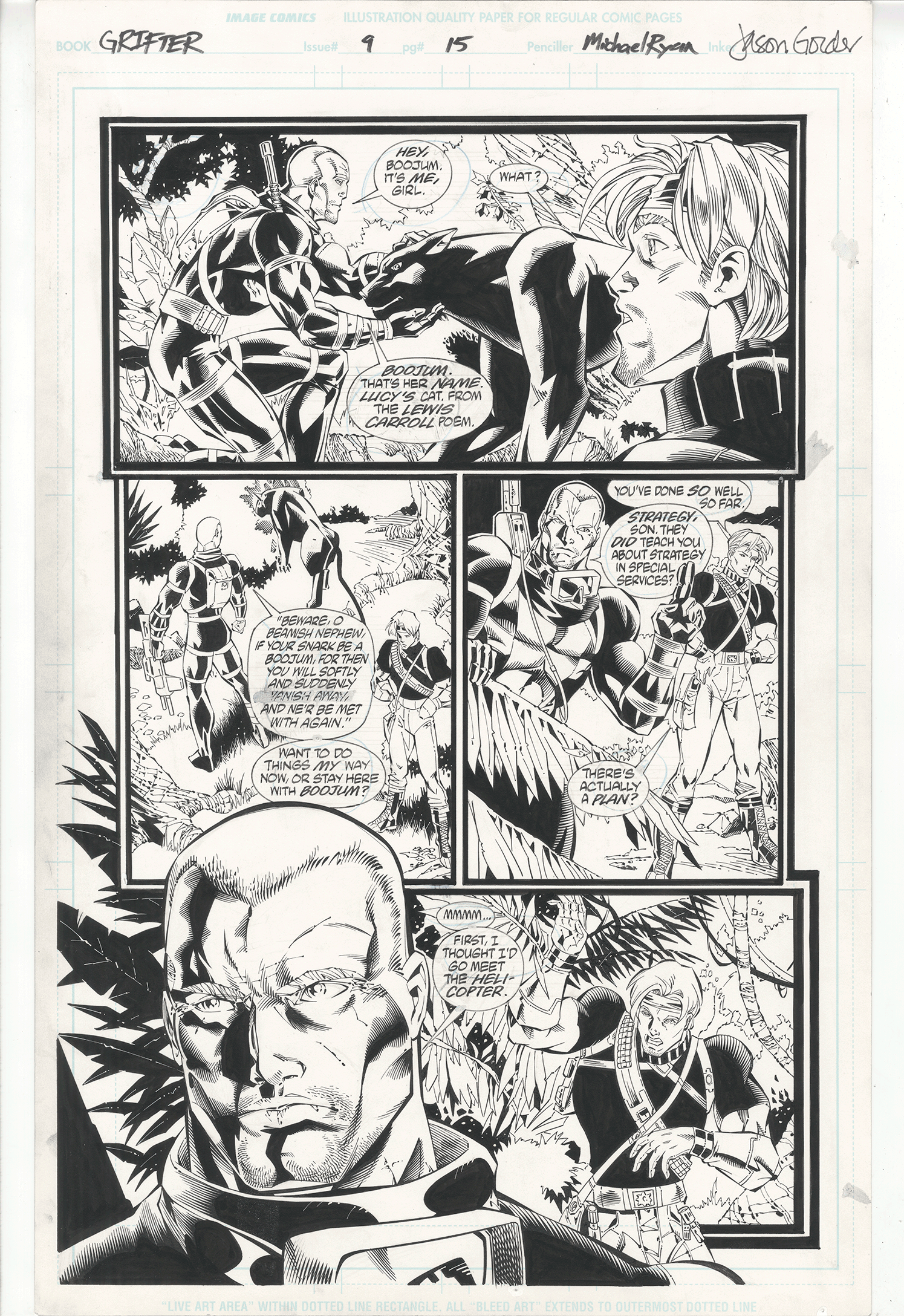
The page I got is from “Grifter” volume 2 issue 9 which was published in 1997. It’s story page 15 and was pencilled by Michael Ryan, inked by Jason Gordon, lettered by Clem Robins, with a Steven Grant script. Oddly enough I’ve never seen this issue before nor am I familiar with the artists involved. I was looking on Ebay for some comic book art, as I often do even though I don’t buy, and this page caught my eye. I always kind of liked Grifter as a character, didn’t have any Wildstorm art from this time period, and liked the look of the page. Plus it was only a starting bid of twenty five dollars with twelve dollars shipping. Thirty seven dollars was doable. I put in a bid and no one else did so I ended up getting it for the thirty seven bucks.
Why did no one else bid? That’s the way things go on Ebay sometimes. It’s not a page that a lot of people would be interested in. Grifter isn’t a very well known character and on this page he isn’t even wearing his rather distinctive mask. Just like more people are interested in Spider-man in costume than plain Peter Parker this page probably got less interest because of the lack of Grifter’s mask. And though the artists involved are talented they’re certainly not household names. They’re more the journeyman type drawing comics because it’s what the love to do and try their best to make a living at it. It’s not an easy gig.
The first thing I notice about this page is the way the blacks are spotted. It’s the solid black areas of ink that often anchor the visual look of a page. Some artists can so effectively create mood with blacks that there is hardly a need for color. Some artists use the black areas to move the reader’s eyes around the page. In the case of this page I’d say it’s the latter. Except here the blacks are used almost like in the composition of an abstract piece art.
We begin with the areas of black that are dictated by the colors of the costumes. Grifter’s shirt is mostly in a black silhouette, the short haired guy’s costume is half black, plus there is a black cat. Those areas have to be black. Then other black areas are peppered throughout the page. In panel one the leaves in the upper left are black and create a diagonal of black in across the panel. In panel two we get another diagonal of black with the leaves and grass. Then we come to panel three and there is a right angle of black made up of the guy on the left and across to the sky and Grifter. In the final panel we again have a diagonal of black from the leaves to the front guy’s shoulder with Grifter as an island of black in a square of white. It’s this arrangement of the blacks that initially attracted me to this page when I saw it on Ebay. It keeps my eyes moving around the page as they follows the path of the ink.
I also like the black panther or whatever the heck that animal is. The anatomy doesn’t seem to be anything close to an actual animal but it still looks interesting. I like interesting. In panel one the cat appears to be made out of stone. I think that’s because of the large areas of black and that it’s drawn very angular. The shapes are important not because they are trying to form an anatomical cat but because they are trying to be interesting on their own. And look at the way the shapes dance around in the man who is petting the cat. All those little black shapes are no so much describing his muscles as they are trying to make his muscles look interesting. I like that. I also like the smaller drawing of the cat in the second panel. It becomes almost an abstract drawing. I like the arrangement of shapes even though they nearly abandon the land of the literal.
I find it interesting that there is a lot of hatching going on in this page rather than crosshatching. Crosshatching defines the excesses of the early 1990s to me but I guess by 1997 comics had moved on from it. We still have lots of little fine lines in this page but no crosshatching. The inker had quite a bit of skill with the pen to make all those little lines so precisely. He brings a lot of order to the page.
I like the left side of the large face on the bottom with its array of shapes and lines but the right side starts to flatten out and fade away. I don’t have a copy of the comic that this page is from but I guess he left that part of the face more open for color. It may have worked fine on the printed page but here it’s only okay. It’s no where near a deal-breaker though. I also appreciate that this page has the lettering right on it. With comic book lettering being digital these days the original art no longer has the lettering on it. A page looks so much better with the words.
All in all I’m really glad I got this page. It’s not one that has big brand names attached to it but I like it because I find it interesting. In the end that’s why I collect things in general.
Discussion ¬