This week I’m pulling out a piece from one of my larger projects that took me years to complete. I made a set of fortune telling cards. I’ve always been fascinated by systems in general and especially systems that are based on nothing. Like fortune telling systems. I don’t believe anyone can see into the future but I find it interesting that the people who say they can have systems and rituals that they have to do a certain way in order to predict the future. You can’t throw Tarot cards down willy-nilly and make up what the cards mean on a whim. There has to be a way to do things. So I made up my own way.
Being a fan of art cards, sketch cards, playing cards, and cards in general I decided to go the card route with my fortune telling system. Lot’s of people have illustrated their own versions of the Tarot deck buy I wanted to start from the ground up. I wanted different cards with different meanings then the Tarot and a modern slant. So that’s what I set out to do. It’s working title was “The Tourmaline Mystique” and it still has its working title because I never though of a better one. I have the finished deck posted on my jaredosborn.com website but now I’m going to look at one card from start to finish.

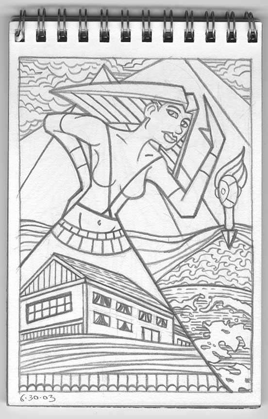
This card is named “The Brat” and it started with a small sketchbook filed with 4×6 inch paper. This was drawn in 2003 which was a couple of years after I started drawing in my spontaneous ink style that is the basis for a lot of my work now but for these drawings I went back to an earlier surrealist automatic drawing method. That means I scribbled on the sketchbook page in pencil and then, like finding faces in clouds, I looked for the images I draw. What I found was a woman, a couple of pyramids, a house, and a strange landscape-man. It all became “The Brat”. From the dates on the drawings I can see that it took me about a month and a half to fill the twenty four page book.
The second step was to draw the image again at a larger 7.5×10.5 inch size. I did my usual meted of scanning the sketch in and then printing it out in blue line to draw over. I notice that I didn’t change much when I made the larger drawing. I defined her eyes more and gave her a gaze but other than that most is about the same. I reordered the wavy lines under the house and straightened out some of the windows too but other than that the sketch was a pretty tight drawing so I didn’t.
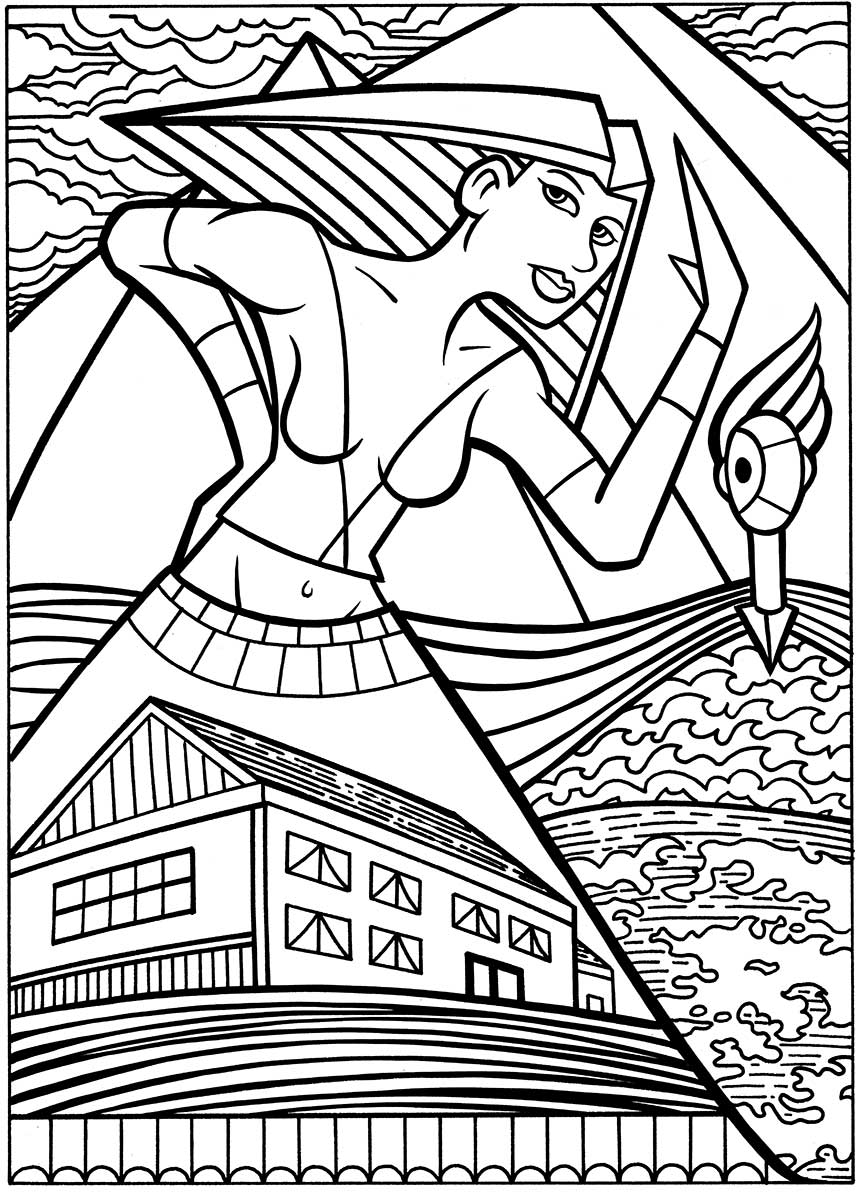
If you’ve read any of my other writings about my process then you know that after the pencils are done the next step is the inks. I scanned the pencils in and printed them out in blue line, This time at 10×15 inches. That’s the size I like to ink at. I kept things fairly simple in the inking. Since the final card size was going to be 2.5×4.5 inches I wanted the inking to be bold without any little skritch-skratchy lines or hatching. I notice that I emphasized the woman dress that turns into a triangle thus repeating the shape of the pyramids above her. The ink line of the triangle of her hair is also strong. That’s a lot of triangles. Other than that there is not a lot of technique in the inks. Just bold lines that’ll hold the color well when things get shrunk down to finished size.
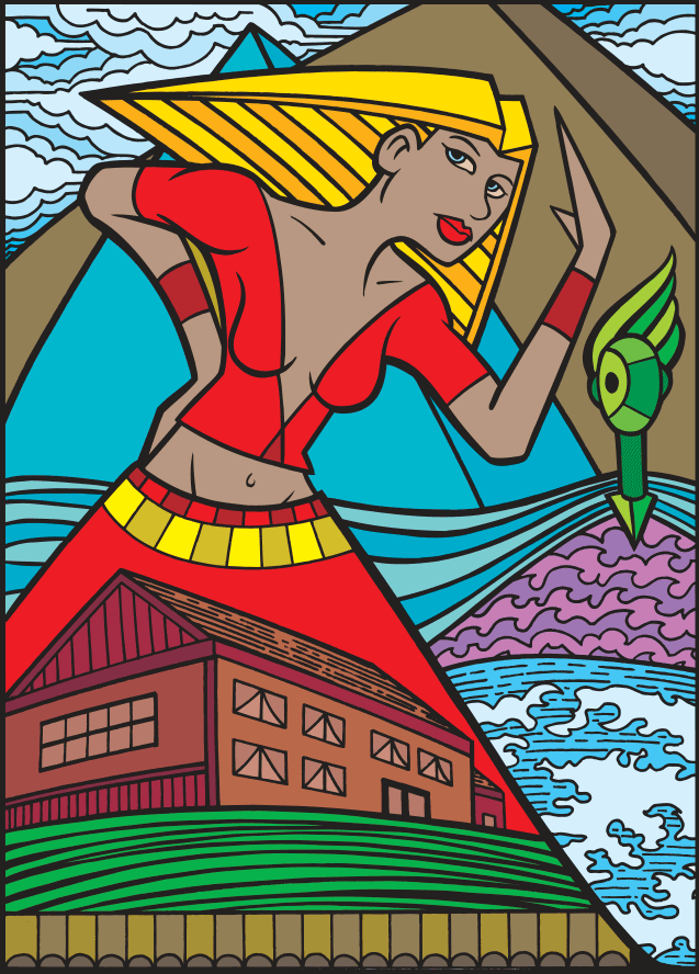
The next step is the color. Once again I kept things simple because of the small size that these were going to end up at. No shading or modeling here just pure cut color. The Egyptian influence on this drawing shows up even more clearly with the color. The woman’s skin is a dark tan that ties her into the brown pyramid behind her. Plus the multi-colored strips in her hair make it look even more like an ancient Egyptian headdress. Her red dress with its boxes of color looks more modern with a bit of old-time Mexico in it. My artistic influences really do go back a ways. I find the blues in this piece particularly interesting. They’re layered in such a way as to flatten the space but they also unify it. It was an odd choice to make the front pyramid blue but it give us layers. Brown skin, blue pyramid, brown pyramid, and then the blue sky. That is not a usual color composition for me. That green head really floats in the composition too.
The final, obvious, step was to make it into a card. That was my goal all along. It took me awhile to settle onto the design of the card because not only did I want it to look good but I also wanted to throw a few extras in there too. For the system I was making up. I decided to have two groups of cards. Twenty four each of “The Hidden” and “The Revealed” for a final tally of forty eight cards. “The Revealed” means that the illustrations are literal. One of the cards is called “Sky Blue Tie” and its a picture of a sky blue tie. This card “The Brat” is one of “The Hidden” so it’s not literal. It’s left up to the viewer to find their own connections between the name and the drawing. The middle number on the card is its number in the set. This card is number 15 of “The Hidden”. The numbers don’t go higher than 24 so each card has a match in the other half of the set. “The Revealed” number 15 is called “The Half Pipe”.
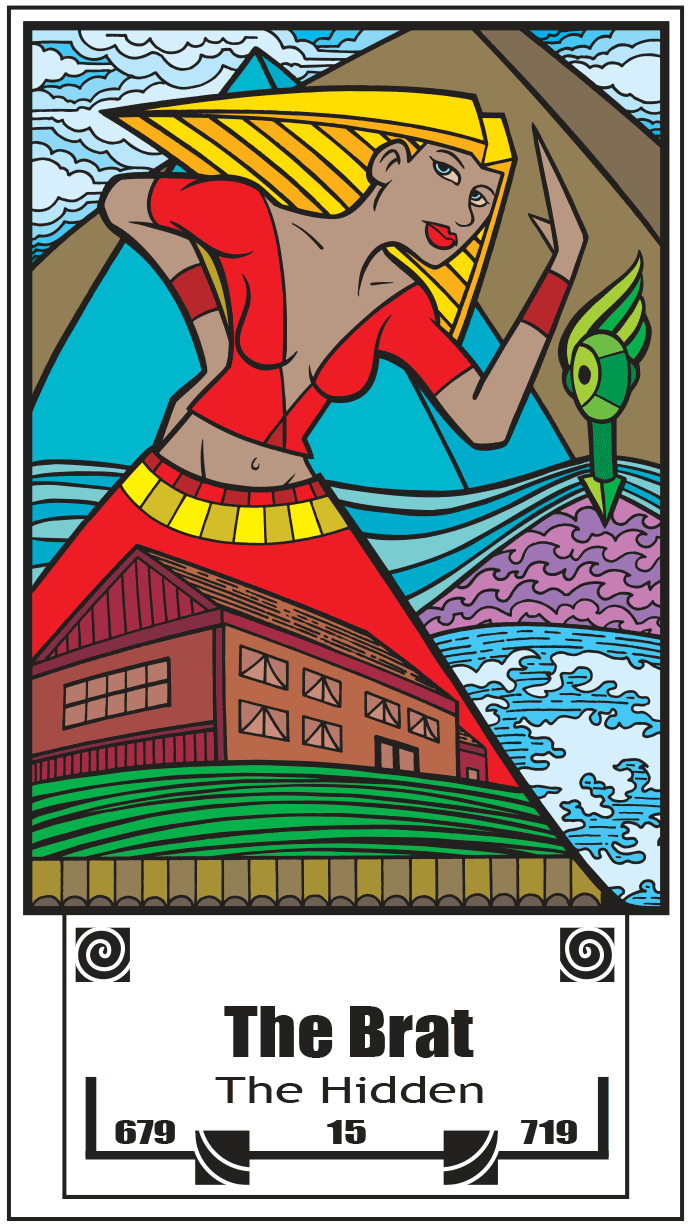
The spirals and wavy lines are just there for decoration. I like spirals a lot so I was glad to get them in there. I ended up putting a three digit number on the left and the right of the cards for no specific meaning but because I, and numerologists, like numbers. I took a bit of care to pick numbers that I thought looked good decoratively and I tried not to repeat myself or fall into a pattern. I figure maybe someday they’ll mean something to someone. After all I can’t figure out every part of the system. The future too uncertain for that.
Discussion ¬