marked 11×17 inch print.
Today I’m going to give you a look at something I finished this morning. I’m doing that mostly for my own benefit because this is one of those days when I can’t get anything done. I know it sounds like I got something done because I said I finished something but I really only put a few last touches on it. It might even need a few more last touches but I can’t tell right now. I hate days like these because I’m used to being able to get things done but days like this happen. Let’s see if I can write a little to get something done.
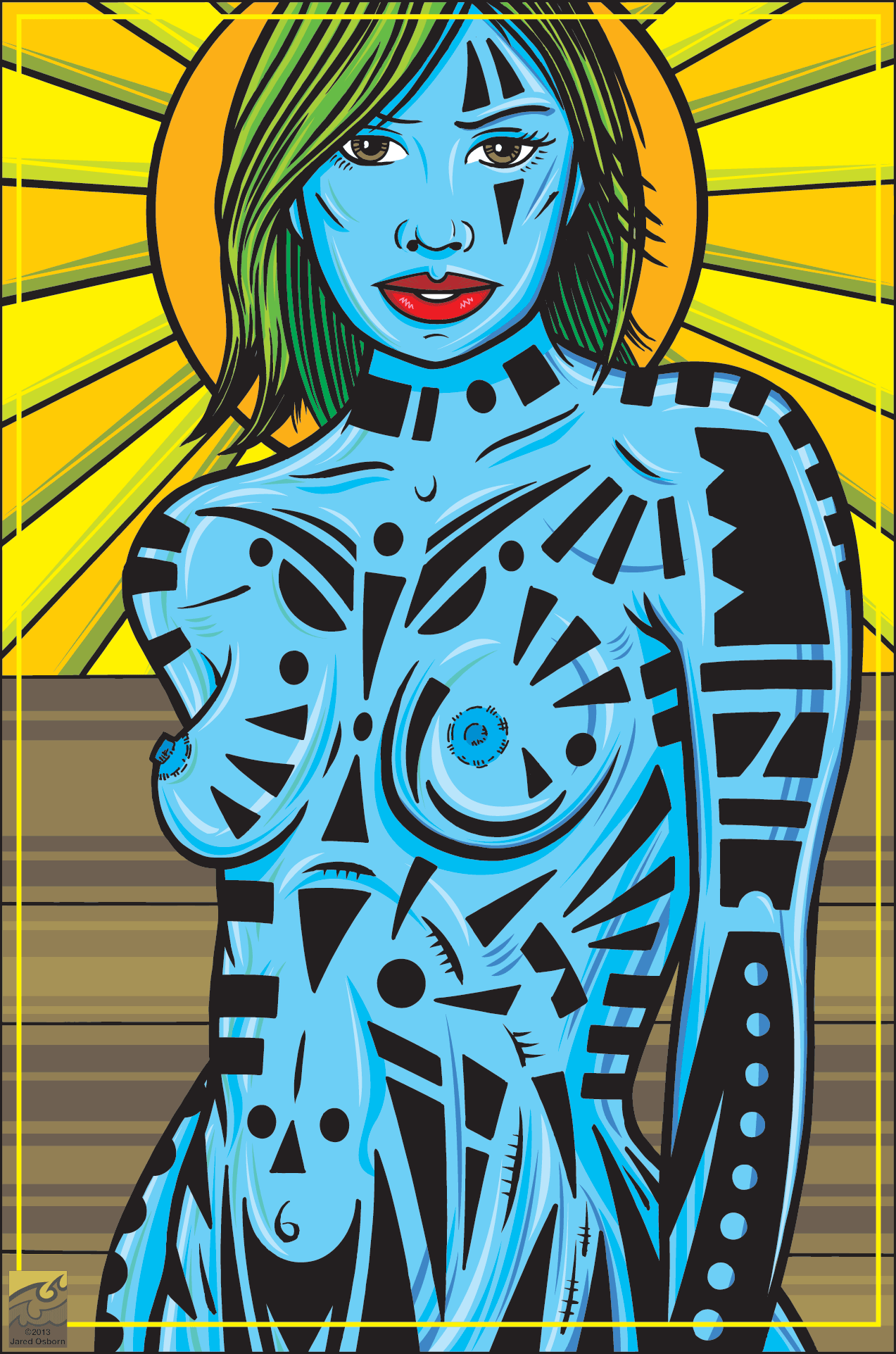
The name of this print is “Marked”. I’ve done a few prints like it over the years. They are basically nudes with drawings on the women’s bodies. They’re part tribal tattoos and part modern art. I’m really not sure what they mean to me. They started out as a project I drew years ago of various goddesses. In those drawings I put the women into highly decorative outfits with fancy backgrounds that were reminiscent of stained glass. Somewhere along the way the the women’s outfits turned into decorations on their skin.
Sometimes I use photo reference for these and sometimes not. I’ve even used a 3D modeling program in recent years. I’m a believer in shooting my own photo reference but I don’t have any nude models available so for these drawings I’ll often use a photo that I find on the internet. I’m very picky about what photos I’ll use though. I basically want a generic straight forward pose. Most figure photography is too fancy for me to use. A pose that might look wonderful in a photo won’t work for me as I’m using the body as a canvas rather than as a body. Between the generic poses and me changing the face and hair my drawing ends up looking quite different from any photo I use for reference.
Whether I’ve used a photo or posed a 3D model the next step is the same. I open up the image in Photoshop, create a new layer on top of the image, and draw the figure. This becomes my underdrawing as I then print that out in blue line and draw the figure again on top of the blue line. This time in pencil. After I finish that drawing I scan the pencil drawing in, print that out in blue line, and then draw it once more in ink. This ink drawing is my final drawing. I scan that in too. I still find it faster and easier to draw on paper and scan that to draw all digitally.
I’ve actually had this particular drawing lying around for a while. At least the pencil version. It’s weird because after I drew the thing I lost interest in it. I think that’s because I’ve grown bored with the color technique that I’m about to describe. Mostly because it’s done on the computer and I’ve been into paints, markers, and inks lately. Virtual hasn’t down it for me. But I was looking for something to do the other day and I picked this up and started working on it again. I think I finished it just out of habit.
After I scanned in the drawing I set it up to be colored in Illustrator. That’s a vector drawing program that I sometimes prefer over the Bitmap based Photoshop. At this point I run through a series of technical steps to separate the black line from the color to make the coloring a littler easier for me. The basic color is then pretty easy to do. For some reason even though this piece ended up as a blue woman I did the initial coloring as if she were a caucasian. I find that to be an easy starting point and can change the colors later on.
This is the part where the tedium starts because I now have to draw shapes of color to create the shading. I use Illustrator’s pen tool to create points and adjust the lines into curved shapes. Since there is no shading going on these shapes that I draw will end up being solid color and they have to be just the right shape. I’ve tried using some of the faster but less precise tools in Illustrator but they don’t work for me. So it’s make a point, make another point, bend the line between the points, make another point, and bend that line into the right shape. Repeat this for about a hundred shapes.
Though I prefer drawing on paper and scanning to making these shapes on the computer it really is faster to do this step on screen. One time I tried drawing all the shapes on paper and then scanning them in and lining them up in Illustrator but that was more trouble than it was worth. I ended up having to do so much clean up of the shapes that it was easier to rebuild them as vectors. I never did that agin and now build them as vector graphics in the first place.
I make all these shapes on four different layers. The first layer is the dark layers. These are where the shadows go. The second layer is the light layer. This is for the highlights. The third layer is for colored reflective highlights. These are not quite as bright as the highlights and represent a little bit of colored light hitting the scene. The fourth layer is the shadows with a little bit of color in them. Much like the colored brights they break up the monotony of the monochrome skin color. In “Marked” where the woman has blue skin the colored brights have a bit of green in them and the colored darks have a bit of purple in them. I find this technique keeps the color interesting and lively. Separating the colors onto four layers also makes it very easy to change out the whole body color. That’s why I color in pink and then swap out to something else.
One thing that has stuck with these type drawings since the beginning has been the stained glass type backgrounds. Lots of rays of light and graphic solid colors as seen here with the halo of light behind her head. They may not be goddesses anymore but I still like the felling of holiness.
Discussion ¬