Comics I Bought This Week: November 23, 2013
I’m back from the comic shop this week and I got seven new comics.
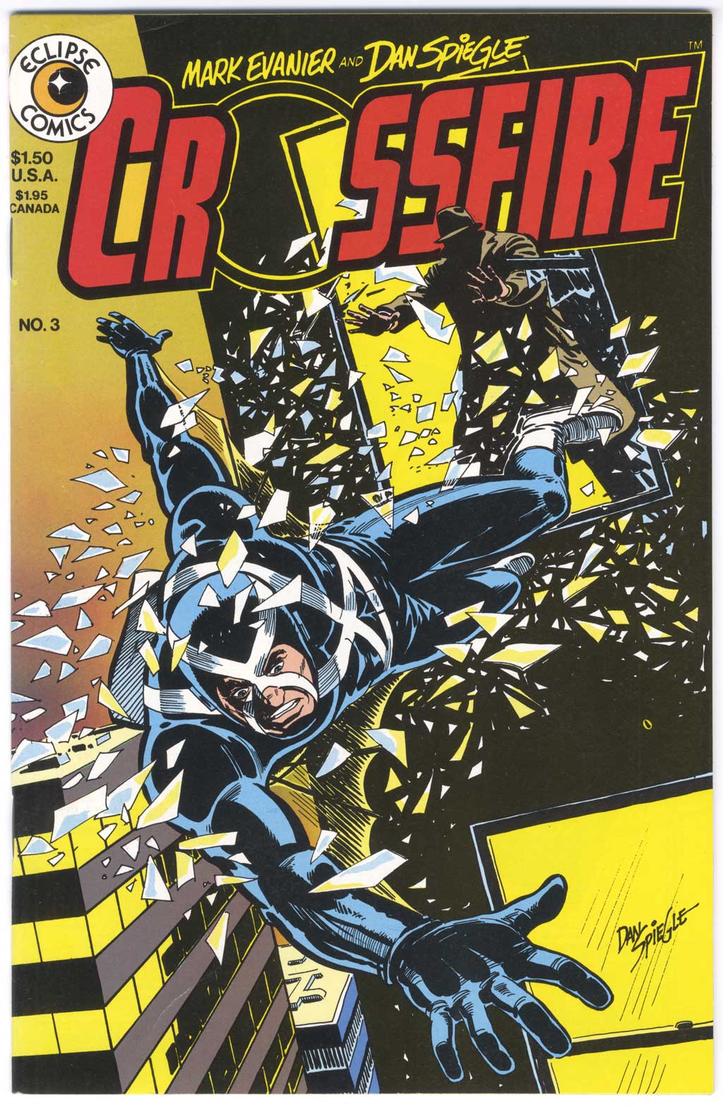
This week’s comic book cover to look at and examine is “Crossfire” #3 by Dan Spiegle from July 1984. This is another comic I bought right off the racks. It’s from my final high school days so it’s in better shape than my grade school ones. It’s a classic defenestration cover. Yes, that is the word for “Throwing someone out of a window”. I didn’t know that word until college though but have been amused by it ever since. Who knew throwing someone out a window needs it’s own word?
I’ve always found Dan Spiegle to be a solid but unspectacular artist. The man can draw the hell out of anything and tell a good story but somehow not in an exciting way. Since I’ve mostly seen him on superhero and adventure stories (what else existed at the time?) that can be a problem. I’ll still take him over most artists though. I also think he excels at covers though and here is one I like.
Crossfire was just pushed out of a window and might just fall to his death. That’s what we got going on here. The first thing Spiegle does is disorient us by tilting the horizon line. Everything is at an angle and gravity is confused. I like the little bits of glass around him causing even more confusion but since they’re drawn without dimension they look a little bit like pieces of paper. At least a lot of them are sharp and pointy though.
I alas like Crossfire’s twisting figure. Spiegle did a nice job capturing him turning in space as he tries to orient himself and somehow find a way to live through the fall. Spiegle is especially good at spotting blacks and they all look pretty good in Crossfire’s costume. It has a nice sense of form and light. The black building with all the yellow in it works well too. The yellow ochre sky was an interesting choice that I don’t see too often but it works well with the color scheme. An example of how you don’t always need to be literal in art.
No word balloons or captions were necessary here and none were put in. By 1984 in the world of independent comics word balloons on covers were left behind. None of the covers in this series have them. The rest of the type is fairly minimal and well done. The red Crossfire logo works well color-wise and I like that we can see through the O to the background. Bringing the yellow up into the creator signature logos was also a good choice.
Overall I think this is an interesting and well done cover. I’d buy this comic all over again if I saw this cover on the stands.
Discussion ¬