Comics I Bought This Week: November 16, 2013
I’m back from the comic shop this week and I got six new comics.
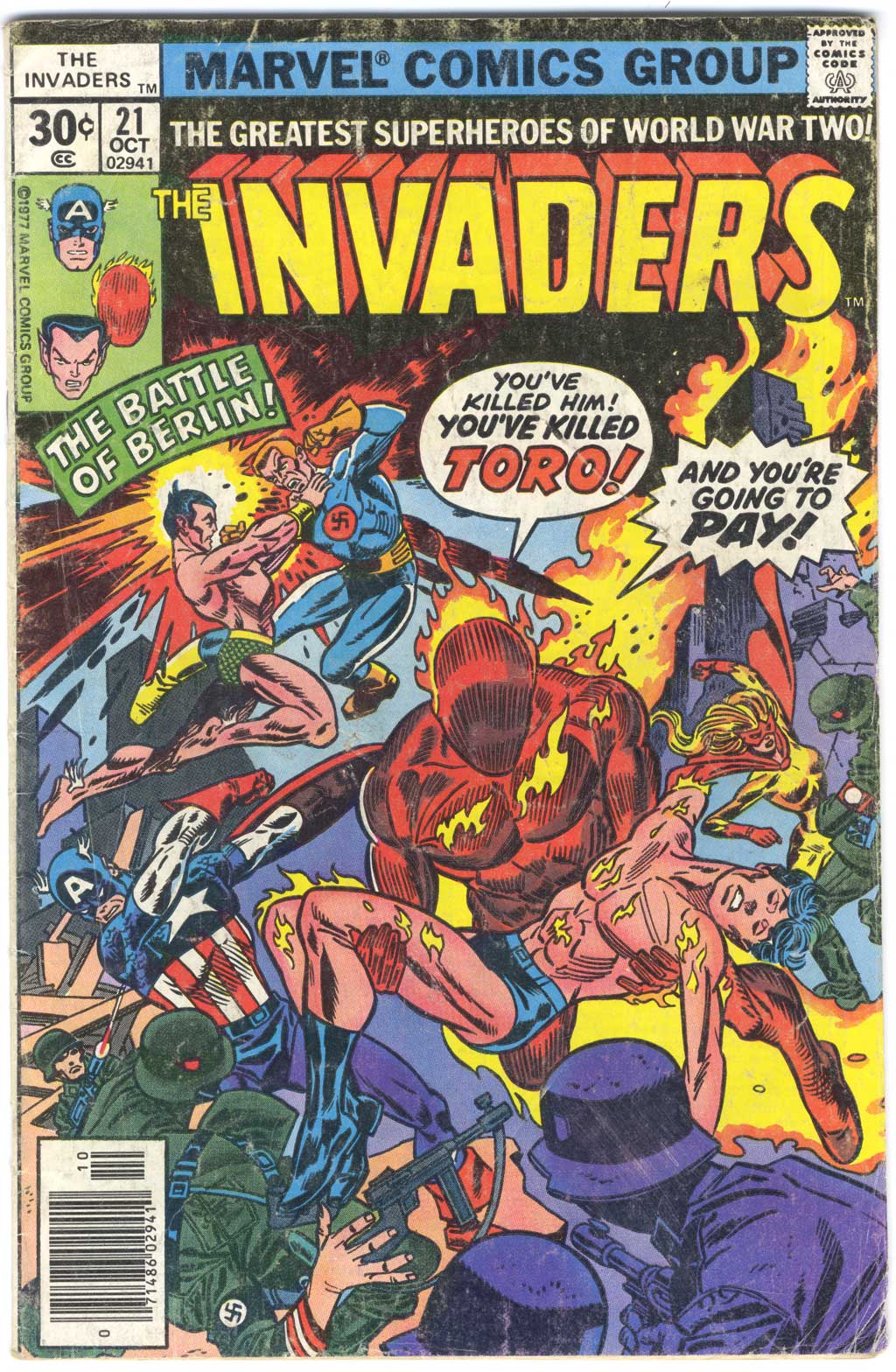
This week’s comic book cover to look at and examine is “The Invaders” #21 by Gil Kane and Frank Giacoia from October 1977. Here is a comic I purchased off the racks back during the summer that I turned eleven. You can tell it’s one of the ones I’ve had since childhood by how beat up it is. Inside it’s half new and half filled with a golden age Sub-Mariner reprint. Clearly I liked it.
Gil Kane who penciled this cover is a solid artist but I’ve always especially liked his covers. I think he’s one of the top cover artists of all time. If I ever put together such a list he’ll be on it. This cover combines two different standard comic books covers. The Pieta type where someone is dead in someone else’s arms and the type where everyone on a team is paired off and fighting their own villain. I can’t think of another one that combines the two.
I like these busy-type chaos covers that there were a lot of from Marvel in the 1970s. You don’t see them much anymore. For a variety of reasons we now get mostly single or double figure covers these days but I prefer a cover with a lot in it. They’re fun. I count eleven people in this cover and that is a lot going on.
Of course the Human Torch and Toro are the main focus of the cover with everything else cycling around them but all the little individual fight scenes are cool too. Sub-Mariner and Master Man having a fight in mid air that looks like a ballet is well done. All the fire is nice too. The fire of the Human Torch blending with the burning city behind him and the shell burst behind Subby all lends to the drama. Good stuff.
The type is especially good on this cover. I like the balloons. They fit well compositionally and for once the dialogue helps tell the story. It gets across the gravity of the situation and the Torch’s anger quickly and dramatically. Even the “Battle of Berlin” box gives us some good information to set the scene and is stuck out of the way up in a corner.
There is an interesting color choice in the background. As Kane never bothered to establish a horizon line you can’t tell where the ground ends and the sky begins. So the colorist knocked out the foreground figures with a purple and then continued with a lighter purple for the “Ground”. Then he went with a light blue for the sky but also kept the sky color behind Spitfire where he could have continued the purple. I’m not sure if that was intentional or an error but the extra bit of blue works for me. It gives things a little more air. Either way this is a cover I like.
Discussion ¬