I’m back from the comic shop this week and I got eight new comics.
Check them all out here:
I’m back from the comic shop this week and I got eight new comics.
Check them all out here:
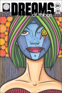
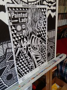
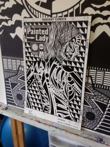
Last week I wanted to make a drawing but was unsure of what I wanted to draw. Not an unusual situation. I had been working for a while on a lot of my “Dreams of Things” faux comic book covers and I wanted to take a break from them. All told over the last year or so I made thirty of these covers and thought that was enough for now. I want to put those together into a book and thirty was plenty for that task. I wanted to move on to something new but I had no idea what. That’s when I decided to draw a face.
I like drawing faces. I draw them a lot since they are one of my favorites. Usually I start with a small thumbnail drawing, work on a sketch after that, do a finished drawing, and then make the final drawing in ink. Usually those are on four different pieces of paper which for whatever reason I didn’t want to deal with at the moment. The whole process turned me off. So I decided to go old school and pull out a large eleven by seventeen sheet of paper and draw right on that to be inked over later. That’s how I used to work all the time before the late 1990s when computers made it easy to blow up a drawing and recompose it is needed. That saves a lot of time.
One thing about starting a drawing at a large size is that it’s tougher to keep all the proportions in line. I have to step back from the drawing and look at it from a distance to see it all at a glance. It took me a while to get the proportions correct and even then I didn’t quite succeed and had to adjust a few things as I inked. This also lead to the left and right sides of her hair not being symmetrical. I’m okay with that though. As I’ve written before I like asymmetrical symmetry a.k.a. the illusion of symmetry.
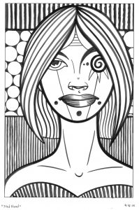
I pencilled the drawing fairly quickly and then moved on to the inks. I can’t remember exactly how long but since it was only a face it probably took me about an hour to draw. The inking took a little bit longer since I had to make a lot of long sweeping lines and I was trying to get all of them just right. As I inked I found myself wishing I had taken a little more time with the pencilling because a couple of things were off. Not off by a ton but I had to correct a few things. The nostrils weren’t quite level and even so I had to redraw them but since they were made of very few lines it wasn’t difficult. The harder thing to deal with was that I didn’t get the mouth as symmetrical and centered as it should have been. That lead me to have to reshape the mouth but I like the way it turned out. I ended up using large blunt ends on the upper lip which I usually don’t do but I like the way they look here. In the end I finished the ink drawing and put it on my easel. I liked it.
After that I went back to my “Dreams of Things” drawings and started organizing them to maybe put them in a digital book. It was during this process that I ran into a usual problem. Whenever I have a group of drawings that I just finished inevitably there are a couple of them I just don’t like. Maybe I liked them after I fined them but now in the context of thirty drawings they are the weakest ones. And it’s obvious. As I was scanning in and prepping the digital files I kept glancing over at my recently completed face drawing and liking it a lot better than the last “Dreams of Things” drawing that I made. It stuck in my craw and was bothering me. So I decided I should redraw the face drawing as a “Dreams of Things” cover. It was suitably dream-like.
Usually when I do my different stages of drawing on different pieces of paper I scan them all in and can manipulate them and print them out as needed. Since I drew this one on a single piece of paper and didn’t really make a finished pencil drawing I never scanned in the pencils. So the first thing I had to do was get out a piece of tracing paper from my long unused pad of tracing paper and them making a tracing of the face to scan in. Not a hard task but an odd one for me. After I scanned the tracing I made it into a blue line to ink over, put it in my “Dreams of Things” template, and printed it out.
The rest was fairly unremarkable as far as my process goes. I completed it just like and other “Dreams of Things” cover that I made. I had already fixed all of the drawing issues when I inked it before so the inking went smoother than the first time. The only thing that changed in the ink stage was the background circles. I didn’t bother to trace them since I knew I could easily use a circle template to draw them in. For the next step I used my markers to color the piece. I already had it in my head to make the mask blue and the circles orange and then the rest of the colors filled themselves in after that. Sometimes choosing color is a struggle and sometimes it flows easily. This was one of the easy ones.
Now I have two finished pieces. One in black and white and one in color. When I color something on the computer I usually print it out afterward but that’s not the same as a piece of original art. It’s an exact copy of the black and white with color added. The two new finished pieces are more unusual. The black and white one doesn’t even have a logo. I have them both on my easel at this moment and I find them interesting to look at. They generally have the same feel to me but are quite different. It can become a game of spot the differences if I look to long but that’s fun too. Overall it’s a bit strange. I rarely do things double.
I’m back from the comic shop this week and I got ten new comics.
Check them all out here:
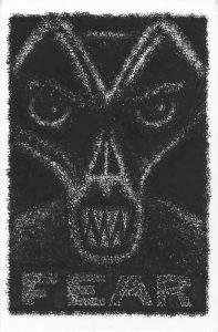
I’ve been doing quite a few of my “Dreams of Things” faux comic book covers lately. So much so I commented that I think I’ve been wanting to live in a dream world. It’s a joking comment but also has a little truth to it. When making dreamy images I have to inhabit the space of a dream world even if it’s just for the little bit of time that I’m thinking about the image. I say a little bit of time because most to the time it takes to make a picture is taken up by thinking about how to physically make the picture rather than thinking about the image. And who wouldn’t want to live in a dream? As long as Freddy isn’t coming after you.
But this week I can say I now live in a world of fear. Or at least I made another of my ten by fifteen inch “Fear” ink drawings. It’s the third one I’ve done in the series as far as I can tell but I haven’t done one in a long time so I only think that’s right. I keep track of the names of my finished pieces by typing them into my calendar on my computer on the day that I finish them. That helps me keep a handle on things. I typed “Fear” into the calendar search bar and only found numbers one and two. The system works pretty well but isn’t perfect so maybe a third snuck by me unnamed. Either way I’m putting number three on this one.
My “Fear” drawing say that right on them. They have the word “Fear” written across them below a monster’s face. They’re meant to be a little bit scary. Maybe they won’t give you nightmares but looking at them too hard could make you uncomfortable. I think the word has as much to do with that as the drawing. Seeing the word makes me a little nervous and I think it has that affect on people in general.
Though I had fun making this third drawing in the series I don’t know if it’s as effective as the first two. I didn’t work out and refine the drawing as much as I did on the others. Usually I work out a drawing at a smaller size than the final size but with this one I drew it at the ten by fifteen inch size. I just didn’t feel like working with a refined drawing. Working in a different way than usual can sometimes help but it’s often tough to tell. Do I just dislike it because it’s different? I don’t know but it’s something to contemplate.
Either way after the initial pencil drawing is done the “Fear” pictures are made the same way. I use a battered old Winsor Newton Series 7 number 3 sable watercolor brush and ink. The brush is so battered that not only won’t it hold a point but it won’t even come to any kind of point. Instead the tip breaks up into about ten different points. It’s impossible to make any kind of single line with so I use it by dabbing the brush onto the paper. It’s almost like using a small stamp except much more flexible so that the pattern in makes changes every time. I call it a “Wet dry brush technique” because it is very similar to dry brush where you drag a nearly inkiness brush across paper but it’s different because the brush is wet with ink. It’s not about making greys like dry brush but is about building up blacks. I can’t work with line when I do things this way so it’s really a different approach for me.
The main problem I find with this technique is that it tests my patience. Usually when I work with line I have a clear vision of what the drawing will end up looking like. The beginning sketch resembles the finished drawing. With this technique the sketch is minimal. It’s some basic lines defining the outlines of a face plus the lettering. I don’t even figure out darks and lights since that’s what I’ll be doing with the brush. As I do that I make marks all along the not-quite-lines and slowly build up the marks all over the drawing. As a result it takes a long time for the drawing to start to look like its finished state.
One of the biggest problems I have with this method is that for the longest time the drawings look comical. Sure there is something inherently funny about a weird monster drawing but when it’s just kind of outlined and not very dark yet it looks more comical than usual. I find it very frustrating when my attempt at fear is funny. Making all those marks takes patience too. I’ve made drawings that take a lot longer to do than these ones but not drawings where I’m working over and over again in the same area. After putting down layer after layer of ink with the spotty brush I always think it’s dark enough but after I put it on the easel and step away from it I can tell it isn’t. I do this five or six times until I get it right. It’s never dark enough until the end.
With this one it stayed comical for quite a long time. I think that’s because the eyes are big. They were even bigger than they appear in the finished one because for the longest time I didn’t really touch the whites of the eyes. You can see the dark pupils and where the color of the eye would be but I also had white around that color. It wasn’t until I blacked that out that I started to like the drawing.
One final thing. The teeth. With these monster drawings it’s always good to show the monster’s teeth. Make them sharp, mean, and maybe a little fuzzy. That fuzziness can make them extra scary. Scary is good in the land of fear.
I’m back from the comic shop this week and I got seven new comics.
Check them all out here:
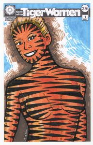
Curse of the Tiger Women #1 on Ebay
Once again this week I was trying to figure out what to do. I thought I might go back to some of my comic book sized ink drawings but I didn’t want to draw one of any of the already existing titles I had. I kind of wanted to do some more decorated bodies but my “Painted Lady” series had run its course for now. I somehow came up with the vague idea to put stripes on a woman as I drew. I call the idea vague because as simple as the stripes came out in the end I really had no notion of how I was going to do them. That’s the kind of half-idea that I sometimes struggle with but I had a little more luck this time around.
The first thing I did was find a reference photo. I don’t always draw from photos but I did with all of my “Painted Lady” series so I figured I would here too. I prefer to take my own reference photos but since I don’t know any models I rely on the good old internet. The problem with relying on the internet is that I have to go through a lot of photos to find one I can use. I’d guess that I have to go through a few hundred photos to find one that suits me. It’s all about the pose. My drawing process brings me so far away from the original photo that my drawings hardly ever look photographic so I also try to find a pose that’s also not very photographic. That’s not easy when looking at photographs since most photos are photographic. That seems obvious but isn’t something I ever think about unless I need a reference photo.
After I find the photograph I open it up and Photoshop and draw over the photo on another layer. I draw quick and dirty at this stage. I don’t really like drawing on the computer so I only get down the basic information that I’ll need. I use a single weight line and quickly draw without thinking about the final drawing. This is just the easiest way for me to do the underdrawing.
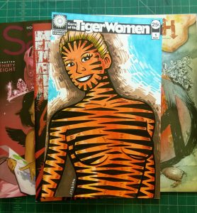
The next step it to print out that underdrawing in blue line on a piece of Bristol board. This is when I refined the drawing and also when I had to figure out the tiger stripes. It all worked out in the end but it was touch and go for a while. I ended up with triangles on her face with their points facing inward because horizontal pattern were obscuring her features. Yet the horizontal stripes worked well on the rest of her body. I also tried angling the strips inward as I did with her face but this obscured the features of her body too much. Overall the stripes are okay but not as intricate and hypnotizing as the body decoration on my “Painted Lady” series. I was okay with that though.
At this point I scan the drawing in, turn it into a blue line, and put it in a template with the logo and trade dress on it. Except I had no logo. This was a new series so I had to make one. Then I was hindered by the fact that I didn’t want to make one. Sometimes I’m really into making a logo but this time it was a pain. I tried to take the easy way out and make it almost identical to my “Painted Lady” logo but I couldn’t make it work. I eventually put a few of hours in and ended up with the logo on a bar that you see before you. It’s mostly just a font but I messed around with it a little bit. It’s also at this point that my “Tiger Women” name became “Curse of the Tiger Women.” I liked the way that looked and sounded better.
Since I was going to be making the finished piece at comic book size, 6.5 by 10 inches, I decided I wanted to make a finished pencil piece as well as my usual inked one. I printed out the drawing in grey with the logo and trade dress on it and drew right over the top of the drawing. I was using dark and heavy pencil lines rather than sketchy ones. It’s a technique I only do occasionally but I think it worked here. It was also at this stage I decided to put in all the little tick-mark lines on the edges of her form. This made her look a little more furry. Then I finished up the pencil drawing with some little stacked lines outside of the figure. It’s kind of like drawing some of the air around her. I added those two horizontal lines up near her head at the very end. They seemed to help the composition. In the end I was happy with the pencil version.
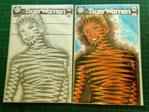
At this point I knew how the inked version was going to go and I decided that I had to add color to the inked version and make the final piece a color one. The black and white tiger stripes would be fine but an orange body would really sell it. I wanted to sell the idea rather than it just being fine. So I inked away. Nothing really interesting happened in this stage since I figured everything out in he finished pencil version. The inks were really a matter of execution and thankfully the execution was uneventful.
The color was fairly uneventful too. I saved putting the little furry tick marks on until after I colored the piece for fear I’d smear the black ink of the little marks. That happens sometimes when scrubbing marker over them. I avoided that problem and put down four orange colors in a fairly simple manner. I did a little modeling with the color but since the graphic tiger stripes were the real show I didn’t need to round the figure much. The only real problem I had with the color was the background. I had no idea what I wanted to do with it. I started imitating my pencil background with the light brown, thought that wasn’t enough, added the dark brow, thought that wasn’t enough, and then added the blue. I thought that may have been too much but I’m not sure.
Overall I like “Curse of the Tiger Women” color version but I may like the pencil version better. It’s tough to tell. The orange is pretty cool. I’ll have to decide later.
I’m back from the comic shop this week and I got seven new comics.
Check them all out here:
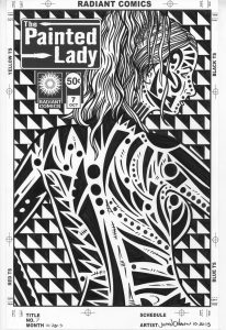
I don’t always succeed at the tasks I set myself. One of those tasks that has born little fruit has been to sell some of my art online. Another related task has been to find a way to make a video of my art that is somehow interesting and worth watching. There are venues online to sell art (See my Ebay and Easy links to the right of this) but if you’re not well known (as I am not well known) then it’s a hard thing to do. If people don’t know you exist then they can’t buy any art from you. How do you get known? Who knows? If there was a recipe for that everyone would follow it and we’d all be famous.
So I tried again today to get things going with my selling of artwork. So far over the last two years it’s been a tough task but here I go again tilting at windmills. Jeez, that’s getting me depressed just wring about it. I’m going to have to ignore the stench of failure and concentrate on the nuts and bolts. The process. I’m good at process.
It takes a lot of work to prep stuff to be able to sell it. I need a lot of images of the paintings in order to try and sell something. I’m working on selling some of my small works so I scan in my paintings and that is usually the best image to use for selling. But you can’t have just one image so I also take photos of my art.
I have three different ways of photographing my drawings and paintings. The first is to take a photo on my drawing table. Easy enough. I lay the small painting flat and hold the camera directly above it. But that can also be a pretty boring shot. So I’ll liven it up by doing two different things. If I’m shooting a five by seven inch painting I’ll put it on a bed of other small paintings. That way there are bits of visual interest around the main painting. I also vary the angle a little and take another shot from about a seventy degree angle. This give me more variety without moving the paintings.
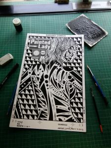
The second way if to make the drawing into a still life. I like to do this with my eleven by seventeen inch drawings. I surround the drawing with the implements of its making. I put markers, brushes, pencils, and other things around the paper. That makes the work look more like an object than a regular scan does. Making it look like an object grounds the work for me and makes it more relatable.
The third way I take a photo is on my easel. I stand the painting or drawing up straight and take three shots. One from straight on (usually the most boring shot), another from the left, and another from the right. The easel shots add a little more visual interest and give a sense of scale to the work. The plain old scan gives the best view of the work but all the other shots add to being able to picture it in the real world.
All these photos need basic work done to them to. Not even heavy graphics work or anything like that but they need to be organized in folders and named. Names. That’s another crazy thing I saddled myself with today. I name all my paintings and drawings with some random name. I do it so I can identify and keep track of individual pieces. Otherwise it gets confusing referring to two hundred pieces all as “That one”. I almost always name the piece right after I finish it. Things work best that way. Except last week I made about twenty five new five by seven inch drawings and wanted to keep going at a fast clip so I didn’t bother to name them. I knew it was the wrong thing to do but I did it anyway. So today after I scanned in the paintings I had to organize the scans and photos I had taken. So I had to come up with twenty five names on the spot. That was about as annoying as it sounds.
I’ve been trying to use my social media platforms to help me sell some art but one of the problems I’ve run into is that Etsy and especially Ebay don’t keep up with social media very well. Especially video. Since I’ve been trying to think up ideas of how to shoot my work in an interesting manner It would be nice if I could embed video into my sales pitch. I have YouTube videos of me actually drawing some of the pieces. Would that be nice to include? Too bad I can’t. You can embed YouTube video just about anywhere but not on Easy or Ebay. Etsy is at least good at linking stuff out to Twitter and such. I can tweet a piece that I post. Ebay can’t do that at all. It’s totally stuck in 1999 like social media never existed. It’s really kind of weird that they never updated that. Ebay exists in its own world separate from the rest of the linked up social media driven internet.
I really wish I could come up with an idea for making some videos of my work. I’d say YouTube is my strongest social media platform so if I could get something going there it would be cool even if Ebay ignores that it exists. But almost all ideas with art and video end up on an animation path. After all video is about movement so what would be more natural that to move stuff? Except art is static. You have to be able to look at it. If it’s not sitting still that’s going to be tough. Instead I’m going to have to think about angles, size differential, movement of stuff other than the art, and overlap. That might make me have to do a lot of video editing too and that’s something that eats up time like a voracious beast. Uh-oh, I better quit writing before I start to smell the stench of failure again. That’ll keep you up nights.
I’m back from the comic shop this week and I got eleven new comics.
Check them all out here:
I’ve been using my markers a lot lately. That and my ink and brushes. I go through periods when I like one medium more than another and keep using it for a little while before I switch off. Early in the summer I was doing a lot of my “Marked Women” drawings. Those take a lot of drawing, some precise inking, and then some computer coloring. Then I just kind of got tired of those. After I made my Blurb book about them I stopped making “Marked Women”. My attention moved on.
It was my “Dreams of Things” series of faux comic book covers that got my attention. That series is different than all my other faux comic book covers in that I color my “Dreams of Things” covers with marker right over the ink drawing. I haven’t done that except on the ten or so covers I’ve done in that series.
The first thing a faux comic book cover starts with is a drawing. In the case of “Dreams of Things” I like a single image that has some dream-like qualities. Usually I refine the drawing a lot for one of these covers but I didn’t have it in me this time to do that. Sure I started with a bit of drawing for the first couple of ones but I got tired of it. I wasn’t into using a pencil that much. But my vast pile of unfinished drawings and my new rough line inking technique came to my rescue.
Most of my brush work over the years has been very precise. A thick to thin line that’s smooth and pretty. I build everything out of that line. It’s made with a very well pointed watercolor brush called a Winsor Newton Series 7 brush. It’s such a good brush that it’s only been in recent years that I’ve developed some other brush techniques based on lesser brushes. The first is my almost-dry-brush technique made with an old, battered and split-tipped Series 7 brush and the second is my rough-line technique made with a cheap round watercolor brush. It was this second technique I was interested in using.
After deciding on the inking technique I looked through my old drawings. I have them scanned into the computer so it’s easy enough to go through them. Plus I have a drawer underneath my drawing table that holds all of my six by nine inch pencil drawings that I never did anything with. It’s a pile of about fifty drawings that go back a few years. Sometimes I draw something, have no idea what I want to do with it, and then it goes into the drawer. I found a good half dozen ones I thought I could work with. I found the corresponding scans for a couple of them and set them up in my “Dreams of Things” template and printed out the logos and trade dress in black and the drawing in blue line to be inked.
One of the things about my refined drawin
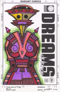 g “Dreams of Things” covers is that the color is also very stripped down and refined. The technique is all in the simplicity of the drawing. With these rough-lined drawings that kind of refinement is not possible. These drawings are all about texture and complicated shapes. So that means the color has to be a little more complicated to. So all the time I saved in the drawing stage got eaten up when it came to color.
The thing I like best about markers is the immediacy of the color. You want red we got red. Just uncap the marker and make a mark in color. No drying time and no patience is needed. It’s immediate. The part I don’t like about marker is that it has no surface to it. It’s not like paint that sits on top of a canvas or paper and holds brush strokes if you want it to. So I like to try to get textures into the marker strokes to imitate brush strokes.
When using markers you have to be very aware of how you’re using that marker. If you just scribble on the paper you can leave streaks and marks that don’t look so good. The key is to be aware that marker doesn’t always go on evenly and use that to your advantage. I follow the form that I’m putting color into and even crosshatching in the color if I want more pigment. For larger areas I use circular strokes that overlap and hide themselves a bit especially after two or three coats with the marker. The of course there are the backgrounds. For those I like to not fill up everything with color. At least not one color. I scumble on three colors from light to dark giving the appearance of a texture. Sometimes I do the same things with parallel lines. Either way I’m not looking for solid color.
Sometimes it’s easier working in one medium rather than another. That’s the way it’s been with these “Dreams of Things” faux covers as of late. I’ve done a few new pencil drawing for them but mostly I’ve been using already completed drawings and then going straight for the ink. Some of them have been in my clean-line technique but it’s been freeing to use the rough-line technique. It’s a different way of finding the right line. It’s also not as dependent on finding the “perfect” line as my more refined line drawings are. If I am only going to define something with one fine line it better be the right one. And finding the right one isn’t always easy. With the rough-line technique it’s all about getting the textures to work together. There is no single correct line to be right or wrong. It gives me a little more leeway.
The downside to the technique is that it takes patience. With the refined-line technique I can tell immediately if I got it right or wrong. With the rough-line technique it takes time to build things up. I keep having to go back into areas to balance things out. I can’t overreact to one area until I see it all come into focus. I have to trust that it will come together. But all-in-all it has come into pretty good focus one the last ten or so drawings. That’s a good run.