I’ve been using my markers a lot lately. That and my ink and brushes. I go through periods when I like one medium more than another and keep using it for a little while before I switch off. Early in the summer I was doing a lot of my “Marked Women” drawings. Those take a lot of drawing, some precise inking, and then some computer coloring. Then I just kind of got tired of those. After I made my Blurb book about them I stopped making “Marked Women”. My attention moved on.
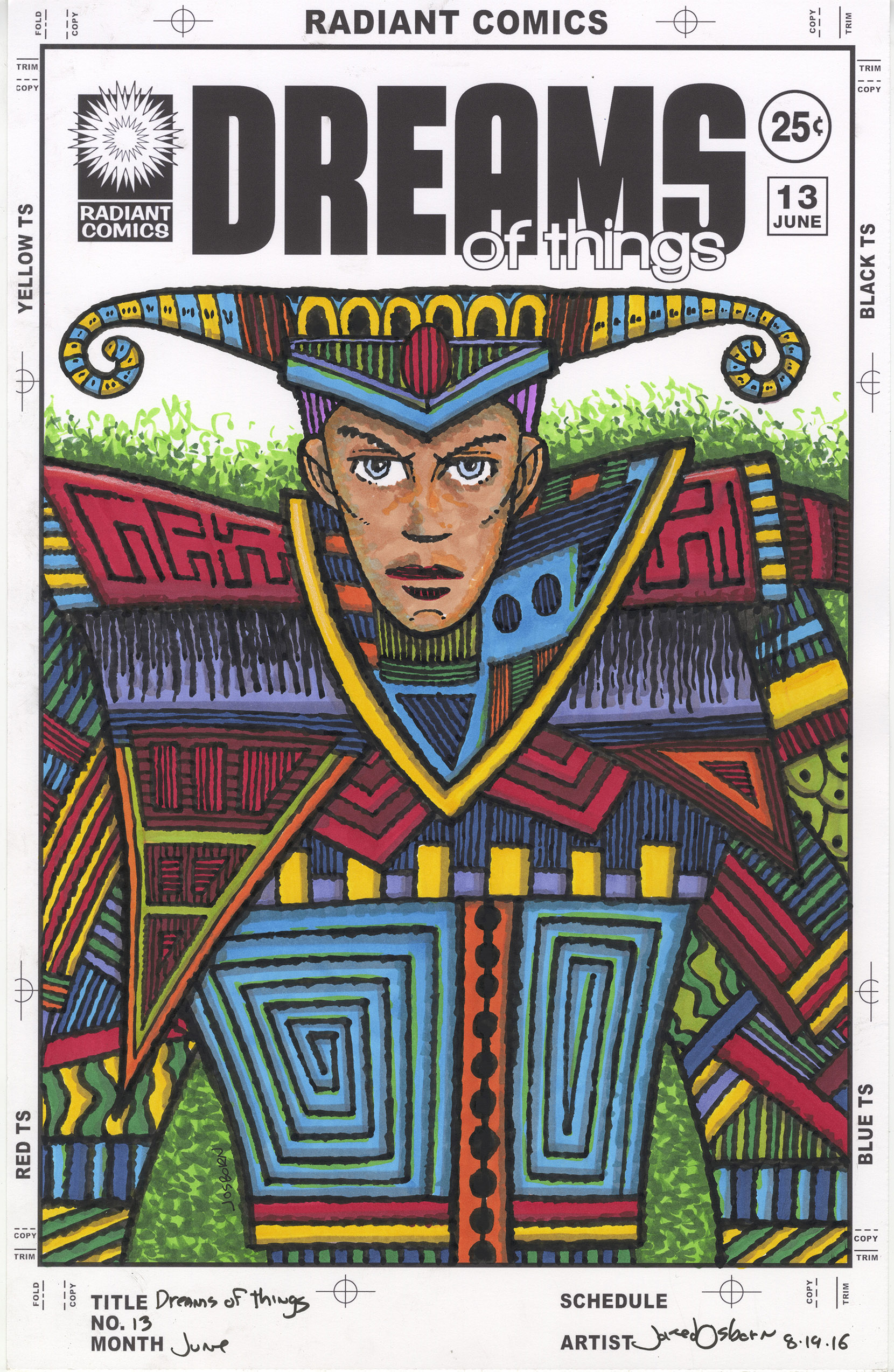
It was my “Dreams of Things” series of faux comic book covers that got my attention. That series is different than all my other faux comic book covers in that I color my “Dreams of Things” covers with marker right over the ink drawing. I haven’t done that except on the ten or so covers I’ve done in that series.
The first thing a faux comic book cover starts with is a drawing. In the case of “Dreams of Things” I like a single image that has some dream-like qualities. Usually I refine the drawing a lot for one of these covers but I didn’t have it in me this time to do that. Sure I started with a bit of drawing for the first couple of ones but I got tired of it. I wasn’t into using a pencil that much. But my vast pile of unfinished drawings and my new rough line inking technique came to my rescue.
Most of my brush work over the years has been very precise. A thick to thin line that’s smooth and pretty. I build everything out of that line. It’s made with a very well pointed watercolor brush called a Winsor Newton Series 7 brush. It’s such a good brush that it’s only been in recent years that I’ve developed some other brush techniques based on lesser brushes. The first is my almost-dry-brush technique made with an old, battered and split-tipped Series 7 brush and the second is my rough-line technique made with a cheap round watercolor brush. It was this second technique I was interested in using.
After deciding on the inking technique I looked through my old drawings. I have them scanned into the computer so it’s easy enough to go through them. Plus I have a drawer underneath my drawing table that holds all of my six by nine inch pencil drawings that I never did anything with. It’s a pile of about fifty drawings that go back a few years. Sometimes I draw something, have no idea what I want to do with it, and then it goes into the drawer. I found a good half dozen ones I thought I could work with. I found the corresponding scans for a couple of them and set them up in my “Dreams of Things” template and printed out the logos and trade dress in black and the drawing in blue line to be inked.
One of the things about my refined drawin
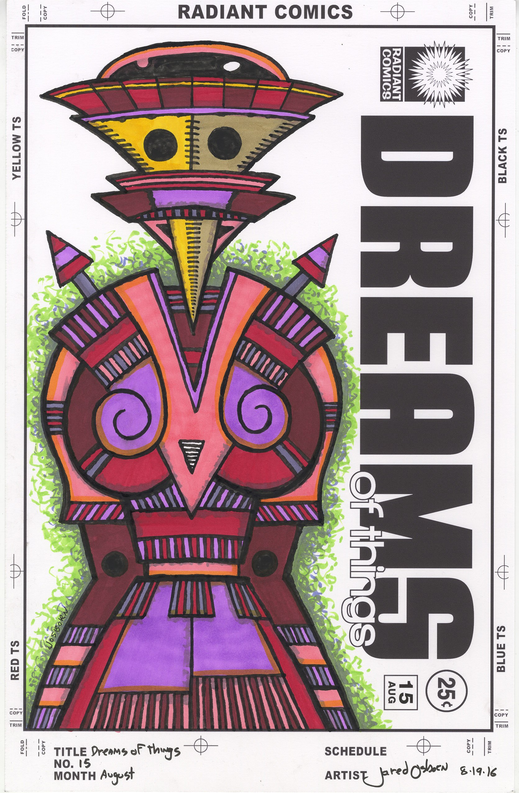 g “Dreams of Things” covers is that the color is also very stripped down and refined. The technique is all in the simplicity of the drawing. With these rough-lined drawings that kind of refinement is not possible. These drawings are all about texture and complicated shapes. So that means the color has to be a little more complicated to. So all the time I saved in the drawing stage got eaten up when it came to color.
The thing I like best about markers is the immediacy of the color. You want red we got red. Just uncap the marker and make a mark in color. No drying time and no patience is needed. It’s immediate. The part I don’t like about marker is that it has no surface to it. It’s not like paint that sits on top of a canvas or paper and holds brush strokes if you want it to. So I like to try to get textures into the marker strokes to imitate brush strokes.
When using markers you have to be very aware of how you’re using that marker. If you just scribble on the paper you can leave streaks and marks that don’t look so good. The key is to be aware that marker doesn’t always go on evenly and use that to your advantage. I follow the form that I’m putting color into and even crosshatching in the color if I want more pigment. For larger areas I use circular strokes that overlap and hide themselves a bit especially after two or three coats with the marker. The of course there are the backgrounds. For those I like to not fill up everything with color. At least not one color. I scumble on three colors from light to dark giving the appearance of a texture. Sometimes I do the same things with parallel lines. Either way I’m not looking for solid color.
Sometimes it’s easier working in one medium rather than another. That’s the way it’s been with these “Dreams of Things” faux covers as of late. I’ve done a few new pencil drawing for them but mostly I’ve been using already completed drawings and then going straight for the ink. Some of them have been in my clean-line technique but it’s been freeing to use the rough-line technique. It’s a different way of finding the right line. It’s also not as dependent on finding the “perfect” line as my more refined line drawings are. If I am only going to define something with one fine line it better be the right one. And finding the right one isn’t always easy. With the rough-line technique it’s all about getting the textures to work together. There is no single correct line to be right or wrong. It gives me a little more leeway.
The downside to the technique is that it takes patience. With the refined-line technique I can tell immediately if I got it right or wrong. With the rough-line technique it takes time to build things up. I keep having to go back into areas to balance things out. I can’t overreact to one area until I see it all come into focus. I have to trust that it will come together. But all-in-all it has come into pretty good focus one the last ten or so drawings. That’s a good run.
Discussion ¬