Curse of the Tiger Women #1 on Ebay
Once again this week I was trying to figure out what to do. I thought I might go back to some of my comic book sized ink drawings but I didn’t want to draw one of any of the already existing titles I had. I kind of wanted to do some more decorated bodies but my “Painted Lady” series had run its course for now. I somehow came up with the vague idea to put stripes on a woman as I drew. I call the idea vague because as simple as the stripes came out in the end I really had no notion of how I was going to do them. That’s the kind of half-idea that I sometimes struggle with but I had a little more luck this time around.
The first thing I did was find a reference photo. I don’t always draw from photos but I did with all of my “Painted Lady” series so I figured I would here too. I prefer to take my own reference photos but since I don’t know any models I rely on the good old internet. The problem with relying on the internet is that I have to go through a lot of photos to find one I can use. I’d guess that I have to go through a few hundred photos to find one that suits me. It’s all about the pose. My drawing process brings me so far away from the original photo that my drawings hardly ever look photographic so I also try to find a pose that’s also not very photographic. That’s not easy when looking at photographs since most photos are photographic. That seems obvious but isn’t something I ever think about unless I need a reference photo.
After I find the photograph I open it up and Photoshop and draw over the photo on another layer. I draw quick and dirty at this stage. I don’t really like drawing on the computer so I only get down the basic information that I’ll need. I use a single weight line and quickly draw without thinking about the final drawing. This is just the easiest way for me to do the underdrawing.
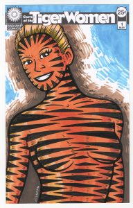
The next step it to print out that underdrawing in blue line on a piece of Bristol board. This is when I refined the drawing and also when I had to figure out the tiger stripes. It all worked out in the end but it was touch and go for a while. I ended up with triangles on her face with their points facing inward because horizontal pattern were obscuring her features. Yet the horizontal stripes worked well on the rest of her body. I also tried angling the strips inward as I did with her face but this obscured the features of her body too much. Overall the stripes are okay but not as intricate and hypnotizing as the body decoration on my “Painted Lady” series. I was okay with that though.
At this point I scan the drawing in, turn it into a blue line, and put it in a template with the logo and trade dress on it. Except I had no logo. This was a new series so I had to make one. Then I was hindered by the fact that I didn’t want to make one. Sometimes I’m really into making a logo but this time it was a pain. I tried to take the easy way out and make it almost identical to my “Painted Lady” logo but I couldn’t make it work. I eventually put a few of hours in and ended up with the logo on a bar that you see before you. It’s mostly just a font but I messed around with it a little bit. It’s also at this point that my “Tiger Women” name became “Curse of the Tiger Women.” I liked the way that looked and sounded better.
Since I was going to be making the finished piece at comic book size, 6.5 by 10 inches, I decided I wanted to make a finished pencil piece as well as my usual inked one. I printed out the drawing in grey with the logo and trade dress on it and drew right over the top of the drawing. I was using dark and heavy pencil lines rather than sketchy ones. It’s a technique I only do occasionally but I think it worked here. It was also at this stage I decided to put in all the little tick-mark lines on the edges of her form. This made her look a little more furry. Then I finished up the pencil drawing with some little stacked lines outside of the figure. It’s kind of like drawing some of the air around her. I added those two horizontal lines up near her head at the very end. They seemed to help the composition. In the end I was happy with the pencil version.
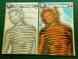
At this point I knew how the inked version was going to go and I decided that I had to add color to the inked version and make the final piece a color one. The black and white tiger stripes would be fine but an orange body would really sell it. I wanted to sell the idea rather than it just being fine. So I inked away. Nothing really interesting happened in this stage since I figured everything out in he finished pencil version. The inks were really a matter of execution and thankfully the execution was uneventful.
The color was fairly uneventful too. I saved putting the little furry tick marks on until after I colored the piece for fear I’d smear the black ink of the little marks. That happens sometimes when scrubbing marker over them. I avoided that problem and put down four orange colors in a fairly simple manner. I did a little modeling with the color but since the graphic tiger stripes were the real show I didn’t need to round the figure much. The only real problem I had with the color was the background. I had no idea what I wanted to do with it. I started imitating my pencil background with the light brown, thought that wasn’t enough, added the dark brow, thought that wasn’t enough, and then added the blue. I thought that may have been too much but I’m not sure.
Overall I like “Curse of the Tiger Women” color version but I may like the pencil version better. It’s tough to tell. The orange is pretty cool. I’ll have to decide later.
Discussion ¬