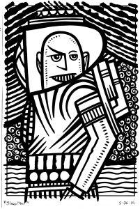
Sometimes I can’t get anything done. I go to put pen or pencil to paper and nothing good comes out of it. It usually doesn’t last that long but I can lose half a day or even more to the grips of mediocrity. It’s not like writer’s block (which, thankfully, has never really haunted me) where you stare at a blank piece of paper, or screen, and nothing comes out. It’s more like I draw badly because I start with a bad idea. Or a half-hearted idea. A bad idea might actually be better than a wishy-washy one.
It all starts with trying to figure out what I want to do. That’s not easy for any artist. What’s the point of doing anything after all? If you’re getting paid to do a job then it’s easy to do. Or at least its easy to see the point in doing it. You do the job so you can get paid. But if you’re an artist not getting paid to make art what is the point of making art? That’s the question that you have to find the answer to. Not being able to answer it leads to many creative people not doing anything creative. Often the answer for me is “Because I want to make something.” Then, of course, I have to figure out what to make. That’s the part where the ideas live.
Some people are good at being popular. Maybe they are in tune with current trends and can see which way the wind is blowing or maybe it’s just that they care about what’s popular. They have a genuine interest in it. They can see what people want and then they can deliver the people something similar and the people like it. They’re people pleasers and their creative ideas are all about pleasing people. I lack this trait. I have little interest in what’s popular and when on the occasions I try to tap into something popular it usually doesn’t work out well.
I’m a me pleaser. That’s how I work. I let my own tastes and interests be my guide. It works for me and let’s me get things done but it’s not much of a crowd pleaser. My tastes aren’t the same as pop culture’s tastes. My tastes ten to be a bit eccentric and weird. I think I’m good. I think I make some good art but it tends not to be popular. It doesn’t have that streak of “Everyman” in it. Instead it has a streak of weirdness.
In trying to sell art over the internet I’ve noticed one trend when it comes to popularity. If you want to be popular than glom onto something that is already popular. You can see it on all of those T-shirt-a-day sites. The shirts all reference something that’s already popular, mash-up two popular things, or straight-up rip-off a popular character. It’s a lot easier to sell a Star Wars T-shirt than one you come up with yourself. I’ve seen people selling all sorts of prints, paintings, and drawings of popular characters. So every now and then I try my hand at it. Usually to no avail.
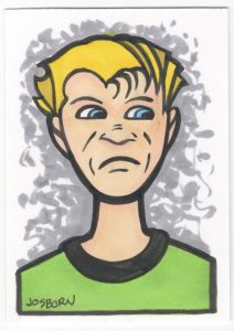
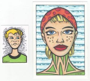
This all started a few days ago when I was trying to draw some art cards. Small baseball card sized pieces of original art. I’ve made many of them, offered them for sale, and almost never sell any. I pencilled a couple a faces and then got sucked into the rabbit hole of popularity for just a minute and tried to draw a Batman card. It was mediocre at best and it killed my momentum. I put all the cards aside to leave for another day.
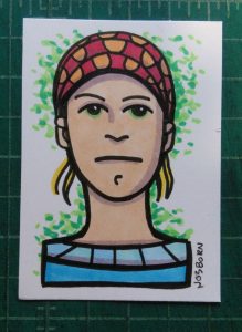
This morning I pulled the incomplete art cards out and looked at them. I liked one of them. A random face that I drew. I inked it, colored it with markers, and liked the way it came out. There was a simplicity to it that I enjoyed. I managed to capture what I wanted to in just a few lines. So then I got the idea to try and do that with a popular character. Who knows? Maybe I could tap into that wave of pop culture. Sure I could.
“Friends” is TV show that I like. It may not be the best show ever but it’s my go-to nostalgia show. It’s also one of the few places where pop culture and I are in agreement that something is good. I’ve tried to do drawings of the cast of the show before and they usually aren’t very good. If I have to stick too close to reality with my art I tend get get bored. That’s not a recipe for making good art. But I figure if I could make some drawings in the simple style that I just drew that face in I could have something good and maybe popular. Silly me.
I tried. I really did. I called up some photo reference of Jennifer Aniston’s face and tried to make a drawing. It didn’t work out. I made the drawing a little too complex and it had no character. Nor did it have much of a resemblance to Jennifer Aniston. Undeterred I started on a second drawing and simplified it even more. It was another swing and a miss. If the drawing of the face I had done earlier got the grade of an A than theses two drawings go the grade of a D at best.
I must have wasted an hour of my life making those two bad little drawings. It’s really not pleasant when that happens. Even worse it sent me into a tailspin for another hour or two. I couldn’t get anything done. I kept wanting to go back and make brilliant little drawings of the whole cast that everybody would love but that was never going to happen. I’m good at freeing my mind to work on things that can go in any direction but when I work with other people’s expectations in mind I don’t so as well. I lack whatever that mechanism is that people who can tap into the popular zeitgeist have.
So there you have it. That’s my story of frustration and not getting things done for the week. What’s yours?
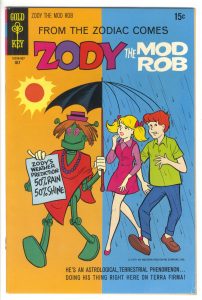 ld occasionally do stuff like that because it’s fun. I sent him a copy of a hand bound (or re-bound as the case may be) comic I made with an alternate Hulk #181 Herb Trimpe drawing on it. A friend of mine once commissioned Trimpe to do a new interpretation of his classic Hulk #181 cover. I scanned in the original art, colored it, printed it out, pulled the staples on a reprint edition of Hulk #181, and bound my new cover to it. It makes for a fun new edition of the book. Herb did a great job with the cover after all. In return for this he sent me 15 comics. One of those comics has a cover that I am going to write about today. “Zody and the Mod Rob.”