I’m back from the comic shop this week and I got three new comics.
Check them all out here:
Comment
I’m back from the comic shop this week and I got three new comics.
Check them all out here:
I always find it shocking when I’m rummaging about the place and I find some piece of art that I’ve forgotten I ever made. Though I’ve made a lot of stuff over the decades it really doesn’t happen that often. I scan my art into the computer and look through the files when I need to find something. That mostly means I only glance at things but since I see them it’s rare when something takes me by surprise.
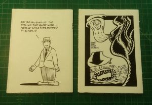
As a lot of folks did back in the 1990s I used to make mini-comics. That’s where you write and draw comics and then print them up as a booklet on a photocopier. They were usually photocopied onto an 8.5×11 inch piece of paper and then the paper was folded in half so the finished comic was 5.75×8 inches. Some people even went smaller and used the paper folded into quarters to get more and smaller pages out of a single sheet of 8.5×11 inch paper. I still have a few copies of mine stuck in a closet somewhere and I remember them all but what I didn’t remember is how I made the last two I ever did.
My usual method for making a mini comic was similar to my method for making a regular comic. I draw the art on individual pages, shrink those pages down to the correct size, paste those pages onto a master sheet (a mechanical in the language of print production) and then use those master sheets to make photocopies from. After the photocopies were made I’d line the sheets of paper up in the right order and then staple and fold them. I even have a long reach stapler because a regular stapler was too short. It’s pretty much a craft project and was easy to do but took time.
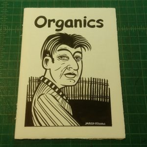
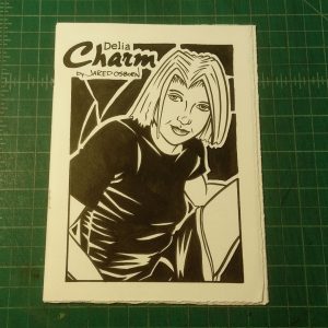
What I found while looking at some sketchbooks on a shelf was the original art from my last two mini-comics, a “Delia Charm” and an “Organics” mini. Except the art wasn’t on individual pieces of paper. I actually made a book out of the original art. A mini-comic that was itself a piece of art. Each little book has twelve pages made from three sheets of paper each, drawn on back and front, and then folded in the middle. I didn’t even use staples to hold it together. I used thread to bind them in the place of two staples each. I have the say the thread gives it a nice look. I’m glad I went that route. And yesterday I didn’t remember I ever made such a thing.
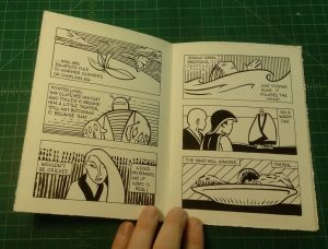
The first mini-comic is “Organics.” That’s the name of a style of comic that I do where there is no literal connection between the story and the pictures. It’s all about making connections. Finding the faces in the clouds. I especially like the front and back covers on this one. The front cover is a twice done picture. I first drew it as a spontaneous ink drawing on textured paper in the late-1990s when I was first learning that technique. I always liked something about the drawing. There was a look in the character’s eyes that works for me. I even recaptured that look when I remade the drawing for this cover. It’s not always possible to recapture a look like that but somehow I did. The back cover is a strange boat and wind thing. I think the inking technique on it is nice and I like the general weirdness of it. The “Knees, bees, trees, squeeze” type is something I used to write all the time when I got stuck and couldn’t think of anything to write. It calmed me.
The inside story has to do with a broke guy named Tony going to an ATM to get twenty dollars and the thoughts that roll through his head on a cold winter day. I think I accidentally called Tony by the wrong name for a panel. Suddenly a Ray is named and not mentioned again. That threw me. There is also a text piece the runs on the inside front and back covers about supernatural silly stuff. I used to write editorial text pieces in my comics as a sort of precursor to blogging.
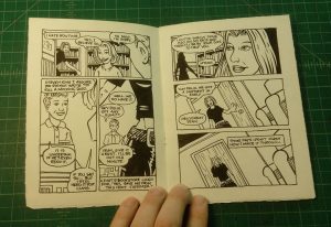
The second mini-comic is one of my slice-of-life Delia Charm stories. She’s having a rough day and is trying to get through it without losing her mind. She contemplates the very nature of rough days. There is also a terrible Stephen King joke in there. It’s a contemplative little piece over all. The front cover is a decent illustration of Delia and the back cover gives us a cartoon of a man who is also contemplating a bit of life. I like the text piece in this one better than in the other one. It’s about growing up and not going out into the snow anymore.
As physical objects I really like these little books. I think that was my goal with them. I wanted to make precious little books that could be admired even without being read. They’re made on what feels like 140 pound watercolor paper. That is a real sturdy piece of paper with a creamy feel. Touching it is nice. None of the edges are cut either. They’re either the original deckle edges that were on the paper when I bought it or my own deckle edges as I folded and tore the paper rather than cut it. The paper even has a watermark on part of it. Together with the stitched staples it looks really cool.
It was really weird finding these. It’s not like they were really hiding either. They were sitting on a shelf in a couple of small white envelopes. It’s the shelf where I keep my ink books and a bunch of other sketchbooks that I flip through ever now and then. So how did I not notice these for years and years? I don’t know. Just life I guess.
I’m back from the comic shop this week and I got six new comics.
Check them all out here:
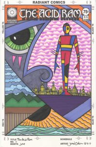
The Acid Ram is back this week with the cover to issue number eleven. Since it’s one of my faux comic book covers there is no actual issue but I’ve got a cover. It was one of the half dozen covers I penciled and set up to be inked and colored a couple of weeks ago and the only one of those that was a “The Acid Ram” cover. What is an acid ram you ask? I’m not sure but it’s something very weird. I imagine all sorts of weird stories revolve around it. Maybe it’s some sort of object that people revere. Or maybe it’s a title. A person could be the Acid Ram and that person could be the center of a strange world. It’s a title that makes me contemplate stories. It’s reserved for my most mysterious images. If I’ve got something that’s really out there it’s going to become an Acid Ram cover.
Of the six covers I had set up five of them were “Dreams of Things” covers and the sixth was this “The Acid Ram” one. Over time I inked them all and then they sat around waiting for me to color them with markers. Number eleven was the trickiest one to color because it has the most complex space of all of them. There are three different horizon lines and three different landscapes in one image. I wasn’t quite sure what I was going to do with all that when I started out.
The first thing I colored was the main figure. That’s one of my Mod Man figures that I’ve been drawing for years. He’s both modular and modern as he’s made up of shapes of color. I have no set design for him and I vary the shapes on his body each time I draw him. I also vary the color. Most often I use the three primary colors, as I’ve done here, but if there are more than one Mod Man figures in a drawing I’ll add in some secondary and tertiary colors.
The second thing I decided on was the very bottom bit of water and sun. One of the things my set of markers is missing is a variety of blue greens. I’ve got plenty of blues and plenty of greens but not enough blue greens to really give me satisfying water. I even mixed my own blue green ink and put it in a marker so I could have a base color but one day I’m going to have to track down some more blue greens. I kept the water simple with three different colors and did the same with the sun. I knew I wanted the sun/sky to be totally orange without any blue and ended up laying down three low contrast oranges. You have to look closely to see the three different shades but they still vibrate a little even if they can’t be seen distinctly.
The next color I dropped in was the pink sky behind the Mod Man. This took some pondering. It is the biggest piece of real estate on the cover and I had to get the color right on it. I didn’t want it to be a blue sky, because that would make the piece too normal, so I opted for a hot pink, a light pink, and a really light pink that’s so light that it’s almost white. I use that really light pink a lot because it changes the tone of the paper just a little bit in an almost undetectable way. It’s a subtle change. I also like how the sky acts as the whitest white on the page and moves forward in space more than a background should. It surrounds Mod Man quite well.
With that pink sky done my next move was obvious. I had to color the third sky and make it blue. Plus the land had to be colored and I went with green. Two blues and two greens. A simple and harmonious pairing that grounds the picture in a kind of reality that we know. I find that it’s important in a picture that’s all about weirdness to have a small anchor in reality. Some place for the viewer to relate to and let them enter into the picture. A little bit of fencing and a landscape can help with that.
The hardest part of this coloring process was deciding on the colors of the giant face. It was foreground, middle ground, and background all at once and that gave me a bunch of trouble. The first color I chose was the lighter purple for his nose and eyebrow. Then I brought some bright orange into the picture up top in the hair. That lead me to add more of the purple on the jawline and in the hair. I didn’t want the orange too dominant so I needed more of the purple. That made the dark purple of the chin/ground an easy call because I needed something heavy and dense there and it couldn’t be more orange with the sun right below it. One choice leads to another.
I went with a greyish blue for the left side of the face because I needed a neutral there. I had to settle down that part of the picture so that the pink sky could come forward a bit. The orange marks under the eye add a little exclamation point to the face. The last choice in the face color was the eye. I went with bright green to make it stand out. With neutrals surrounding it the green looked extra bright so I dulled it down slightly with lines of darker green so it wouldn’t fight too much with the pink. The pink has to be the master.
The very last color choice in this piece was the building behind the Mod Man. I had no idea what color to make them. I didn’t want them too bright but I also didn’t want them to be a neutral and blend in with the blue/grey of the face. I eventually settled on a light yellow. That’s a color that normally moves forward in space as it’s so bright but I dulled it down with some light purples and oranges. It ended up more of a gold color than a yellow and it stays in its place well.
So there is a color walkthrough for you. A little bit of my thought process to chew on.
I’m back from the comic shop this week and I got five new comics.
Check them all out here:
I’m back from the comic shop this week and I got six new comics.
Check them all out here:
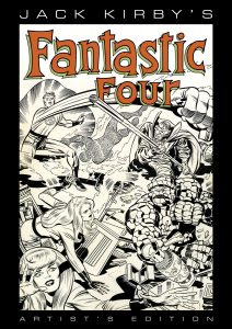
I posted a video last week looking at a friend’s copy of “Jack Kirby’s Fantastic Four Artist Edition.” It’s an excellent book. The idea behind the “Artist Edition” books is to give us fans a publication that duplicates looking at comic book original art that we will probably never see in real life. The original art is drawn in black and white and when printed in a comic book only the black line prints. But in reality there are all sorts of things on the original art that don’t show up in the final comic. There are non-photostat blue guide lines that are on the page, hand written notes outside the panel borders, correction notes, and occasional white-outs and art patches. So in these Artist Editions they take a full color scan of the original art and print from those scans so we can see all of the stuff that drops out in a finished comic. It’s also printed at the same size as the original art. This book is 11×17 inches. That’s pretty big.
I haven’t read any Jack Kirby and Stan Lee Fantastic Four in a long time. As a kid in the late 1970s it was not a comic that was a favorite of mine. It was ten to fifteen years old at the time (I read it in reprints) and the Stan Lee writing was too old fashioned for me. I liked the Jack Kirby art but there was plenty of other Kirby stuff at the time that I liked better. In general I prefer Jack Kirby’s 1970s work that he wrote himself to his 1960s work that Stan Lee wrote with him. So this was not only the first time I had seen this work in a long time but also the first time I had seen it in original art form.
Though the book is named for Jack Kirby, who is the plotter and penciller of the book, it’s really the work of four people. Jack Kirby, Stan Lee – who wrote the dialogue, Joe Rosen or Artie Simek – who did the lettering (depending on the issue), and Joe Sinnott – who did the inking and embellishing. For those who don’t know inking is a step that was necessary in order to print a comic book. First a drawing would be made in pencil and then it wold be redrawn in ink over top of the pencil. This was done because an ink line reproduced better than a pencil line. Usually in Marvel and DC comics the penciller and inker were two different people. In this book Joe Sinnott is credited as the embellisher rather than inker. That means that he did more work than a normal inker. The pencils may have been a little incomplete and Sinnott did some of the drawing work on them that a penciller might usually do.
The book is filled with beautiful drawing. Jack Kirby was a master and that shines through on every page. Some highlights for me are the crazy designs that go along with the villains Annihilus and Maximus. Annihilus is this crazy armored bug-like person who comes from a place called the Negative Zone and he has all sorts of fun Kirby machines around him. Maximus is wearing an incredibly designed complex suit of royal clothes/armor that’s so amazing it has to be abandoned after a few pages. There is no way he could be drawn in that outfit indefinitely because that would take too much time but it was glorious while it lasted. Kirby’s large panel drawings and splash pages really have a lot of power when seen at their full size.
Jack Kirby also wrote notes in pencil on all the pages. At this time Kirby was plotting the book himself, writing story notes in the margins, and then sending the pencilled pages to Stan Lee for Stan to dialogue. Most of the pages have had their edges trimmed during the printing process and some of the notes have been cut off but others can be read all these years later. It must have been fun to be Stan Lee and get these pages in and lay them all out in front of you to absorb the story and then start writing the finished words. He was the first one to get to the Kirby wonders on the page.
Joe Sinnott’s inks are amazing too. His skill shines through. Since the inks are the finished product it’s actually Sinnott’s line we are looking at on the pages. He’s using a brush and pen to make these finished drawings and he’s well known for his polished finishes. Everything is clear, precise, and as it should be. He is especially good at technique. There are certain ways that an inker does things like hair, folds in clothing, clouds, motion lines, and countless other items that Sinnott has down pat. Nothing seems wrong or out of place. Sinnott was also making the faces of some of the characters prettier. That was part of his embellishing role. Some people thought Kirby’s faces could be a little ugly so Sinnott made them pretty as needed. In going though the book I could sometimes say “Sinnott Face” or “Kirby Face.” The finished pages are flawless in a way that most comic pages aren’t.
The final thing to mention on the pages is the lettering. Lettering usually isn’t noticed much when reading a comic because we’re too busy reading the words but in an Artist Edition a person can really look at the lettering and appreciate it. It’s so well crafted. Almost all lettering done in modern comics is digital and there are certainly a lot of good letterers around today but to see masterful lettering on the page is amazing. The ballon shapes are all individually drawn to suit the panel they are in making for a tight and intricate design. The letters themselves with their bolds and varying sizes depended on what was written look beautiful. This is some of the best lettering in the business and unlike a lot of today’s digital lettering it is inseparable from the art. That’s interesting to see.
Meanwhile here is the video.
I’m back from the comic shop this week and I got six new comics.
Check them all out here:
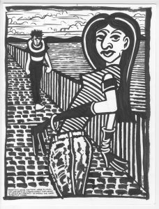
Once again I decided to dig out an old piece of art of mine and write about it. I find that to be an interesting exercise that can help me shed some light on my current work. Looking further back on the path can help me look ahead. So I pulled out an old 8.5×11 inch ink drawing from April 4, 1999 creatively named “Ink Drawing #8.” At least it was named something. I didn’t always name things back then.
This days I’m adept at making spontaneous ink drawings. I can take a pen or brush and just start drawing in ink without putting down any underdrawing in pencil. It’s a skill and technique that took me a long time to learn. Ink Drawing #8 was one of the first drawings that I made when I was first learning how to do that.
It started with me buying some coquille board. That’s a drawing paper that’s a good heavy stock but with a very fine pebbled texture on the surface. It was the first time I ever tried using that type of paper and though I enjoyed using a brush and ink with it I found it hard to draw on with a pencil. So I ended up saving it for a while until I started drawing in just ink. This board may have even been the impetus to start me in that direction.
One interesting aside about this drawing is that there is a false start on the back of it. I stared a drawing of a large monster or some such on the back but after a couple of dozen lines defining its basic shape I bailed on it, turned the paper over, and started a new drawing on the other side. Of course I don’t actually remember doing this but since the drawing is in ink it’s still there.
Ink Drawing #8 is one of my better drawing from this period. It works for me. It’s not perfect but I’m not looking for perfection when I’m drawing this way. It’s almost impossible to attain perfection with a brush and ink when drawing spontaneously so it’s better to go for interesting and happy accidents. Keep it simple and think ahead.
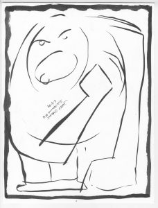
With spontaneous ink drawing there is often stuff that drives me crazy but I have to live with it. For example there is one small area of this picture the my eye is drawn to as not quite right. To the left of the woman’s right arm (the one that’s behind her body) the slat of the handrail of the bridge and the line of her arm create a triangle. That triangle seems a little off to me. All these years later and I still notice it. It’s kind of nuts but not everything can be perfect in an ink drawing so I accepted it and moved on. That and there was no real way to fix it. That’s another thing you have to accept when making a spontaneous ink drawing. It’s not a technique where you can fix everything. But that’s strength too. It frees you from worrying so much about mistakes which can be paralyzing for an artist. Sometimes you have to throw away the eraser.
This drawing reminds me of Edvard Munch’s “The Scream.” There are no screaming people in mind but the composition of the diagonal bridge and the high horizon line in the background are very similar. Plus there is a small person approaching a larger person. I must have had that painting in mind when I drew this because it’s a very particular composition.
My main weapon of choice in making this drawing was pattern. The four main ones are the horizontal stripes of the water, the vertical stripes of the bridge railing, the brick pattern of bridge road, and the diagonal stripes of the woman’s shirt. That each one is distinct helps the piece. I could have crossed the water pattern over into the railing to imply that the railing was made of iron rods rather than a solid wall but that would probably have cause visual chaos. It would have messed up the distinct diagonal of the piece. Roads not taken are important too.
One of the things I really like is the figure gesture of the woman. She’s bending backwards and twisting her head towards us. She’s standing still but also in action. I find that hard to capture. The diagonal lines in her shirt also help to make her more action oriented. The are just curved enough to suggest a there dimensionality to her and make her move a little bit. While the shape and texture of her pants, which look like a big jar, ground her. The pants give her a solid base.
I like the man walking towards her. Though a lot of him looks to be made out of blobs he has a movement to him. He’s coming forward. Not running but in a bit of a hurry. His legs aren’t even differentiated one from the other but they still read as his two legs. I also like how his shirt has turned into a bullseye with his head near the center. It lets us know that he’s coming.
I also used white paint on this drawing. Since I was making a finished piece I went back in here and there and whited out some black lines. Not to make it perfect but to make it presentable. I even drew with the white paint on her gloves. I used it to emphasize the fingers. Give her hands a little bit of a gesture. I can tilt the original and catch the light on it in such a way as to see some of the white paint that’s been drawn over in black. It’s almost like looking at the underdrawing. That’s neat because usually an underdrawing gets totally obliterated. It’s like a little time machine or glimpse into the process.
One last thing. There is also some writing on this piece. Way down in the bottom left corner it says, “Conditions inside the maze were so cruel that the rats no longer longed for a sense of order but dreamed to embrace the warm bosom of chaos.”
I’m back from the comic shop this week and I got four new comics.
Check them all out here: