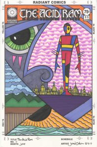
The Acid Ram is back this week with the cover to issue number eleven. Since it’s one of my faux comic book covers there is no actual issue but I’ve got a cover. It was one of the half dozen covers I penciled and set up to be inked and colored a couple of weeks ago and the only one of those that was a “The Acid Ram” cover. What is an acid ram you ask? I’m not sure but it’s something very weird. I imagine all sorts of weird stories revolve around it. Maybe it’s some sort of object that people revere. Or maybe it’s a title. A person could be the Acid Ram and that person could be the center of a strange world. It’s a title that makes me contemplate stories. It’s reserved for my most mysterious images. If I’ve got something that’s really out there it’s going to become an Acid Ram cover.
Of the six covers I had set up five of them were “Dreams of Things” covers and the sixth was this “The Acid Ram” one. Over time I inked them all and then they sat around waiting for me to color them with markers. Number eleven was the trickiest one to color because it has the most complex space of all of them. There are three different horizon lines and three different landscapes in one image. I wasn’t quite sure what I was going to do with all that when I started out.
The first thing I colored was the main figure. That’s one of my Mod Man figures that I’ve been drawing for years. He’s both modular and modern as he’s made up of shapes of color. I have no set design for him and I vary the shapes on his body each time I draw him. I also vary the color. Most often I use the three primary colors, as I’ve done here, but if there are more than one Mod Man figures in a drawing I’ll add in some secondary and tertiary colors.
The second thing I decided on was the very bottom bit of water and sun. One of the things my set of markers is missing is a variety of blue greens. I’ve got plenty of blues and plenty of greens but not enough blue greens to really give me satisfying water. I even mixed my own blue green ink and put it in a marker so I could have a base color but one day I’m going to have to track down some more blue greens. I kept the water simple with three different colors and did the same with the sun. I knew I wanted the sun/sky to be totally orange without any blue and ended up laying down three low contrast oranges. You have to look closely to see the three different shades but they still vibrate a little even if they can’t be seen distinctly.
The next color I dropped in was the pink sky behind the Mod Man. This took some pondering. It is the biggest piece of real estate on the cover and I had to get the color right on it. I didn’t want it to be a blue sky, because that would make the piece too normal, so I opted for a hot pink, a light pink, and a really light pink that’s so light that it’s almost white. I use that really light pink a lot because it changes the tone of the paper just a little bit in an almost undetectable way. It’s a subtle change. I also like how the sky acts as the whitest white on the page and moves forward in space more than a background should. It surrounds Mod Man quite well.
With that pink sky done my next move was obvious. I had to color the third sky and make it blue. Plus the land had to be colored and I went with green. Two blues and two greens. A simple and harmonious pairing that grounds the picture in a kind of reality that we know. I find that it’s important in a picture that’s all about weirdness to have a small anchor in reality. Some place for the viewer to relate to and let them enter into the picture. A little bit of fencing and a landscape can help with that.
The hardest part of this coloring process was deciding on the colors of the giant face. It was foreground, middle ground, and background all at once and that gave me a bunch of trouble. The first color I chose was the lighter purple for his nose and eyebrow. Then I brought some bright orange into the picture up top in the hair. That lead me to add more of the purple on the jawline and in the hair. I didn’t want the orange too dominant so I needed more of the purple. That made the dark purple of the chin/ground an easy call because I needed something heavy and dense there and it couldn’t be more orange with the sun right below it. One choice leads to another.
I went with a greyish blue for the left side of the face because I needed a neutral there. I had to settle down that part of the picture so that the pink sky could come forward a bit. The orange marks under the eye add a little exclamation point to the face. The last choice in the face color was the eye. I went with bright green to make it stand out. With neutrals surrounding it the green looked extra bright so I dulled it down slightly with lines of darker green so it wouldn’t fight too much with the pink. The pink has to be the master.
The very last color choice in this piece was the building behind the Mod Man. I had no idea what color to make them. I didn’t want them too bright but I also didn’t want them to be a neutral and blend in with the blue/grey of the face. I eventually settled on a light yellow. That’s a color that normally moves forward in space as it’s so bright but I dulled it down with some light purples and oranges. It ended up more of a gold color than a yellow and it stays in its place well.
So there is a color walkthrough for you. A little bit of my thought process to chew on.
Discussion ¬