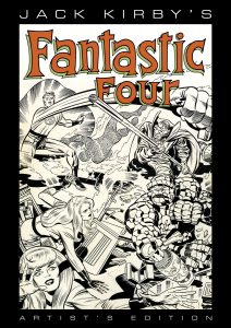
Taking a Look ” Jack Kirby Fantastic Four Artist Edition”
I posted a video last week looking at a friend’s copy of “Jack Kirby’s Fantastic Four Artist Edition.” It’s an excellent book. The idea behind the “Artist Edition” books is to give us fans a publication that duplicates looking at comic book original art that we will probably never see in real life. The original art is drawn in black and white and when printed in a comic book only the black line prints. But in reality there are all sorts of things on the original art that don’t show up in the final comic. There are non-photostat blue guide lines that are on the page, hand written notes outside the panel borders, correction notes, and occasional white-outs and art patches. So in these Artist Editions they take a full color scan of the original art and print from those scans so we can see all of the stuff that drops out in a finished comic. It’s also printed at the same size as the original art. This book is 11×17 inches. That’s pretty big.
I haven’t read any Jack Kirby and Stan Lee Fantastic Four in a long time. As a kid in the late 1970s it was not a comic that was a favorite of mine. It was ten to fifteen years old at the time (I read it in reprints) and the Stan Lee writing was too old fashioned for me. I liked the Jack Kirby art but there was plenty of other Kirby stuff at the time that I liked better. In general I prefer Jack Kirby’s 1970s work that he wrote himself to his 1960s work that Stan Lee wrote with him. So this was not only the first time I had seen this work in a long time but also the first time I had seen it in original art form.
Though the book is named for Jack Kirby, who is the plotter and penciller of the book, it’s really the work of four people. Jack Kirby, Stan Lee – who wrote the dialogue, Joe Rosen or Artie Simek – who did the lettering (depending on the issue), and Joe Sinnott – who did the inking and embellishing. For those who don’t know inking is a step that was necessary in order to print a comic book. First a drawing would be made in pencil and then it wold be redrawn in ink over top of the pencil. This was done because an ink line reproduced better than a pencil line. Usually in Marvel and DC comics the penciller and inker were two different people. In this book Joe Sinnott is credited as the embellisher rather than inker. That means that he did more work than a normal inker. The pencils may have been a little incomplete and Sinnott did some of the drawing work on them that a penciller might usually do.
The book is filled with beautiful drawing. Jack Kirby was a master and that shines through on every page. Some highlights for me are the crazy designs that go along with the villains Annihilus and Maximus. Annihilus is this crazy armored bug-like person who comes from a place called the Negative Zone and he has all sorts of fun Kirby machines around him. Maximus is wearing an incredibly designed complex suit of royal clothes/armor that’s so amazing it has to be abandoned after a few pages. There is no way he could be drawn in that outfit indefinitely because that would take too much time but it was glorious while it lasted. Kirby’s large panel drawings and splash pages really have a lot of power when seen at their full size.
Jack Kirby also wrote notes in pencil on all the pages. At this time Kirby was plotting the book himself, writing story notes in the margins, and then sending the pencilled pages to Stan Lee for Stan to dialogue. Most of the pages have had their edges trimmed during the printing process and some of the notes have been cut off but others can be read all these years later. It must have been fun to be Stan Lee and get these pages in and lay them all out in front of you to absorb the story and then start writing the finished words. He was the first one to get to the Kirby wonders on the page.
Joe Sinnott’s inks are amazing too. His skill shines through. Since the inks are the finished product it’s actually Sinnott’s line we are looking at on the pages. He’s using a brush and pen to make these finished drawings and he’s well known for his polished finishes. Everything is clear, precise, and as it should be. He is especially good at technique. There are certain ways that an inker does things like hair, folds in clothing, clouds, motion lines, and countless other items that Sinnott has down pat. Nothing seems wrong or out of place. Sinnott was also making the faces of some of the characters prettier. That was part of his embellishing role. Some people thought Kirby’s faces could be a little ugly so Sinnott made them pretty as needed. In going though the book I could sometimes say “Sinnott Face” or “Kirby Face.” The finished pages are flawless in a way that most comic pages aren’t.
The final thing to mention on the pages is the lettering. Lettering usually isn’t noticed much when reading a comic because we’re too busy reading the words but in an Artist Edition a person can really look at the lettering and appreciate it. It’s so well crafted. Almost all lettering done in modern comics is digital and there are certainly a lot of good letterers around today but to see masterful lettering on the page is amazing. The ballon shapes are all individually drawn to suit the panel they are in making for a tight and intricate design. The letters themselves with their bolds and varying sizes depended on what was written look beautiful. This is some of the best lettering in the business and unlike a lot of today’s digital lettering it is inseparable from the art. That’s interesting to see.
Meanwhile here is the video.
Discussion ¬