I’m back from the comic shop this week and I got three new comics.
Check them all out here:
I’m back from the comic shop this week and I got three new comics.
Check them all out here:
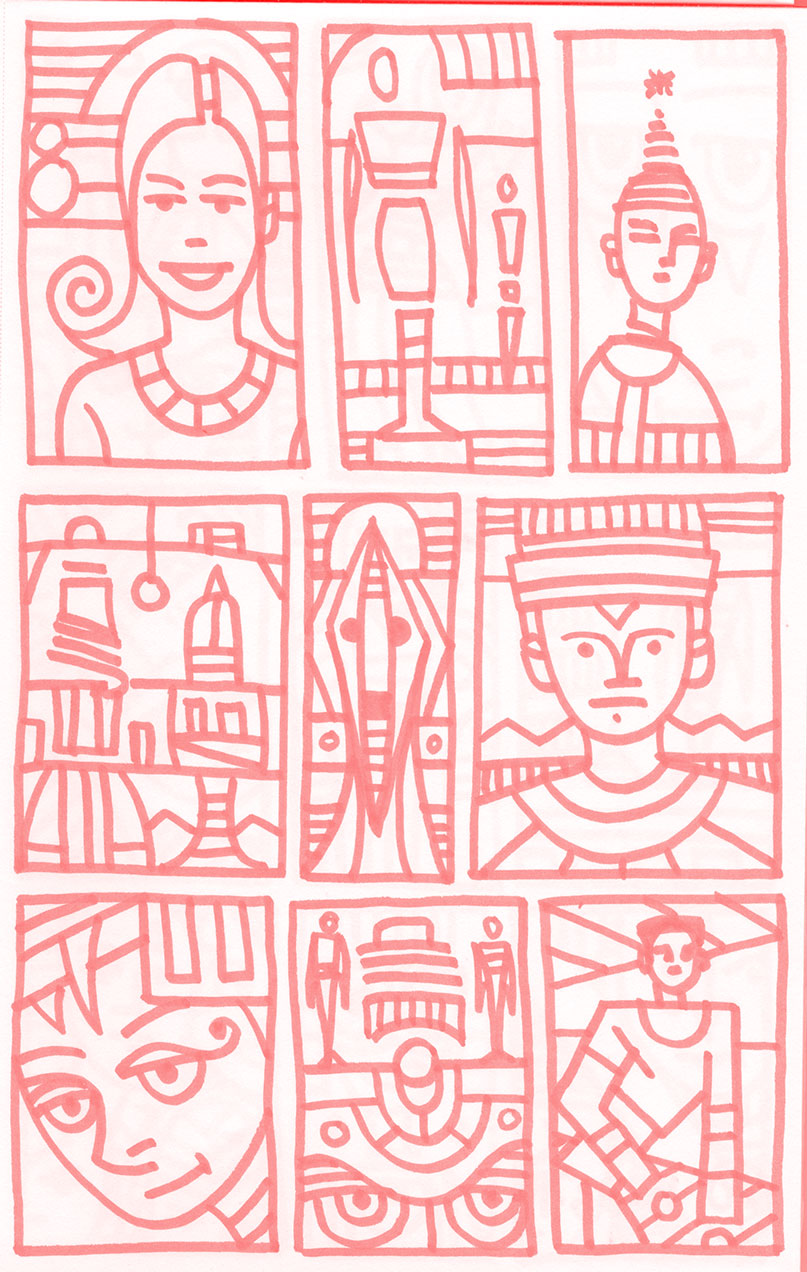
I just finished drawing a page in my nineteenth ink book. This ink book is titled “Sidelong.”I randomly name these books by opening the dictionary and pointing to a word with my eyes closed. I fill up one of these books a year, which is about eight pages a month, so it was page 80 that I finished this October day. I figured I’d write about it while it was fresh in my mind.
First off this page was drawn with a red Pentel Sign pen (a marker). I normally draw with a black pen but a couple of months ago I opened my last black marker and haven’t bought any new ones since. But a few years ago I bought a box of red sign pens that I used to draw in a red covered sketch book. I finished the red book long before I finished the pens. I figure I’ll use up these red pens before I buy new black ones. Otherwise they’ll just go to waste.
I have habits when I draw in an ink book and the first habit is to draw one box in the upper left. Then I draw in that box. I try to vary the first pen mark I make in a box because that can determine the whole drawing and I’m looking to draw a variety of images. If I always make the same mark first a lot of the drawings will come out similar. With this woman’s face I drew the spiral on the left side of her hair first. After that mark I knew I’d be drawing a face. This is one of my simple smiling faces that I draw a lot of. I added the background elements last to give some visual interest to the top of the drawing but I left the spiral by itself.
For the next step I drew two boxes. The box in the middle top and the box on the right side top. I’m not sure why I always draw one box then two but I almost always do. It just seems weird to leave that right side box undrawn after I draw the middle box. I drew the head on the figure in the middle box first. Since I had just drawn a big face I wanted a figure in the second box. Since I try yo draw these on the fly without much conscious thinking I could never decide on what type of figure. So I ended up with a weird modern art statue of a figure. I added an equally strange figure on the right and some background shapes. This one has a bit of surrealism in it.
The third box has just a bust of a person it it. No background at all. I wanted to draw a very graphic person in a few lines. The top of his head and hat became stripped down and simple so that a background would clutter things up. I like the simplicity of this one but it looks like his head might be falling off.
I continued my drawing of one box in the second row and then decided I wanted something without a figure in it but had no idea what to draw. This is what that looks like. What is it? I’m not even sure. I used a lot of shapes in this drawing and some parts look vaguely like buildings but they don’t seem to be on any landscape. I can’t even tell where the horizon line is. Some drawings end up being an unsubjected mystery.
Here is where I drew two more boxes. The middle drawing went vaginal on me. People are usually quick to point out when an image is phallic but vaginal slips by them. People can really giggle at rocket ships but draw an extended diamond shape that looks vaginal and people don’t mention it as much. Unless you’re Georgia O’Keefe painting flowers. Either way I like this little drawing. It has a lot of good shapes and spaces. Sometimes I like the composition of an abstract drawing as much as I like an image.
Box number six has another of my clean line faces. He’s in a decorated outfit and I took liberties with his eyebrows and nose but other than that it’s a straightforward face. The horizon line by his shoulders and mountains on top of that is one of my standard backgrounds. It helps to define the space of a drawing.
Box number seven (drawn by itself) is where I got it in my head to write a blog about drawing this page. That made me weirdly self conscious. I couldn’t figure out what to draw for a moment so fell back into drawing a face. It’s strange that the eyes are in the middle of the composition as I almost never do that. It throws off the balance of the drawing as so much of it had to be the top of the head and the chin is squeezed by the bottom of the drawing. I don’t think I reached my place of unthinking with this one and it suffered as a result.
I drew the last two boxes and then tried to clear my head of my consciousness of drawing and writing. I think I succeeded for a few minutes and got this nice little composition out of it. Small little figures and big eyes. The eyes at the bottom were drawn last and changed the whole look of the drawing. It went from okay to intriguing with that addition. I think it was a nice recovery from the drawing before it.
And then the self-consciousness crept in again for the last drawing. I couldn’t clear my mind and then decided I wanted to draw a twisting figure but had no idea how I wanted to draw it. So I just started and went in whatever direction showed itself. It wasn’t much of a direction. The figure is weirdly twisted and the composition is flawed. Not that all the other compositions are great but this one is off by a mile. They can’t all be winners.
So this is just one page out of nineteen ink books over nineteen years. I don’t see anything special on it right now but I know that time changes things. When I’m looking for something to make a finished drawing from I grab one of my books and look through it until something catches my eye. Maybe next year something will catch my eye from this very page. We’ll have to see.
I’m back from the comic shop this week and I got four new comics.
Check them all out here:
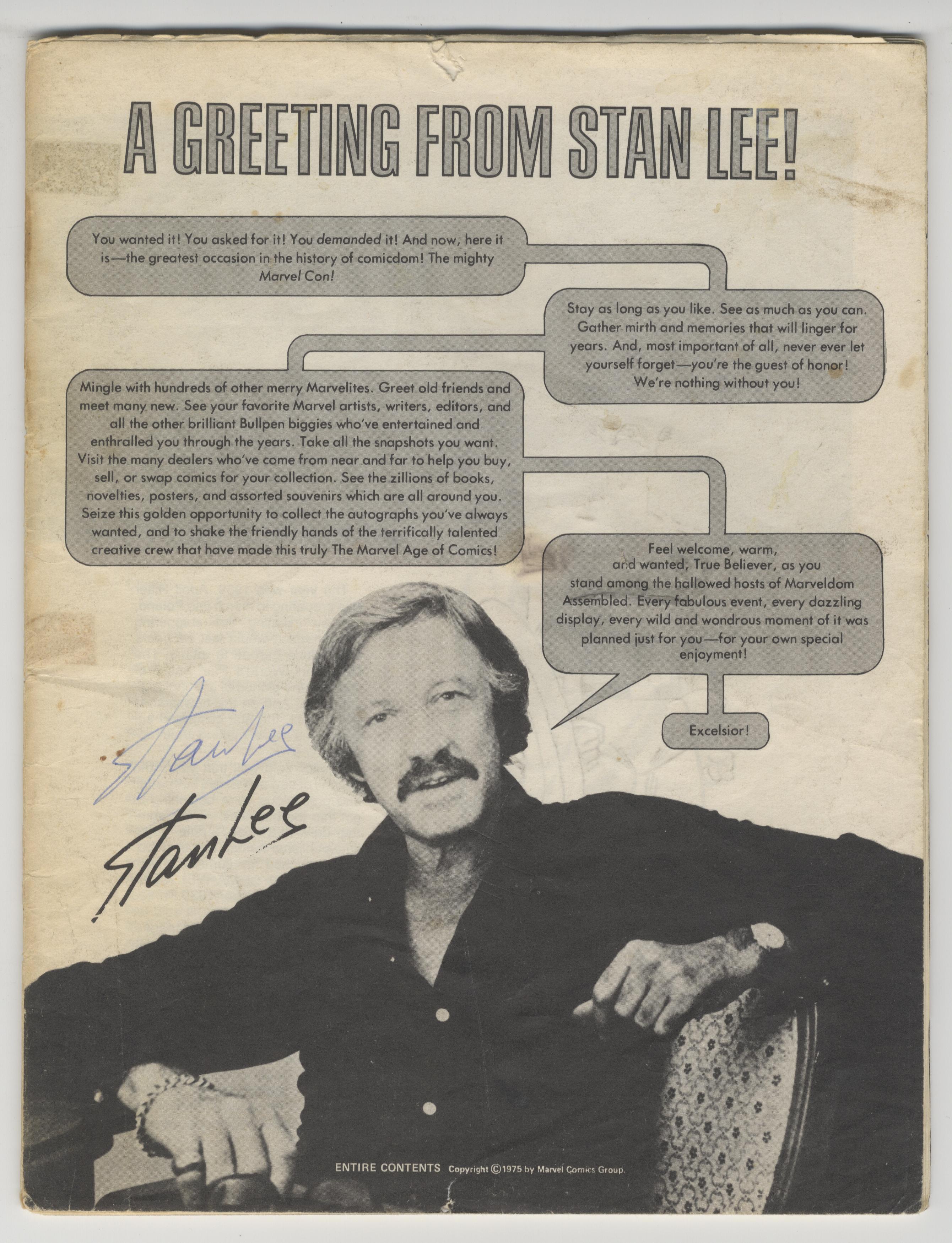
I’m writing this on the day we all got the news that, at age 95, Stan Lee has died. As a comic book fan since I was a kid, and I was a Marvel kid, the name Stan Lee has been in my life for a long time and I found myself sadder than I thought I’d be at this news. It prompted me to pull out a couple of things from my collection to post on social media and contemplate them.
The first thing is the magazine program from a 1975 comic convention that was signed by Stan Lee. You might think there is a story that went with the program about me going to the con and meeting Stan Lee but there is not. I’m not even sure who got the autograph in person at the con but I’ve had it since about 1977.
Back in the late 1970s in the suburbs of NYC there were no comic shops. If you were a ten year old kid your choices in comics were limited to what you could find on the newsstand. Back issues were usually nonexistent except on the occasions where word would come down the kid-grapevine that some kid in some other neighborhood was selling comics. We’d jump on our bikes, ride over to another suburban street, ask around if anyone was selling comics, and then knock on that kid’s door. Usually they would be selling the comics for a nickel a piece. Occasionally a friend of a friend would hear I liked comics and take a trip over to my neighborhood to see if I wanted to buy or trade comics.
Those back issue excursions probably only happened about a dozen times over the years, I remember such occasions being fairly rare, but a few of them were memorable. I have a vague memory of getting the Stan Lee autographed program at my house so it must have been an instance where the guy came to me. What I remember most is being confused.
Whoever this fellow was, who I made the trade with, is now lost to my memory. All I remember is that he was older than me. I was probably eleven or twelve and he was fourteen or fifteen. I don’t even remember what I traded away or got in return. What I remember is that after the deal was done and we handing over the books to each other he insisted on throwing in the program. I was baffled. The deal was done, the terms were met, so what was he doing changing the deal? He must have gotten frustrated with my suspicions because he finally said, “Just take it. It has Stan Lee’s autograph on it. Some guy traded it to me and I don’t want it.” So I took it. What else was there to do?
I’m not an autograph person. Despite having many chances I usually don’t get things signed just because it doesn’t cross my mind. But this is the autograph I’ve had in my possession for the longest time. Every time I’ve pulled it out over the years it not only reminds me of Stan Lee but makes me wonder about the two people who owned it for a short time before me who didn’t want it. Who were they? Why didn’t they want it? One who didn’t want it so much that he gave it to me just to get of it. Strange but makes me think.
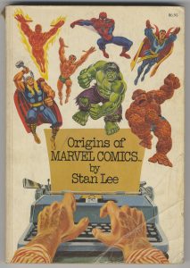
The second piece that I pulled out was the book “Origins of Marvel Comics” by Stan Lee. It’s a book that I got in about 1976. It’s a reprint collection of early 1960’s Marvel comics that comprise the first issues of Spider-Man, the Hulk, the Fantastic Four, and others. It was the only way I could get to read those fifteen year old comics. But it was also an interesting history book.
Even as a child I loved history. I used to take out history books written for kids from the library. So a history of comics was of special interest to me. Before each comic that was presented Stan Lee wrote a few pages about the story behind the comic. How each one was created. I loved that stuff and read it and the comics over and over. It also taught me a little something about reading history with a skeptical eye. As much as I loved the text pieces I began to suspect that Stan Lee was telling some tall tales. Once again I had suspicions.
My ah-ha moment came a year or so later when, for another birthday or Christmas present, I was given the book “Son of Origins of Marvel Comics.” It was the same format as the first one, and I loved it just as much, but I found my smoking gun in one of Stan Lee’s text pieces.
From the first volume I was already familiar with the “Marvel Method” of making comics. Stan would write a loose plot or maybe just have a conversation with Jack Kirby, the artist of the Fantastic Four, and then Jack Kirby would go off in draw the whole comic. After the comic was pencilled Stan Lee would get the pages and add dialogue to them. Seemed simple enough but still left a lot of room for a twelve year old to wonder who really came up with what.
Then in the section before the first appearance of the Silver Surfer we were told of his origin. Stan Lee writes that when he got the pencilled pages back from Jack Kirby there was a little figure flying around them and Stan Lee asked Jack Kirby who that was. Jack answered that he thought that a villain as powerful as Galactus (it was his origin story too) should have a herald and that’s who the Silver Surfer was. Stan Lee wrote that he thought that was a great idea and he ran with it.
The problem my twelve year old brain had with Stan Lee’s telling of this story was that it didn’t jibe with the actual issue. The Silver Surfer wasn’t some minor character on the fringes of the story he was the main mover of action. He was the story. How could the writer of the story not know what was in the story? That’s what my young mind tried to figure out. Of course the inevitable answer was that Stan Lee was not the writer of that particular story. Jack Kirby was. In between the tall tales a little truth snuck in.
I still love those Stan Lee text pieces in those two “Origins” books and the few that came after them but I learned to look at history with a more skeptical eye. Over the years Stan Lee’s stories about the origins of Marvel Comics have been shown to be flawed but he always was good at writing an origin story. And I enjoyed reading them.
I’m back from the comic shop this week and I got four new comics.
Check them all out here:
I recently got an Apple Pencil to go along with the iPad that I got last December. I’ve had a Wacom Tablet and Wacom Cintiq for years so I’m no stranger to digital pens but there is definitely a learning curve drawing on an iPad. I started out wanting to dive right into the deep end but I’ve had to slow down my ambitions with it. I’ve changed over to just drawing with a “Pencil” rather than going into full blown painting mode.
I’ve been using an app called “Procreate” and it’s a good drawing app but it’s been taking me time to learn the basics. It’s easy enough to pick a pencil, pen, paintbrush, or marker and change the size and opacity of the tool but beyond that the app doesn’t act like a desktop application. All my long used keyboard shortcuts don’t exist because there is no keyboard. So far I’ve been having to look up a lot of basic stuff on the internet. Like how to cut and paste. Since it’s an iPad there are finger gestures to bring up those menus. I would have never figured that out on my own. Like lots of other things that have to do with this app things are hidden and not found in an intuitive way. It’s a good thing the internet exists.
I also had to look up tips on how to set up my own color palettes. Those are the little swatches of color that you tap the pen tip on to change what color you are using. In the Adobe desktop apps I set up my color palettes decades ago and have been importing them to all the new and different Adobe apps ever since. Setting up all new color palettes was looking like a real pain in the neck until I looked up some tips. I ended up taking a screen shot of my color palate and then sampling the colors in Procreate. It went smoothly.
After initially being a bit overwhelmed by Procreate I gave myself the task of drawing the equivalent of one of my 6×9 inch pencil drawings in it. I figured that I only used one pencil to draw them in real life so I’d only need one digital pencil too. That turned out to be true. I imported in a thumbnail drawing, dropped the opacity of it to 50%, and created a layer above it to draw on. In the real world I’d print the thumbnail drawing out in light blue and draw over it with a pencil. The process was about the same so I had no problem with it.
Turns out the biggest problem I had with it was where to draw. Normally I draw standing up at my drawing table but I use my iPad sitting down in a chair. I’m also usually taking a break when I sit down so it was weird to be working that way. Sometimes when I sit down to take a break I end up working on a photo on my iPad so the lines have been blurred before. I ended up doing a little of both but I mostly tried to stand and work.
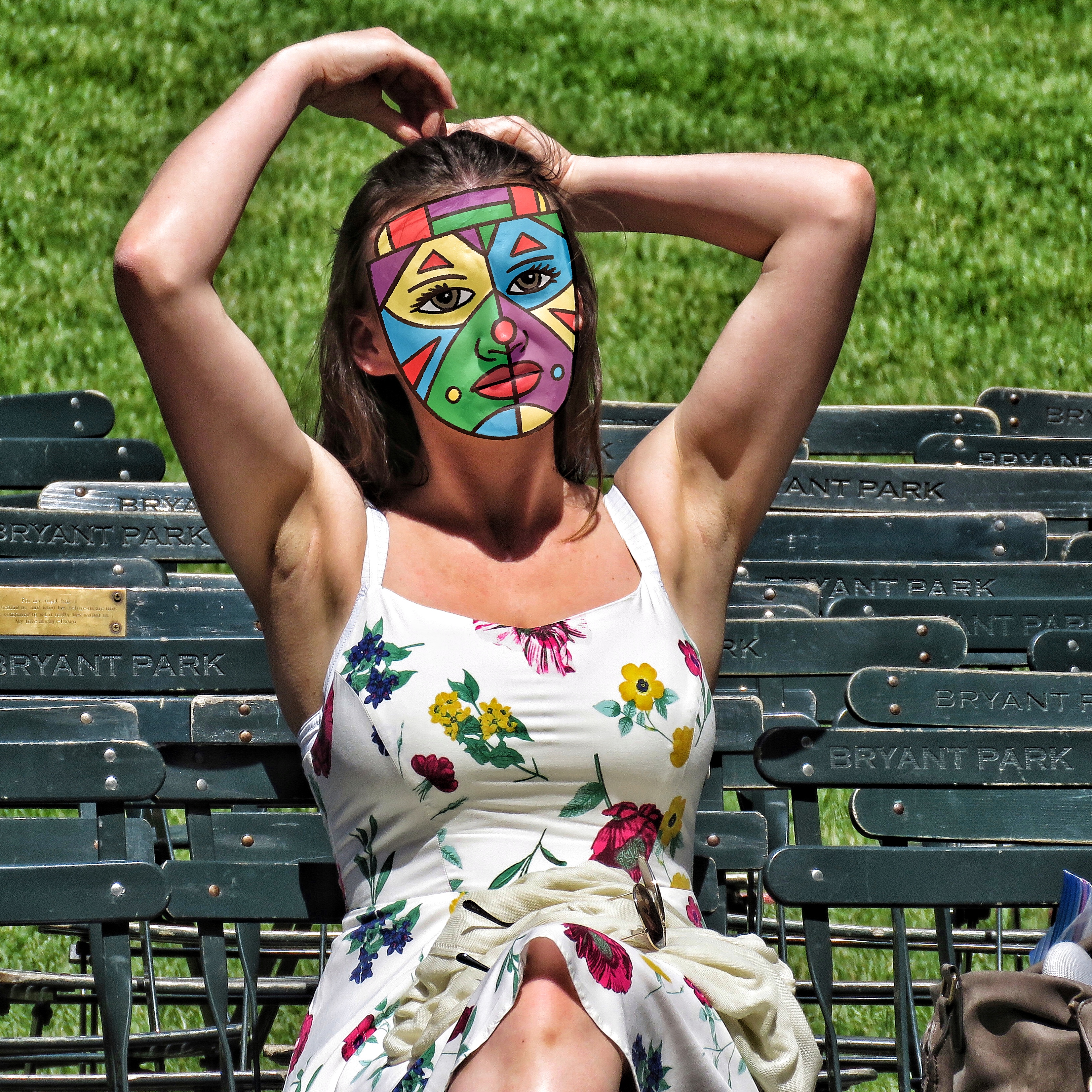
After getting comfortable with pencil drawing on the iPad I decided to revive my practice of drawing masks on my street photos. I like taking street photos but I don’t like posting them online because the people in them have no idea their photo is being taken. Since I don’t have many followers on Instagram (where I post them) it really doesn’t matter but it still makes me a little uncomfortable. I’m more comfortable with large group photos but when one person becomes my unknowing model I feel I owe them a little privacy. So years ago I developed a technique where I digitally put masks on them. Since I love drawing masks it was a natural and I like the end results. They always look like photos that are mine.
The main problem with the technique was that it took so much time. For some reason I was never able to master drawing the mask digitally with a Wacom tablet and pen. So I would print out a low opacity version of the photo on drawing paper, draw the mask on the paper, scan the drawing back into the computer, color the mask, and then digitally put the mask over the person’s face. It always came out well but it took about twice the time it could have. Maybe three times the time. Either way I’d do one or two of them but then the time suck would get me down.
One of the best things about drawing the masks on the iPad with the Apple pencil is the immediacy of it. First I look through a bunch of my street photos. This takes a while. It isn’t always easy to find just the right one but after I find the right one I can get to work right away. I bring the photo into Procreate, dim the opacity to 50%, create a new layer on top of the photo, and draw the mask on that layer. It all moves a lot faster than printing out and scanning in. Especially since it’s not a big and complicated drawing.
After I draw the mask I color it. I create another layer between the photo and line drawing layer. That’s usually how comics and cartoons are colored and the makers of Procreate even put a helpful trick in to facilitate this process. I can set up the line layer as a “Reference” layer. This means that the app sees the two layers as connected and I can automatically use the lines as boundaries for my color even though the color isn’t on the line layer. So I can fill in the color with one touch rather than have to color it in. That speeds things up.
I’ve done a few masked photos so far on the iPad. I’ve liked how they’ve come out too. I haven’t tried to print any of them yet as that’s the final test for this technique but I think they’ll print fine. In the days of my iPad 2 it would sometime downsample a photo that I put on it but nowadays when I work on a photo on the iPad it keeps the photo’s native resolution. So a high resolution photo stays a hires photo. That’s a good step up. I think this whole digital drawing thing is going to work out.
I’m back from the comic shop this week and I got three new comics.
Check them all out here:
I’ve been working large lately on my 22×30 ink drawings so I thought for a change of pace I’d look at some small things. I’m going to pull four art cards out of my binder of art cards and take a look at them. Art cards are baseball card sized art (2.5×3.5 inches) and I’ve done a lot of them over the years. I keep them in nine card sleeves that are meant for trading cards so they are pretty easy to store and look through.
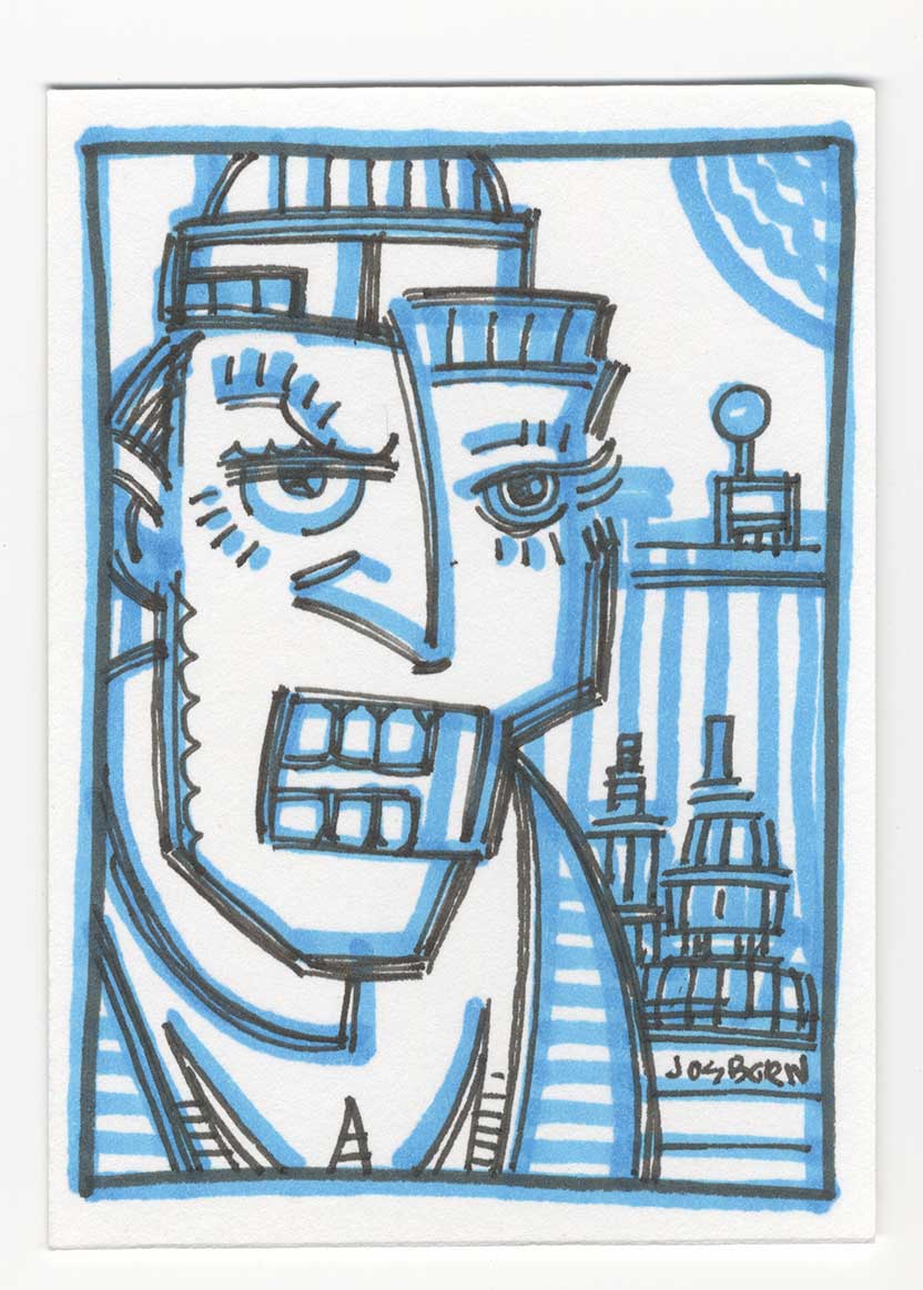
The first one I grabbed is art card number 936 that I drew on April 24, 2013. This looks like one of my spontaneous ink drawings. It’s drawn in just two colors: blue and black. When I first started getting back into markers in 2010 (I had used a lot of markers in my late 1980s college days) the first Copic marker I bought was a Tahitian Blue marker. It was a regular tipped marker and not a brush tip. All the other Copic markers I bought after that one were brush tipped so the first one never fit in with the rest of my markers. As a result it sat apart from them in the side tray of my drawing table.
I soon developed a drawing habit with this one marker. I’d draw art cards with it by first drawing spontaneously with it. No underdrawing with a pencil. I’d grab my blue marker and hit the paper with it. After I made a blue marker drawing I’d come in with a thin black ink pen and draw over the blue. The blue kind of acted as an underdrawing but it also added an element of shading to it. Also not every blue line has a corresponding black outline. In this drawing the moon and various stripes are all blue.
I like this combination of the two pens. Thick blue and thin black. Even when I draw multiple lines with the thin black I never make then solid to keep its thins intact. I don’t think this technique would scale up into a large drawing but I like it for a small one. I’ve done a bunch of art cards in this style.
The next art card that catches my eye is number 938 that was drawn on August 1, 2013. It’s on the same page as 936 so I didn’t have to go far to find it. You can see how I draw these cards sporadically as it’s only two numbers from 936 but was done four months later. I often draw them in bunches and there can be a lot of time in between bunches.
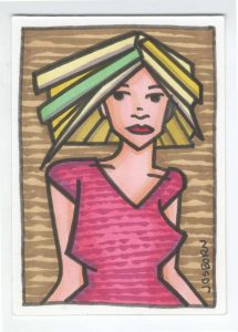
Art Card 938 uses a totally different technique form 936. This one wasn’t a spontaneous drawing so that means I drew it in pencil first. I had the drawing worked out before any markers came on the scene to finish it. This may have even been a larger finished drawing that I shrunk down and reused as an art card. I do that sometimes but often I just grab a pencil and start drawing on the card itself. This one could have even gone the other way and I liked the art card and so blew it up into a larger drawing.
I used a sign pen and Copic markers to finish this one. I refill the sign pen with black India ink and use that for my black line and then fill in the color with the Copic markers. I add a slight bit of shading to the color in the air and shirt with a dull purple marker. I also added texture to the drawing with rough vertical lines in the background and on her shirt. Overall I like the simplicity of this drawing. It has good lines, shapes, and colors and doesn’t get overly complicated.
For our third card I flipped a bunch of pages to get to Art Card 1042 drawn on March 19, 2014. We’re into the next year and a different drawing tool. This is one of my monster faces but it’s not in ink like they usually are but it’s drawn with a Wolf’s Carbon pencil. That’s not a pencil I use very often but I can remember buying them around this time to try them out. I thought I could draw dark things with them. It turned out that I could but at the same time I was developing my “Busted Brush” technique and the brush was a lot more versatile than the pencil.
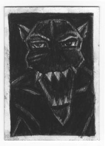
This face is a good example of what I could do with the pencil. I could lay down a really dark area of graphite and pull some light areas out of it. With this monster face you just get hints of the edges of his form. That’s how I wanted it. He mostly fades into the shadows with his white teeth showing the most. The carbon pencil only worked for these small drawings though. It was tough making something bigger than this with it because it took so much work to draw in large areas of dark. That was much easier to do with ink so I ended up only making a few of theses carbon monster faces and lots of ink ones in big sizes.
For our final Art Card I skipped ahead to October 27, 2014 and card number 1180. This one is brightly colored and not simple in it’s imagery. It uses the same technique of the sign pen and the Copic markers but this one looks like it was drawn at this size in pencil first for this specific card. There is no chance this one was a repurposed drawing.
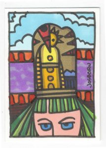
It’s a complex piece in that card is broken into three different backgrounds. There is a blue sky on top, a purple sky in the middle, and a black and red wall on the bottom. Plus there is a fourth background in the hat in the middle. The hat has its own figure in it and there is a part of a head on the bottom. A lot of different things are going on in such a small area.
Then there is all that color. The bright green hair balances with the blue skies nicely. The purple sky plays off the orange borders well. The yellow and neutrals in the center act like glue holding the whole piece together. The pink skin acts as our whitest white and shines out at us. In hindsight I’m amazed I was able to pull off such complexity in something so small.
So there you go. A look at four little pieces that make up a small part of this big old world of ours.
I’m back from the comic shop this week and I got five new comics.
Check them all out here:
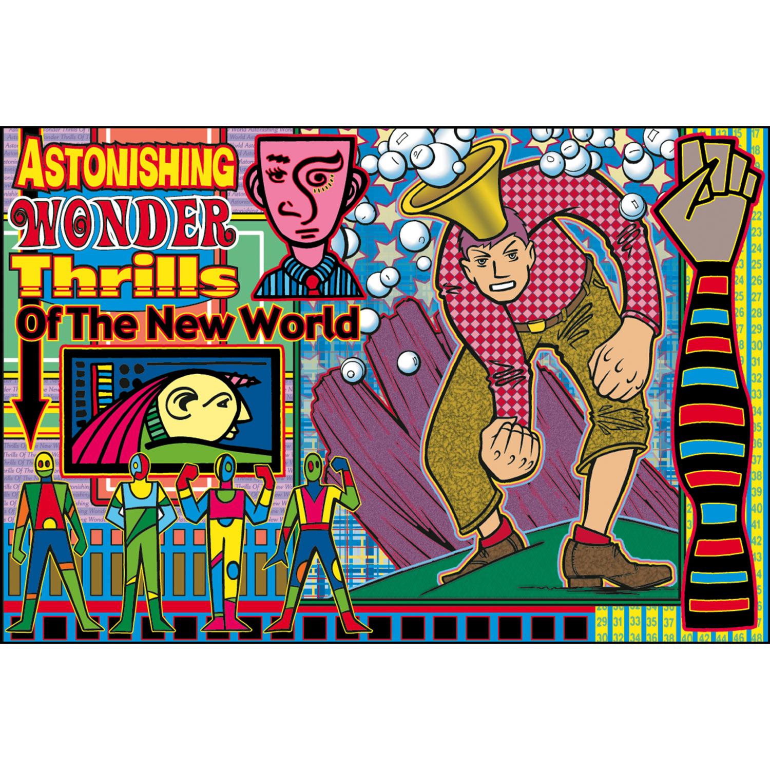
I’m going back into the past this week to look at a piece of art that I made back in August of 2000. That puts it at eighteen years old as of the date I am writing this. It’s a digital print named “Astonishing Wonder Thrills of the New World” and it’s print number six of about a hundred prints I’ve made over the years.
Let me take you back for a moment to the time I made this print. I bought my first computer at the and of 1995 and had been doing graphics on a computer since about the beginning of 1994. So by the year 2000 I was well versed in Adobe Photoshop and Illustrator but it was still not that long since I started working in them. This was around the time I started thinking I could make big full color prints in them.
A few years before, in about 1997, I made my first digital art prints but they were fairly small, maybe around 8×10 inches, and my inkjet printer really wasn’t good enough to make art prints. In those days you could tell with the naked eye what was an inkjet print. The color just wasn’t smooth enough. But by the year 2000 inkjet printers were a lot better so I decided to make some new art prints.
The first thing I notice about “Astonishing” is how busy it is. Normally I’m a simplicity guy but with these prints I indulged my complex side. I call them digital prints but my process for these wasn’t all digital. I made the drawings by hand with a brush and ink and then scanned them into the computer and colored them digitally. With this one, unlike most later ones, I also composed digitally.
This print was made before I was in the habit of drawing in my sketchbooks in ink (my ink books). So I didn’t have my now vast reservoir of thumbnail drawings to choose from and instead had a bunch on drawings on random sheets of paper lying around. In looking at this print I can see five different source drawings for the overall image. The largest drawing of the man with the firsts and bubble head was a finished ink drawing that came out of my “Surrealist Automatic Drawing” method, the four colorful figures are some of my “Mod Men” drawings, the yellow faced guy on the left was a tiny ink drawing, and the stripped arm and pink faced guy were pulled from pages of ink doodles that I made.
It was not easy working that way. Having to pull drawings from a variety of sources and put them all together into one drawing can be a tough go. The main problem I had was that I’d find an image or three I wanted to work with, fit them together, and that would suggest that I needed another image to complete the composition. But what image? It was back to looking through my drawings and hoping to find something. I think it was this process that lead me to drawing in my ink books and keeping my spontaneous ink drawings all in one place but at the time all I had was various piles of drawings.
It may have been a pain to work in that piecemeal method but that was the point of these early prints. I was trying to find a way to make something finished out of all these various small drawings that I made. For example I drew a bunch of those Mod Men over time but what were they for? They weren’t characters in a story. They were mostly decorative figures so I had to make something they could decorate. These prints were it.
Besides the variety of images in this print it also has an overload of patterns and outlines. It’s a little crazy busy. This also might be the only print that I used four different fonts for the headline. That’s really something you should not do. It’s also a bit of an amateur move to make each word or line its own font. Newbies do it because they’re so enamored with having so many fonts at their disposal that they want to use tons of them but the more experienced designer knows to stay away from that. But sometimes it does work and I think it does in this print. With all the busyness you barely notice the many fonts.
Outlines are also another tool that I don’t use often but used a lot in these early prints. I think it was because outlines helped integrate all the drawings. Normally an outline would be used to separate parts of a drawing, and it does that a bit here, but since almost everything has an outline in this drawing it becomes a unifying theme. I was tough using digital outlines though. Any little imperfection in the edges of my drawing were amplified by a digital outline. I had to do a lot of smoothing.
The background is filled with patterns. Stripes, squares, rectangles, stars, and bubbles fill the print. I even used more type and numbers on some of the background stripes. The bubble headed man’s shirt has a digital pattern and his pants have a digital texture. So does the rock behind him. The stars in the background even have a digital opacity fade to them. There is so much going on that it’s tough to note it all.
It’s a saying of mine that complexity is simplicity multiplied. That’s how I approached these prints. I added one element at a time. It was impossible to plan out in advance so I planned one step and after that was done I planned another. Or maybe I planned two or three steps in advance but not the whole thing. I’d drop a block of color here and there and then maybe a stripe before figuring out I needed another drawing in some spot. One decision lead to the next.
I look back on these early prints with a bit of nostalgia these days. It was before digital was as integrated into my workflow as it is today and I can see myself learning and exploring. As is my nature I eventually stripped down the complexity of my prints but it took a long time. Or maybe the complexity changed a bit since my “Painted Lady” prints are still pretty complex. But it’s a different kind of complexity. Either way I did dozens of prints in this style and it’s cool to pull them out every now and again and give them a look.