I’m going back into the past this week to look at a piece of art that I made back in August of 2000. That puts it at eighteen years old as of the date I am writing this. It’s a digital print named “Astonishing Wonder Thrills of the New World” and it’s print number six of about a hundred prints I’ve made over the years.
Let me take you back for a moment to the time I made this print. I bought my first computer at the and of 1995 and had been doing graphics on a computer since about the beginning of 1994. So by the year 2000 I was well versed in Adobe Photoshop and Illustrator but it was still not that long since I started working in them. This was around the time I started thinking I could make big full color prints in them.
A few years before, in about 1997, I made my first digital art prints but they were fairly small, maybe around 8×10 inches, and my inkjet printer really wasn’t good enough to make art prints. In those days you could tell with the naked eye what was an inkjet print. The color just wasn’t smooth enough. But by the year 2000 inkjet printers were a lot better so I decided to make some new art prints.
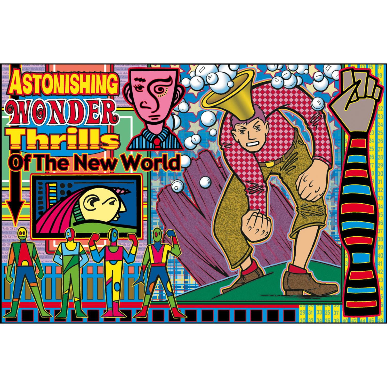
The first thing I notice about “Astonishing” is how busy it is. Normally I’m a simplicity guy but with these prints I indulged my complex side. I call them digital prints but my process for these wasn’t all digital. I made the drawings by hand with a brush and ink and then scanned them into the computer and colored them digitally. With this one, unlike most later ones, I also composed digitally.
This print was made before I was in the habit of drawing in my sketchbooks in ink (my ink books). So I didn’t have my now vast reservoir of thumbnail drawings to choose from and instead had a bunch on drawings on random sheets of paper lying around. In looking at this print I can see five different source drawings for the overall image. The largest drawing of the man with the firsts and bubble head was a finished ink drawing that came out of my “Surrealist Automatic Drawing” method, the four colorful figures are some of my “Mod Men” drawings, the yellow faced guy on the left was a tiny ink drawing, and the stripped arm and pink faced guy were pulled from pages of ink doodles that I made.
It was not easy working that way. Having to pull drawings from a variety of sources and put them all together into one drawing can be a tough go. The main problem I had was that I’d find an image or three I wanted to work with, fit them together, and that would suggest that I needed another image to complete the composition. But what image? It was back to looking through my drawings and hoping to find something. I think it was this process that lead me to drawing in my ink books and keeping my spontaneous ink drawings all in one place but at the time all I had was various piles of drawings.
It may have been a pain to work in that piecemeal method but that was the point of these early prints. I was trying to find a way to make something finished out of all these various small drawings that I made. For example I drew a bunch of those Mod Men over time but what were they for? They weren’t characters in a story. They were mostly decorative figures so I had to make something they could decorate. These prints were it.
Besides the variety of images in this print it also has an overload of patterns and outlines. It’s a little crazy busy. This also might be the only print that I used four different fonts for the headline. That’s really something you should not do. It’s also a bit of an amateur move to make each word or line its own font. Newbies do it because they’re so enamored with having so many fonts at their disposal that they want to use tons of them but the more experienced designer knows to stay away from that. But sometimes it does work and I think it does in this print. With all the busyness you barely notice the many fonts.
Outlines are also another tool that I don’t use often but used a lot in these early prints. I think it was because outlines helped integrate all the drawings. Normally an outline would be used to separate parts of a drawing, and it does that a bit here, but since almost everything has an outline in this drawing it becomes a unifying theme. I was tough using digital outlines though. Any little imperfection in the edges of my drawing were amplified by a digital outline. I had to do a lot of smoothing.
The background is filled with patterns. Stripes, squares, rectangles, stars, and bubbles fill the print. I even used more type and numbers on some of the background stripes. The bubble headed man’s shirt has a digital pattern and his pants have a digital texture. So does the rock behind him. The stars in the background even have a digital opacity fade to them. There is so much going on that it’s tough to note it all.
It’s a saying of mine that complexity is simplicity multiplied. That’s how I approached these prints. I added one element at a time. It was impossible to plan out in advance so I planned one step and after that was done I planned another. Or maybe I planned two or three steps in advance but not the whole thing. I’d drop a block of color here and there and then maybe a stripe before figuring out I needed another drawing in some spot. One decision lead to the next.
I look back on these early prints with a bit of nostalgia these days. It was before digital was as integrated into my workflow as it is today and I can see myself learning and exploring. As is my nature I eventually stripped down the complexity of my prints but it took a long time. Or maybe the complexity changed a bit since my “Painted Lady” prints are still pretty complex. But it’s a different kind of complexity. Either way I did dozens of prints in this style and it’s cool to pull them out every now and again and give them a look.